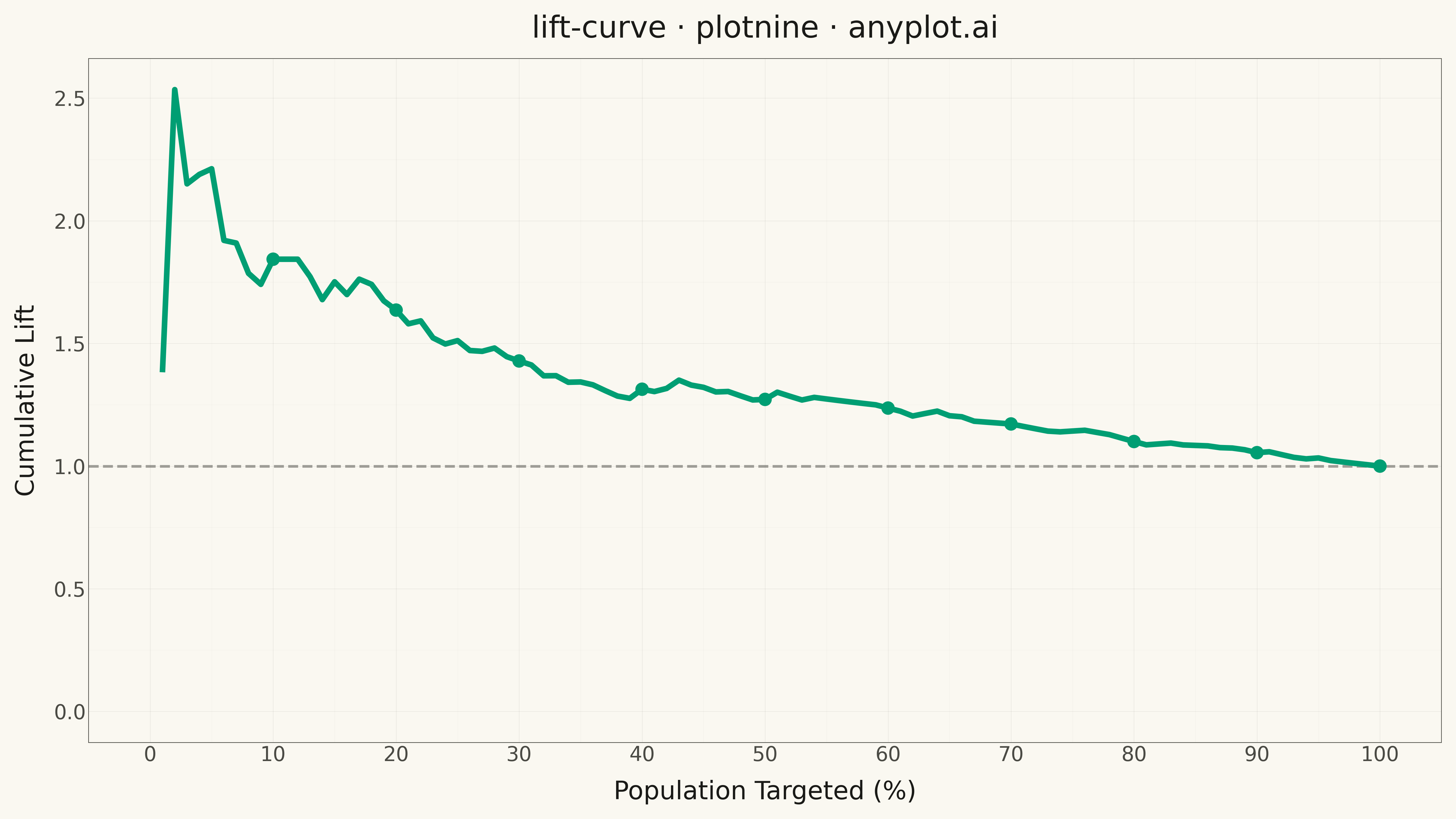
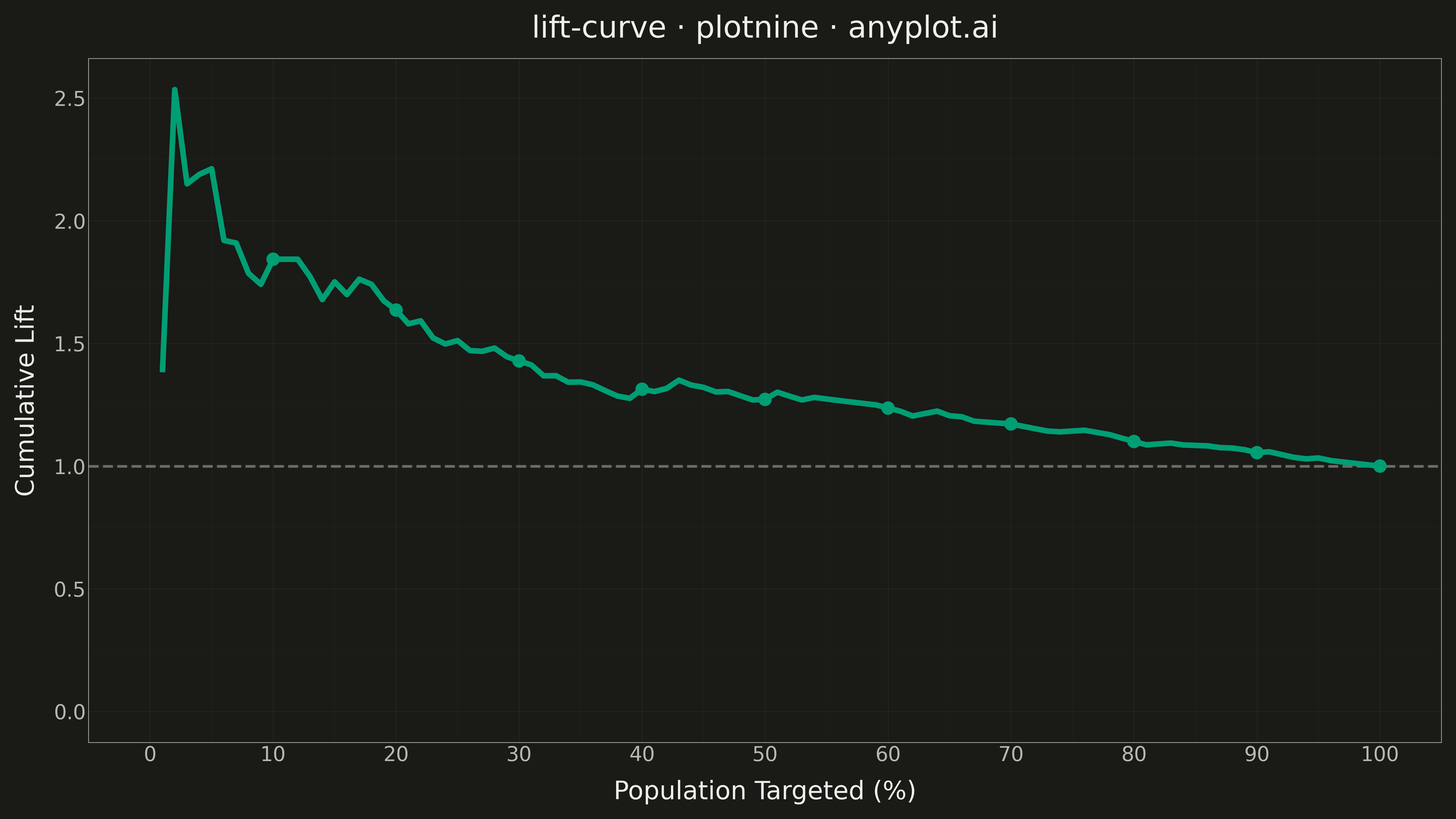
A lift curve visualizes how much better a predictive model performs compared to random selection, showing the cumulative lift ratio as you target increasing percentages of the population. It answers the question: "If I target the top X% of predictions, how many times more responders will I capture than random targeting?" This plot is essential for evaluating and comparing classification models in scenarios where targeting efficiency matters.
""" anyplot.ai
lift-curve: Model Lift Chart
Library: plotnine 0.15.4 | Python 3.13.13
Quality: 89/100 | Updated: 2026-05-10
"""

import os

import numpy as np
import pandas as pd
from plotnine import (
    aes,
    element_line,
    element_rect,
    element_text,
    geom_hline,
    geom_line,
    geom_point,
    ggplot,
    labs,
    scale_x_continuous,
    scale_y_continuous,
    theme,
    theme_minimal,
)


# Theme colors
THEME = os.getenv("ANYPLOT_THEME", "light")
PAGE_BG = "#FAF8F1" if THEME == "light" else "#1A1A17"
INK = "#1A1A17" if THEME == "light" else "#F0EFE8"
INK_SOFT = "#4A4A44" if THEME == "light" else "#B8B7B0"
ELEVATED_BG = "#FFFDF6" if THEME == "light" else "#242420"

# Okabe-Ito palette - first series is brand color
BRAND = "#009E73"
REFERENCE_LINE = INK_SOFT

# Data - simulated customer response model scores
np.random.seed(42)
n_samples = 1000

# Generate realistic response probabilities
base_prob = 0.15  # 15% baseline response rate
model_score = np.random.beta(2, 5, n_samples)  # Model predictions

# True responses correlated with model score (good model)
response_prob = 0.05 + 0.6 * model_score  # Higher score = higher response chance
y_true = (np.random.random(n_samples) < response_prob).astype(int)
y_score = model_score + np.random.normal(0, 0.05, n_samples)
y_score = np.clip(y_score, 0, 1)

# Calculate lift curve data
# Sort by predicted score descending
sorted_indices = np.argsort(y_score)[::-1]
y_true_sorted = y_true[sorted_indices]

# Calculate cumulative lift
n_total = len(y_true)
n_positive = y_true.sum()
baseline_rate = n_positive / n_total

# Calculate cumulative values at each percentile
percentiles = np.arange(1, 101)
lift_values = []
pct_population = []

for pct in percentiles:
    n_targeted = int(np.ceil(n_total * pct / 100))
    n_positive_captured = y_true_sorted[:n_targeted].sum()

    # Lift = (response rate in targeted group) / (baseline response rate)
    targeted_rate = n_positive_captured / n_targeted
    lift = targeted_rate / baseline_rate if baseline_rate > 0 else 0

    lift_values.append(lift)
    pct_population.append(pct)

# Create DataFrame for plotting
df = pd.DataFrame({"pct_population": pct_population, "lift": lift_values})

# Decile markers for emphasis
decile_points = df[df["pct_population"].isin([10, 20, 30, 40, 50, 60, 70, 80, 90, 100])]

# Theme configuration
anyplot_theme = theme(
    figure_size=(16, 9),
    plot_background=element_rect(fill=PAGE_BG, color=PAGE_BG),
    panel_background=element_rect(fill=PAGE_BG, color=None),
    panel_grid_major=element_line(color=INK, size=0.3, alpha=0.10),
    panel_grid_minor=element_line(color=INK, size=0.2, alpha=0.05),
    panel_border=element_rect(color=INK_SOFT, fill=None, size=0.5),
    axis_title=element_text(size=20, color=INK),
    axis_text=element_text(size=16, color=INK_SOFT),
    axis_line=element_line(color=INK_SOFT, size=0.5),
    plot_title=element_text(size=24, color=INK),
    legend_background=element_rect(fill=ELEVATED_BG, color=INK_SOFT),
    legend_text=element_text(size=16, color=INK_SOFT),
    legend_title=element_text(size=16, color=INK),
)

# Create plot
plot = (
    ggplot()
    + geom_hline(yintercept=1.0, linetype="dashed", color=REFERENCE_LINE, size=1.2, alpha=0.5)
    + geom_line(data=df, mapping=aes(x="pct_population", y="lift"), color=BRAND, size=2.5)
    + geom_point(data=decile_points, mapping=aes(x="pct_population", y="lift"), color=BRAND, size=5)
    + scale_x_continuous(breaks=[0, 10, 20, 30, 40, 50, 60, 70, 80, 90, 100], limits=(0, 100))
    + scale_y_continuous(breaks=[0, 0.5, 1.0, 1.5, 2.0, 2.5, 3.0, 3.5], limits=(0, None))
    + labs(title="Model Lift Curve", x="Population Targeted (%)", y="Cumulative Lift")
    + theme_minimal()
    + anyplot_theme
)

# Save
plot.save(f"plot-{THEME}.png", dpi=300, verbose=False)
Runnable source as JSON, for any HTTP client: https://api.anyplot.ai/specs/lift-curve/plotnine/code. Any spec id and library id listed in llms-full.txt fit the same URL shape; every URL below is complete and callable.
{
  "spec_id": "lift-curve",
  "language": "python",
  "library": "plotnine",
  "page": "https://anyplot.ai/lift-curve/python/plotnine",
  "hub": "https://anyplot.ai/lift-curve",
  "code_json": "https://api.anyplot.ai/specs/lift-curve/plotnine/code",
  "spec_json": "https://api.anyplot.ai/specs/lift-curve",
  "render_light_png": "https://storage.googleapis.com/anyplot-images/plots/lift-curve/python/plotnine/plot-light.png",
  "render_dark_png": "https://storage.googleapis.com/anyplot-images/plots/lift-curve/python/plotnine/plot-dark.png",
  "quality_score": 89.0,
  "license": "MIT",
  "guide": "https://anyplot.ai/llms.txt"
}
Part of Model Lift Chart on anyplot.ai.