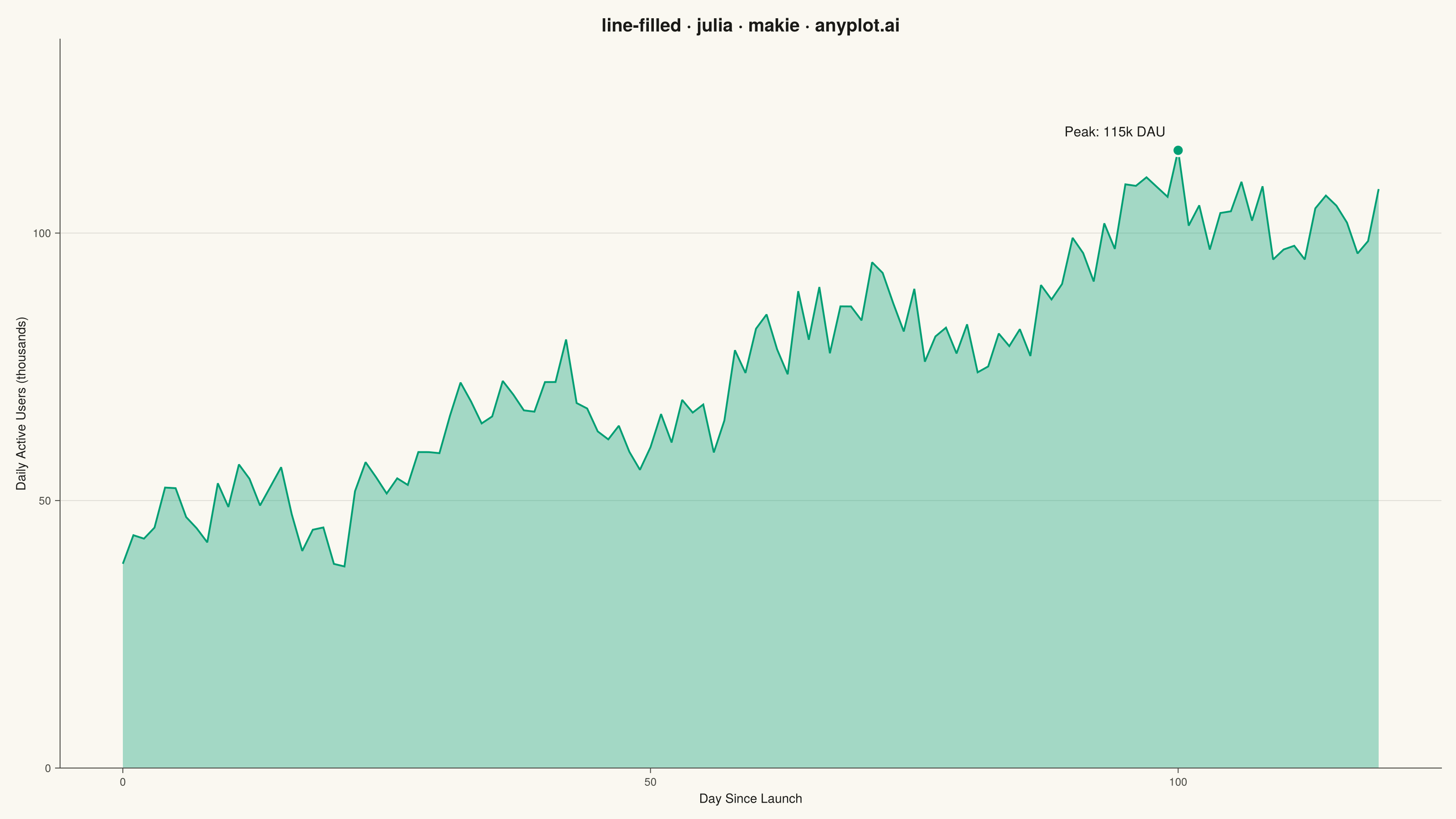
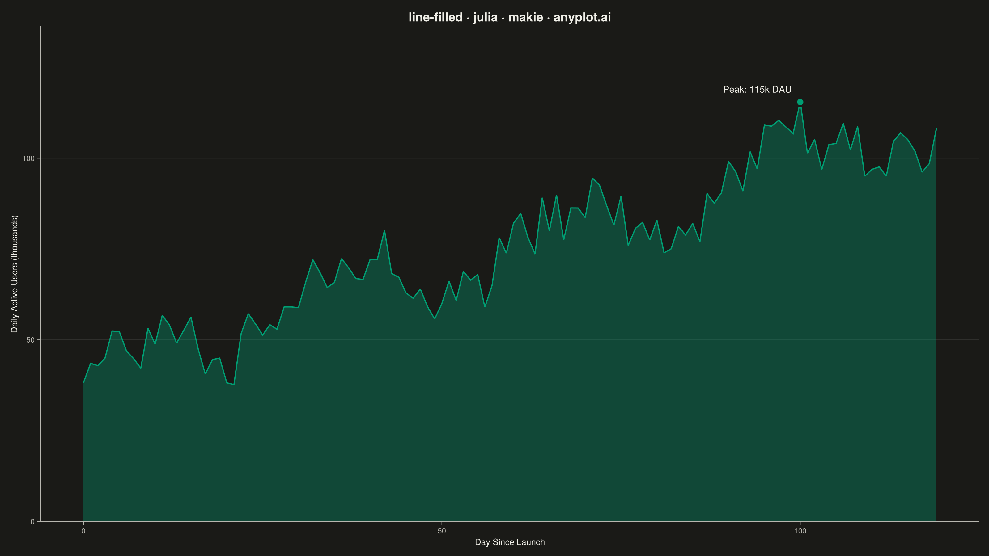
The same plot in 14 other libraries — Python: Altair, Bokeh, lets-plot, Matplotlib, Plotly, plotnine, Pygal, Seaborn; R: ggplot2; JavaScript: Chart.js, D3.js, Apache ECharts, Highcharts, MUI X Charts. Compare all 15 side by side: Filled Line Plot in Python, R, Julia and JavaScript.
A line plot with the area between the line and the baseline (typically x-axis) filled with a semi-transparent color. This creates an area chart effect for a single series, emphasizing the magnitude of values.
# anyplot.ai
# line-filled: Filled Line Plot
# Library: makie 0.21.9 | Julia 1.11.9
# Quality: 89/100 | Created: 2026-09-05

using CairoMakie
using Colors
using Random

Random.seed!(42)

# --- Theme tokens -----------------------------------------------------------
const THEME    = get(ENV, "ANYPLOT_THEME", "light")
const PAGE_BG  = THEME == "light" ? colorant"#FAF8F1" : colorant"#1A1A17"
const INK      = THEME == "light" ? colorant"#1A1A17" : colorant"#F0EFE8"
const INK_SOFT = THEME == "light" ? colorant"#4A4A44" : colorant"#B8B7B0"
const IMPRINT_PALETTE = [
    colorant"#009E73", colorant"#C475FD", colorant"#4467A3", colorant"#BD8233",
    colorant"#AE3030", colorant"#2ABCCD", colorant"#954477", colorant"#99B314",
]
const BRAND = IMPRINT_PALETTE[1]

# --- Data ---------------------------------------------------------------
days = 0:119
trend = 40.0 .+ 0.6 .* days
seasonal = 8.0 .* sin.(2π .* days ./ 30)
noise = 5.0 .* randn(length(days))
daily_active_users = max.(trend .+ seasonal .+ noise, 2.0)

# --- Plot -----------------------------------------------------------------
fig = Figure(
    resolution      = (1600, 900),
    fontsize        = 14,
    backgroundcolor = PAGE_BG,
)

ax = Axis(
    fig[1, 1];
    title              = "line-filled · julia · makie · anyplot.ai",
    titlesize          = 20,
    titlecolor         = INK,
    xlabel             = "Day Since Launch",
    ylabel             = "Daily Active Users (thousands)",
    xlabelsize         = 14,
    ylabelsize         = 14,
    xlabelcolor        = INK,
    ylabelcolor        = INK,
    xticklabelsize     = 12,
    yticklabelsize     = 12,
    xticklabelcolor    = INK_SOFT,
    yticklabelcolor    = INK_SOFT,
    xtickcolor         = INK_SOFT,
    ytickcolor         = INK_SOFT,
    backgroundcolor    = PAGE_BG,
    topspinevisible    = false,
    rightspinevisible  = false,
    leftspinecolor     = INK_SOFT,
    bottomspinecolor   = INK_SOFT,
    xgridvisible       = false,
    ygridcolor         = RGBAf(INK.r, INK.g, INK.b, 0.12),
    yminorgridvisible  = false,
)

y_top = maximum(daily_active_users) * 1.18

band!(ax, days, zeros(length(days)), daily_active_users; color = (BRAND, 0.35))
lines!(ax, days, daily_active_users; color = BRAND, linewidth = 2.0)
ylims!(ax, 0, y_top)

# Callout marking the peak day, giving the chart a storytelling focal point.
# Drawn last so it sits on top of the fill and line (Makie/Cairo painter's
# order = plot-call order).
peak_idx = argmax(daily_active_users)
peak_day = days[peak_idx]
peak_value = daily_active_users[peak_idx]
scatter!(ax, [peak_day], [peak_value]; color = BRAND, markersize = 18,
    strokewidth = 2.5, strokecolor = PAGE_BG)
text!(ax, peak_day, peak_value;
    text = "Peak: $(round(Int, peak_value))k DAU",
    align = (:right, :bottom), offset = (-14, 12),
    color = INK, fontsize = 15)

# --- Save -------------------------------------------------------------------
save("plot-$(THEME).png", fig; px_per_unit = 2)
Runnable source as JSON, for any HTTP client: https://api.anyplot.ai/specs/line-filled/makie/code. Any spec id and library id listed in llms-full.txt fit the same URL shape; every URL below is complete and callable.
{
  "spec_id": "line-filled",
  "language": "julia",
  "library": "makie",
  "page": "https://anyplot.ai/line-filled/julia/makie",
  "hub": "https://anyplot.ai/line-filled",
  "code_json": "https://api.anyplot.ai/specs/line-filled/makie/code",
  "spec_json": "https://api.anyplot.ai/specs/line-filled",
  "render_light_png": "https://storage.googleapis.com/anyplot-images/plots/line-filled/julia/makie/plot-light.png",
  "render_dark_png": "https://storage.googleapis.com/anyplot-images/plots/line-filled/julia/makie/plot-dark.png",
  "quality_score": 89.0,
  "license": "MIT",
  "guide": "https://anyplot.ai/llms.txt"
}
Part of Filled Line Plot on anyplot.ai.