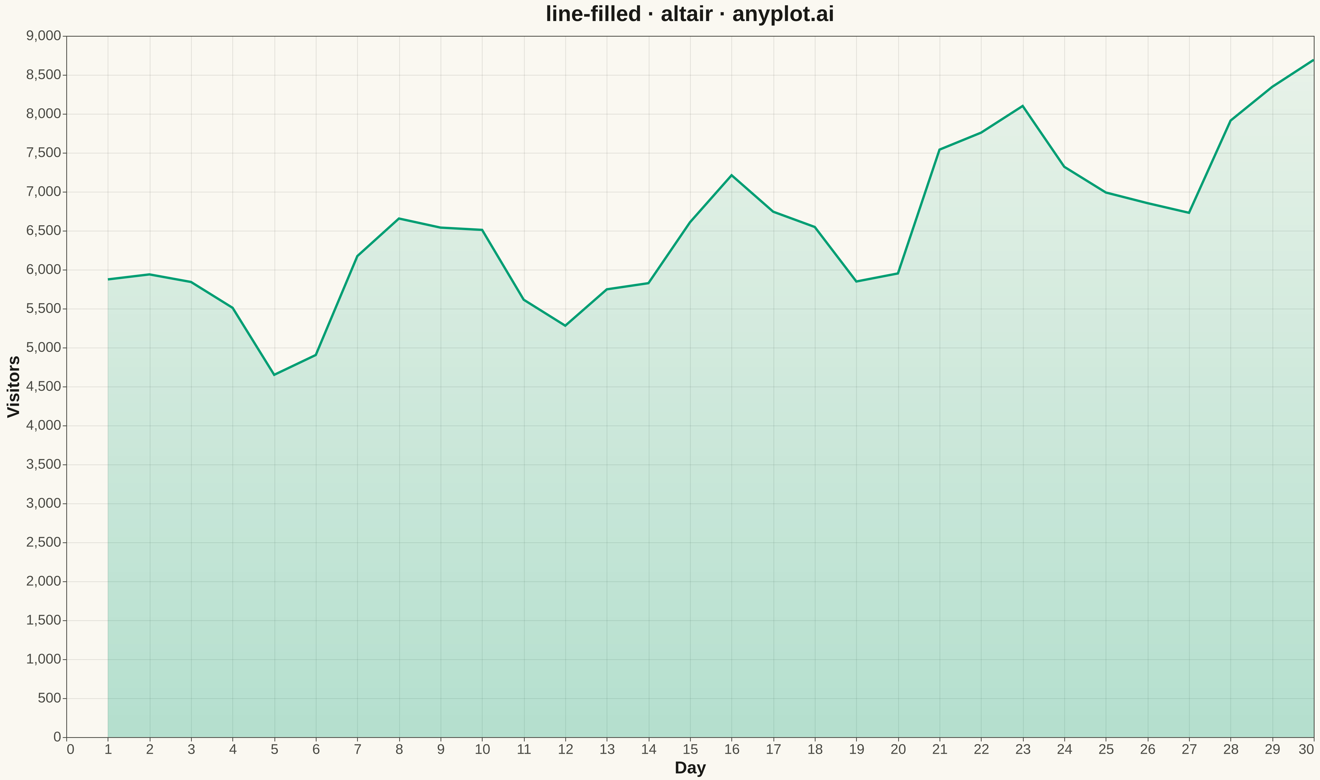
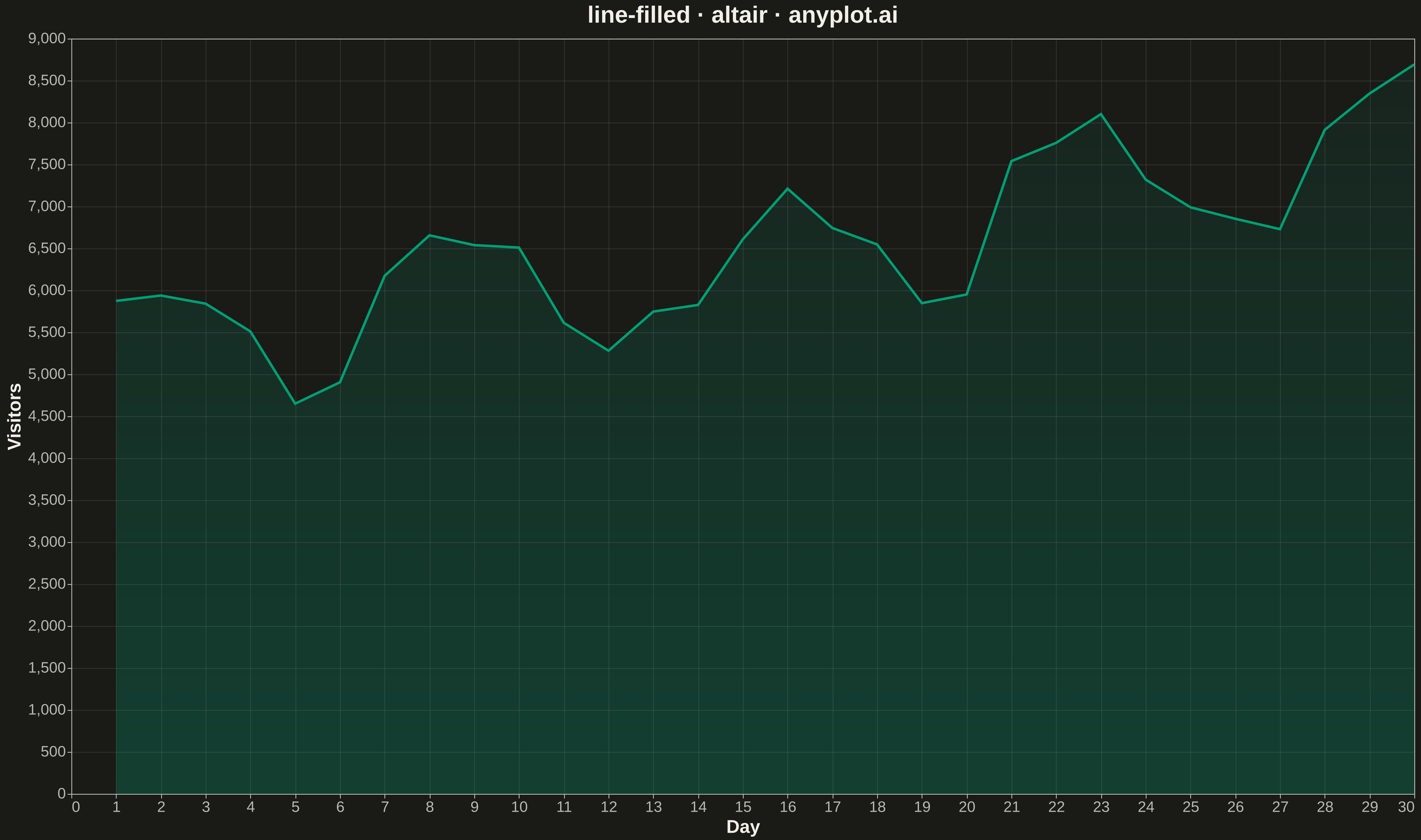
A line plot with the area between the line and the baseline (typically x-axis) filled with a semi-transparent color. This creates an area chart effect for a single series, emphasizing the magnitude of values.
""" anyplot.ai
line-filled: Filled Line Plot
Library: altair 6.1.0 | Python 3.13.13
Quality: 72/100 | Updated: 2026-05-12
"""

import altair as alt
import numpy as np
import pandas as pd


# Data - Website traffic over a month
np.random.seed(42)
days = np.arange(1, 31)
# Simulate daily visitors with weekly patterns and growth trend
base = 5000 + days * 100  # Growth trend
weekly_pattern = 800 * np.sin(2 * np.pi * days / 7)  # Weekly cycle
noise = np.random.normal(0, 300, len(days))
visitors = base + weekly_pattern + noise
visitors = np.maximum(visitors, 1000)  # Ensure positive values

df = pd.DataFrame({"Day": days, "Visitors": visitors})

# Create filled line chart (area chart)
chart = (
    alt.Chart(df)
    .mark_area(
        line={"color": "#306998", "strokeWidth": 3},
        color=alt.Gradient(
            gradient="linear",
            stops=[
                alt.GradientStop(color="rgba(48, 105, 152, 0.4)", offset=0),
                alt.GradientStop(color="rgba(48, 105, 152, 0.1)", offset=1),
            ],
            x1=1,
            x2=1,
            y1=1,
            y2=0,
        ),
    )
    .encode(
        x=alt.X("Day:Q", title="Day of Month", axis=alt.Axis(labelFontSize=18, titleFontSize=22)),
        y=alt.Y("Visitors:Q", title="Daily Visitors", axis=alt.Axis(labelFontSize=18, titleFontSize=22)),
        tooltip=["Day:Q", "Visitors:Q"],
    )
    .properties(
        width=1600, height=900, title=alt.Title("line-filled · altair · pyplots.ai", fontSize=28, anchor="middle")
    )
    .configure_axis(grid=True, gridOpacity=0.3, gridDash=[3, 3])
    .configure_view(strokeWidth=0)
)

# Save as PNG and HTML
chart.save("plot.png", scale_factor=3.0)
chart.save("plot.html")
Runnable source as JSON, for any HTTP client: https://api.anyplot.ai/specs/line-filled/altair/code. Any spec id and library id listed in llms-full.txt fit the same URL shape; every URL below is complete and callable.
{
  "spec_id": "line-filled",
  "language": "python",
  "library": "altair",
  "page": "https://anyplot.ai/line-filled/python/altair",
  "hub": "https://anyplot.ai/line-filled",
  "code_json": "https://api.anyplot.ai/specs/line-filled/altair/code",
  "spec_json": "https://api.anyplot.ai/specs/line-filled",
  "render_light_png": "https://storage.googleapis.com/anyplot-images/plots/line-filled/python/altair/plot-light.png",
  "render_dark_png": "https://storage.googleapis.com/anyplot-images/plots/line-filled/python/altair/plot-dark.png",
  "interactive_light_html": "https://storage.googleapis.com/anyplot-images/plots/line-filled/python/altair/plot-light.html",
  "interactive_dark_html": "https://storage.googleapis.com/anyplot-images/plots/line-filled/python/altair/plot-dark.html",
  "quality_score": 72.0,
  "license": "MIT",
  "guide": "https://anyplot.ai/llms.txt"
}
Part of Filled Line Plot on anyplot.ai.