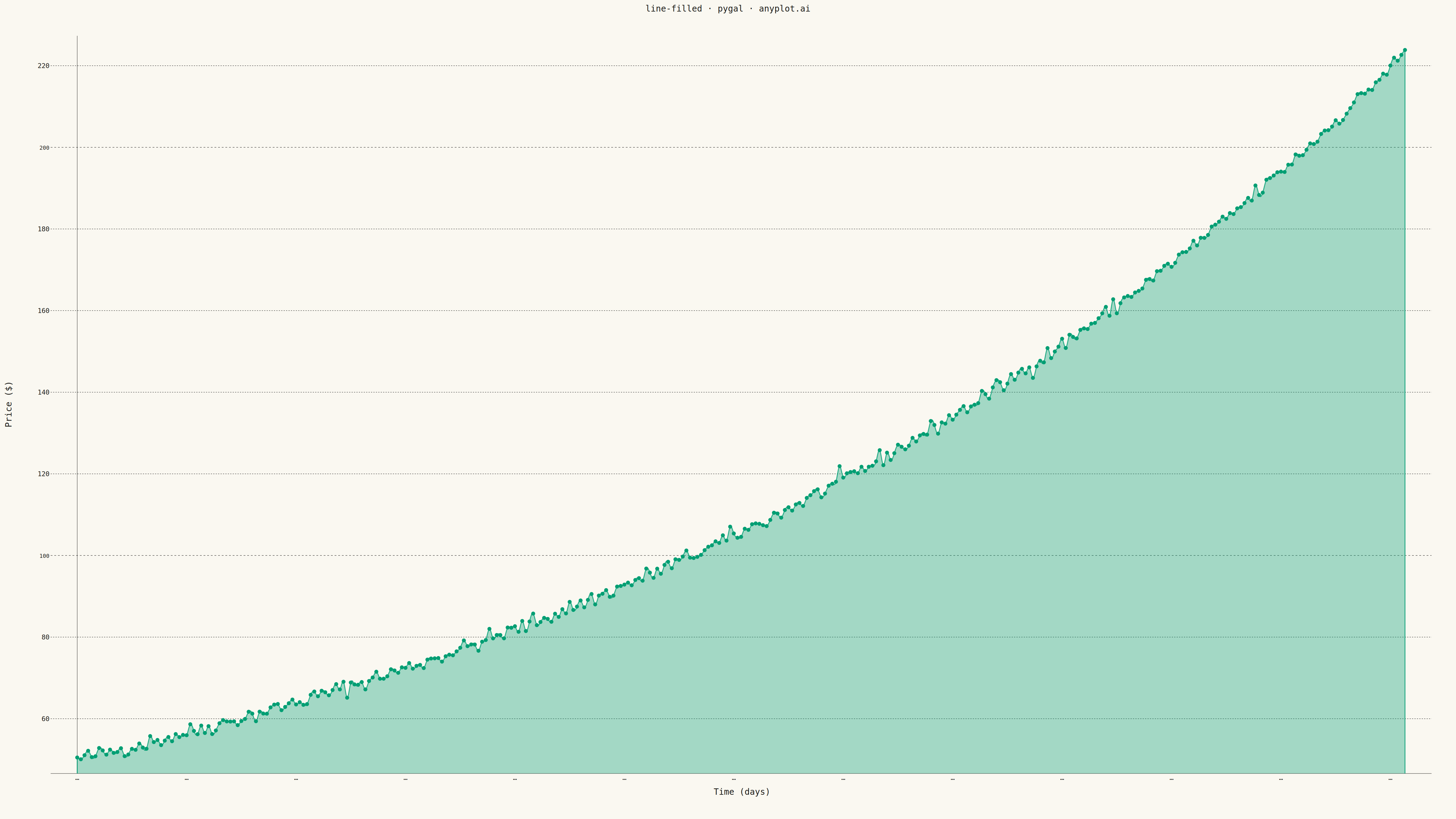
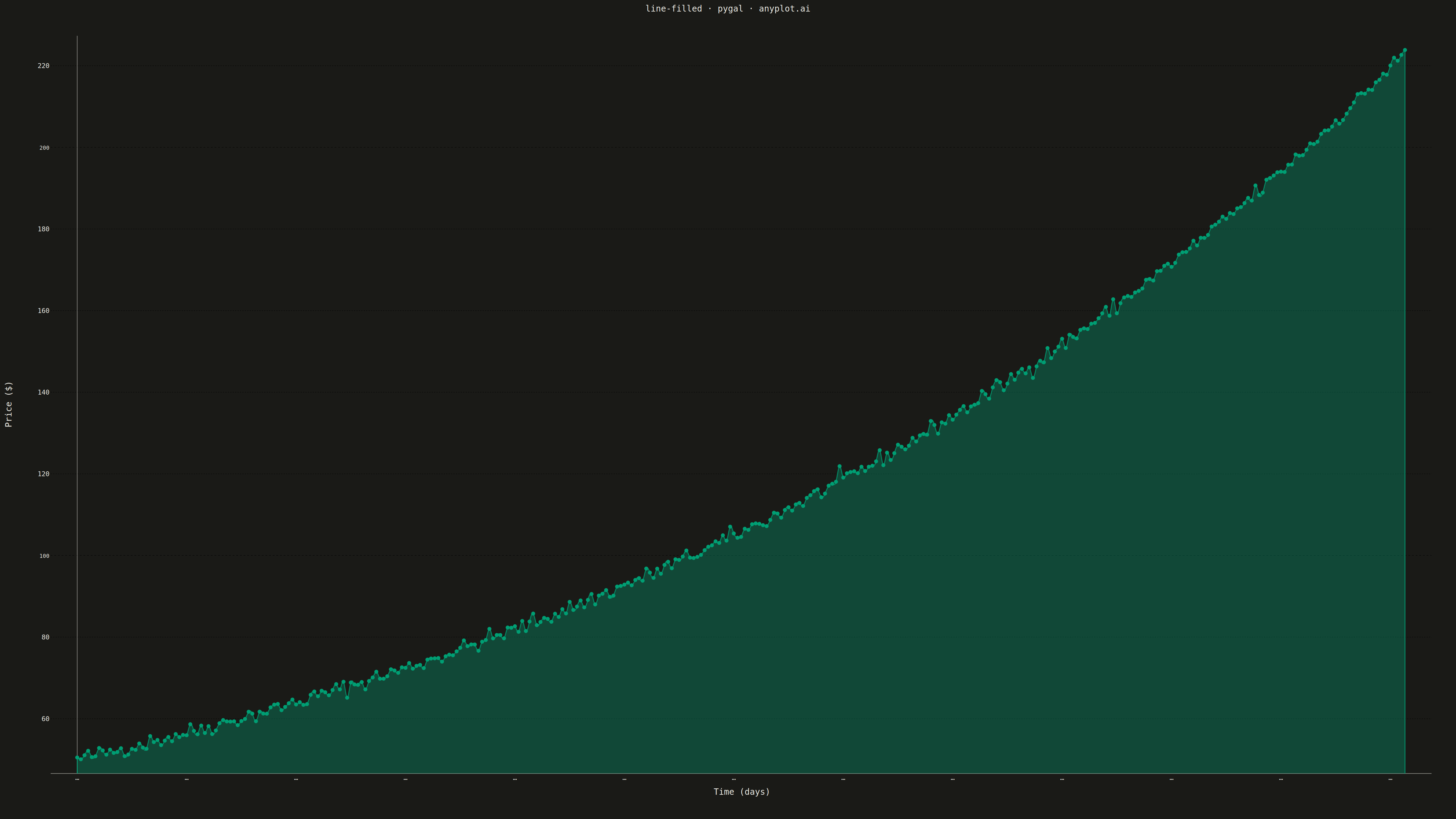
A line plot with the area between the line and the baseline (typically x-axis) filled with a semi-transparent color. This creates an area chart effect for a single series, emphasizing the magnitude of values.
""" anyplot.ai
line-filled: Filled Line Plot
Library: pygal 3.1.0 | Python 3.13.13
Quality: 70/100 | Updated: 2026-05-12
"""

import numpy as np
import pygal
from pygal.style import Style


# Data - Monthly website traffic over a year
np.random.seed(42)
months = ["Jan", "Feb", "Mar", "Apr", "May", "Jun", "Jul", "Aug", "Sep", "Oct", "Nov", "Dec"]
# Simulating website traffic with seasonal trend and some noise
base_traffic = 50000
seasonal = np.array([0.8, 0.85, 0.95, 1.0, 1.1, 1.15, 1.2, 1.1, 1.05, 0.95, 0.9, 1.3])  # Holiday spike in Dec
noise = np.random.normal(0, 2000, 12)
traffic = (base_traffic * seasonal + noise).astype(int)

# Custom style for large canvas
custom_style = Style(
    background="white",
    plot_background="white",
    foreground="#333333",
    foreground_strong="#333333",
    foreground_subtle="#666666",
    colors=("#306998",),  # Python Blue for the line/fill
    title_font_size=72,
    label_font_size=48,
    major_label_font_size=42,
    legend_font_size=42,
    value_font_size=36,
    stroke_width=5,
    opacity=0.4,  # Fill opacity
    opacity_hover=0.6,
)

# Create filled line chart
chart = pygal.Line(
    width=4800,
    height=2700,
    style=custom_style,
    title="line-filled · pygal · pyplots.ai",
    x_title="Month",
    y_title="Page Views",
    fill=True,  # Enable fill under the line
    show_legend=True,
    show_y_guides=True,
    show_x_guides=False,
    dots_size=8,
    stroke_style={"width": 5},
    legend_at_bottom=False,
    truncate_legend=-1,
    margin=50,
    x_label_rotation=0,
)

# Add data
chart.x_labels = months
chart.add("Website Traffic", traffic.tolist())

# Save as PNG and HTML
chart.render_to_png("plot.png")
chart.render_to_file("plot.html")
Runnable source as JSON, for any HTTP client: https://api.anyplot.ai/specs/line-filled/pygal/code. Any spec id and library id listed in llms-full.txt fit the same URL shape; every URL below is complete and callable.
{
  "spec_id": "line-filled",
  "language": "python",
  "library": "pygal",
  "page": "https://anyplot.ai/line-filled/python/pygal",
  "hub": "https://anyplot.ai/line-filled",
  "code_json": "https://api.anyplot.ai/specs/line-filled/pygal/code",
  "spec_json": "https://api.anyplot.ai/specs/line-filled",
  "render_light_png": "https://storage.googleapis.com/anyplot-images/plots/line-filled/python/pygal/plot-light.png",
  "render_dark_png": "https://storage.googleapis.com/anyplot-images/plots/line-filled/python/pygal/plot-dark.png",
  "interactive_light_html": "https://storage.googleapis.com/anyplot-images/plots/line-filled/python/pygal/plot-light.html",
  "interactive_dark_html": "https://storage.googleapis.com/anyplot-images/plots/line-filled/python/pygal/plot-dark.html",
  "quality_score": 70.0,
  "license": "MIT",
  "guide": "https://anyplot.ai/llms.txt"
}
Part of Filled Line Plot on anyplot.ai.