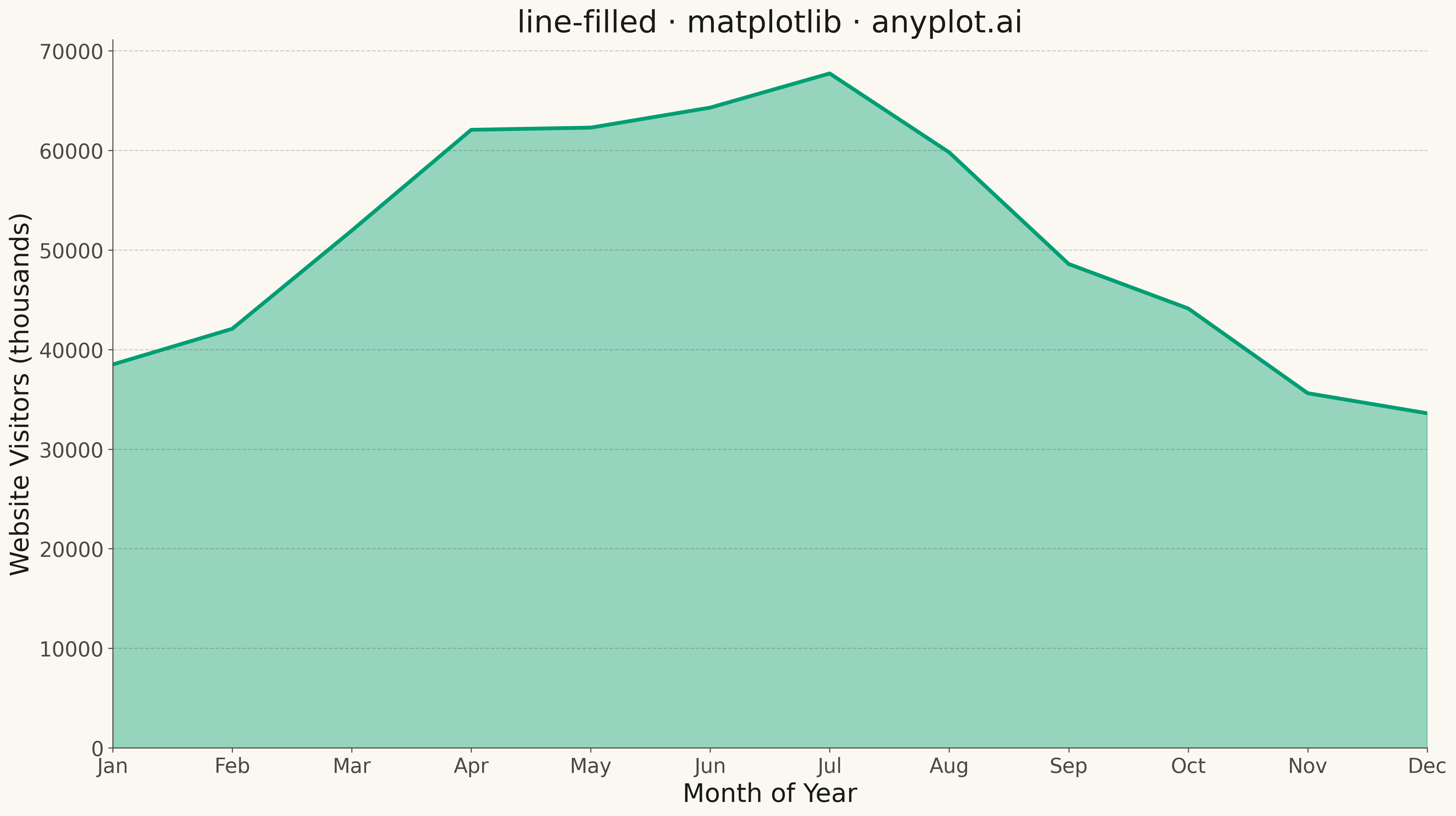
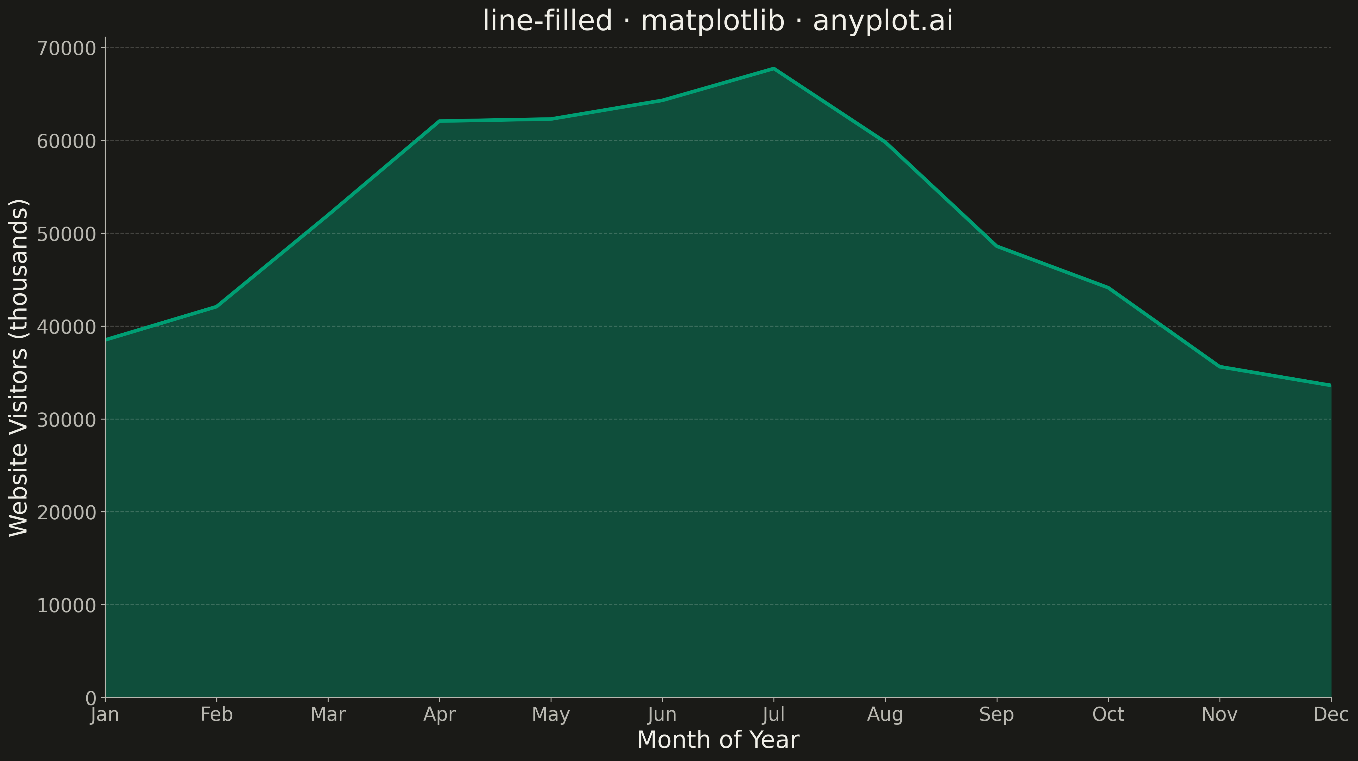
A line plot with the area between the line and the baseline (typically x-axis) filled with a semi-transparent color. This creates an area chart effect for a single series, emphasizing the magnitude of values.
""" anyplot.ai
line-filled: Filled Line Plot
Library: matplotlib 3.10.9 | Python 3.13.13
Quality: 78/100 | Updated: 2026-05-12
"""

import matplotlib.pyplot as plt
import numpy as np


# Data: Monthly website traffic over a year
np.random.seed(42)
months = np.arange(1, 13)
# Simulate website traffic with seasonal trend (higher in summer)
base_traffic = 50000
seasonal = 15000 * np.sin((months - 3) * np.pi / 6)  # Peak in summer
noise = np.random.normal(0, 3000, 12)
traffic = base_traffic + seasonal + noise
traffic = np.maximum(traffic, 0)  # Ensure non-negative

# Plot
fig, ax = plt.subplots(figsize=(16, 9))

# Fill the area under the line
ax.fill_between(months, traffic, alpha=0.4, color="#306998")

# Draw the line on top
ax.plot(months, traffic, linewidth=3, color="#306998")

# Styling
ax.set_xlabel("Month", fontsize=20)
ax.set_ylabel("Website Visitors", fontsize=20)
ax.set_title("line-filled · matplotlib · pyplots.ai", fontsize=24)
ax.tick_params(axis="both", labelsize=16)
ax.set_xticks(months)
ax.set_xticklabels(["Jan", "Feb", "Mar", "Apr", "May", "Jun", "Jul", "Aug", "Sep", "Oct", "Nov", "Dec"])
ax.set_xlim(1, 12)
ax.set_ylim(0, None)  # Start y-axis at 0 for proper fill effect
ax.grid(True, alpha=0.3, linestyle="--")

plt.tight_layout()
plt.savefig("plot.png", dpi=300, bbox_inches="tight")
Runnable source as JSON, for any HTTP client: https://api.anyplot.ai/specs/line-filled/matplotlib/code. Any spec id and library id listed in llms-full.txt fit the same URL shape; every URL below is complete and callable.
{
  "spec_id": "line-filled",
  "language": "python",
  "library": "matplotlib",
  "page": "https://anyplot.ai/line-filled/python/matplotlib",
  "hub": "https://anyplot.ai/line-filled",
  "code_json": "https://api.anyplot.ai/specs/line-filled/matplotlib/code",
  "spec_json": "https://api.anyplot.ai/specs/line-filled",
  "render_light_png": "https://storage.googleapis.com/anyplot-images/plots/line-filled/python/matplotlib/plot-light.png",
  "render_dark_png": "https://storage.googleapis.com/anyplot-images/plots/line-filled/python/matplotlib/plot-dark.png",
  "quality_score": 78.0,
  "license": "MIT",
  "guide": "https://anyplot.ai/llms.txt"
}
Part of Filled Line Plot on anyplot.ai.