The same plot in 14 other libraries — Python: Altair, Bokeh, lets-plot, Plotly, plotnine, Pygal, Seaborn; R: ggplot2; Julia: Makie.jl; JavaScript: Chart.js, D3.js, Apache ECharts, Highcharts, MUI X Charts. Compare all 15 side by side: Spiral Time Series Chart in Python, R, Julia and JavaScript.
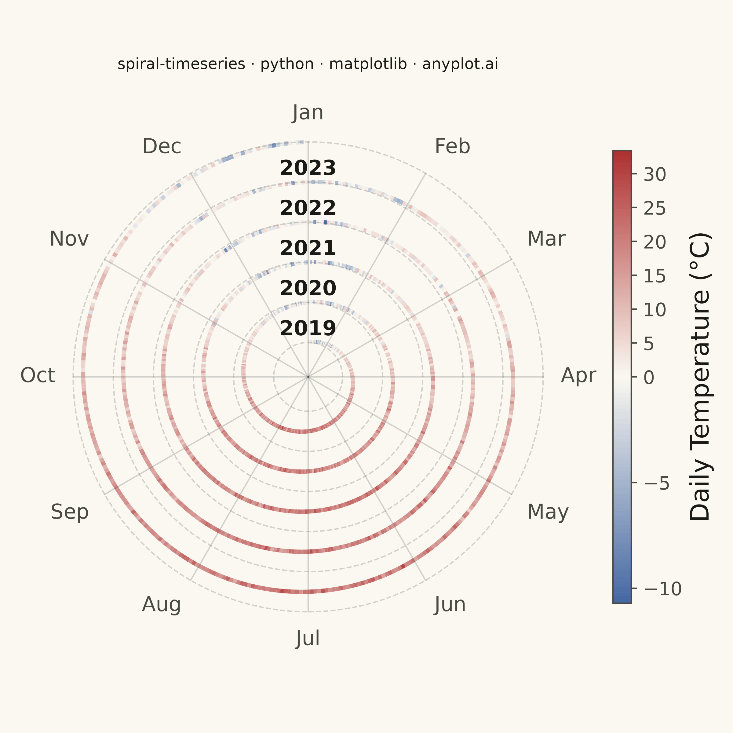
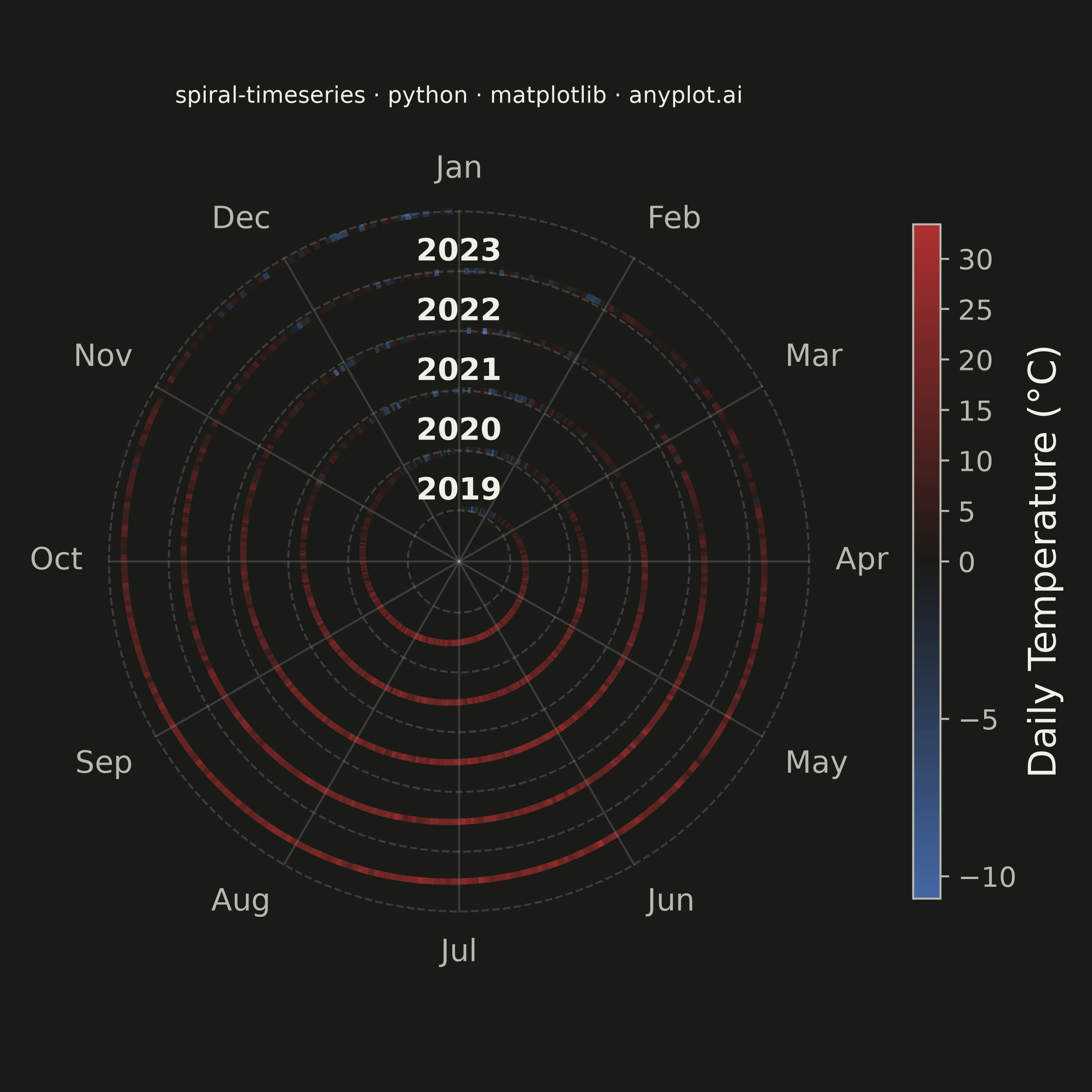
A time series plotted along a spiral (Archimedean or logarithmic), where each full revolution represents one cycle period (e.g., one year). By wrapping temporal data around a spiral, corresponding periods from different cycles align vertically, making recurring seasonal or periodic patterns immediately visible. This layout provides a compact alternative to long horizontal time series for cyclic data, revealing periodicity and trend simultaneously.
""" anyplot.ai
spiral-timeseries: Spiral Time Series Chart
Library: matplotlib 3.11.1 | Python 3.13.15
Quality: 90/100 | Updated: 2026-08-17
"""

import os

import matplotlib.pyplot as plt
import numpy as np
from matplotlib.collections import LineCollection
from matplotlib.colors import LinearSegmentedColormap, TwoSlopeNorm


# Theme tokens
THEME = os.getenv("ANYPLOT_THEME", "light")
PAGE_BG = "#FAF8F1" if THEME == "light" else "#1A1A17"
INK = "#1A1A17" if THEME == "light" else "#F0EFE8"
INK_SOFT = "#4A4A44" if THEME == "light" else "#B8B7B0"

# Data: Daily average temperatures over 5 years (Berlin-like climate)
np.random.seed(42)
n_years = 5
start_year = 2019
days_per_year = 365
total_days = n_years * days_per_year

day_idx = np.arange(total_days)
day_of_year = day_idx % days_per_year

seasonal = -11.0 * np.cos(2 * np.pi * day_of_year / days_per_year)
warming_trend = 0.6 * day_idx / total_days
noise = np.random.normal(0, 3.5, total_days)
temperatures = 10.0 + seasonal + warming_trend + noise

# Archimedean spiral: r = r0 + spacing * (cumulative_angle / 2π)
r0 = 1.2
rev_spacing = 1.4
total_angle = day_idx * (2 * np.pi / days_per_year)
r = r0 + rev_spacing * total_angle / (2 * np.pi)

# Clockwise rotation, January starts at 12 o'clock
theta = -total_angle + np.pi / 2
x = r * np.cos(theta)
y = r * np.sin(theta)

r_max = r0 + rev_spacing * n_years

# Plot — square canvas suits the radially symmetric spiral (see default-style-guide.md)
fig, ax = plt.subplots(figsize=(6, 6), dpi=400, facecolor=PAGE_BG)
ax.set_facecolor(PAGE_BG)
ax.set_aspect("equal")

# Spiral colored by temperature with the Imprint diverging colormap.
# Temperature has a physically meaningful midpoint (freezing, 0°C) and a strong
# domain color convention (cold→blue, hot→red), so imprint_div is oriented
# blue→neutral→red rather than the library's default red→neutral→blue order.
midpoint = PAGE_BG
imprint_div = LinearSegmentedColormap.from_list("imprint_div", ["#4467A3", midpoint, "#AE3030"])
norm = TwoSlopeNorm(vcenter=0.0, vmin=temperatures.min(), vmax=temperatures.max())

points = np.column_stack([x, y]).reshape(-1, 1, 2)
segments = np.concatenate([points[:-1], points[1:]], axis=1)
lc = LineCollection(segments, cmap=imprint_div, norm=norm, linewidth=2.5, alpha=0.95)
lc.set_array(temperatures[:-1])
ax.add_collection(lc)

# Month radial grid lines and outer labels
month_names = ["Jan", "Feb", "Mar", "Apr", "May", "Jun", "Jul", "Aug", "Sep", "Oct", "Nov", "Dec"]
for m in range(12):
    m_angle = -2 * np.pi * m / 12 + np.pi / 2
    ax.plot([0, r_max * np.cos(m_angle)], [0, r_max * np.sin(m_angle)], color=INK_SOFT, alpha=0.22, linewidth=0.8)
    label_r = r_max + 0.62
    cos_a, sin_a = np.cos(m_angle), np.sin(m_angle)
    ha = "left" if cos_a > 0.1 else ("right" if cos_a < -0.1 else "center")
    va = "bottom" if sin_a > 0.1 else ("top" if sin_a < -0.1 else "center")
    ax.text(label_r * cos_a, label_r * sin_a, month_names[m], ha=ha, va=va, fontsize=12, color=INK_SOFT)

# Concentric year-boundary rings and year labels, placed precisely at the Jan
# start of each revolution (12 o'clock, straight above the ring)
for yi in range(n_years + 1):
    ring_r = r0 + rev_spacing * yi
    ring_theta = np.linspace(0, 2 * np.pi, 500)
    ax.plot(
        ring_r * np.cos(ring_theta),
        ring_r * np.sin(ring_theta),
        color=INK_SOFT,
        alpha=0.22,
        linewidth=0.8,
        linestyle="--",
    )
    if yi < n_years:
        ax.text(
            0, ring_r + 0.08, str(start_year + yi), ha="center", va="bottom", fontsize=12, fontweight="bold", color=INK
        )

# Colorbar
sm = plt.cm.ScalarMappable(cmap=imprint_div, norm=norm)
sm.set_array([])
cbar = fig.colorbar(sm, ax=ax, fraction=0.030, pad=0.04, aspect=25)
cbar.set_label("Daily Temperature (°C)", fontsize=15, color=INK)
cbar.ax.tick_params(labelsize=11, colors=INK_SOFT, labelcolor=INK_SOFT)
cbar.outline.set_edgecolor(INK_SOFT)
plt.setp(cbar.ax.yaxis.get_ticklabels(), color=INK_SOFT)

# Axis bounds, title, and cleanup
margin = r_max + 1.6
ax.set_xlim(-margin, margin)
ax.set_ylim(-margin, margin)
ax.axis("off")

# Title fontsize scales with title length off the 67-char baseline (see
# prompts/plot-generator.md). The square canvas is narrower (2400px) than the
# landscape baseline (3200px) the 12pt default targets, so the effective
# baseline shrinks by the same 2400/3200 width ratio.
title = "spiral-timeseries · python · matplotlib · anyplot.ai"
square_baseline = round(12 * 2400 / 3200)
title_fontsize = max(8, round(square_baseline * 67 / len(title))) if len(title) > 67 else square_baseline
ax.set_title(title, fontsize=title_fontsize, fontweight="medium", color=INK, pad=16)

plt.tight_layout()
plt.savefig(f"plot-{THEME}.png", dpi=400, facecolor=PAGE_BG)
Runnable source as JSON, for any HTTP client: https://api.anyplot.ai/specs/spiral-timeseries/matplotlib/code. Any spec id and library id listed in llms-full.txt fit the same URL shape; every URL below is complete and callable.
{
  "spec_id": "spiral-timeseries",
  "language": "python",
  "library": "matplotlib",
  "page": "https://anyplot.ai/spiral-timeseries/python/matplotlib",
  "hub": "https://anyplot.ai/spiral-timeseries",
  "code_json": "https://api.anyplot.ai/specs/spiral-timeseries/matplotlib/code",
  "spec_json": "https://api.anyplot.ai/specs/spiral-timeseries",
  "render_light_png": "https://storage.googleapis.com/anyplot-images/plots/spiral-timeseries/python/matplotlib/plot-light.png",
  "render_dark_png": "https://storage.googleapis.com/anyplot-images/plots/spiral-timeseries/python/matplotlib/plot-dark.png",
  "quality_score": 90.0,
  "license": "MIT",
  "guide": "https://anyplot.ai/llms.txt"
}
Part of Spiral Time Series Chart on anyplot.ai.