The same plot in 14 other libraries — Python: Altair, lets-plot, Matplotlib, Plotly, plotnine, Pygal, Seaborn; R: ggplot2; Julia: Makie.jl; JavaScript: Chart.js, D3.js, Apache ECharts, Highcharts, MUI X Charts. Compare all 15 side by side: Spiral Time Series Chart in Python, R, Julia and JavaScript.
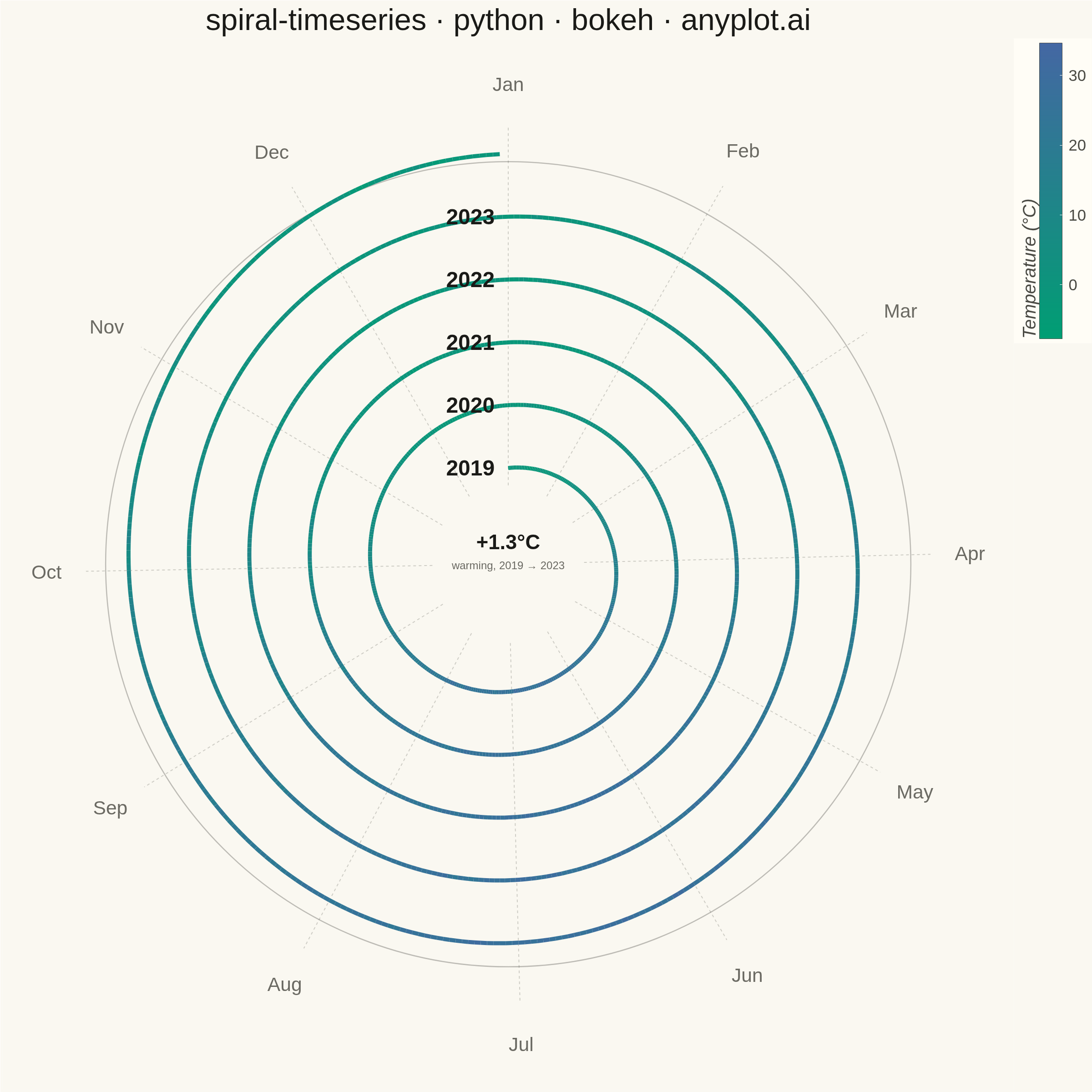
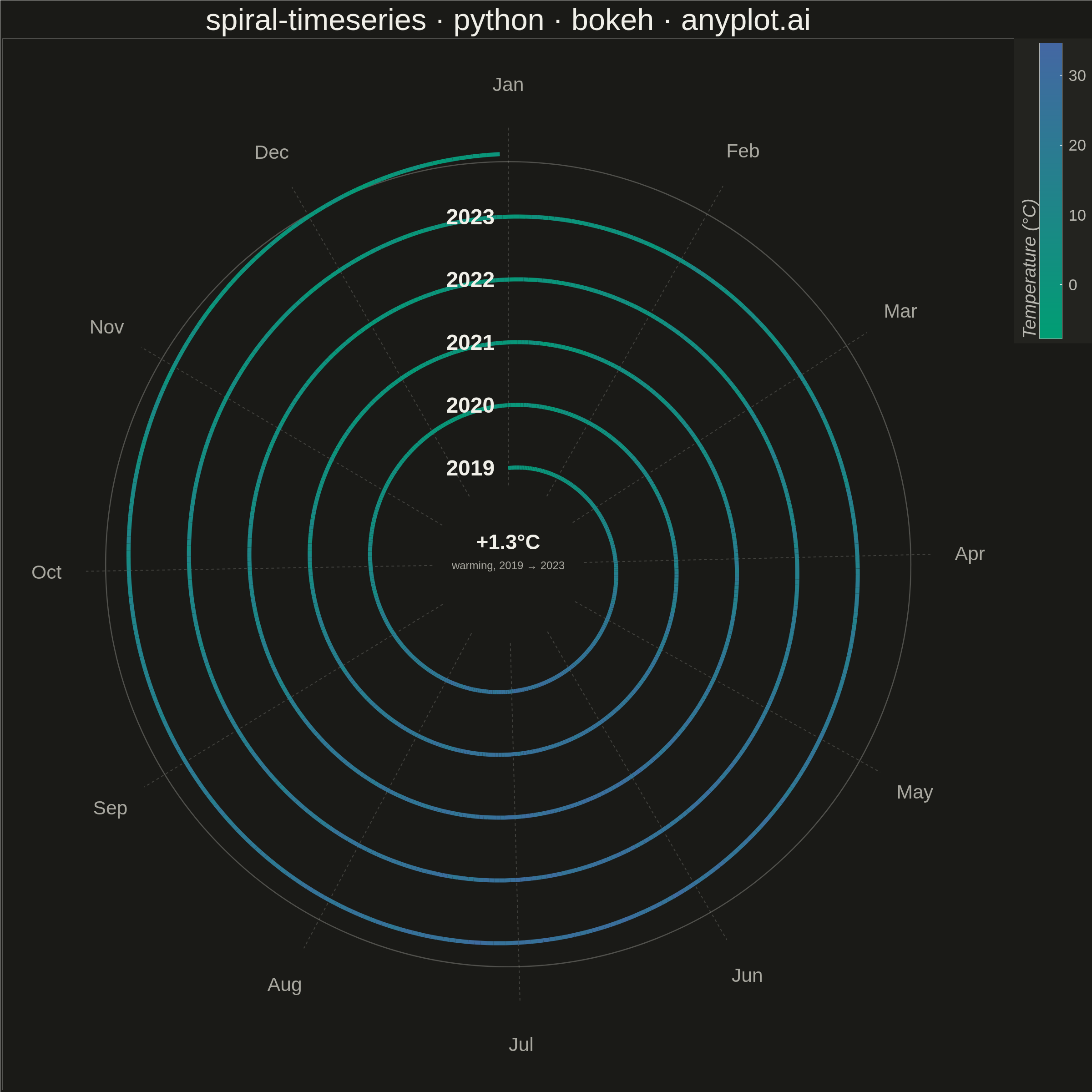
A time series plotted along a spiral (Archimedean or logarithmic), where each full revolution represents one cycle period (e.g., one year). By wrapping temporal data around a spiral, corresponding periods from different cycles align vertically, making recurring seasonal or periodic patterns immediately visible. This layout provides a compact alternative to long horizontal time series for cyclic data, revealing periodicity and trend simultaneously.
""" anyplot.ai
spiral-timeseries: Spiral Time Series Chart
Library: bokeh 3.9.2 | Python 3.13.15
Quality: 96/100 | Updated: 2026-08-18
"""

import os
import sys
import time
from pathlib import Path


# Remove current directory from sys.path to avoid shadowing bokeh module
_impl_dir = str(Path(__file__).parent.resolve())
for _p in ("", ".", _impl_dir):
    while _p in sys.path:
        sys.path.remove(_p)

import numpy as np
import pandas as pd
from bokeh.io import output_file, save
from bokeh.models import ColorBar, ColumnDataSource, CustomJS, HoverTool, Label, LinearColorMapper
from bokeh.plotting import figure
from selenium import webdriver
from selenium.webdriver.chrome.options import Options


# Theme
THEME = os.getenv("ANYPLOT_THEME", "light")
PAGE_BG = "#FAF8F1" if THEME == "light" else "#1A1A17"
ELEVATED_BG = "#FFFDF6" if THEME == "light" else "#242420"
INK = "#1A1A17" if THEME == "light" else "#F0EFE8"
INK_SOFT = "#4A4A44" if THEME == "light" else "#B8B7B0"
INK_MUTED = "#6B6A63" if THEME == "light" else "#A8A79F"


# Imprint sequential colormap (brand green -> blue) for continuous, single-polarity
# (magnitude) data — temperature here is an intensity value, not a signed deviation,
# so imprint_seq is the correct choice over imprint_div.
def _lerp_hex(c0, c1, t):
    r0, g0, b0 = (int(c0[i : i + 2], 16) for i in (1, 3, 5))
    r1, g1, b1 = (int(c1[i : i + 2], 16) for i in (1, 3, 5))
    r, g, b = (int(round(a + (b - a) * t)) for a, b in ((r0, r1), (g0, g1), (b0, b1)))
    return f"#{r:02X}{g:02X}{b:02X}"


IMPRINT_SEQ256 = [_lerp_hex("#009E73", "#4467A3", t / 255.0) for t in range(256)]

# Data — daily average temperatures (synthetic) for a temperate city, 2019–2023
np.random.seed(42)
dates = pd.date_range("2019-01-01", "2023-12-31", freq="D")
n = len(dates)
day_of_year = dates.day_of_year.values.astype(float)
year_offset = (dates.year.values - 2019).astype(float)

# Seasonal sinusoidal pattern with slight warming trend and noise
temperature = (
    12.0 + 14.0 * np.sin(2 * np.pi * (day_of_year - 80) / 365) + 0.3 * year_offset + np.random.normal(0, 2.5, n)
)

# Per-year mean temperature — surfaces the multi-year warming trend as a number
# alongside each year label, rather than leaving it to be inferred from color alone.
year_avg_temp = [float(temperature[dates.year == yr].mean()) for yr in range(2019, 2024)]
warming_delta = year_avg_temp[-1] - year_avg_temp[0]

# Archimedean spiral: r grows linearly with θ; one year ≈ one full revolution
days_elapsed = (dates - dates[0]).days.values.astype(float)
num_rev = 5.0
theta = 2 * np.pi * days_elapsed / 365.25  # continuous accumulated angle

inner_r = 150.0
outer_r = 640.0
r = inner_r + (outer_r - inner_r) * theta / (num_rev * 2 * np.pi)

# Cartesian coordinates — start at 12 o'clock (top), advance clockwise
phi0 = np.pi / 2
x = r * np.cos(phi0 - theta)
y = r * np.sin(phi0 - theta)

# Segment endpoints + midpoint temperatures for color mapping
x0, y0, x1, y1 = x[:-1], y[:-1], x[1:], y[1:]
seg_temp = (temperature[:-1] + temperature[1:]) / 2
date_strs = dates[:-1].strftime("%Y-%m-%d").tolist()
source = ColumnDataSource({"x0": x0, "y0": y0, "x1": x1, "y1": y1, "temp": seg_temp, "date": date_strs})

# Color mapper (Imprint sequential ramp for continuous temperature values)
t_min, t_max = float(temperature.min()), float(temperature.max())
mapper = LinearColorMapper(palette=IMPRINT_SEQ256, low=t_min, high=t_max)

# Figure
p = figure(
    width=2400,
    height=2400,
    title="spiral-timeseries · python · bokeh · anyplot.ai",
    toolbar_location=None,
    x_range=(-820, 820),
    y_range=(-820, 820),
)

# Month radial dividers and labels (one per month, at fixed angular positions)
month_names = ["Jan", "Feb", "Mar", "Apr", "May", "Jun", "Jul", "Aug", "Sep", "Oct", "Nov", "Dec"]
# Days elapsed since Jan 1 for each month's start (0-indexed, non-leap)
month_day_offsets = [0, 31, 59, 90, 120, 151, 181, 212, 243, 273, 304, 334]

for doy_offset, mname in zip(month_day_offsets, month_names, strict=True):
    ang = phi0 - 2 * np.pi * doy_offset / 365.25
    r_inner_line = inner_r * 0.82
    r_outer_line = outer_r * 1.07
    p.line(
        [r_inner_line * np.cos(ang), r_outer_line * np.cos(ang)],
        [r_inner_line * np.sin(ang), r_outer_line * np.sin(ang)],
        line_color=INK_SOFT,
        line_alpha=0.25,
        line_width=2,
        line_dash="dashed",
    )
    label_r = outer_r * 1.17
    p.add_layout(
        Label(
            x=label_r * np.cos(ang),
            y=label_r * np.sin(ang),
            text=mname,
            text_align="center",
            text_baseline="middle",
            text_color=INK_MUTED,
            text_font_size="32pt",
        )
    )

# Outer boundary ring — annotates the final revolution's edge more prominently
p.circle(x=0, y=0, radius=outer_r * 1.02, fill_color=None, line_color=INK_SOFT, line_alpha=0.35, line_width=2.5)

# Year labels — right-anchored just left of the Jan 1 divider (x=0), vertically
# centered on each revolution's starting radius for a cleaner, less cramped read
# than the previous fixed x=65 offset.
for yi in range(5):
    yr_r = inner_r + (outer_r - inner_r) * yi / num_rev
    p.add_layout(
        Label(
            x=-22,
            y=yr_r,
            text=str(2019 + yi),
            text_align="right",
            text_baseline="middle",
            text_color=INK,
            text_font_size="36pt",
            text_font_style="bold",
        )
    )

# Trend callout — the spiral's empty center hole (r < inner_r) is otherwise
# unused, so it becomes a compact summary of the multi-year warming trend.
# This gives the reader an explicit number for the trend the color ramp only
# implies, without disturbing the month grid or year-label ring.
p.add_layout(
    Label(
        x=0,
        y=16,
        text=f"+{warming_delta:.1f}°C",
        text_align="center",
        text_baseline="bottom",
        text_color=INK,
        text_font_size="34pt",
        text_font_style="bold",
    )
)
p.add_layout(
    Label(
        x=0,
        y=8,
        text="warming, 2019 → 2023",
        text_align="center",
        text_baseline="top",
        text_color=INK_MUTED,
        text_font_size="18pt",
    )
)

# Spiral segments colored by temperature
seg_renderer = p.segment(
    x0="x0", y0="y0", x1="x1", y1="y1", line_color={"field": "temp", "transform": mapper}, line_width=9, source=source
)

# Hover halo — a CustomJS-driven bokeh-native touch: an initially empty glyph
# source that the HoverTool's JS callback repositions onto the hovered segment,
# ringing it in the page's ink color. More distinctive than a bare tooltip since
# it reinforces exactly which point on the spiral the tooltip refers to.
halo_source = ColumnDataSource({"x": [], "y": []})
p.scatter(
    x="x",
    y="y",
    source=halo_source,
    marker="circle",
    size=22,
    fill_color=None,
    line_color=INK,
    line_width=3,
    line_alpha=0.9,
)

hover = HoverTool(
    renderers=[seg_renderer],
    tooltips=[("Date", "@date"), ("Temperature", "@temp{0.1f} °C")],
    line_policy="interp",
    callback=CustomJS(
        args={"seg_source": source, "halo_source": halo_source},
        code="""
        const indices = cb_data.index.indices
        if (indices.length > 0) {
            const i = indices[0]
            halo_source.data = {x: [seg_source.data['x1'][i]], y: [seg_source.data['y1'][i]]}
        } else {
            halo_source.data = {x: [], y: []}
        }
        halo_source.change.emit()
        """,
    ),
)
p.add_tools(hover)

# Color bar — larger than the previous regen (40x600 on a 3600px canvas read as
# tiny); at 50x650 against the new 2400px canvas it reads as a clear, legible key.
color_bar = ColorBar(
    color_mapper=mapper,
    title="Temperature (°C)",
    title_text_font_size="30pt",
    title_text_color=INK_SOFT,
    major_label_text_font_size="26pt",
    major_label_text_color=INK_SOFT,
    background_fill_color=ELEVATED_BG,
    bar_line_color=INK_SOFT,
    width=50,
    height=650,
    label_standoff=14,
)
p.add_layout(color_bar, "right")

# Theme chrome
p.background_fill_color = PAGE_BG
p.border_fill_color = PAGE_BG
p.outline_line_color = None
p.title.text_color = INK
p.title.text_font_size = "50pt"
p.title.text_font_style = "normal"
p.title.align = "center"
p.xaxis.visible = False
p.yaxis.visible = False
p.xgrid.grid_line_color = None
p.ygrid.grid_line_color = None

# Save HTML
output_file(f"plot-{THEME}.html")
save(p)

# Screenshot with headless Chrome via Selenium
W, H = 2400, 2400
opts = Options()
for arg in (
    "--headless=new",
    "--no-sandbox",
    "--disable-dev-shm-usage",
    "--disable-gpu",
    f"--window-size={W},{H}",
    "--hide-scrollbars",
):
    opts.add_argument(arg)
driver = webdriver.Chrome(options=opts)
driver.set_window_size(W, H)
driver.get(f"file://{Path(f'plot-{THEME}.html').resolve()}")
# Pin the viewport exactly via CDP — headless Chrome's --window-size sets the
# OUTER window and still reserves a phantom title-bar height, so innerHeight
# (and thus the screenshot) would otherwise come out short of H.
driver.execute_cdp_cmd(
    "Emulation.setDeviceMetricsOverride", {"width": W, "height": H, "deviceScaleFactor": 1, "mobile": False}
)
time.sleep(3)
driver.save_screenshot(f"plot-{THEME}.png")
driver.quit()
Runnable source as JSON, for any HTTP client: https://api.anyplot.ai/specs/spiral-timeseries/bokeh/code. Any spec id and library id listed in llms-full.txt fit the same URL shape; every URL below is complete and callable.
{
  "spec_id": "spiral-timeseries",
  "language": "python",
  "library": "bokeh",
  "page": "https://anyplot.ai/spiral-timeseries/python/bokeh",
  "hub": "https://anyplot.ai/spiral-timeseries",
  "code_json": "https://api.anyplot.ai/specs/spiral-timeseries/bokeh/code",
  "spec_json": "https://api.anyplot.ai/specs/spiral-timeseries",
  "render_light_png": "https://storage.googleapis.com/anyplot-images/plots/spiral-timeseries/python/bokeh/plot-light.png",
  "render_dark_png": "https://storage.googleapis.com/anyplot-images/plots/spiral-timeseries/python/bokeh/plot-dark.png",
  "interactive_light_html": "https://storage.googleapis.com/anyplot-images/plots/spiral-timeseries/python/bokeh/plot-light.html",
  "interactive_dark_html": "https://storage.googleapis.com/anyplot-images/plots/spiral-timeseries/python/bokeh/plot-dark.html",
  "quality_score": 96.0,
  "license": "MIT",
  "guide": "https://anyplot.ai/llms.txt"
}
Part of Spiral Time Series Chart on anyplot.ai.