The same plot in 14 other libraries — Python: Bokeh, lets-plot, Matplotlib, Plotly, plotnine, Pygal, Seaborn; R: ggplot2; Julia: Makie.jl; JavaScript: Chart.js, D3.js, Apache ECharts, Highcharts, MUI X Charts. Compare all 15 side by side: Spiral Time Series Chart in Python, R, Julia and JavaScript.
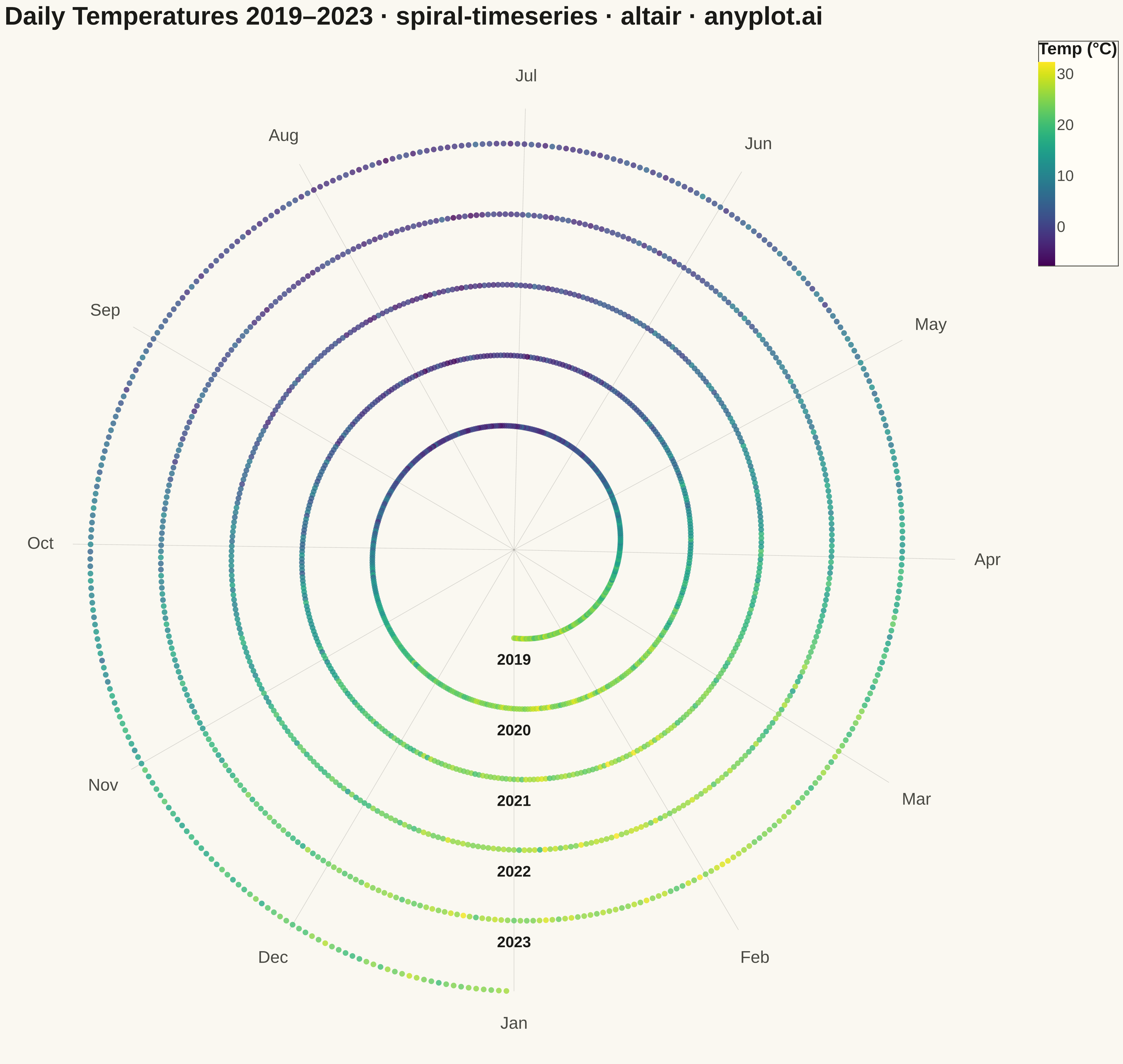
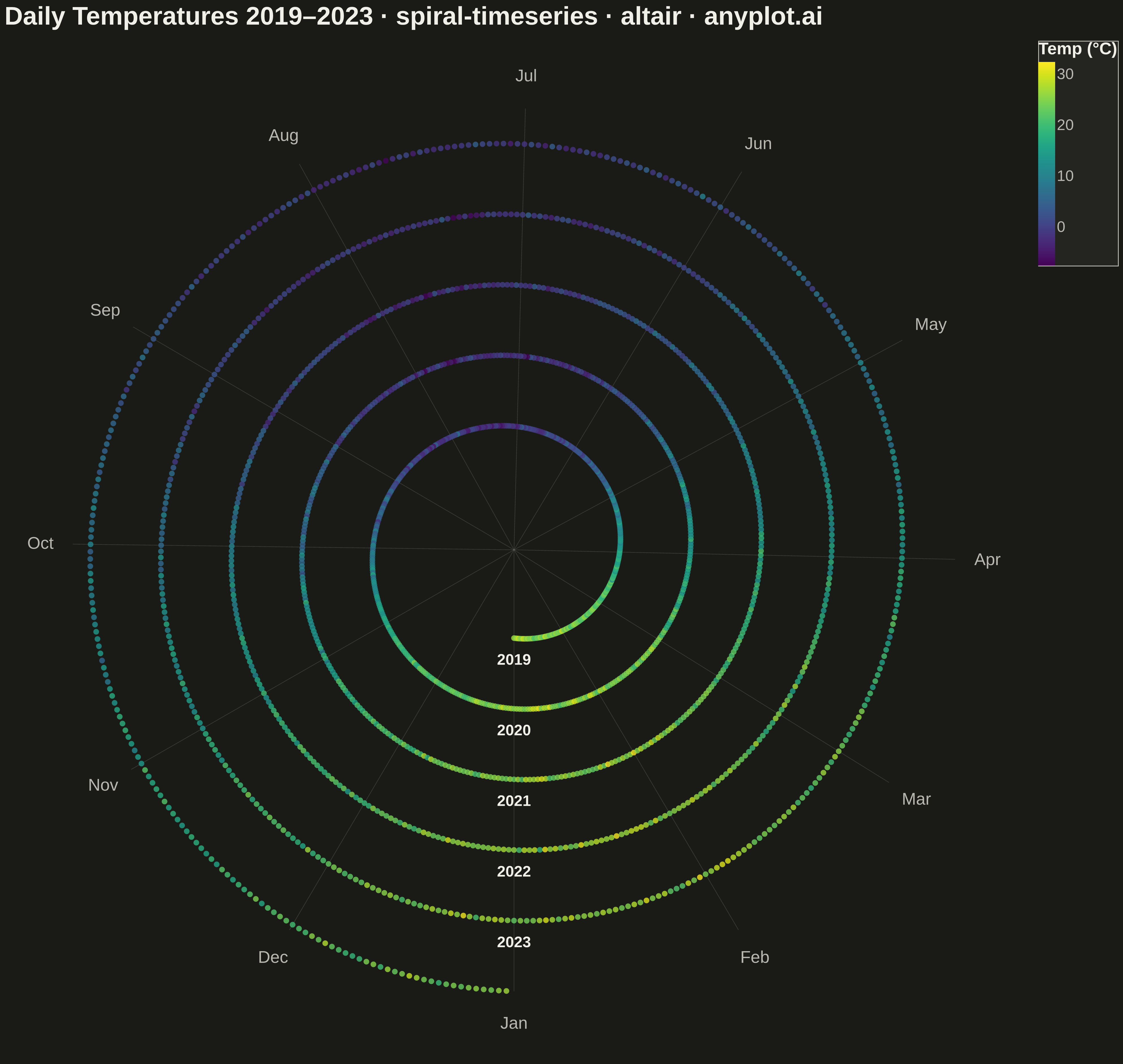
A time series plotted along a spiral (Archimedean or logarithmic), where each full revolution represents one cycle period (e.g., one year). By wrapping temporal data around a spiral, corresponding periods from different cycles align vertically, making recurring seasonal or periodic patterns immediately visible. This layout provides a compact alternative to long horizontal time series for cyclic data, revealing periodicity and trend simultaneously.
""" anyplot.ai
spiral-timeseries: Spiral Time Series Chart
Library: altair 6.1.0 | Python 3.13.13
Quality: 88/100 | Created: 2026-05-07
"""

import os
import sys


# Prevent the script's own filename from shadowing the altair package
sys.path = [p for p in sys.path if p != os.path.dirname(os.path.abspath(__file__))]

import altair as alt
import numpy as np
import pandas as pd


# Theme tokens
THEME = os.getenv("ANYPLOT_THEME", "light")
PAGE_BG = "#FAF8F1" if THEME == "light" else "#1A1A17"
ELEVATED_BG = "#FFFDF6" if THEME == "light" else "#242420"
INK = "#1A1A17" if THEME == "light" else "#F0EFE8"
INK_SOFT = "#4A4A44" if THEME == "light" else "#B8B7B0"

# Data: daily average temperatures over 5 years (one revolution per year)
np.random.seed(42)
years_list = [2019, 2020, 2021, 2022, 2023]
records = []
for yr in years_list:
    n_days = 366 if yr % 4 == 0 else 365
    for doy in range(1, n_days + 1):
        temp = 12.0 + 14.0 * np.cos(2 * np.pi * (doy - 15) / n_days) + (yr - 2019) * 0.08 + np.random.normal(0, 2.5)
        records.append({"year": yr, "doy": doy, "n_days": n_days, "temperature": round(temp, 2)})

df = pd.DataFrame(records)

# Spiral coordinates: Archimedean spiral, each year = one revolution
BASE_R = 1.5
SPACING = 1.2
year_order = {yr: i for i, yr in enumerate(years_list)}
df["year_idx"] = df["year"].map(year_order)
df["angle"] = 2 * np.pi * (df["doy"] - 1) / df["n_days"] - np.pi / 2
df["radius"] = BASE_R + SPACING * (df["year_idx"] + (df["doy"] - 1) / df["n_days"])
df["x"] = df["radius"] * np.cos(df["angle"])
df["y"] = df["radius"] * np.sin(df["angle"])

# Radial grid lines: one per month, from origin to outer edge
month_names = ["Jan", "Feb", "Mar", "Apr", "May", "Jun", "Jul", "Aug", "Sep", "Oct", "Nov", "Dec"]
month_doys = [1, 32, 60, 91, 121, 152, 182, 213, 244, 274, 305, 335]
outer_r = BASE_R + SPACING * len(years_list)
label_r = outer_r + 0.55

grid_rows = []
for i, doy in enumerate(month_doys):
    angle = 2 * np.pi * (doy - 1) / 365 - np.pi / 2
    grid_rows.append({"x": 0.0, "y": 0.0, "seg": i})
    grid_rows.append({"x": outer_r * np.cos(angle), "y": outer_r * np.sin(angle), "seg": i})

grid_df = pd.DataFrame(grid_rows)

# Month labels at outer rim
month_label_rows = [
    {
        "x": label_r * np.cos(2 * np.pi * (doy - 1) / 365 - np.pi / 2),
        "y": label_r * np.sin(2 * np.pi * (doy - 1) / 365 - np.pi / 2),
        "label": name,
    }
    for name, doy in zip(month_names, month_doys, strict=True)
]
month_label_df = pd.DataFrame(month_label_rows)

# Year labels at start of each revolution (Jan 1 = top of spiral)
year_label_rows = [{"x": 0.0, "y": -(BASE_R + SPACING * yi) - 0.25, "label": str(yr)} for yr, yi in year_order.items()]
year_label_df = pd.DataFrame(year_label_rows)

# Equal-axis domain so spiral stays circular
domain_max = label_r + 0.6

# Plot layers
grid_chart = (
    alt.Chart(grid_df)
    .mark_line(strokeWidth=0.7, opacity=0.20)
    .encode(
        x=alt.X("x:Q", scale=alt.Scale(domain=[-domain_max, domain_max]), axis=None),
        y=alt.Y("y:Q", scale=alt.Scale(domain=[-domain_max, domain_max]), axis=None),
        detail="seg:N",
        color=alt.value(INK_SOFT),
    )
)

spiral_chart = (
    alt.Chart(df)
    .mark_circle(size=18)
    .encode(
        x=alt.X("x:Q", scale=alt.Scale(domain=[-domain_max, domain_max]), axis=None),
        y=alt.Y("y:Q", scale=alt.Scale(domain=[-domain_max, domain_max]), axis=None),
        color=alt.Color(
            "temperature:Q",
            scale=alt.Scale(scheme="viridis"),
            legend=alt.Legend(
                title="Temp (°C)",
                titleFontSize=18,
                labelFontSize=16,
                gradientLength=220,
                gradientThickness=18,
                orient="right",
                titleColor=INK,
                labelColor=INK_SOFT,
            ),
        ),
        tooltip=[
            alt.Tooltip("year:O", title="Year"),
            alt.Tooltip("doy:Q", title="Day"),
            alt.Tooltip("temperature:Q", title="Temp (°C)", format=".1f"),
        ],
    )
)

month_labels_chart = (
    alt.Chart(month_label_df)
    .mark_text(fontSize=17, fontWeight="normal", align="center", baseline="middle")
    .encode(
        x=alt.X("x:Q", scale=alt.Scale(domain=[-domain_max, domain_max]), axis=None),
        y=alt.Y("y:Q", scale=alt.Scale(domain=[-domain_max, domain_max]), axis=None),
        text="label:N",
        color=alt.value(INK_SOFT),
    )
)

year_labels_chart = (
    alt.Chart(year_label_df)
    .mark_text(fontSize=15, fontWeight="bold", align="center", baseline="top")
    .encode(
        x=alt.X("x:Q", scale=alt.Scale(domain=[-domain_max, domain_max]), axis=None),
        y=alt.Y("y:Q", scale=alt.Scale(domain=[-domain_max, domain_max]), axis=None),
        text="label:N",
        color=alt.value(INK),
    )
)

chart = (
    alt.layer(grid_chart, spiral_chart, month_labels_chart, year_labels_chart)
    .properties(
        width=1200,
        height=1200,
        background=PAGE_BG,
        title=alt.TitleParams(
            "Daily Temperatures 2019–2023 · spiral-timeseries · altair · anyplot.ai",
            fontSize=24,
            color=INK,
            anchor="start",
            offset=12,
        ),
    )
    .configure_view(fill=PAGE_BG, stroke=None)
    .configure_legend(fillColor=ELEVATED_BG, strokeColor=INK_SOFT, labelColor=INK_SOFT, titleColor=INK)
)

# Save
chart.save(f"plot-{THEME}.png", scale_factor=3.0)
chart.save(f"plot-{THEME}.html")
Runnable source as JSON, for any HTTP client: https://api.anyplot.ai/specs/spiral-timeseries/altair/code. Any spec id and library id listed in llms-full.txt fit the same URL shape; every URL below is complete and callable.
{
  "spec_id": "spiral-timeseries",
  "language": "python",
  "library": "altair",
  "page": "https://anyplot.ai/spiral-timeseries/python/altair",
  "hub": "https://anyplot.ai/spiral-timeseries",
  "code_json": "https://api.anyplot.ai/specs/spiral-timeseries/altair/code",
  "spec_json": "https://api.anyplot.ai/specs/spiral-timeseries",
  "render_light_png": "https://storage.googleapis.com/anyplot-images/plots/spiral-timeseries/python/altair/plot-light.png",
  "render_dark_png": "https://storage.googleapis.com/anyplot-images/plots/spiral-timeseries/python/altair/plot-dark.png",
  "interactive_light_html": "https://storage.googleapis.com/anyplot-images/plots/spiral-timeseries/python/altair/plot-light.html",
  "interactive_dark_html": "https://storage.googleapis.com/anyplot-images/plots/spiral-timeseries/python/altair/plot-dark.html",
  "quality_score": 88.0,
  "license": "MIT",
  "guide": "https://anyplot.ai/llms.txt"
}
Part of Spiral Time Series Chart on anyplot.ai.