The same plot in 14 other libraries — Python: Altair, Bokeh, lets-plot, Matplotlib, Plotly, Pygal, Seaborn; R: ggplot2; Julia: Makie.jl; JavaScript: Chart.js, D3.js, Apache ECharts, Highcharts, MUI X Charts. Compare all 15 side by side: Spiral Time Series Chart in Python, R, Julia and JavaScript.
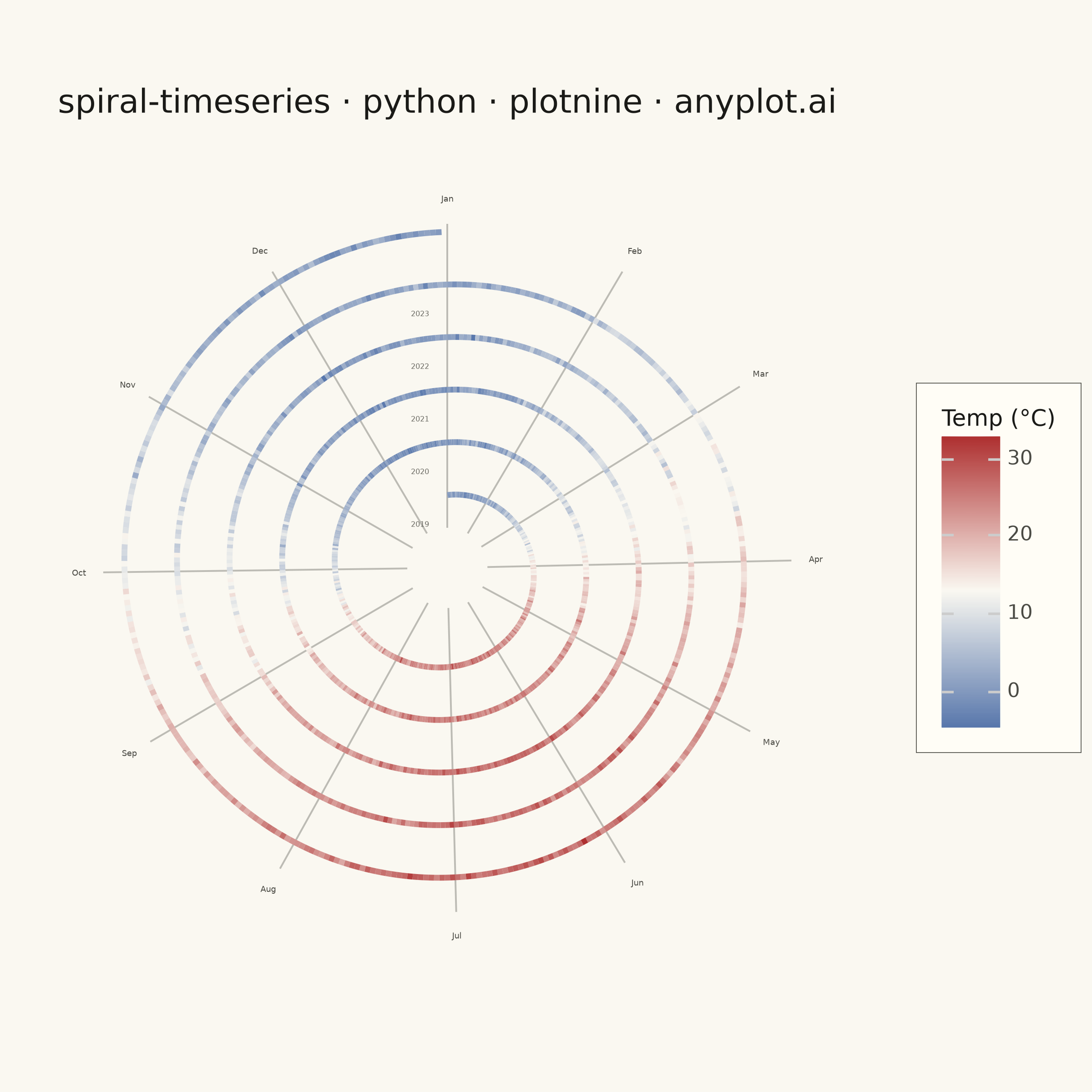
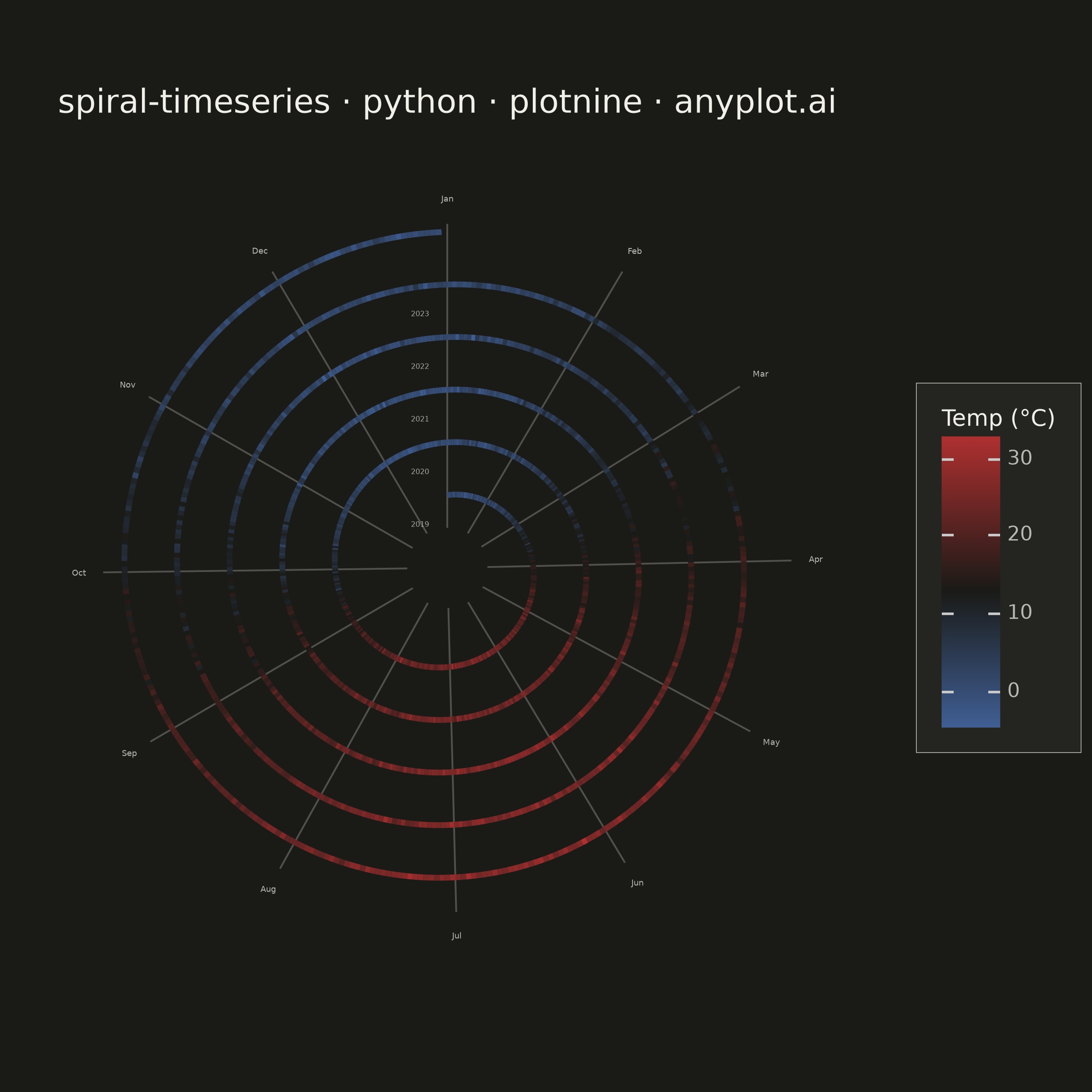
A time series plotted along a spiral (Archimedean or logarithmic), where each full revolution represents one cycle period (e.g., one year). By wrapping temporal data around a spiral, corresponding periods from different cycles align vertically, making recurring seasonal or periodic patterns immediately visible. This layout provides a compact alternative to long horizontal time series for cyclic data, revealing periodicity and trend simultaneously.
""" anyplot.ai
spiral-timeseries: Spiral Time Series Chart
Library: plotnine 0.15.8 | Python 3.13.15
Quality: 87/100 | Updated: 2026-08-18
"""

import os
import sys


# Prevent this file from shadowing the plotnine package when imported by name
_this_dir = os.path.dirname(os.path.abspath(__file__))
sys.path = [p for p in sys.path if p not in ("", ".", _this_dir) and os.path.abspath(p) != _this_dir]
if "plotnine" in sys.modules and getattr(sys.modules["plotnine"], "__file__", "") == os.path.abspath(__file__):
    del sys.modules["plotnine"]

import numpy as np
import pandas as pd
from plotnine import (
    aes,
    coord_fixed,
    element_blank,
    element_rect,
    element_text,
    geom_path,
    geom_segment,
    geom_text,
    ggplot,
    labs,
    scale_color_gradient2,
    theme,
    theme_minimal,
)


THEME = os.getenv("ANYPLOT_THEME", "light")
PAGE_BG = "#FAF8F1" if THEME == "light" else "#1A1A17"
ELEVATED_BG = "#FFFDF6" if THEME == "light" else "#242420"
INK = "#1A1A17" if THEME == "light" else "#F0EFE8"
INK_SOFT = "#4A4A44" if THEME == "light" else "#B8B7B0"
INK_MUTED = "#6B6A63" if THEME == "light" else "#A8A79F"

# Data
np.random.seed(42)
n_years = 5
days_per_year = 365
start_year = 2019

total_days = n_years * days_per_year
day_idx = np.arange(total_days, dtype=float)
doy = (day_idx % days_per_year) + 1
year_idx = (day_idx // days_per_year).astype(int)

# Daily temperature with Northern Hemisphere seasonal pattern (°C)
# Peak ~late July, trough ~late January
temperature = (
    12.0 + 13.0 * np.sin(2 * np.pi * (doy - 80) / days_per_year) + 0.5 * year_idx + np.random.normal(0, 2.0, total_days)
)

# Archimedean spiral: clockwise from top (Jan 1 = 12 o'clock position)
r_base = 1.8
r_expand = 1.3  # radius increase per full revolution
theta = np.pi / 2 - 2 * np.pi * day_idx / days_per_year
r = r_base + r_expand * (day_idx / days_per_year)

spiral_df = pd.DataFrame({"x": r * np.cos(theta), "y": r * np.sin(theta), "temperature": temperature})

# Radial grid lines at month boundaries
month_doys = [0, 31, 59, 90, 120, 151, 181, 212, 243, 273, 304, 334]
month_names = ["Jan", "Feb", "Mar", "Apr", "May", "Jun", "Jul", "Aug", "Sep", "Oct", "Nov", "Dec"]
month_angles = [np.pi / 2 - 2 * np.pi * d / days_per_year for d in month_doys]

r_inner = r_base * 0.55
r_outer = r_base + r_expand * n_years + 0.2

grid_df = pd.DataFrame(
    {
        "x": [r_inner * np.cos(a) for a in month_angles],
        "y": [r_inner * np.sin(a) for a in month_angles],
        "xend": [r_outer * np.cos(a) for a in month_angles],
        "yend": [r_outer * np.sin(a) for a in month_angles],
    }
)

# Month labels just beyond the outer spiral edge
r_label = r_outer + 0.6
label_df = pd.DataFrame(
    {
        "x": [r_label * np.cos(a) for a in month_angles],
        "y": [r_label * np.sin(a) for a in month_angles],
        "label": month_names,
    }
)

# Year labels at Jan 1 of each revolution. The spiral's local radius barely
# changes near the Jan boundary (the curve is nearly tangential there), so an
# x-only offset at the same radius still sits on the ring. Nudge the label
# radially inward into the empty gap between revolutions instead, plus a
# small x offset to clear the Jan grid line.
year_label_df = pd.DataFrame(
    {
        "x": [-0.45] * n_years,
        "y": [r_base + r_expand * yi - 0.55 * r_expand for yi in range(n_years)],
        "label": [str(start_year + yi) for yi in range(n_years)],
    }
)

# Symmetric plot bounds so the spiral sits centered rather than
# drifting toward the year-label side
extent = r_label + 0.7

# Plot
plot = (
    ggplot(spiral_df, aes("x", "y", color="temperature"))
    + geom_segment(
        data=grid_df,
        mapping=aes(x="x", y="y", xend="xend", yend="yend"),
        color=INK_SOFT,
        size=0.4,
        alpha=0.35,
        inherit_aes=False,
    )
    + geom_path(size=1.3)
    + geom_text(data=label_df, mapping=aes(x="x", y="y", label="label"), color=INK_SOFT, size=3.2, inherit_aes=False)
    + geom_text(
        data=year_label_df,
        mapping=aes(x="x", y="y", label="label"),
        color=INK_MUTED,
        size=2.8,
        ha="right",
        inherit_aes=False,
    )
    + scale_color_gradient2(low="#4467A3", mid=PAGE_BG, high="#AE3030", midpoint=13, name="Temp (°C)")
    + coord_fixed(ratio=1, xlim=(-extent, extent), ylim=(-extent, extent))
    + labs(title="spiral-timeseries · python · plotnine · anyplot.ai")
    + theme_minimal()
    + theme(
        figure_size=(6, 6),
        plot_background=element_rect(fill=PAGE_BG, color=PAGE_BG),
        panel_background=element_rect(fill=PAGE_BG),
        panel_grid_major=element_blank(),
        panel_grid_minor=element_blank(),
        panel_border=element_blank(),
        axis_title=element_blank(),
        axis_text=element_blank(),
        axis_ticks=element_blank(),
        axis_line=element_blank(),
        plot_title=element_text(color=INK, size=13),
        legend_background=element_rect(fill=ELEVATED_BG, color=INK_SOFT, size=0.3),
        legend_text=element_text(color=INK_SOFT, size=8),
        legend_title=element_text(color=INK, size=9),
        legend_position="right",
        legend_box_margin=9,
    )
)

# Save
plot.save(f"plot-{THEME}.png", dpi=400, width=6, height=6)
Runnable source as JSON, for any HTTP client: https://api.anyplot.ai/specs/spiral-timeseries/plotnine/code. Any spec id and library id listed in llms-full.txt fit the same URL shape; every URL below is complete and callable.
{
  "spec_id": "spiral-timeseries",
  "language": "python",
  "library": "plotnine",
  "page": "https://anyplot.ai/spiral-timeseries/python/plotnine",
  "hub": "https://anyplot.ai/spiral-timeseries",
  "code_json": "https://api.anyplot.ai/specs/spiral-timeseries/plotnine/code",
  "spec_json": "https://api.anyplot.ai/specs/spiral-timeseries",
  "render_light_png": "https://storage.googleapis.com/anyplot-images/plots/spiral-timeseries/python/plotnine/plot-light.png",
  "render_dark_png": "https://storage.googleapis.com/anyplot-images/plots/spiral-timeseries/python/plotnine/plot-dark.png",
  "quality_score": 87.0,
  "license": "MIT",
  "guide": "https://anyplot.ai/llms.txt"
}
Part of Spiral Time Series Chart on anyplot.ai.