The same plot in 14 other libraries — Python: Altair, Bokeh, lets-plot, Matplotlib, Plotly, plotnine, Seaborn; R: ggplot2; Julia: Makie.jl; JavaScript: Chart.js, D3.js, Apache ECharts, Highcharts, MUI X Charts. Compare all 15 side by side: Spiral Time Series Chart in Python, R, Julia and JavaScript.
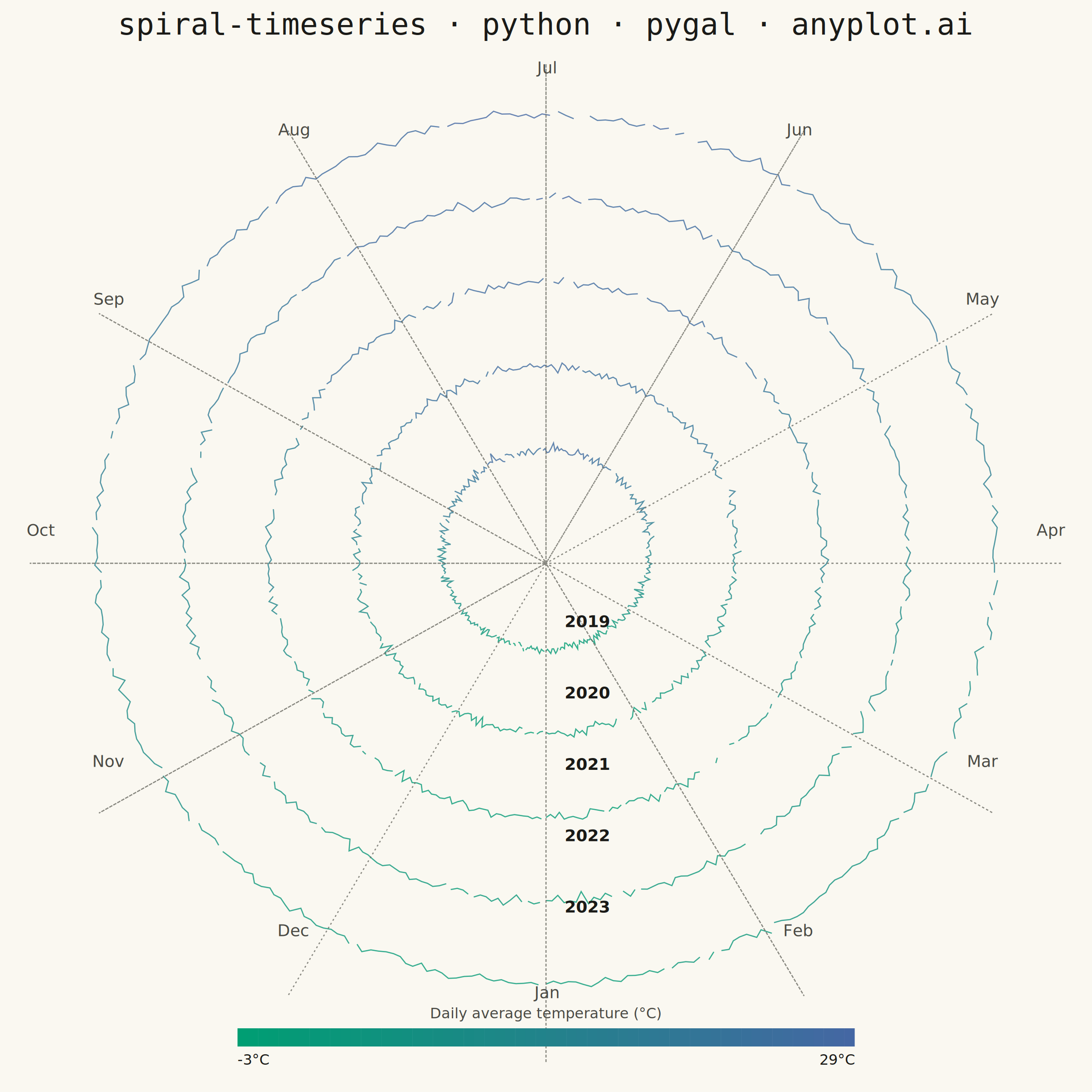
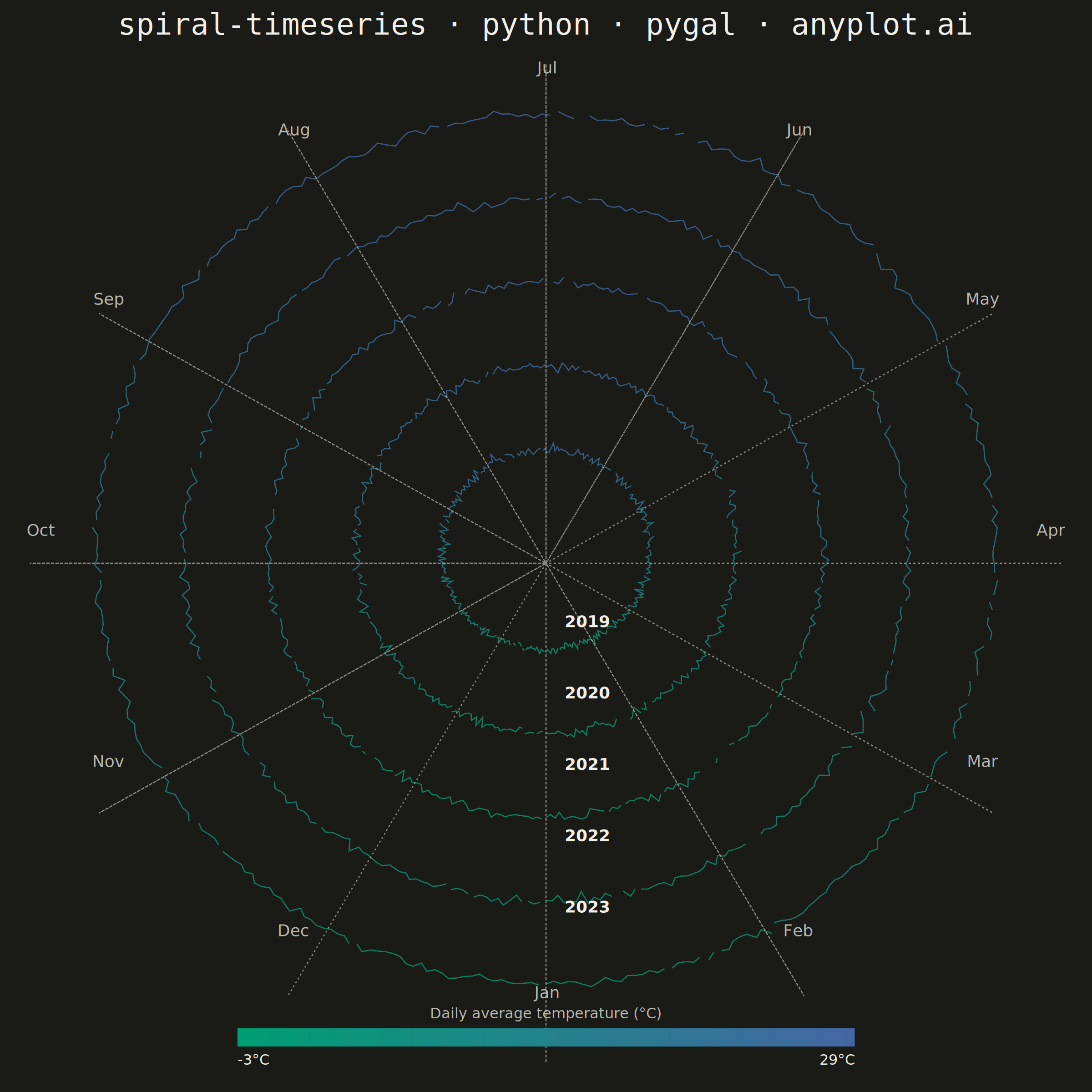
A time series plotted along a spiral (Archimedean or logarithmic), where each full revolution represents one cycle period (e.g., one year). By wrapping temporal data around a spiral, corresponding periods from different cycles align vertically, making recurring seasonal or periodic patterns immediately visible. This layout provides a compact alternative to long horizontal time series for cyclic data, revealing periodicity and trend simultaneously.
""" anyplot.ai
spiral-timeseries: Spiral Time Series Chart
Library: pygal 3.1.3 | Python 3.13.15
Quality: 87/100 | Updated: 2026-08-18
"""

import datetime
import importlib
import itertools
import math
import os
import sys
import xml.etree.ElementTree as ET


# Remove the script's own directory from sys.path so importlib resolves
# "pygal" to the installed package, not this file (same package name).
_this_dir = os.path.dirname(os.path.abspath(__file__))
sys.path = [p for p in sys.path if os.path.abspath(p or ".") != _this_dir]

np = importlib.import_module("numpy")
pygal = importlib.import_module("pygal")
Style = importlib.import_module("pygal.style").Style
cairosvg = importlib.import_module("cairosvg")

# Theme tokens
THEME = os.getenv("ANYPLOT_THEME", "light")
PAGE_BG = "#FAF8F1" if THEME == "light" else "#1A1A17"
INK = "#1A1A17" if THEME == "light" else "#F0EFE8"
INK_SOFT = "#4A4A44" if THEME == "light" else "#B8B7B0"
INK_MUTED = "#6B6A63" if THEME == "light" else "#A8A79F"

# Data — daily average temperatures over 5 years (Northern Hemisphere city)
np.random.seed(42)
n_years = 5
days_per_year = 365
n_points = n_years * days_per_year

day_indices = np.arange(n_points)
year_idx = day_indices // days_per_year
day_of_year = day_indices % days_per_year

annual_mean = 12.0  # °C
amplitude = 13.0  # °C seasonal amplitude
temp = (
    annual_mean
    + amplitude * np.cos(2 * np.pi * day_of_year / days_per_year + np.pi)
    + np.random.normal(0, 2.5, n_points)
    + year_idx * 0.4  # subtle multi-year warming trend
)

# Archimedean spiral geometry
base_r = 3.0
rev_gap = 2.5
temp_scale = 0.5  # radial deviation amplitude
t_norm = (temp - annual_mean) / (amplitude + 3.0)

theta = 2 * np.pi * day_of_year / days_per_year - math.pi / 2
radius = base_r + year_idx * rev_gap + temp_scale * t_norm
x_coords = (radius * np.cos(theta)).tolist()
y_coords = (radius * np.sin(theta)).tolist()

# Imprint sequential colormap (brand green -> blue) for temperature buckets.
T_MIN = float(np.percentile(temp, 1))
T_MAX = float(np.percentile(temp, 99))
N_BUCKETS = 14


def _lerp_hex(c0, c1, t):
    r0, g0, b0 = (int(c0[i : i + 2], 16) for i in (1, 3, 5))
    r1, g1, b1 = (int(c1[i : i + 2], 16) for i in (1, 3, 5))
    r, g, b = (round(a + (b - a) * t) for a, b in ((r0, r1), (g0, g1), (b0, b1)))
    return f"#{r:02X}{g:02X}{b:02X}"


def _rolling_mean(values, window):
    half = window // 2
    n = len(values)
    return np.array([values[max(0, i - half) : min(n, i + half + 1)].mean() for i in range(n)])


bucket_colors = tuple(_lerp_hex("#009E73", "#4467A3", i / (N_BUCKETS - 1)) for i in range(N_BUCKETS))
bucket_edges = np.linspace(T_MIN, T_MAX, N_BUCKETS + 1)

# pygal draws a straight line between any two points added to a series
# regardless of how far apart they are in time, so bucketing on the raw
# noisy daily value would connect unrelated days that happen to share a
# temperature (e.g. a cold spring day with a cold autumn day) into long
# spurious chords. Bucketing on an 11-day rolling mean instead gives each
# color a smooth, slow-changing assignment, so consecutive days sharing a
# bucket are genuinely adjacent in time — grouped below into one contiguous
# arc per run via itertools.groupby.
smoothed_temp = _rolling_mean(temp, 11)
bucket_idx = np.clip(np.digitize(smoothed_temp, bucket_edges[1:]), 0, N_BUCKETS - 1)

base_date = datetime.date(2019, 1, 1)
arc_runs = []  # list of (color, points) — one per contiguous same-bucket run
for y in range(n_years):
    year_buckets = bucket_idx[y * days_per_year : (y + 1) * days_per_year]
    for b, days in itertools.groupby(range(days_per_year), key=lambda d: year_buckets[d]):
        points = []
        for d in days:
            i = y * days_per_year + d
            date_str = (base_date + datetime.timedelta(days=i)).strftime("%b %d, %Y")
            points.append({"value": (x_coords[i], y_coords[i]), "label": f"{date_str}: {temp[i]:.1f}°C"})
        arc_runs.append((bucket_colors[b], points))

# Spoke geometry — kept as real chart series (not just an overlay) so pygal's
# own auto-scaling accounts for their reach; the legend is hidden entirely
# (custom colorbar below replaces it), so the "Month grid" name is never shown.
outer_r = base_r + (n_years - 1) * rev_gap + temp_scale + 1.5  # ~15.0
label_r = outer_r + 1.2  # beyond outer ring, for month text anchors

month_names = ["Jan", "Feb", "Mar", "Apr", "May", "Jun", "Jul", "Aug", "Sep", "Oct", "Nov", "Dec"]

spoke_points = []
for m in range(12):
    th = 2 * math.pi * m / 12 - math.pi / 2
    spoke_points.append({"value": (0.0, 0.0)})
    spoke_points.append({"value": (outer_r * math.cos(th), outer_r * math.sin(th))})
    if m < 11:
        spoke_points.append(None)

start_year = 2019

# pygal Style — one color slot per contiguous run (in add() order), plus one
# for the spoke series. Legend is hidden; a custom SVG colorbar below
# communicates the temperature scale instead.
run_colors = tuple(color for color, _ in arc_runs)
custom_style = Style(
    background=PAGE_BG,
    plot_background=PAGE_BG,
    foreground=INK,
    foreground_strong=INK,
    foreground_subtle=INK_MUTED,
    colors=run_colors + (INK_MUTED,),
    title_font_size=66,
    major_label_font_size=44,
    stroke_width=2.6,
)

chart = pygal.XY(
    style=custom_style,
    width=2400,
    height=2400,
    title="spiral-timeseries · python · pygal · anyplot.ai",
    show_dots=False,
    stroke=True,
    show_x_labels=False,
    show_y_labels=False,
    show_x_guides=False,
    show_y_guides=False,
    show_legend=False,
)

# Temperature-colored spiral arcs (Imprint sequential gradient) — one series
# per contiguous same-bucket run so no line ever jumps between distant days.
for idx, (_, points) in enumerate(arc_runs):
    chart.add(f"run {idx}", points)

# Month guide spokes (data only — no legend entry since show_legend=False).
# Thin dashed stroke keeps them a subtle background grid behind the data rings.
chart.add("Month grid", spoke_points, stroke_style={"width": 1, "dasharray": "4,6"})

# --- SVG post-processing: inject permanent month/year labels + a colorbar ---
svg_bytes = chart.render()
svg_str = svg_bytes.decode("utf-8")

# Register SVG namespace to preserve structure
ET.register_namespace("", "http://www.w3.org/2000/svg")
ET.register_namespace("xlink", "http://www.w3.org/1999/xlink")

root = ET.fromstring(svg_str)
svg_w = float(root.get("width", 2400))
svg_h = float(root.get("height", 2400))

# Estimate plot area from pygal's layout: title ~130px, bottom band reserved
# for the custom colorbar ~200px, side margins ~70px.
margin_top = 130
margin_bottom = 200
margin_side = 70
plot_w = svg_w - 2 * margin_side
plot_h = svg_h - margin_top - margin_bottom

# Data bounds — use the actual chart data range (spiral + spokes, not label anchors)
all_x = x_coords + [outer_r * math.cos(2 * math.pi * m / 12 - math.pi / 2) for m in range(12)]
all_y = y_coords + [outer_r * math.sin(2 * math.pi * m / 12 - math.pi / 2) for m in range(12)]
data_xmin, data_xmax = min(all_x), max(all_x)
data_ymin, data_ymax = min(all_y), max(all_y)
# Add a small margin (pygal pads the axes)
pad = 0.05
dx = (data_xmax - data_xmin) * pad
dy = (data_ymax - data_ymin) * pad
data_xmin -= dx
data_xmax += dx
data_ymin -= dy
data_ymax += dy


def data_to_svg(dx_val, dy_val):
    sx = margin_side + (dx_val - data_xmin) / (data_xmax - data_xmin) * plot_w
    # SVG y-axis is inverted
    sy = margin_top + (1 - (dy_val - data_ymin) / (data_ymax - data_ymin)) * plot_h
    return sx, sy


# Inject month labels as SVG <text> elements
svg_ns = "http://www.w3.org/2000/svg"
for m in range(12):
    th = 2 * math.pi * m / 12 - math.pi / 2
    mx = label_r * math.cos(th)
    my = label_r * math.sin(th)
    sx, sy = data_to_svg(mx, my)
    text_el = ET.SubElement(root, f"{{{svg_ns}}}text")
    text_el.set("x", f"{sx:.1f}")
    text_el.set("y", f"{sy:.1f}")
    text_el.set("text-anchor", "middle")
    text_el.set("dominant-baseline", "middle")
    text_el.set("font-size", "36")
    text_el.set("font-family", "sans-serif")
    text_el.set("fill", INK_SOFT)
    text_el.text = month_names[m]

# Inject year-start labels at Jan 1 of each ring
for y in range(n_years):
    th = -math.pi / 2  # Jan 1 = 12-o'clock
    r = base_r + y * rev_gap
    lx = r * math.cos(th) + 0.6  # slight rightward offset from vertical axis
    ly = r * math.sin(th) - 0.2
    sx, sy = data_to_svg(lx, ly)
    text_el = ET.SubElement(root, f"{{{svg_ns}}}text")
    text_el.set("x", f"{sx:.1f}")
    text_el.set("y", f"{sy:.1f}")
    text_el.set("text-anchor", "start")
    text_el.set("dominant-baseline", "middle")
    text_el.set("font-size", "36")
    text_el.set("font-family", "sans-serif")
    text_el.set("font-weight", "bold")
    text_el.set("fill", INK)
    text_el.text = str(start_year + y)

# Custom colorbar (replaces the built-in legend) — narrative anchor for the
# temperature scale, drawn as a smooth gradient strip with endpoint labels.
BAR_SEGMENTS = 60
bar_w = plot_w * 0.6
bar_h = 40
bar_x0 = margin_side + (plot_w - bar_w) / 2
bar_y0 = svg_h - margin_bottom + 60
seg_w = bar_w / BAR_SEGMENTS
for s in range(BAR_SEGMENTS):
    seg_color = _lerp_hex("#009E73", "#4467A3", s / (BAR_SEGMENTS - 1))
    rect_el = ET.SubElement(root, f"{{{svg_ns}}}rect")
    rect_el.set("x", f"{bar_x0 + s * seg_w:.1f}")
    rect_el.set("y", f"{bar_y0:.1f}")
    rect_el.set("width", f"{seg_w + 0.5:.1f}")
    rect_el.set("height", f"{bar_h}")
    rect_el.set("fill", seg_color)

caption_el = ET.SubElement(root, f"{{{svg_ns}}}text")
caption_el.set("x", f"{svg_w / 2:.1f}")
caption_el.set("y", f"{bar_y0 - 22:.1f}")
caption_el.set("text-anchor", "middle")
caption_el.set("font-size", "32")
caption_el.set("font-family", "sans-serif")
caption_el.set("fill", INK_SOFT)
caption_el.text = "Daily average temperature (°C)"

for value, x_pos, anchor in ((T_MIN, bar_x0, "start"), (T_MAX, bar_x0 + bar_w, "end")):
    label_el = ET.SubElement(root, f"{{{svg_ns}}}text")
    label_el.set("x", f"{x_pos:.1f}")
    label_el.set("y", f"{bar_y0 + bar_h + 40:.1f}")
    label_el.set("text-anchor", anchor)
    label_el.set("font-size", "32")
    label_el.set("font-family", "sans-serif")
    label_el.set("fill", INK)
    label_el.text = f"{value:.0f}°C"

modified_svg = ET.tostring(root, encoding="unicode", xml_declaration=False)
modified_svg_bytes = ("<?xml version='1.0' encoding='utf-8'?>\n" + modified_svg).encode("utf-8")

# Save PNG and interactive HTML from the same annotated SVG (month/year labels,
# colorbar) so both outputs stay in sync; per-day hover tooltips on the spiral
# arcs still come from pygal's native interactivity.
cairosvg.svg2png(bytestring=modified_svg_bytes, write_to=f"plot-{THEME}.png")
with open(f"plot-{THEME}.html", "wb") as f:
    f.write(modified_svg_bytes)
Runnable source as JSON, for any HTTP client: https://api.anyplot.ai/specs/spiral-timeseries/pygal/code. Any spec id and library id listed in llms-full.txt fit the same URL shape; every URL below is complete and callable.
{
  "spec_id": "spiral-timeseries",
  "language": "python",
  "library": "pygal",
  "page": "https://anyplot.ai/spiral-timeseries/python/pygal",
  "hub": "https://anyplot.ai/spiral-timeseries",
  "code_json": "https://api.anyplot.ai/specs/spiral-timeseries/pygal/code",
  "spec_json": "https://api.anyplot.ai/specs/spiral-timeseries",
  "render_light_png": "https://storage.googleapis.com/anyplot-images/plots/spiral-timeseries/python/pygal/plot-light.png",
  "render_dark_png": "https://storage.googleapis.com/anyplot-images/plots/spiral-timeseries/python/pygal/plot-dark.png",
  "interactive_light_html": "https://storage.googleapis.com/anyplot-images/plots/spiral-timeseries/python/pygal/plot-light.html",
  "interactive_dark_html": "https://storage.googleapis.com/anyplot-images/plots/spiral-timeseries/python/pygal/plot-dark.html",
  "quality_score": 87.0,
  "license": "MIT",
  "guide": "https://anyplot.ai/llms.txt"
}
Part of Spiral Time Series Chart on anyplot.ai.