The same plot in 14 other libraries — Python: Altair, Bokeh, lets-plot, Matplotlib, plotnine, Pygal, Seaborn; R: ggplot2; Julia: Makie.jl; JavaScript: Chart.js, D3.js, Apache ECharts, Highcharts, MUI X Charts. Compare all 15 side by side: Spiral Time Series Chart in Python, R, Julia and JavaScript.
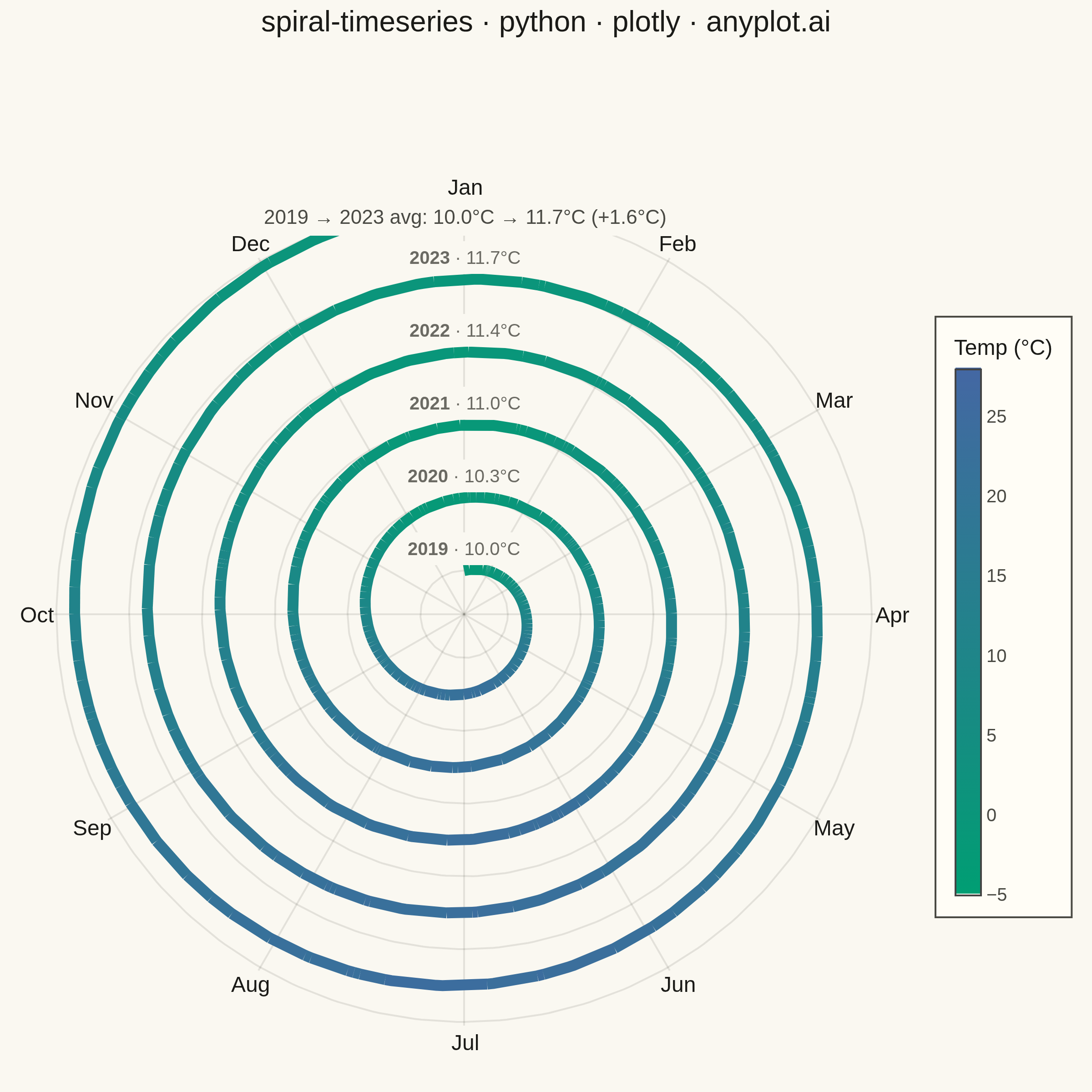
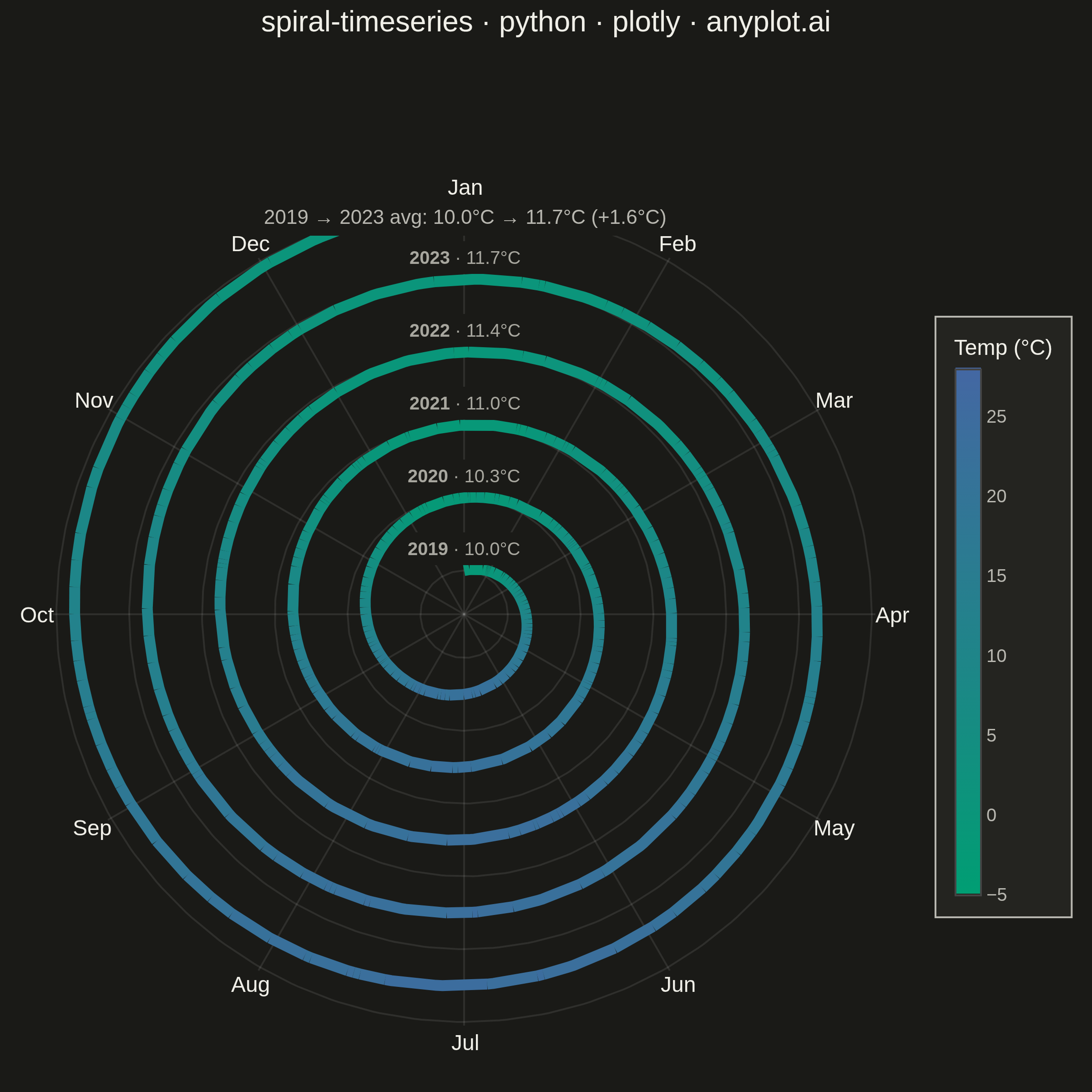
A time series plotted along a spiral (Archimedean or logarithmic), where each full revolution represents one cycle period (e.g., one year). By wrapping temporal data around a spiral, corresponding periods from different cycles align vertically, making recurring seasonal or periodic patterns immediately visible. This layout provides a compact alternative to long horizontal time series for cyclic data, revealing periodicity and trend simultaneously.
""" anyplot.ai
spiral-timeseries: Spiral Time Series Chart
Library: plotly 6.9.0 | Python 3.13.15
Quality: 89/100 | Updated: 2026-08-18
"""

import os

import numpy as np
import pandas as pd
import plotly.graph_objects as go


# Theme tokens
THEME = os.getenv("ANYPLOT_THEME", "light")
PAGE_BG = "#FAF8F1" if THEME == "light" else "#1A1A17"
ELEVATED_BG = "#FFFDF6" if THEME == "light" else "#242420"
INK = "#1A1A17" if THEME == "light" else "#F0EFE8"
INK_SOFT = "#4A4A44" if THEME == "light" else "#B8B7B0"
INK_MUTED = "#6B6A63" if THEME == "light" else "#A8A79F"
GRID = "rgba(26,26,23,0.10)" if THEME == "light" else "rgba(240,239,232,0.10)"

# Continuous data: single-polarity Imprint sequential scale (brand green -> blue)
imprint_seq = [[0.0, "#009E73"], [1.0, "#4467A3"]]

# Data: Daily average temperatures 2019–2023 (temperate northern hemisphere)
np.random.seed(42)
dates = pd.date_range("2019-01-01", "2023-12-31", freq="D")
n = len(dates)

doy = dates.day_of_year.values.astype(float)
yr_num = (dates.year - 2019).values.astype(float)

seasonal = -12.0 * np.cos(2 * np.pi * doy / 365.25)  # cold Jan, warm Jul
trend = yr_num * 0.4  # gradual multi-year warming signal
noise = np.random.normal(0, 1.8, n)
temperature = 10.0 + seasonal + trend + noise  # °C, roughly −4 to +26

TMIN, TMAX = -5.0, 28.0

# Archimedean spiral geometry (clockwise from top = Jan 1)
SPACING = 2.0
R0 = 1.2
frac = (doy - 1.0) / 365.25
theta = np.pi / 2.0 - 2 * np.pi * frac
r = R0 + (yr_num + frac) * SPACING
x_sp = r * np.cos(theta)
y_sp = r * np.sin(theta)

r_outer = R0 + 5.0 * SPACING  # outer boundary (end of 2023)
r_label = r_outer + 0.55  # month-label ring


def lerp_color(t, c0=(0, 158, 115), c1=(68, 103, 163)):
    """Linear interpolation along the two-stop imprint_seq scale."""
    t = min(max(t, 0.0), 1.0)
    rgb = [round(a + (b - a) * t) for a, b in zip(c0, c1)]
    return f"rgb({rgb[0]},{rgb[1]},{rgb[2]})"


# Smoothed color channel (15-day rolling mean) removes daily-noise flicker so
# the ribbon reads as a polished gradient; raw daily values stay in hover text.
NBINS = 40
smooth_temp = pd.Series(temperature).rolling(15, center=True, min_periods=1).mean().values
bin_idx = np.clip(((smooth_temp - TMIN) / (TMAX - TMIN) * NBINS).astype(int), 0, NBINS - 1)
run_breaks = np.flatnonzero(np.diff(bin_idx) != 0)
run_starts = np.concatenate(([0], run_breaks + 1))
# each run's end coincides with the next run's start so adjacent line traces
# share a literal vertex — otherwise separately-capped traces leave visible
# notches at every color transition
run_ends = np.concatenate((run_breaks + 1, [n - 1]))

# Figure
fig = go.Figure()

# 1. Circular ring guides at each year boundary
arc_t = np.linspace(0, 2 * np.pi, 361)
for k in range(6):
    arc_r = R0 + k * SPACING
    fig.add_trace(
        go.Scatter(
            x=arc_r * np.cos(arc_t),
            y=arc_r * np.sin(arc_t),
            mode="lines",
            line=dict(color=GRID, width=1),
            hoverinfo="skip",
            showlegend=False,
        )
    )

# 2. Radial month dividers and labels
month_names = ["Jan", "Feb", "Mar", "Apr", "May", "Jun", "Jul", "Aug", "Sep", "Oct", "Nov", "Dec"]
for m, mname in enumerate(month_names):
    mt = np.pi / 2.0 - 2 * np.pi * (m / 12.0)
    fig.add_trace(
        go.Scatter(
            x=[0, (r_outer + 0.1) * np.cos(mt)],
            y=[0, (r_outer + 0.1) * np.sin(mt)],
            mode="lines",
            line=dict(color=GRID, width=1),
            hoverinfo="skip",
            showlegend=False,
        )
    )
    fig.add_annotation(
        x=r_label * np.cos(mt),
        y=r_label * np.sin(mt),
        text=mname,
        showarrow=False,
        font=dict(size=12, color=INK, family="Arial, sans-serif"),
        xanchor="center",
        yanchor="middle",
    )

# 3. Temperature-colored ribbon: one smooth line per constant-color run, so the
# spiral reads as a continuous gradient stroke rather than a beaded scatter.
for start, end in zip(run_starts, run_ends):
    t = (bin_idx[start] + 0.5) / NBINS
    fig.add_trace(
        go.Scatter(
            x=x_sp[start : end + 1],
            y=y_sp[start : end + 1],
            mode="lines",
            line=dict(color=lerp_color(t), width=6, shape="linear"),
            hoverinfo="skip",
            showlegend=False,
        )
    )

# 4. Invisible per-day markers carry the rich hover tooltips (raw, unsmoothed
# temperature) without reintroducing a visible dotted texture.
fig.add_trace(
    go.Scatter(
        x=x_sp,
        y=y_sp,
        mode="markers",
        marker=dict(size=8, color="rgba(0,0,0,0)"),
        text=[f"{d.strftime('%b %d, %Y')}: {t:.1f}°C" for d, t in zip(dates, temperature)],
        hovertemplate="%{text}<extra></extra>",
        showlegend=False,
    )
)

# 4b. Zero-size dummy trace: draws the colorbar for the ribbon's temperature scale
fig.add_trace(
    go.Scatter(
        x=[None],
        y=[None],
        mode="markers",
        marker=dict(
            size=0.1,
            color=[TMIN, TMAX],
            colorscale=imprint_seq,
            cmin=TMIN,
            cmax=TMAX,
            showscale=True,
            colorbar=dict(
                title=dict(text="Temp (°C)", font=dict(size=12, color=INK)),
                tickfont=dict(size=10, color=INK_SOFT),
                tickvals=[-5, 0, 5, 10, 15, 20, 25],
                bgcolor=ELEVATED_BG,
                bordercolor=INK_SOFT,
                borderwidth=1,
                thickness=14,
                len=0.65,
                x=1.03,
            ),
        ),
        hoverinfo="skip",
        showlegend=False,
    )
)

# 5. Year labels at Jan 1 position (top of each ring), annotated with each
# year's average temperature to surface the multi-year warming trend alongside
# the seasonal pattern.
yearly_avg = pd.Series(temperature).groupby(dates.year).mean()
for k, yr in enumerate(range(2019, 2024)):
    yr_r = R0 + k * SPACING + 0.12
    fig.add_annotation(
        x=0.0,
        y=yr_r,
        text=f"<b>{yr}</b> · {yearly_avg[yr]:.1f}°C",
        showarrow=False,
        font=dict(size=10, color=INK_MUTED, family="Arial, sans-serif"),
        xanchor="center",
        yanchor="bottom",
        bgcolor=PAGE_BG,
        borderpad=3,
    )

# 6. Compact multi-year trend callout (below title): makes the secondary
# year-over-year warming signal explicit, not just implied by the ring labels.
warming = yearly_avg[2023] - yearly_avg[2019]
fig.add_annotation(
    x=0.5,
    y=0.955,
    xref="paper",
    yref="paper",
    text=f"2019 → 2023 avg: {yearly_avg[2019]:.1f}°C → {yearly_avg[2023]:.1f}°C (+{warming:.1f}°C)",
    showarrow=False,
    font=dict(size=11, color=INK_SOFT, family="Arial, sans-serif"),
    xanchor="center",
    yanchor="top",
    bgcolor=PAGE_BG,
    borderpad=4,
)

# Layout (square canvas for circular chart)
ax_lim = r_label + 0.5
fig.update_layout(
    autosize=False,
    paper_bgcolor=PAGE_BG,
    plot_bgcolor=PAGE_BG,
    width=600,
    height=600,
    title=dict(
        text="spiral-timeseries · python · plotly · anyplot.ai",
        font=dict(size=16, color=INK, family="Arial, sans-serif"),
        x=0.5,
        xanchor="center",
        y=0.99,
        yanchor="top",
    ),
    xaxis=dict(range=[-ax_lim, ax_lim], scaleanchor="y", scaleratio=1, visible=False),
    yaxis=dict(range=[-ax_lim, ax_lim], visible=False),
    margin=dict(l=10, r=60, t=85, b=10),
    showlegend=False,
)

# Save — 600x600 @ scale=4 -> 2400x2400 (canonical square target)
fig.write_image(f"plot-{THEME}.png", width=600, height=600, scale=4)
fig.write_html(f"plot-{THEME}.html", include_plotlyjs="cdn")
Runnable source as JSON, for any HTTP client: https://api.anyplot.ai/specs/spiral-timeseries/plotly/code. Any spec id and library id listed in llms-full.txt fit the same URL shape; every URL below is complete and callable.
{
  "spec_id": "spiral-timeseries",
  "language": "python",
  "library": "plotly",
  "page": "https://anyplot.ai/spiral-timeseries/python/plotly",
  "hub": "https://anyplot.ai/spiral-timeseries",
  "code_json": "https://api.anyplot.ai/specs/spiral-timeseries/plotly/code",
  "spec_json": "https://api.anyplot.ai/specs/spiral-timeseries",
  "render_light_png": "https://storage.googleapis.com/anyplot-images/plots/spiral-timeseries/python/plotly/plot-light.png",
  "render_dark_png": "https://storage.googleapis.com/anyplot-images/plots/spiral-timeseries/python/plotly/plot-dark.png",
  "interactive_light_html": "https://storage.googleapis.com/anyplot-images/plots/spiral-timeseries/python/plotly/plot-light.html",
  "interactive_dark_html": "https://storage.googleapis.com/anyplot-images/plots/spiral-timeseries/python/plotly/plot-dark.html",
  "quality_score": 89.0,
  "license": "MIT",
  "guide": "https://anyplot.ai/llms.txt"
}
Part of Spiral Time Series Chart on anyplot.ai.