The same plot in 14 other libraries — Python: Altair, Bokeh, lets-plot, Matplotlib, Plotly, plotnine, Pygal; R: ggplot2; Julia: Makie.jl; JavaScript: Chart.js, D3.js, Apache ECharts, Highcharts, MUI X Charts. Compare all 15 side by side: Spiral Time Series Chart in Python, R, Julia and JavaScript.
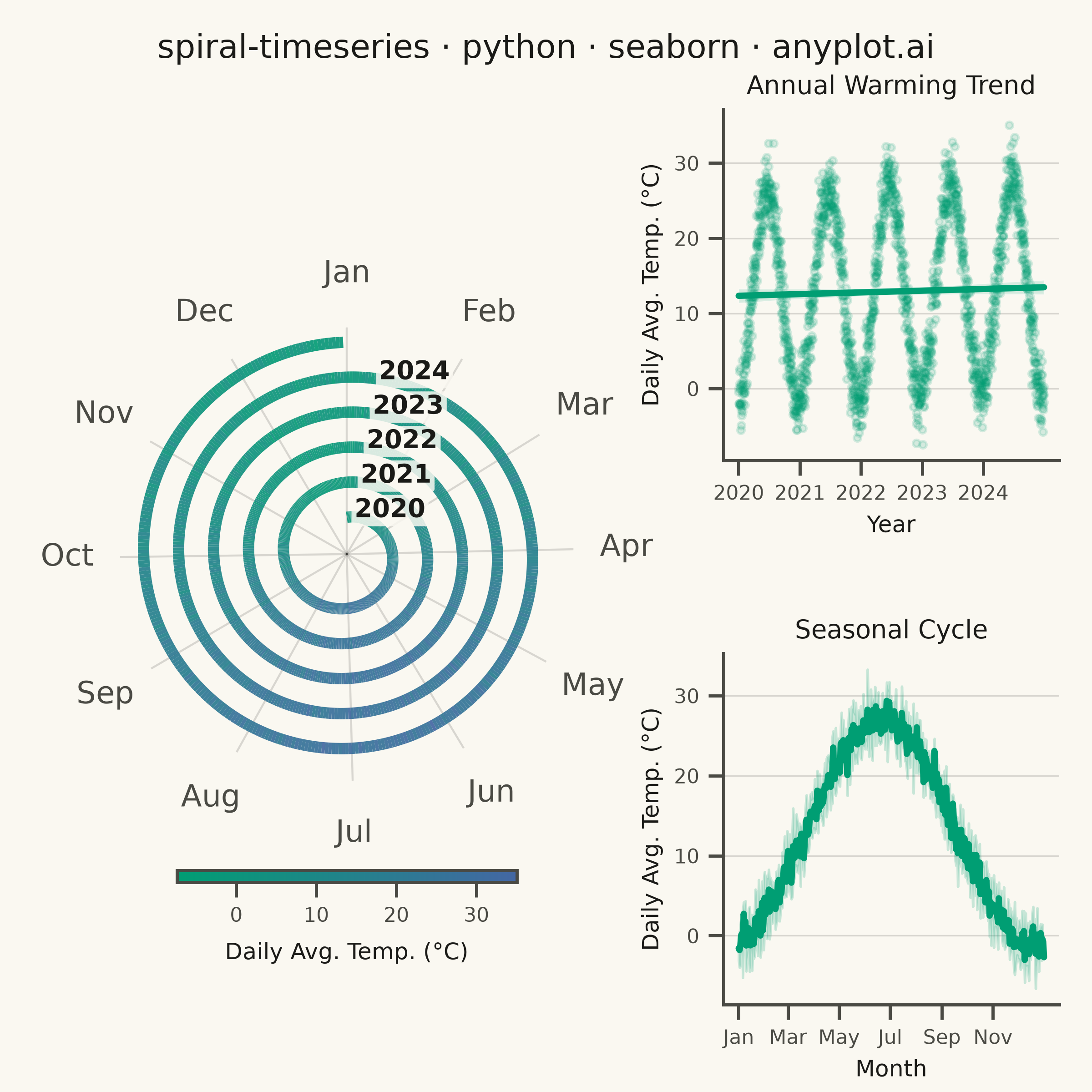
A time series plotted along a spiral (Archimedean or logarithmic), where each full revolution represents one cycle period (e.g., one year). By wrapping temporal data around a spiral, corresponding periods from different cycles align vertically, making recurring seasonal or periodic patterns immediately visible. This layout provides a compact alternative to long horizontal time series for cyclic data, revealing periodicity and trend simultaneously.
""" anyplot.ai
spiral-timeseries: Spiral Time Series Chart
Library: seaborn 0.13.2 | Python 3.13.15
Quality: 91/100 | Updated: 2026-08-18
"""

import os
import sys


# Prevent this file from shadowing the installed seaborn package
_this_dir = os.path.dirname(os.path.abspath(__file__))
sys.path = [p for p in sys.path if not (p and os.path.abspath(p) == _this_dir)]

import matplotlib.cm as cm
import matplotlib.pyplot as plt
import numpy as np
import pandas as pd
import seaborn as sns
from matplotlib.collections import LineCollection
from matplotlib.colors import LinearSegmentedColormap, Normalize


# Theme tokens (see prompts/default-style-guide.md "Background" + "Theme-adaptive Chrome")
THEME = os.getenv("ANYPLOT_THEME", "light")
PAGE_BG = "#FAF8F1" if THEME == "light" else "#1A1A17"
ELEVATED_BG = "#FFFDF6" if THEME == "light" else "#242420"
INK = "#1A1A17" if THEME == "light" else "#F0EFE8"
INK_SOFT = "#4A4A44" if THEME == "light" else "#B8B7B0"
BRAND = "#009E73"  # Imprint palette position 1 — ALWAYS first series

sns.set_theme(
    style="ticks",
    rc={
        "figure.facecolor": PAGE_BG,
        "axes.facecolor": PAGE_BG,
        "axes.edgecolor": INK_SOFT,
        "axes.labelcolor": INK,
        "text.color": INK,
        "xtick.color": INK_SOFT,
        "ytick.color": INK_SOFT,
        "grid.color": INK,
        "grid.alpha": 0.15,
        "legend.facecolor": ELEVATED_BG,
        "legend.edgecolor": INK_SOFT,
    },
)

# Imprint sequential colormap for continuous data (temperature magnitude)
imprint_seq = LinearSegmentedColormap.from_list("imprint_seq", [BRAND, "#4467A3"])

# Data: 5 years of daily average temperatures (Northern Hemisphere city)
np.random.seed(42)
n_years = 5
days_per_year = 365
n = n_years * days_per_year

dates = pd.date_range("2020-01-01", periods=n, freq="D")
day_of_year = np.array([d.timetuple().tm_yday for d in dates])
year_num = np.array([d.year - 2020 for d in dates])

# Seasonal temperature: peak ~July, trough ~January, with warming trend + noise
temperature = 12.0 + 14.0 * np.sin(2 * np.pi * (day_of_year - 80) / 365) + 0.4 * year_num + np.random.normal(0, 2.5, n)

# Archimedean spiral: theta increases 2π per year, r grows with each revolution
theta = 2 * np.pi * np.arange(n) / days_per_year
r_min = 2.0
arm_spacing = 1.9
r = r_min + arm_spacing * (theta / (2 * np.pi))

# Build colored line segments for the spiral
points = np.column_stack([theta, r]).reshape(-1, 1, 2)
segments = np.concatenate([points[:-1], points[1:]], axis=1)

norm = Normalize(vmin=temperature.min(), vmax=temperature.max())
lc = LineCollection(segments, cmap=imprint_seq, norm=norm, linewidth=4.5, alpha=0.92, zorder=3)
lc.set_array(temperature[:-1])

# Plot: square canvas, spiral (left) beside two seaborn-native supplementary panels (right)
fig = plt.figure(figsize=(6, 6), dpi=400, facecolor=PAGE_BG)
gs = fig.add_gridspec(
    2,
    2,
    width_ratios=[1.35, 1],
    height_ratios=[1, 1],
    left=0.11,
    right=0.97,
    top=0.90,
    bottom=0.08,
    wspace=0.38,
    hspace=0.55,
)

ax = fig.add_subplot(gs[:, 0], projection="polar")
ax_trend = fig.add_subplot(gs[0, 1])
ax_season = fig.add_subplot(gs[1, 1])

# January at top, spiral growing clockwise
ax.set_facecolor(PAGE_BG)
ax.set_theta_zero_location("N")
ax.set_theta_direction(-1)
ax.add_collection(lc)

# Radial limits
r_outer = r_min + arm_spacing * n_years + 0.8
ax.set_ylim(0, r_outer)

# Month angular ticks and labels around the outer ring
month_names = ["Jan", "Feb", "Mar", "Apr", "May", "Jun", "Jul", "Aug", "Sep", "Oct", "Nov", "Dec"]
month_start_days = [1, 32, 60, 91, 121, 152, 182, 213, 244, 274, 305, 335]
month_angles_deg = [360.0 * (d - 1) / 365.0 for d in month_start_days]

ax.set_thetagrids(month_angles_deg, labels=month_names)
for label in ax.get_xticklabels():
    label.set_color(INK_SOFT)
    label.set_fontsize(12)
ax.tick_params(axis="x", pad=14, length=0)

# Remove radial tick marks and labels (they clutter the spiral)
ax.set_rticks([])
ax.set_yticklabels([])

# Year labels just outside the outer edge of each spiral arm (past Jan 1, clockwise);
# a background swatch means contrast never depends on the local spiral color.
year_label_angle = np.radians(10)
for yr in range(n_years):
    yr_r = r_min + arm_spacing * yr + 0.4
    ax.text(
        year_label_angle,
        yr_r,
        str(2020 + yr),
        ha="left",
        va="center",
        fontsize=10,
        color=INK,
        fontweight="bold",
        zorder=6,
        bbox={"boxstyle": "round,pad=0.12", "facecolor": PAGE_BG, "edgecolor": "none", "alpha": 0.85},
    )

# Show only spoke grid lines (months), hide concentric r-circles
ax.yaxis.grid(False)
ax.xaxis.grid(True, alpha=0.15, color=INK, linewidth=0.8)
ax.spines["polar"].set_visible(False)

# Colorbar below the spiral — horizontal, so it never competes with the
# month-label ring on the right side of the wheel (the recurring "Apr" clip)
sm = cm.ScalarMappable(cmap=imprint_seq, norm=norm)
sm.set_array([])
cbar = fig.colorbar(sm, ax=ax, orientation="horizontal", pad=0.1, shrink=0.75, aspect=28)
cbar.set_label("Daily Avg. Temp. (°C)", fontsize=9, color=INK, labelpad=6)
cbar.ax.tick_params(labelsize=8, colors=INK_SOFT)
cbar.outline.set_edgecolor(INK_SOFT)

# Supplementary panel: annual warming trend (seaborn regplot over all daily obs.)
fractional_year = 2020 + year_num + (day_of_year - 1) / 365
sns.regplot(
    x=fractional_year,
    y=temperature,
    ax=ax_trend,
    color=BRAND,
    scatter_kws={"alpha": 0.15, "s": 8},
    line_kws={"linewidth": 2.5},
)
ax_trend.set_title("Annual Warming Trend", fontsize=10, color=INK, pad=6)
ax_trend.set_xlabel("Year", fontsize=9, color=INK)
ax_trend.set_ylabel("Daily Avg. Temp. (°C)", fontsize=9, color=INK)
ax_trend.tick_params(axis="both", labelsize=8, colors=INK_SOFT)
ax_trend.set_xticks([2020, 2021, 2022, 2023, 2024])
sns.despine(ax=ax_trend)
ax_trend.yaxis.grid(True, alpha=0.15, linewidth=0.6, color=INK)

# Supplementary panel: seasonal cycle (seaborn lineplot aggregates mean ± sd across years)
sns.lineplot(x=day_of_year, y=temperature, ax=ax_season, color=BRAND, errorbar="sd", linewidth=2.5)
ax_season.set_title("Seasonal Cycle", fontsize=10, color=INK, pad=6)
ax_season.set_xlabel("Month", fontsize=9, color=INK)
ax_season.set_ylabel("Daily Avg. Temp. (°C)", fontsize=9, color=INK)
ax_season.set_xticks(month_start_days[::2])
ax_season.set_xticklabels(month_names[::2])
ax_season.tick_params(axis="both", labelsize=8, colors=INK_SOFT)
sns.despine(ax=ax_season)
ax_season.yaxis.grid(True, alpha=0.15, linewidth=0.6, color=INK)

# Title
fig.suptitle("spiral-timeseries · python · seaborn · anyplot.ai", fontsize=13, fontweight="medium", color=INK, y=0.97)

plt.savefig(f"plot-{THEME}.png", dpi=400, facecolor=PAGE_BG)
Runnable source as JSON, for any HTTP client: https://api.anyplot.ai/specs/spiral-timeseries/seaborn/code. Any spec id and library id listed in llms-full.txt fit the same URL shape; every URL below is complete and callable.
{
  "spec_id": "spiral-timeseries",
  "language": "python",
  "library": "seaborn",
  "page": "https://anyplot.ai/spiral-timeseries/python/seaborn",
  "hub": "https://anyplot.ai/spiral-timeseries",
  "code_json": "https://api.anyplot.ai/specs/spiral-timeseries/seaborn/code",
  "spec_json": "https://api.anyplot.ai/specs/spiral-timeseries",
  "render_light_png": "https://storage.googleapis.com/anyplot-images/plots/spiral-timeseries/python/seaborn/plot-light.png",
  "render_dark_png": "https://storage.googleapis.com/anyplot-images/plots/spiral-timeseries/python/seaborn/plot-dark.png",
  "quality_score": 91.0,
  "license": "MIT",
  "guide": "https://anyplot.ai/llms.txt"
}
Part of Spiral Time Series Chart on anyplot.ai.