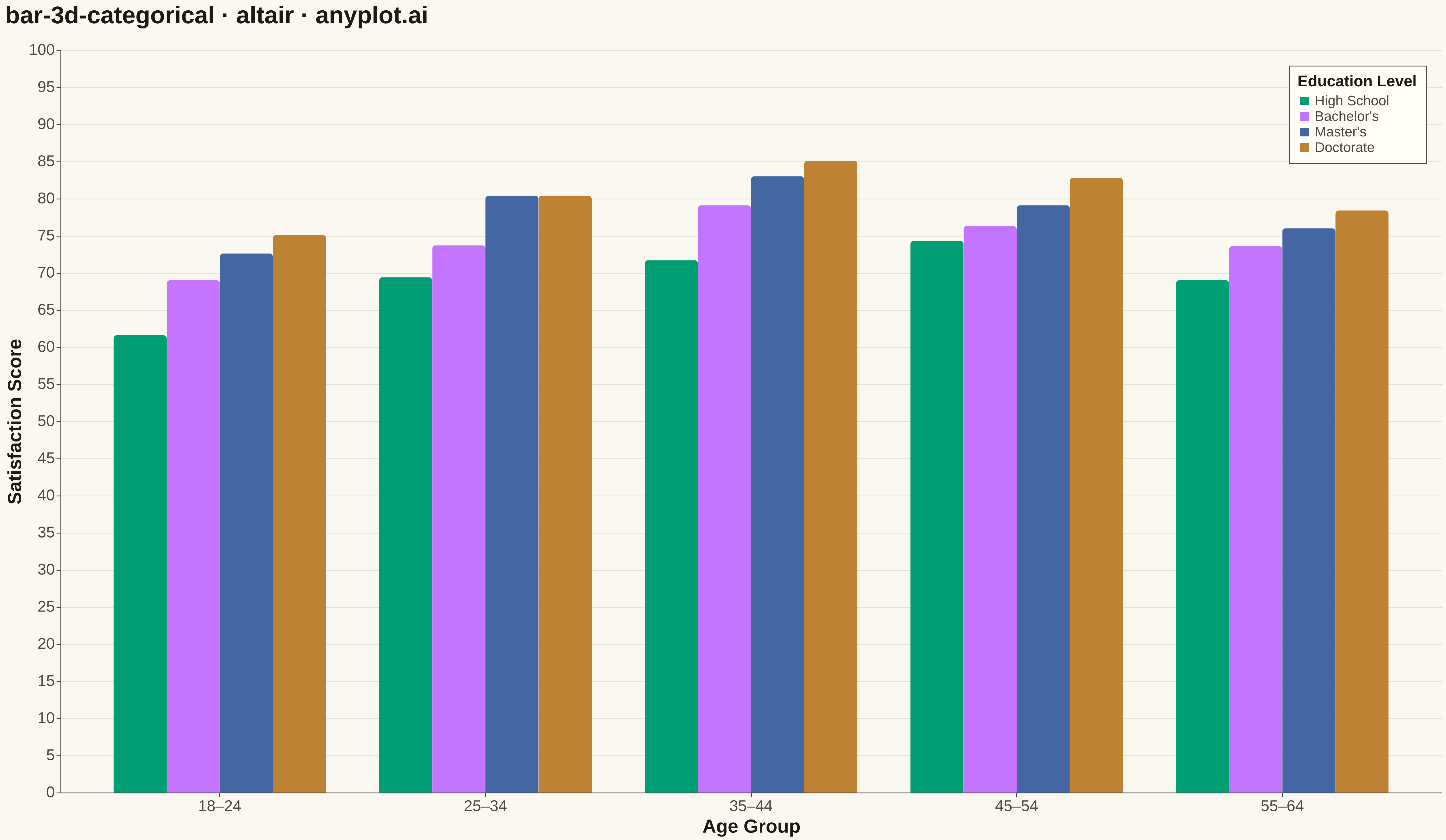
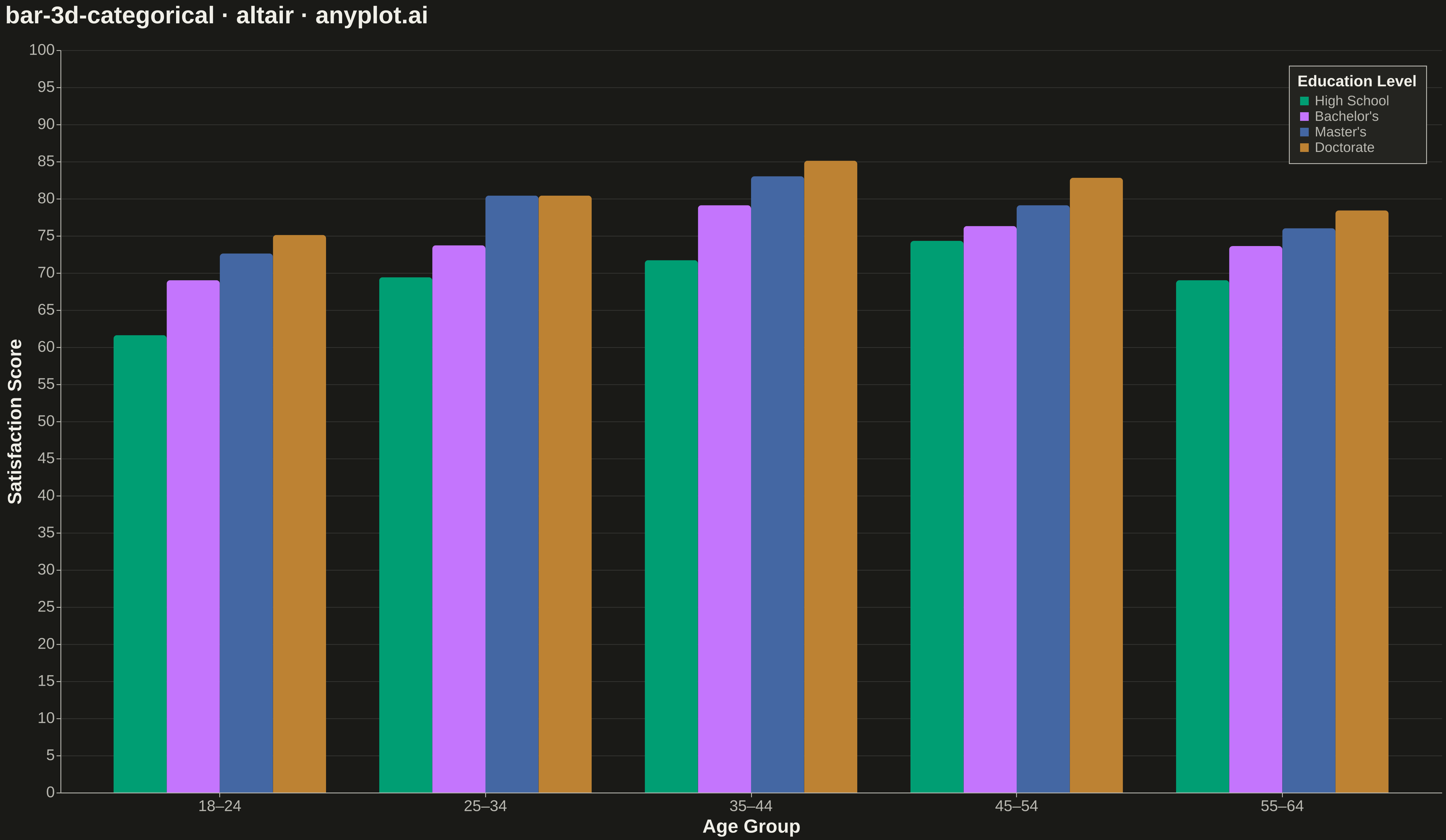
The same plot in 13 other libraries — Python: Bokeh, lets-plot, Matplotlib, Plotly, plotnine, Pygal, Seaborn; R: ggplot2; Julia: Makie.jl; JavaScript: Chart.js, D3.js, Apache ECharts, MUI X Charts. Compare all 14 side by side: 3D Bar Chart for Categorical Comparison in Python, R, Julia and JavaScript.
A three-dimensional bar chart where bars rise from a 2D categorical grid, with height encoding the measured value. Two categorical axes define the grid position on the base plane while the vertical axis shows magnitude. This visualization extends the bar chart family into 3D space, making it effective for comparing values across two categorical dimensions simultaneously.
""" anyplot.ai
bar-3d-categorical: 3D Bar Chart for Categorical Comparison
Library: altair 6.1.0 | Python 3.13.13
Quality: 81/100 | Created: 2026-05-15
"""

import os
import sys


_here = os.path.dirname(os.path.abspath(__file__))
sys.path = [p for p in sys.path if os.path.abspath(p or os.getcwd()) != _here]

import altair as alt
import numpy as np
import pandas as pd


THEME = os.getenv("ANYPLOT_THEME", "light")
PAGE_BG = "#FAF8F1" if THEME == "light" else "#1A1A17"
ELEVATED_BG = "#FFFDF6" if THEME == "light" else "#242420"
INK = "#1A1A17" if THEME == "light" else "#F0EFE8"
INK_SOFT = "#4A4A44" if THEME == "light" else "#B8B7B0"

IMPRINT = ["#009E73", "#C475FD", "#4467A3", "#BD8233", "#AE3030"]

# Data — survey satisfaction scores across age groups and education levels
np.random.seed(42)

age_groups = ["18–24", "25–34", "35–44", "45–54", "55–64"]
education_levels = ["High School", "Bachelor's", "Master's", "Doctorate"]

rows = []
base_scores = {
    "High School": [62, 68, 71, 74, 70],
    "Bachelor's": [70, 75, 78, 76, 73],
    "Master's": [74, 79, 82, 80, 77],
    "Doctorate": [76, 81, 85, 83, 79],
}
for edu, scores in base_scores.items():
    for age, score in zip(age_groups, scores, strict=True):
        jitter = np.random.uniform(-1.5, 1.5)
        rows.append({"Age Group": age, "Education": edu, "Satisfaction Score": round(score + jitter, 1)})

df = pd.DataFrame(rows)

# Plot
chart = (
    alt.Chart(df)
    .mark_bar(cornerRadiusTopLeft=4, cornerRadiusTopRight=4)
    .encode(
        x=alt.X(
            "Age Group:N",
            sort=age_groups,
            title="Age Group",
            axis=alt.Axis(labelAngle=0, labelFontSize=18, titleFontSize=22),
        ),
        y=alt.Y(
            "Satisfaction Score:Q",
            title="Satisfaction Score",
            scale=alt.Scale(domain=[0, 100]),
            axis=alt.Axis(labelFontSize=18, titleFontSize=22, grid=True),
        ),
        color=alt.Color(
            "Education:N",
            sort=education_levels,
            scale=alt.Scale(domain=education_levels, range=IMPRINT),
            legend=alt.Legend(title="Education Level", titleFontSize=18, labelFontSize=16, orient="top-right"),
        ),
        xOffset=alt.XOffset("Education:N", sort=education_levels),
        tooltip=[
            alt.Tooltip("Age Group:N"),
            alt.Tooltip("Education:N"),
            alt.Tooltip("Satisfaction Score:Q", format=".1f"),
        ],
    )
    .properties(
        width=1600,
        height=860,
        title=alt.Title("bar-3d-categorical · altair · anyplot.ai", fontSize=28, color=INK, anchor="start", offset=16),
        background=PAGE_BG,
    )
    .configure_view(fill=PAGE_BG, stroke=None)
    .configure_axis(
        domainColor=INK_SOFT, tickColor=INK_SOFT, gridColor=INK, gridOpacity=0.10, labelColor=INK_SOFT, titleColor=INK
    )
    .configure_legend(fillColor=ELEVATED_BG, strokeColor=INK_SOFT, labelColor=INK_SOFT, titleColor=INK, padding=10)
)

# Save
chart.save(f"plot-{THEME}.png", scale_factor=3.0)
chart.save(f"plot-{THEME}.html")
Runnable source as JSON, for any HTTP client: https://api.anyplot.ai/specs/bar-3d-categorical/altair/code. Any spec id and library id listed in llms-full.txt fit the same URL shape; every URL below is complete and callable.
{
  "spec_id": "bar-3d-categorical",
  "language": "python",
  "library": "altair",
  "page": "https://anyplot.ai/bar-3d-categorical/python/altair",
  "hub": "https://anyplot.ai/bar-3d-categorical",
  "code_json": "https://api.anyplot.ai/specs/bar-3d-categorical/altair/code",
  "spec_json": "https://api.anyplot.ai/specs/bar-3d-categorical",
  "render_light_png": "https://storage.googleapis.com/anyplot-images/plots/bar-3d-categorical/python/altair/plot-light.png",
  "render_dark_png": "https://storage.googleapis.com/anyplot-images/plots/bar-3d-categorical/python/altair/plot-dark.png",
  "interactive_light_html": "https://storage.googleapis.com/anyplot-images/plots/bar-3d-categorical/python/altair/plot-light.html",
  "interactive_dark_html": "https://storage.googleapis.com/anyplot-images/plots/bar-3d-categorical/python/altair/plot-dark.html",
  "quality_score": 81.0,
  "license": "MIT",
  "guide": "https://anyplot.ai/llms.txt"
}
Part of 3D Bar Chart for Categorical Comparison on anyplot.ai.