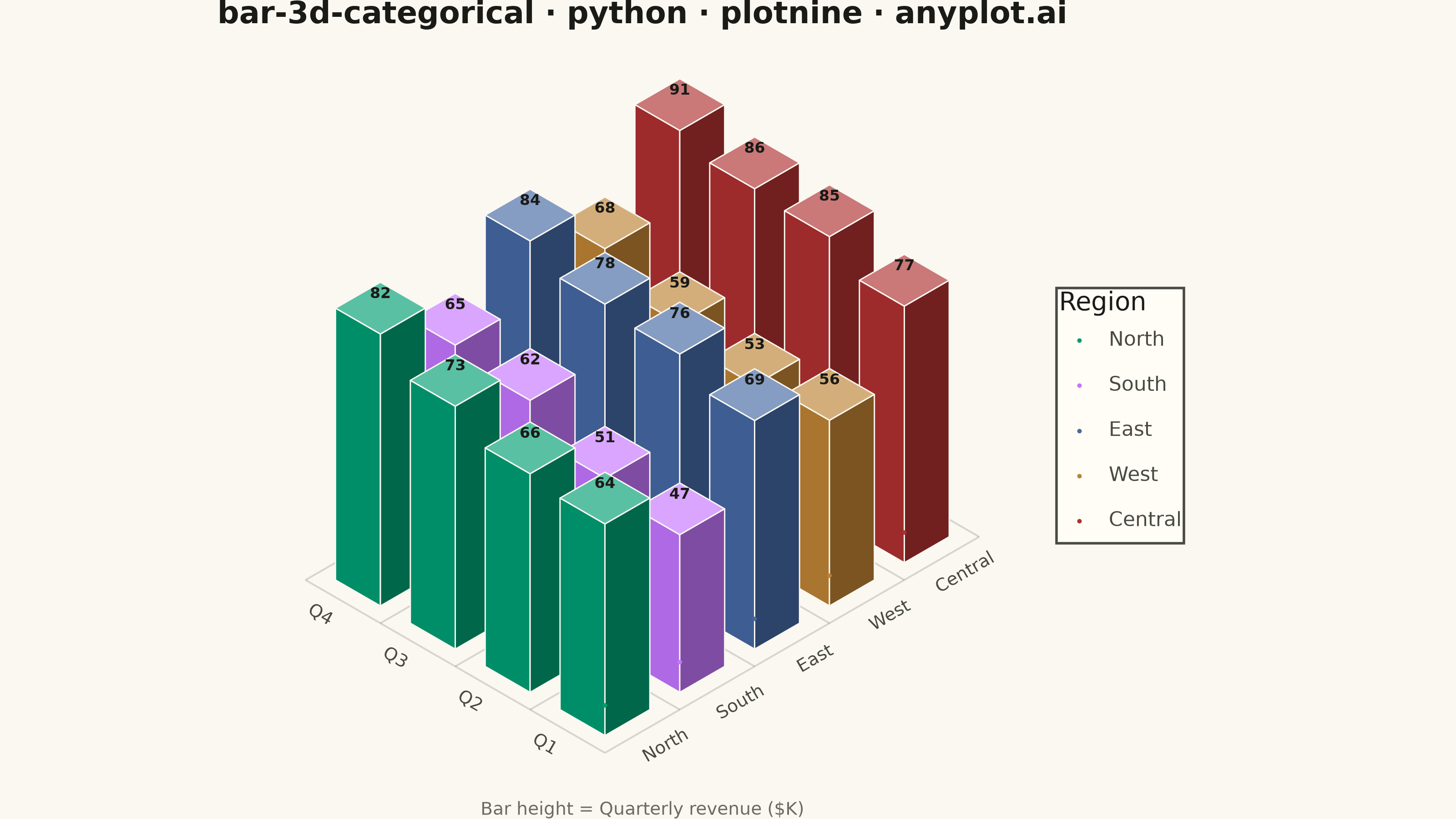
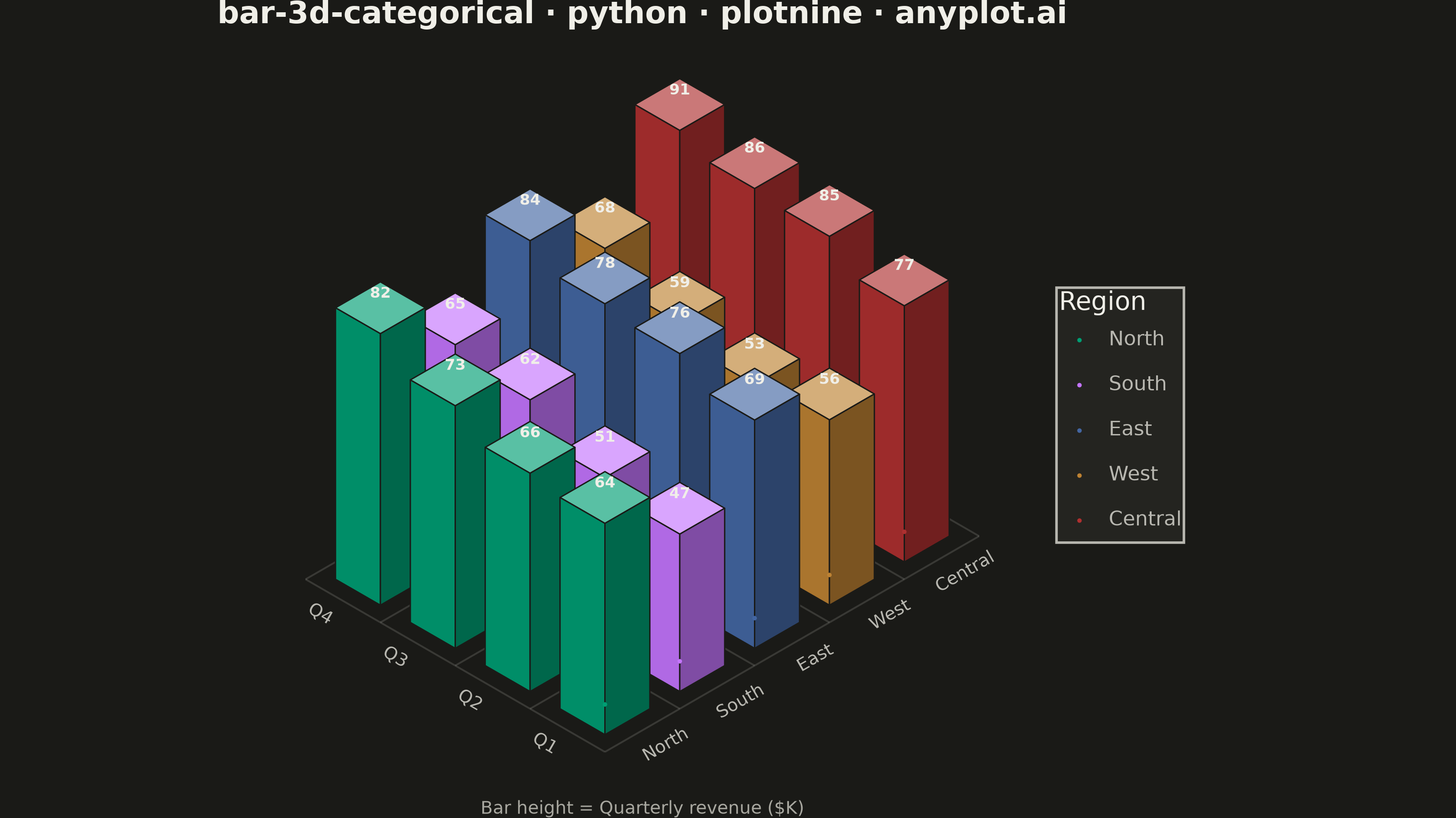
The same plot in 13 other libraries — Python: Altair, Bokeh, lets-plot, Matplotlib, Plotly, Pygal, Seaborn; R: ggplot2; Julia: Makie.jl; JavaScript: Chart.js, D3.js, Apache ECharts, MUI X Charts. Compare all 14 side by side: 3D Bar Chart for Categorical Comparison in Python, R, Julia and JavaScript.
A three-dimensional bar chart where bars rise from a 2D categorical grid, with height encoding the measured value. Two categorical axes define the grid position on the base plane while the vertical axis shows magnitude. This visualization extends the bar chart family into 3D space, making it effective for comparing values across two categorical dimensions simultaneously.
""" anyplot.ai
bar-3d-categorical: 3D Bar Chart for Categorical Comparison
Library: plotnine 0.15.8 | Python 3.13.15
Quality: 92/100 | Created: 2026-08-24
"""

import os

import numpy as np
import pandas as pd
from plotnine import (
    aes,
    coord_fixed,
    element_rect,
    element_text,
    geom_path,
    geom_point,
    geom_polygon,
    geom_text,
    ggplot,
    labs,
    scale_color_manual,
    scale_fill_identity,
    theme,
    theme_void,
)


# Theme tokens (see prompts/default-style-guide.md "Background" + "Theme-adaptive Chrome")
THEME = os.getenv("ANYPLOT_THEME", "light")
PAGE_BG = "#FAF8F1" if THEME == "light" else "#1A1A17"
ELEVATED_BG = "#FFFDF6" if THEME == "light" else "#242420"
INK = "#1A1A17" if THEME == "light" else "#F0EFE8"
INK_SOFT = "#4A4A44" if THEME == "light" else "#B8B7B0"
INK_MUTED = "#6B6A63" if THEME == "light" else "#A8A79F"

# Imprint palette — 8 hues, theme-independent, hybrid-v3 sort
IMPRINT_PALETTE = ["#009E73", "#C475FD", "#4467A3", "#BD8233", "#AE3030", "#2ABCCD", "#954477", "#99B314"]

# Data — quarterly revenue across five regions (grid of 5 x 4 = 20 bars)
np.random.seed(42)
regions = ["North", "South", "East", "West", "Central"]
quarters = ["Q1", "Q2", "Q3", "Q4"]
region_baseline = {"North": 62, "South": 48, "East": 70, "West": 55, "Central": 80}
quarter_growth = {"Q1": 0, "Q2": 4, "Q3": 9, "Q4": 15}

records = []
for region in regions:
    for quarter in quarters:
        noise = np.random.normal(0, 3)
        revenue = region_baseline[region] + quarter_growth[quarter] + noise
        records.append({"region": region, "quarter": quarter, "revenue": round(revenue, 1)})
data = pd.DataFrame(records)

# Isometric projection — elevation ~30 deg, azimuth ~45 deg (see specification.md "Notes")
COS30 = np.cos(np.radians(30))
SIN30 = np.sin(np.radians(30))


def project(gx, gy, gz):
    px = (gx - gy) * COS30
    py = (gx + gy) * SIN30 + gz
    return px, py


def hex_to_rgb(hex_color):
    hex_color = hex_color.lstrip("#")
    return tuple(int(hex_color[i : i + 2], 16) / 255 for i in (0, 2, 4))


def rgb_to_hex(rgb):
    clamped = (max(0.0, min(1.0, c)) for c in rgb)
    return "#{:02X}{:02X}{:02X}".format(*(round(c * 255) for c in clamped))


def shade(hex_color, amount):
    """Lighten (amount > 0, toward white) or darken (amount < 0, toward black)."""
    r, g, b = hex_to_rgb(hex_color)
    if amount >= 0:
        r, g, b = (r + (1 - r) * amount, g + (1 - g) * amount, b + (1 - b) * amount)
    else:
        r, g, b = (r * (1 + amount), g * (1 + amount), b * (1 + amount))
    return rgb_to_hex((r, g, b))


# Bar footprint & height scaling
CELL, BAR_W, BAR_D = 1.0, 0.6, 0.6
MARGIN = (CELL - BAR_W) / 2
HEIGHT_SCALE = 3.5 / data["revenue"].max()

# Build bars far-to-near (painter's algorithm) so nearer bars occlude farther ones
bars = []
for i, region in enumerate(regions):
    for j, quarter in enumerate(quarters):
        revenue = data.loc[(data.region == region) & (data.quarter == quarter), "revenue"].iloc[0]
        bars.append({"i": i, "j": j, "region": region, "quarter": quarter, "revenue": revenue, "depth_key": i + j})
bars.sort(key=lambda b: -b["depth_key"])

faces = []
value_labels = []
poly_id = 0
for bar in bars:
    i, j = bar["i"], bar["j"]
    x0, x1 = i + MARGIN, i + MARGIN + BAR_W
    y0, y1 = j + MARGIN, j + MARGIN + BAR_D
    h = bar["revenue"] * HEIGHT_SCALE
    base_color = IMPRINT_PALETTE[i % len(IMPRINT_PALETTE)]
    top_color = shade(base_color, 0.35)
    left_color = shade(base_color, -0.10)
    right_color = shade(base_color, -0.35)

    # Top face — z = h
    top_corners = [(x0, y0, h), (x1, y0, h), (x1, y1, h), (x0, y1, h)]
    # Left face — x = x0 (nearest vertical edge is (x0, y0))
    left_corners = [(x0, y0, 0), (x0, y1, 0), (x0, y1, h), (x0, y0, h)]
    # Right face — y = y0
    right_corners = [(x0, y0, 0), (x1, y0, 0), (x1, y0, h), (x0, y0, h)]

    for corners, fill_hex in ((top_corners, top_color), (left_corners, left_color), (right_corners, right_color)):
        for order, (gx, gy, gz) in enumerate(corners):
            px, py = project(gx, gy, gz)
            faces.append({"poly_id": poly_id, "order": order, "px": px, "py": py, "fill_hex": fill_hex})
        poly_id += 1

    # Value label above the bar top (only feasible for grids under 25 bars, see spec Notes)
    top_cx = (x0 + x1) / 2
    top_cy = (y0 + y1) / 2
    label_px, label_py = project(top_cx, top_cy, h)
    value_labels.append({"px": label_px, "py": label_py + 0.18, "label": f"{bar['revenue']:.0f}"})

faces_df = pd.DataFrame(faces)
labels_df = pd.DataFrame(value_labels)

# Base-plane grid lines (relate bars to their categorical position)
grid_lines = []
line_id = 0
for i in range(len(regions) + 1):
    for gy in np.linspace(0, len(quarters), 2):
        px, py = project(i, gy, 0)
        grid_lines.append({"line_id": line_id, "px": px, "py": py})
    line_id += 1
for j in range(len(quarters) + 1):
    for gx in np.linspace(0, len(regions), 2):
        px, py = project(gx, j, 0)
        grid_lines.append({"line_id": line_id, "px": px, "py": py})
    line_id += 1
grid_df = pd.DataFrame(grid_lines)

# Category tick labels along the two front edges of the base plane
region_ticks = []
for i, region in enumerate(regions):
    px, py = project(i + 0.5, -0.3, 0)
    region_ticks.append({"px": px, "py": py, "label": region})
region_ticks_df = pd.DataFrame(region_ticks)

quarter_ticks = []
for j, quarter in enumerate(quarters):
    px, py = project(-0.3, j + 0.5, 0)
    quarter_ticks.append({"px": px, "py": py, "label": quarter})
quarter_ticks_df = pd.DataFrame(quarter_ticks)

# Invisible legend-proxy layer — a real geom on the 'color' aesthetic (independent of the
# 'fill' aesthetic used by the shaded faces) so the legend swatch shows the true region color
region_color_map = {region: IMPRINT_PALETTE[i % len(IMPRINT_PALETTE)] for i, region in enumerate(regions)}
legend_proxy = []
for i, region in enumerate(regions):
    px, py = project(i + 0.5, MARGIN + BAR_D / 2, 0.05)
    legend_proxy.append({"px": px, "py": py, "region": region})
legend_proxy_df = pd.DataFrame(legend_proxy)

# Theme-adaptive chrome — bespoke isometric canvas (no meaningful cartesian axes)
anyplot_theme = theme_void() + theme(
    plot_background=element_rect(fill=PAGE_BG, color=PAGE_BG),
    legend_background=element_rect(fill=ELEVATED_BG, color=INK_SOFT),
    legend_text=element_text(color=INK_SOFT, size=8),
    legend_title=element_text(color=INK, size=10),
    plot_title=element_text(color=INK, size=12, weight="bold", ha="center"),
    plot_caption=element_text(color=INK_MUTED, size=7, ha="center"),
    legend_position="right",
    figure_size=(8, 4.5),
)

plot = (
    ggplot()
    + geom_path(grid_df, aes(x="px", y="py", group="line_id"), color=INK_SOFT, alpha=0.2, size=0.4)
    + geom_polygon(
        faces_df, aes(x="px", y="py", group="poly_id", fill="fill_hex"), color=PAGE_BG, size=0.3, show_legend=False
    )
    + geom_point(legend_proxy_df, aes(x="px", y="py", color="region"), size=0.001, alpha=1)
    + geom_text(labels_df, aes(x="px", y="py", label="label"), color=INK, size=6, fontweight="bold")
    + geom_text(region_ticks_df, aes(x="px", y="py", label="label"), color=INK_SOFT, size=7, angle=30)
    + geom_text(quarter_ticks_df, aes(x="px", y="py", label="label"), color=INK_SOFT, size=7, angle=-30)
    + scale_fill_identity()
    + scale_color_manual(values=region_color_map, name="Region", breaks=regions)
    + coord_fixed(ratio=1)
    + labs(title="bar-3d-categorical · python · plotnine · anyplot.ai", caption="Bar height = Quarterly revenue ($K)")
    + anyplot_theme
)

plot.save(f"plot-{THEME}.png", dpi=400, width=8, height=4.5, units="in")
Runnable source as JSON, for any HTTP client: https://api.anyplot.ai/specs/bar-3d-categorical/plotnine/code. Any spec id and library id listed in llms-full.txt fit the same URL shape; every URL below is complete and callable.
{
  "spec_id": "bar-3d-categorical",
  "language": "python",
  "library": "plotnine",
  "page": "https://anyplot.ai/bar-3d-categorical/python/plotnine",
  "hub": "https://anyplot.ai/bar-3d-categorical",
  "code_json": "https://api.anyplot.ai/specs/bar-3d-categorical/plotnine/code",
  "spec_json": "https://api.anyplot.ai/specs/bar-3d-categorical",
  "render_light_png": "https://storage.googleapis.com/anyplot-images/plots/bar-3d-categorical/python/plotnine/plot-light.png",
  "render_dark_png": "https://storage.googleapis.com/anyplot-images/plots/bar-3d-categorical/python/plotnine/plot-dark.png",
  "quality_score": 92.0,
  "license": "MIT",
  "guide": "https://anyplot.ai/llms.txt"
}
Part of 3D Bar Chart for Categorical Comparison on anyplot.ai.