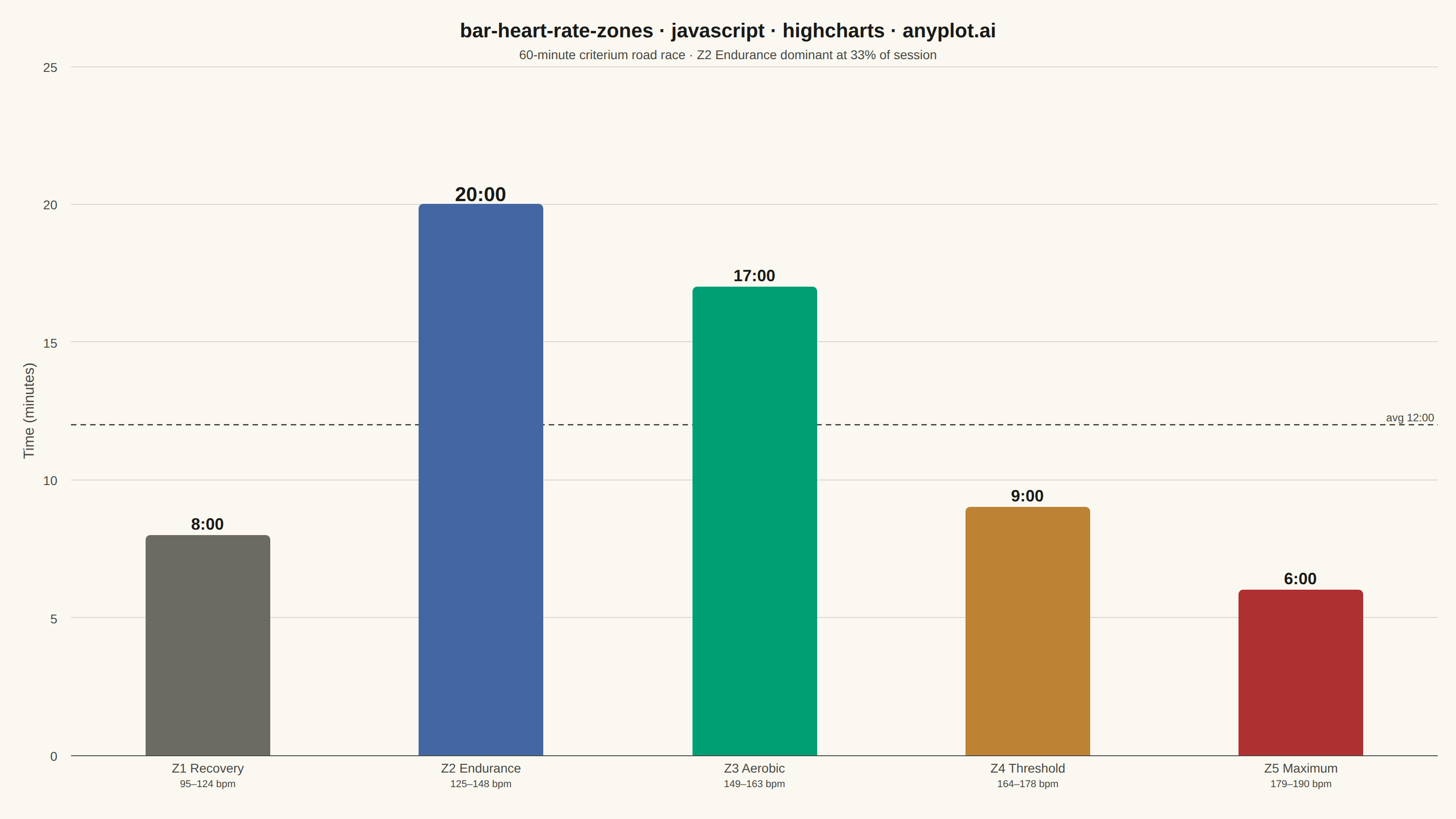
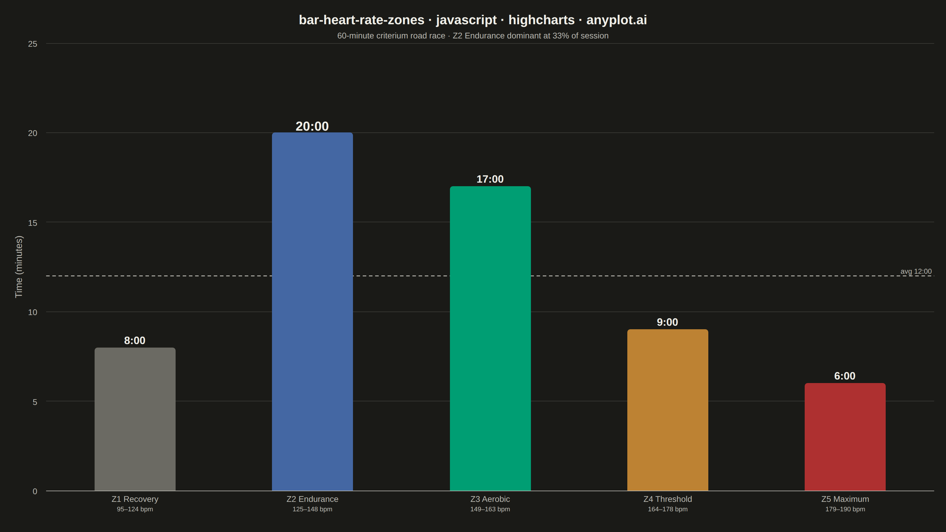
A vertical bar chart showing the time spent in each heart rate training zone (Z1–Z5) during a workout or training period. Each bar uses the conventional zone color semantics (grey for Z1 recovery, blue for Z2 endurance, green for Z3 aerobic, orange for Z4 threshold, red for Z5 maximum) and is annotated with its duration, making the distribution of training intensity immediately readable. This is the standard summary chart found in fitness platforms such as Garmin, Strava, and Polar, and it reveals at a glance whether a session was easy, balanced, or high-intensity.
// anyplot.ai
// bar-heart-rate-zones: Time in Heart Rate Zones Bar Chart
// Library: highcharts 12.6.0 | JavaScript 22.22.3
// Quality: 91/100 | Created: 2026-06-14
//# anyplot-orientation: landscape

const t = window.ANYPLOT_TOKENS;

// Zone colors follow fitness convention (semantic exception to ordinal Imprint order):
// Z1 static #6B6A63 (grey/recovery — same in both themes, satisfies data-colors-identical rule),
// Z2 blue, Z3 brand green, Z4 ochre, Z5 red
const categories = [
    'Z1 Recovery<br><span style="font-size:11px">95–124 bpm</span>',
    'Z2 Endurance<br><span style="font-size:11px">125–148 bpm</span>',
    'Z3 Aerobic<br><span style="font-size:11px">149–163 bpm</span>',
    'Z4 Threshold<br><span style="font-size:11px">164–178 bpm</span>',
    'Z5 Maximum<br><span style="font-size:11px">179–190 bpm</span>',
];

Highcharts.chart("container", {
    chart: {
        type: "column",
        backgroundColor: "transparent",
        animation: false,
        style: { fontFamily: "inherit" },
        spacingTop: 24,
        spacingBottom: 32,
        spacingLeft: 20,
        spacingRight: 20,
    },
    credits: { enabled: false },
    title: {
        text: "bar-heart-rate-zones · javascript · highcharts · anyplot.ai",
        style: { color: t.ink, fontSize: "22px", fontWeight: "600" },
        margin: 8,
    },
    subtitle: {
        text: "60-minute criterium road race · Z2 Endurance dominant at 33% of session",
        style: { color: t.inkSoft, fontSize: "14px" },
        margin: 20,
    },
    xAxis: {
        categories,
        lineColor: t.inkSoft,
        tickColor: "transparent",
        labels: {
            useHTML: true,
            style: { color: t.inkSoft, fontSize: "14px", textAlign: "center" },
            y: 20,
        },
        gridLineWidth: 0,
    },
    yAxis: {
        title: {
            text: "Time (minutes)",
            style: { color: t.inkSoft, fontSize: "16px" },
        },
        gridLineColor: t.grid,
        labels: { style: { color: t.inkSoft, fontSize: "14px" } },
        min: 0,
        tickInterval: 5,
        // Reference line at session mean (60 min ÷ 5 zones = 12 min avg)
        plotLines: [{
            value: 12,
            color: t.inkSoft,
            dashStyle: "Dash",
            width: 1.5,
            label: {
                text: "avg 12:00",
                style: { color: t.inkSoft, fontSize: "12px" },
                align: "right",
                x: -4,
            },
            zIndex: 3,
        }],
    },
    legend: { enabled: false },
    tooltip: { enabled: false },
    plotOptions: {
        series: { animation: false },
        column: {
            borderWidth: 0,
            borderRadius: 5,
            pointPadding: 0.12,
            groupPadding: 0.2,
            dataLabels: {
                enabled: true,
                formatter: function () {
                    const m = Math.floor(this.y);
                    const s = Math.round((this.y % 1) * 60);
                    return `${m}:${String(s).padStart(2, "0")}`;
                },
                style: {
                    color: t.ink,
                    fontSize: "18px",
                    fontWeight: "700",
                    textOutline: "none",
                },
                verticalAlign: "top",
                y: -28,
            },
        },
    },
    series: [{
        name: "Time in Zone",
        colorByPoint: true,
        data: [
            { y: 8,  color: "#6B6A63" },
            // Z2 is the dominant zone — larger label emphasises the focal insight
            { y: 20, color: "#4467A3", dataLabels: { style: { fontSize: "22px", fontWeight: "800" } } },
            { y: 17, color: "#009E73" },
            { y: 9,  color: "#BD8233" },
            { y: 6,  color: "#AE3030" },
        ],
    }],
});
Runnable source as JSON, for any HTTP client: https://api.anyplot.ai/specs/bar-heart-rate-zones/highcharts/code. Any spec id and library id listed in llms-full.txt fit the same URL shape; every URL below is complete and callable.
{
  "spec_id": "bar-heart-rate-zones",
  "language": "javascript",
  "library": "highcharts",
  "page": "https://anyplot.ai/bar-heart-rate-zones/javascript/highcharts",
  "hub": "https://anyplot.ai/bar-heart-rate-zones",
  "code_json": "https://api.anyplot.ai/specs/bar-heart-rate-zones/highcharts/code",
  "spec_json": "https://api.anyplot.ai/specs/bar-heart-rate-zones",
  "render_light_png": "https://storage.googleapis.com/anyplot-images/plots/bar-heart-rate-zones/javascript/highcharts/plot-light.png",
  "render_dark_png": "https://storage.googleapis.com/anyplot-images/plots/bar-heart-rate-zones/javascript/highcharts/plot-dark.png",
  "interactive_light_html": "https://storage.googleapis.com/anyplot-images/plots/bar-heart-rate-zones/javascript/highcharts/plot-light.html",
  "interactive_dark_html": "https://storage.googleapis.com/anyplot-images/plots/bar-heart-rate-zones/javascript/highcharts/plot-dark.html",
  "quality_score": 91.0,
  "license": "MIT",
  "guide": "https://anyplot.ai/llms.txt"
}
Part of Time in Heart Rate Zones Bar Chart on anyplot.ai.