The same plot in 14 other libraries — JavaScript: Chart.js, D3.js, Highcharts, MUI X Charts; Python: Altair, Bokeh, lets-plot, Matplotlib, Plotly, plotnine, Pygal, Seaborn; R: ggplot2; Julia: Makie.jl. Compare all 15 side by side: Cumulative Gains Chart in Python, R, Julia and JavaScript.
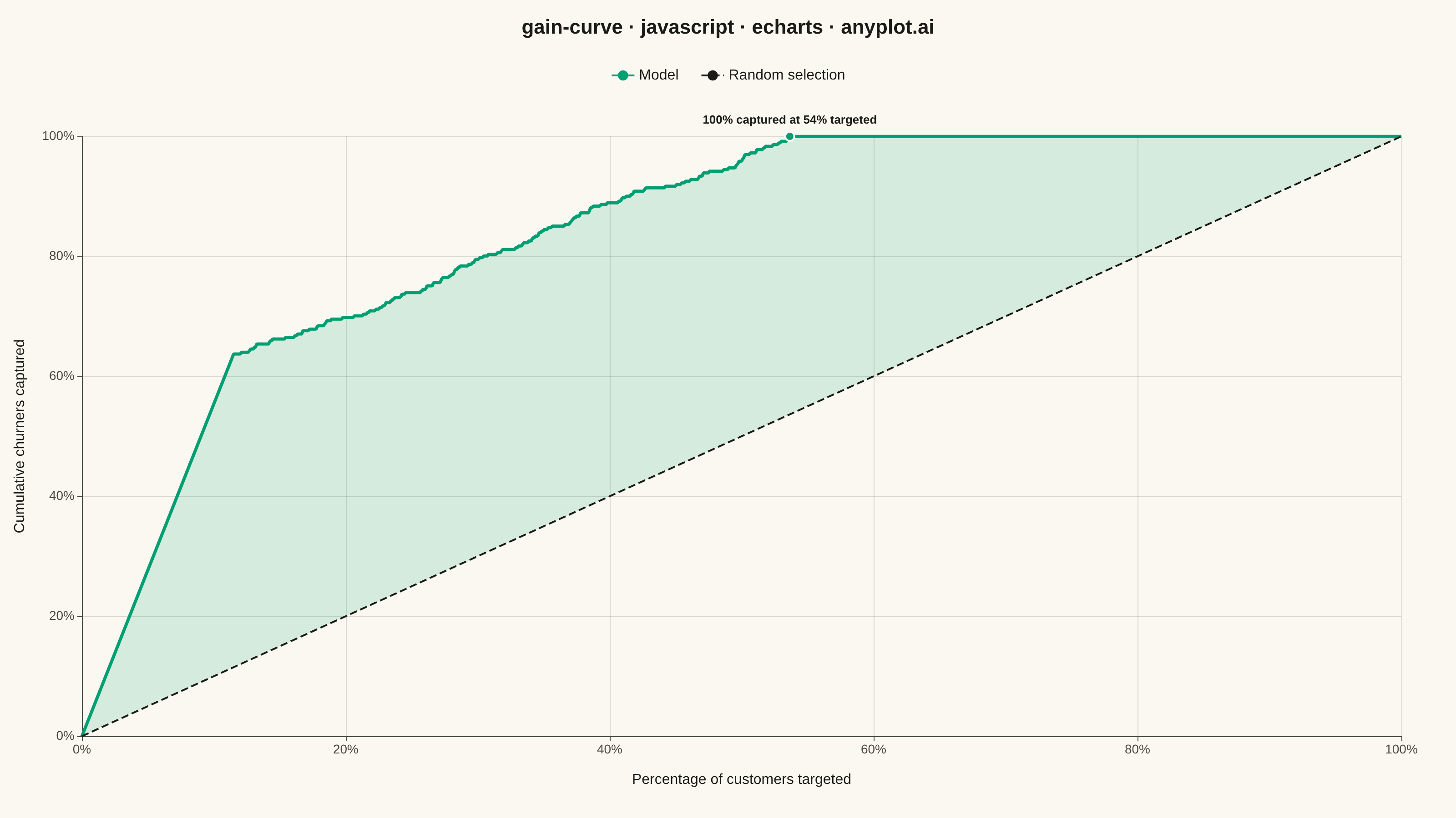
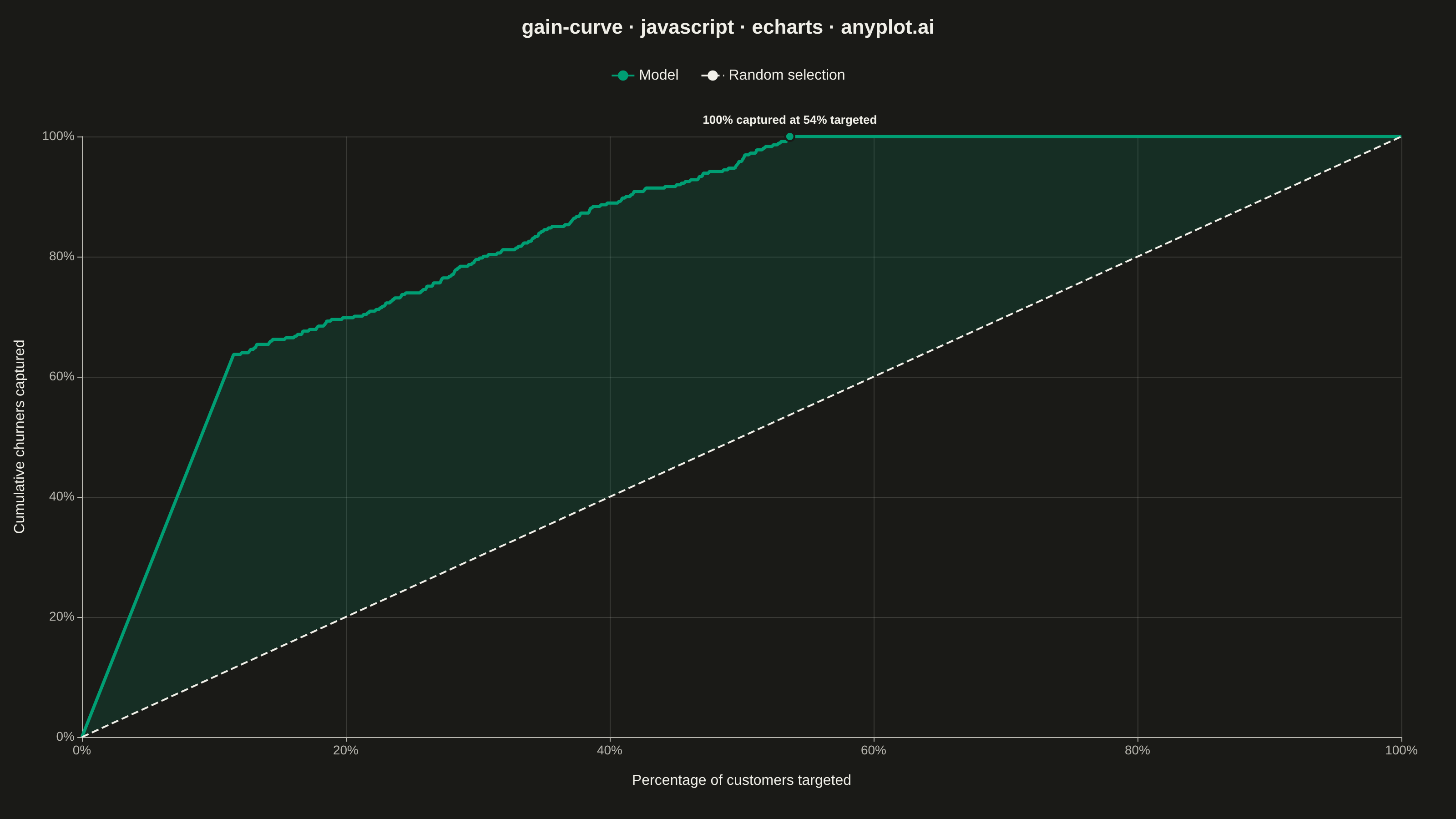
A cumulative gains chart visualizes the effectiveness of a classification model by showing what percentage of positive cases is captured when targeting increasing percentages of the population, ranked by predicted probability. It answers the question: "If I target the top X% of my predictions, what percentage of all actual positives will I capture?" This plot is essential for evaluating targeting strategies in marketing, risk assessment, and resource allocation scenarios.
// anyplot.ai
// gain-curve: Cumulative Gains Chart
// Library: echarts 6.1.0 | JavaScript 22.23.2
// Quality: 89/100 | Created: 2026-09-05

const t = window.ANYPLOT_TOKENS;

// --- Data (in-memory, deterministic) -----------------------------------------
// Fixed-seed LCG — the browser has no seeded RNG.
function makeLcg(seed) {
  let state = seed;
  return () => {
    state = (state * 1664525 + 1013904223) >>> 0;
    return state / 4294967296;
  };
}
const rand = makeLcg(42);

// Simulated churn-prediction model: 2000 customers, ~18% actually churned.
// The model score correlates with the true outcome but overlaps realistically.
const sampleCount = 2000;
const churnRate = 0.18;
const customers = [];
for (let i = 0; i < sampleCount; i++) {
  const churned = rand() < churnRate ? 1 : 0;
  const score = churned
    ? 0.35 + 0.65 * rand()
    : 0.05 + 0.55 * rand();
  customers.push({ churned, score });
}

customers.sort((a, b) => b.score - a.score);

const totalPositives = customers.reduce((sum, c) => sum + c.churned, 0);
const modelCurve = [[0, 0]];
let capturedPositives = 0;
for (let i = 0; i < customers.length; i++) {
  capturedPositives += customers[i].churned;
  const targetedPct = ((i + 1) / sampleCount) * 100;
  const capturedPct = (capturedPositives / totalPositives) * 100;
  modelCurve.push([targetedPct, capturedPct]);
}

// The random-selection baseline is the identity line y = x, so the gap
// between it and the model curve at any targeted % is simply (captured - targeted).
// Stacking an invisible "lower" series (= the baseline value) with a
// transparent-line/filled "diff" series on top shades exactly that gap —
// the chart's core "gain" insight — without needing per-point interpolation.
const gainBandLower = modelCurve.map(([x]) => [x, x]);
const gainBandDiff = modelCurve.map(([x, y]) => [x, Math.max(y - x, 0)]);

// Elbow annotation: first point where the model has captured all positives.
let elbowIndex = modelCurve.findIndex(([, y]) => y >= 100);
if (elbowIndex === -1) elbowIndex = modelCurve.length - 1;
const elbowPoint = modelCurve[elbowIndex];

// --- Init ---------------------------------------------------------------------
const chart = echarts.init(document.getElementById("container"));

// --- Option ---------------------------------------------------------------------
chart.setOption({
  animation: false,
  color: t.palette,
  backgroundColor: "transparent",
  title: {
    text: "gain-curve · javascript · echarts · anyplot.ai",
    left: "center",
    textStyle: { color: t.ink, fontSize: 22 },
  },
  legend: {
    data: ["Model", "Random selection"],
    top: 70,
    itemGap: 24,
    textStyle: { color: t.ink, fontSize: 16 },
  },
  tooltip: {
    trigger: "axis",
    valueFormatter: (value) => `${value.toFixed(1)}%`,
  },
  grid: { left: 90, right: 60, top: 150, bottom: 90 },
  xAxis: {
    type: "value",
    name: "Percentage of customers targeted",
    nameLocation: "middle",
    nameGap: 40,
    nameTextStyle: { color: t.ink, fontSize: 16 },
    min: 0,
    max: 100,
    axisLabel: { color: t.inkSoft, fontSize: 14, formatter: "{value}%" },
    axisLine: { lineStyle: { color: t.inkSoft } },
    splitLine: { lineStyle: { color: t.grid } },
  },
  yAxis: {
    type: "value",
    name: "Cumulative churners captured",
    nameLocation: "middle",
    nameGap: 60,
    nameTextStyle: { color: t.ink, fontSize: 16 },
    min: 0,
    max: 100,
    axisLabel: { color: t.inkSoft, fontSize: 14, formatter: "{value}%" },
    axisLine: { lineStyle: { color: t.inkSoft } },
    splitLine: { lineStyle: { color: t.grid } },
  },
  series: [
    {
      name: "__gain-band-lower",
      type: "line",
      data: gainBandLower,
      symbol: "none",
      silent: true,
      stack: "gain-band",
      lineStyle: { opacity: 0 },
      tooltip: { show: false },
      z: 0,
    },
    {
      name: "__gain-band-diff",
      type: "line",
      data: gainBandDiff,
      symbol: "none",
      silent: true,
      stack: "gain-band",
      lineStyle: { opacity: 0 },
      areaStyle: { color: t.palette[0], opacity: 0.15 },
      tooltip: { show: false },
      z: 0,
    },
    {
      // Empty data: the visible diagonal comes from markLine below. Keeping
      // the series (rather than a plain second line) gives ECharts a named
      // legend entry while the reference line itself is drawn via markLine.
      name: "Random selection",
      type: "line",
      data: [],
      symbol: "none",
      color: t.ink,
      lineStyle: { color: t.ink, width: 2, type: "dashed" },
      z: 1,
      markLine: {
        symbol: "none",
        silent: true,
        lineStyle: { color: t.ink, width: 2, type: "dashed" },
        label: { show: false },
        data: [[{ coord: [0, 0] }, { coord: [100, 100] }]],
      },
    },
    {
      name: "Model",
      type: "line",
      data: modelCurve,
      symbol: "none",
      color: t.palette[0],
      lineStyle: { color: t.palette[0], width: 3.5 },
      z: 2,
      markPoint: {
        symbol: "circle",
        symbolSize: 10,
        itemStyle: { color: t.palette[0], borderColor: t.pageBg, borderWidth: 2 },
        label: {
          color: t.ink,
          fontSize: 13,
          fontWeight: "bold",
          position: "top",
          formatter: () => `100% captured at ${elbowPoint[0].toFixed(0)}% targeted`,
        },
        data: [{ coord: elbowPoint }],
      },
    },
  ],
});
Runnable source as JSON, for any HTTP client: https://api.anyplot.ai/specs/gain-curve/echarts/code. Any spec id and library id listed in llms-full.txt fit the same URL shape; every URL below is complete and callable.
{
  "spec_id": "gain-curve",
  "language": "javascript",
  "library": "echarts",
  "page": "https://anyplot.ai/gain-curve/javascript/echarts",
  "hub": "https://anyplot.ai/gain-curve",
  "code_json": "https://api.anyplot.ai/specs/gain-curve/echarts/code",
  "spec_json": "https://api.anyplot.ai/specs/gain-curve",
  "render_light_png": "https://storage.googleapis.com/anyplot-images/plots/gain-curve/javascript/echarts/plot-light.png",
  "render_dark_png": "https://storage.googleapis.com/anyplot-images/plots/gain-curve/javascript/echarts/plot-dark.png",
  "interactive_light_html": "https://storage.googleapis.com/anyplot-images/plots/gain-curve/javascript/echarts/plot-light.html",
  "interactive_dark_html": "https://storage.googleapis.com/anyplot-images/plots/gain-curve/javascript/echarts/plot-dark.html",
  "quality_score": 89.0,
  "license": "MIT",
  "guide": "https://anyplot.ai/llms.txt"
}
Part of Cumulative Gains Chart on anyplot.ai.