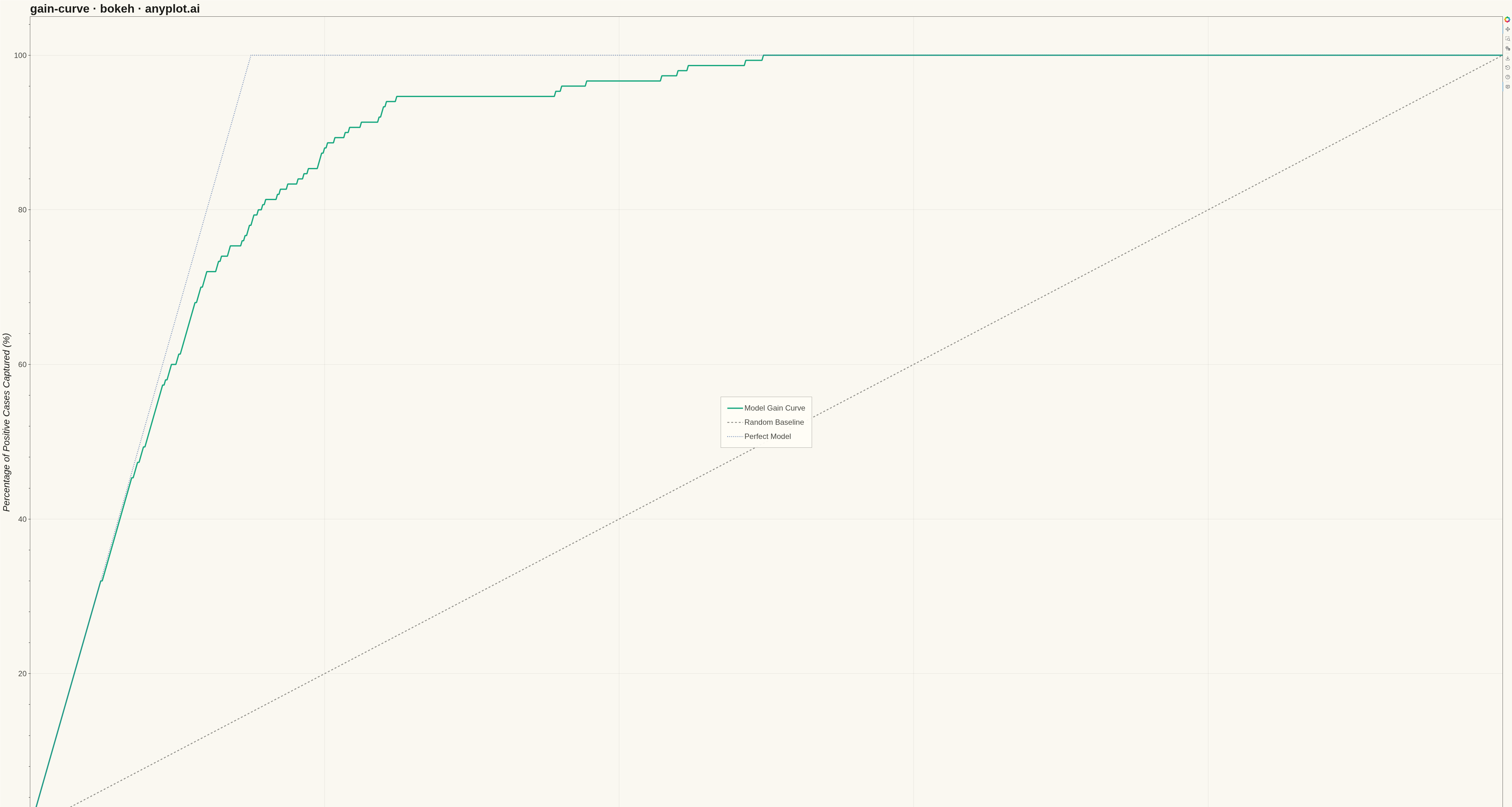
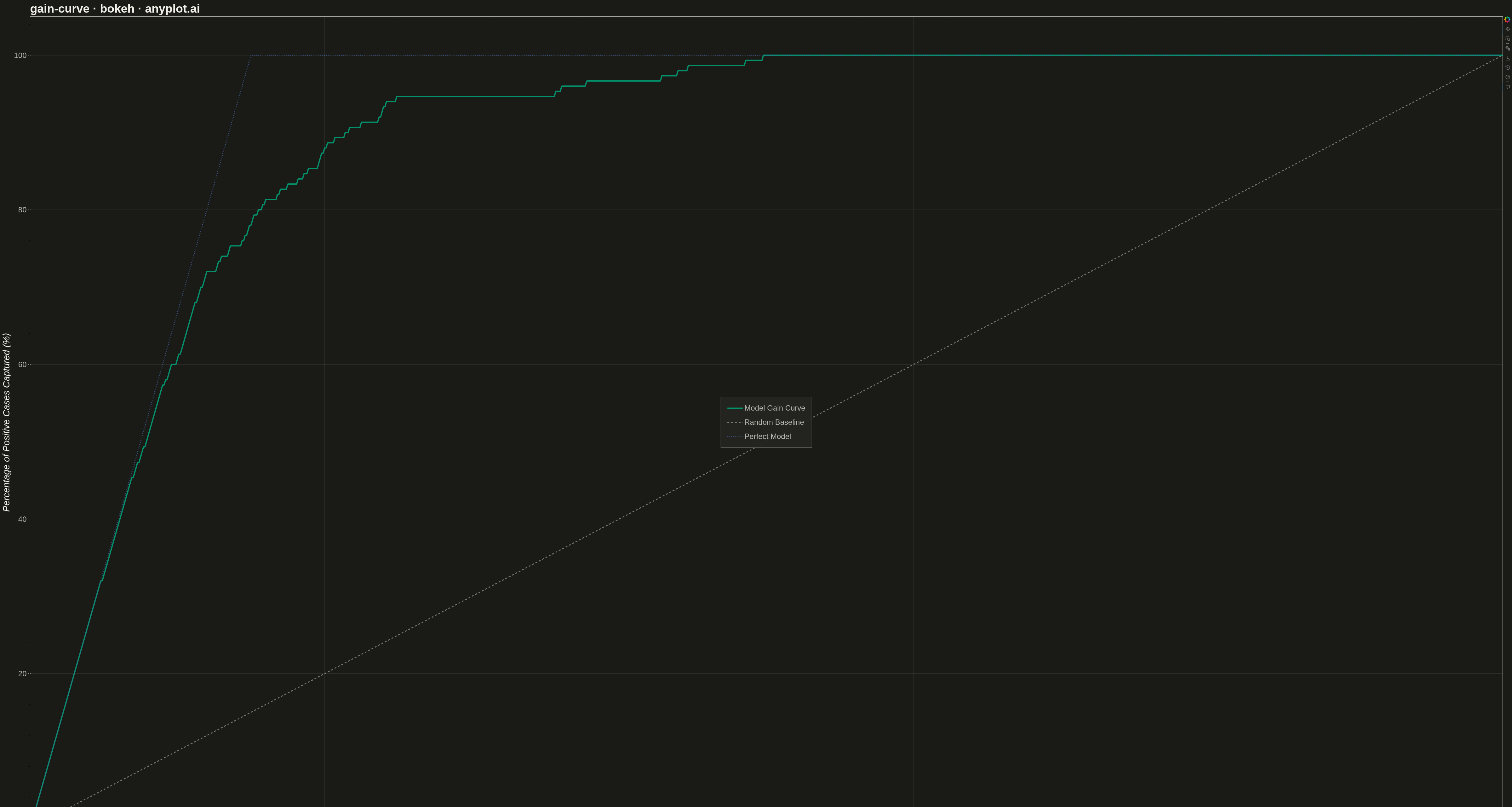
A cumulative gains chart visualizes the effectiveness of a classification model by showing what percentage of positive cases is captured when targeting increasing percentages of the population, ranked by predicted probability. It answers the question: "If I target the top X% of my predictions, what percentage of all actual positives will I capture?" This plot is essential for evaluating targeting strategies in marketing, risk assessment, and resource allocation scenarios.
""" anyplot.ai
gain-curve: Cumulative Gains Chart
Library: bokeh 3.9.0 | Python 3.13.13
Quality: 94/100 | Updated: 2026-05-11
"""

import os
import time
from pathlib import Path

import numpy as np
from bokeh.io import output_file, save
from bokeh.models import ColumnDataSource, HoverTool
from bokeh.plotting import figure
from selenium import webdriver
from selenium.webdriver.chrome.options import Options


# Theme tokens
THEME = os.getenv("ANYPLOT_THEME", "light")
PAGE_BG = "#FAF8F1" if THEME == "light" else "#1A1A17"
ELEVATED_BG = "#FFFDF6" if THEME == "light" else "#242420"
INK = "#1A1A17" if THEME == "light" else "#F0EFE8"
INK_SOFT = "#4A4A44" if THEME == "light" else "#B8B7B0"

# Okabe-Ito palette
BRAND = "#009E73"  # First series
SECONDARY = "#4467A3"  # imprint blue — perfect-model reference (red reserved for semantic bad)
NEUTRAL = "#888888"  # Adaptive gray for reference

# Data - Simulated customer response model
np.random.seed(42)
n_samples = 1000

# Generate realistic probability scores from a classification model
positive_ratio = 0.15
n_positive = int(n_samples * positive_ratio)
n_negative = n_samples - n_positive

# Scores for positive cases (skewed towards higher probabilities)
positive_scores = np.random.beta(5, 2, n_positive)
# Scores for negative cases (skewed towards lower probabilities)
negative_scores = np.random.beta(2, 5, n_negative)

y_true = np.concatenate([np.ones(n_positive), np.zeros(n_negative)])
y_score = np.concatenate([positive_scores, negative_scores])

# Shuffle to mix positives and negatives
shuffle_idx = np.random.permutation(n_samples)
y_true = y_true[shuffle_idx]
y_score = y_score[shuffle_idx]

# Calculate cumulative gains curve
# Sort by predicted probability (descending)
sorted_idx = np.argsort(y_score)[::-1]
y_true_sorted = y_true[sorted_idx]

# Cumulative gains
cumulative_positives = np.cumsum(y_true_sorted)
total_positives = np.sum(y_true)

# Percentages for axes
pct_population = np.arange(1, n_samples + 1) / n_samples * 100
pct_captured = cumulative_positives / total_positives * 100

# Add origin point for complete curve
pct_population = np.insert(pct_population, 0, 0)
pct_captured = np.insert(pct_captured, 0, 0)

# Random baseline (diagonal line)
baseline = np.array([0, 100])

# Perfect model curve
positive_pct = positive_ratio * 100
perfect_x = np.array([0, positive_pct, 100])
perfect_y = np.array([0, 100, 100])

# Create figure
p = figure(
    width=4800,
    height=2700,
    title="gain-curve · bokeh · anyplot.ai",
    x_axis_label="Percentage of Population Targeted (%)",
    y_axis_label="Percentage of Positive Cases Captured (%)",
    x_range=(0, 100),
    y_range=(0, 105),
)

# Create data sources
source_model = ColumnDataSource(data={"x": pct_population, "y": pct_captured})
source_baseline = ColumnDataSource(data={"x": baseline, "y": baseline})
source_perfect = ColumnDataSource(data={"x": perfect_x, "y": perfect_y})

# Plot the curves
# Model gain curve (brand green - primary series)
model_line = p.line(
    x="x", y="y", source=source_model, line_color=BRAND, line_width=4, line_alpha=0.9, legend_label="Model Gain Curve"
)

# Random baseline (neutral gray)
baseline_line = p.line(
    x="x",
    y="y",
    source=source_baseline,
    line_color=INK_SOFT,
    line_width=3,
    line_dash="dashed",
    line_alpha=0.6,
    legend_label="Random Baseline",
)

# Perfect model (secondary color)
perfect_line = p.line(
    x="x",
    y="y",
    source=source_perfect,
    line_color=SECONDARY,
    line_width=3,
    line_dash="dotted",
    line_alpha=0.8,
    legend_label="Perfect Model",
)

# Add hover tool for interactivity
hover_model = HoverTool(renderers=[model_line], tooltips=[("Population %", "@x{0.0}"), ("Captured %", "@y{0.0}")])
hover_baseline = HoverTool(renderers=[baseline_line], tooltips=[("Population %", "@x{0.0}"), ("Baseline %", "@y{0.0}")])
hover_perfect = HoverTool(renderers=[perfect_line], tooltips=[("Population %", "@x{0.0}"), ("Perfect %", "@y{0.0}")])
p.add_tools(hover_model, hover_baseline, hover_perfect)

# Style legend
if p.legend:
    p.legend.background_fill_color = ELEVATED_BG
    p.legend.border_line_color = INK_SOFT
    p.legend.border_line_width = 1
    p.legend.label_text_color = INK_SOFT
    p.legend.label_text_font_size = "18pt"
    p.legend.glyph_height = 30
    p.legend.glyph_width = 50
    p.legend.spacing = 15
    p.legend.padding = 20
    p.legend.location = "center"

# Styling
p.title.text_font_size = "28pt"
p.title.text_color = INK
p.xaxis.axis_label_text_font_size = "22pt"
p.yaxis.axis_label_text_font_size = "22pt"
p.xaxis.axis_label_text_color = INK
p.yaxis.axis_label_text_color = INK
p.xaxis.major_label_text_font_size = "18pt"
p.yaxis.major_label_text_font_size = "18pt"
p.xaxis.major_label_text_color = INK_SOFT
p.yaxis.major_label_text_color = INK_SOFT

# Grid styling
p.xgrid.grid_line_alpha = 0.10
p.ygrid.grid_line_alpha = 0.10
p.xgrid.grid_line_color = INK
p.ygrid.grid_line_color = INK
p.xaxis.axis_line_color = INK_SOFT
p.yaxis.axis_line_color = INK_SOFT
p.xaxis.major_tick_line_color = INK_SOFT
p.yaxis.major_tick_line_color = INK_SOFT

# Background
p.background_fill_color = PAGE_BG
p.border_fill_color = PAGE_BG
p.outline_line_color = INK_SOFT

# Save HTML and screenshot with Selenium
output_file(f"plot-{THEME}.html")
save(p)

# Screenshot with headless Chrome
W, H = 4800, 2700
opts = Options()
for arg in (
    "--headless=new",
    "--no-sandbox",
    "--disable-dev-shm-usage",
    "--disable-gpu",
    f"--window-size={W},{H}",
    "--hide-scrollbars",
):
    opts.add_argument(arg)
driver = webdriver.Chrome(options=opts)
driver.set_window_size(W, H)
driver.get(f"file://{Path(f'plot-{THEME}.html').resolve()}")
time.sleep(3)
driver.save_screenshot(f"plot-{THEME}.png")
driver.quit()
Runnable source as JSON, for any HTTP client: https://api.anyplot.ai/specs/gain-curve/bokeh/code. Any spec id and library id listed in llms-full.txt fit the same URL shape; every URL below is complete and callable.
{
  "spec_id": "gain-curve",
  "language": "python",
  "library": "bokeh",
  "page": "https://anyplot.ai/gain-curve/python/bokeh",
  "hub": "https://anyplot.ai/gain-curve",
  "code_json": "https://api.anyplot.ai/specs/gain-curve/bokeh/code",
  "spec_json": "https://api.anyplot.ai/specs/gain-curve",
  "render_light_png": "https://storage.googleapis.com/anyplot-images/plots/gain-curve/python/bokeh/plot-light.png",
  "render_dark_png": "https://storage.googleapis.com/anyplot-images/plots/gain-curve/python/bokeh/plot-dark.png",
  "interactive_light_html": "https://storage.googleapis.com/anyplot-images/plots/gain-curve/python/bokeh/plot-light.html",
  "interactive_dark_html": "https://storage.googleapis.com/anyplot-images/plots/gain-curve/python/bokeh/plot-dark.html",
  "quality_score": 94.0,
  "license": "MIT",
  "guide": "https://anyplot.ai/llms.txt"
}
Part of Cumulative Gains Chart on anyplot.ai.