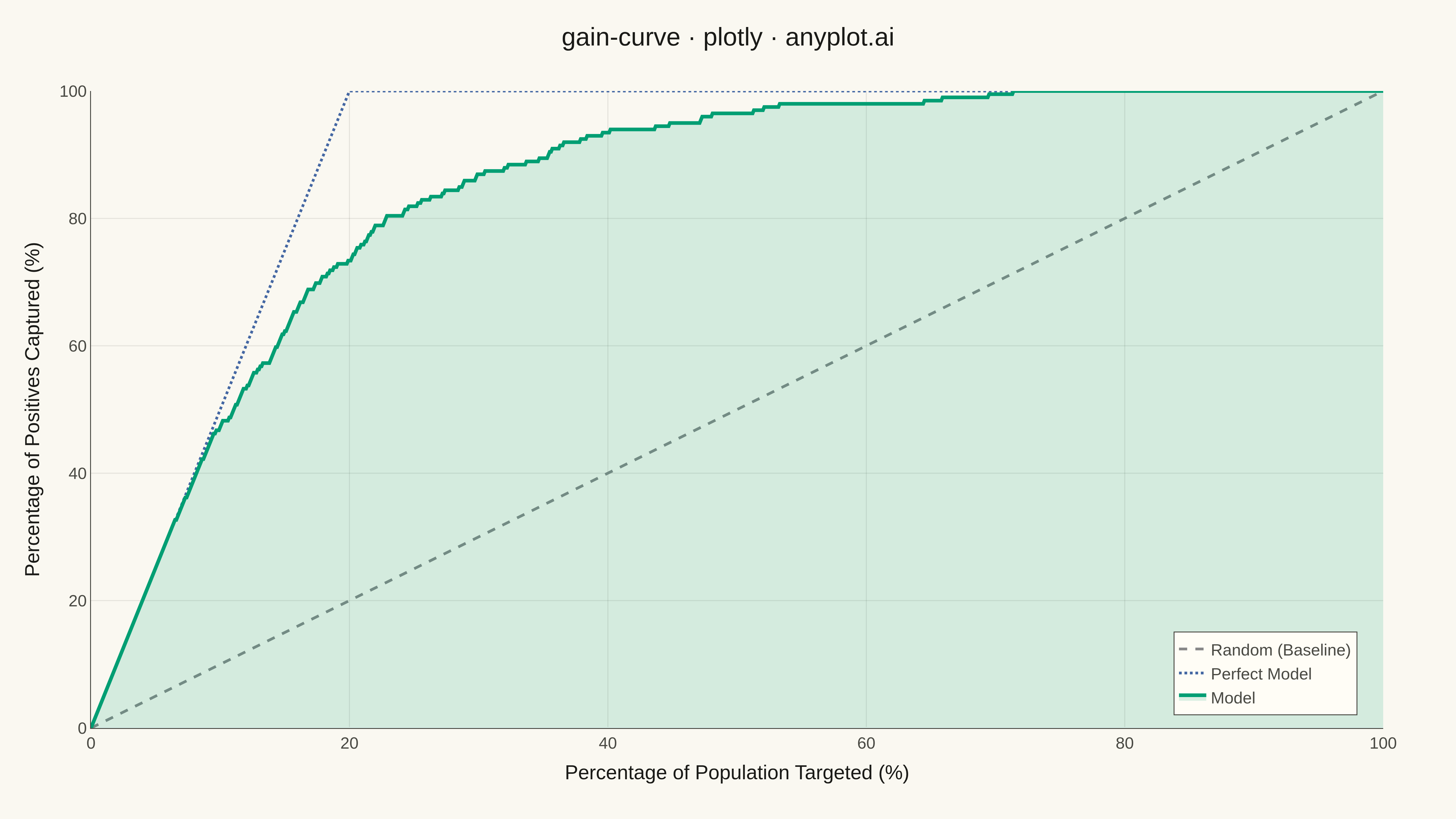
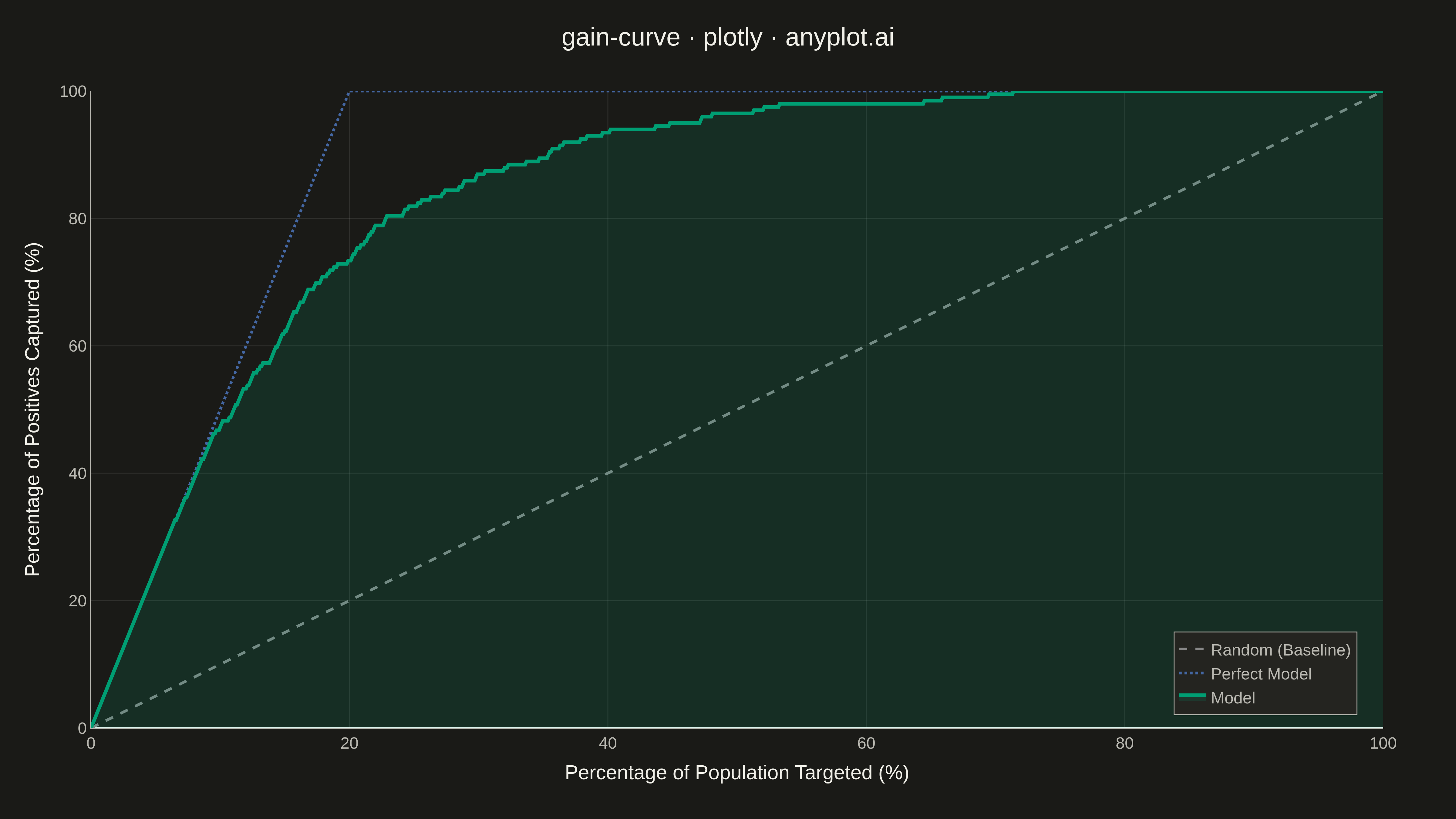
A cumulative gains chart visualizes the effectiveness of a classification model by showing what percentage of positive cases is captured when targeting increasing percentages of the population, ranked by predicted probability. It answers the question: "If I target the top X% of my predictions, what percentage of all actual positives will I capture?" This plot is essential for evaluating targeting strategies in marketing, risk assessment, and resource allocation scenarios.
""" anyplot.ai
gain-curve: Cumulative Gains Chart
Library: plotly 6.7.0 | Python 3.13.13
Quality: 94/100 | Updated: 2026-05-11
"""

import os

import numpy as np
import plotly.graph_objects as go


# Theme tokens
THEME = os.getenv("ANYPLOT_THEME", "light")
PAGE_BG = "#FAF8F1" if THEME == "light" else "#1A1A17"
ELEVATED_BG = "#FFFDF6" if THEME == "light" else "#242420"
INK = "#1A1A17" if THEME == "light" else "#F0EFE8"
INK_SOFT = "#4A4A44" if THEME == "light" else "#B8B7B0"
GRID = "rgba(26,26,23,0.10)" if THEME == "light" else "rgba(240,239,232,0.10)"

# Okabe-Ito palette
BRAND = "#009E73"  # First series — always
BASELINE = "#888888"  # Neutral for reference
PERFECT = "#4467A3"  # imprint blue — neutral reference for perfect model (red is reserved for semantic bad)

# Data - Customer response model evaluation
np.random.seed(42)
n_samples = 1000

# Simulate a classification model with moderate discrimination
positive_rate = 0.20
y_true = np.random.binomial(1, positive_rate, n_samples)

# Generate predicted scores that correlate with true labels
y_score = np.where(
    y_true == 1,
    np.random.beta(5, 2, n_samples),  # Positives: skewed toward higher scores
    np.random.beta(2, 5, n_samples),  # Negatives: skewed toward lower scores
)
y_score = np.clip(y_score + np.random.normal(0, 0.1, n_samples), 0, 1)

# Calculate cumulative gains
sorted_indices = np.argsort(y_score)[::-1]
y_true_sorted = y_true[sorted_indices]

cumulative_positives = np.cumsum(y_true_sorted)
total_positives = y_true.sum()

pct_population = np.arange(1, n_samples + 1) / n_samples * 100
pct_positives_captured = cumulative_positives / total_positives * 100

# Add origin point
pct_population = np.insert(pct_population, 0, 0)
pct_positives_captured = np.insert(pct_positives_captured, 0, 0)

# Perfect model curve
pct_for_perfect = positive_rate * 100
perfect_x = [0, pct_for_perfect, 100]
perfect_y = [0, 100, 100]

# Plot
fig = go.Figure()

# Random baseline (diagonal)
fig.add_trace(
    go.Scatter(
        x=[0, 100],
        y=[0, 100],
        mode="lines",
        name="Random (Baseline)",
        line=dict(color=BASELINE, width=3, dash="dash"),
        hovertemplate="Baseline<br>Population: %{x:.1f}%<br>Positives: %{y:.1f}%<extra></extra>",
    )
)

# Perfect model
fig.add_trace(
    go.Scatter(
        x=perfect_x,
        y=perfect_y,
        mode="lines",
        name="Perfect Model",
        line=dict(color=PERFECT, width=3, dash="dot"),
        hovertemplate="Perfect<br>Population: %{x:.1f}%<br>Positives: %{y:.1f}%<extra></extra>",
    )
)

# Model gains curve
fig.add_trace(
    go.Scatter(
        x=pct_population,
        y=pct_positives_captured,
        mode="lines",
        name="Model",
        line=dict(color=BRAND, width=4),
        fill="tozeroy",
        fillcolor="rgba(0, 158, 115, 0.15)",
        hovertemplate="Model<br>Population: %{x:.1f}%<br>Positives: %{y:.1f}%<extra></extra>",
    )
)

# Layout
fig.update_layout(
    title=dict(text="gain-curve · plotly · anyplot.ai", font=dict(size=28, color=INK), x=0.5, xanchor="center"),
    xaxis=dict(
        title=dict(text="Percentage of Population Targeted (%)", font=dict(size=22, color=INK)),
        tickfont=dict(size=18, color=INK_SOFT),
        range=[0, 100],
        dtick=20,
        showgrid=True,
        gridcolor=GRID,
        linecolor=INK_SOFT,
    ),
    yaxis=dict(
        title=dict(text="Percentage of Positives Captured (%)", font=dict(size=22, color=INK)),
        tickfont=dict(size=18, color=INK_SOFT),
        range=[0, 100],
        dtick=20,
        showgrid=True,
        gridcolor=GRID,
        linecolor=INK_SOFT,
    ),
    paper_bgcolor=PAGE_BG,
    plot_bgcolor=PAGE_BG,
    legend=dict(
        x=0.98,
        y=0.02,
        xanchor="right",
        yanchor="bottom",
        font=dict(size=18, color=INK_SOFT),
        bgcolor=ELEVATED_BG,
        bordercolor=INK_SOFT,
        borderwidth=1,
    ),
    margin=dict(l=100, r=80, t=100, b=100),
)

# Save
fig.write_image(f"plot-{THEME}.png", width=1600, height=900, scale=3)
fig.write_html(f"plot-{THEME}.html", include_plotlyjs="cdn")
Runnable source as JSON, for any HTTP client: https://api.anyplot.ai/specs/gain-curve/plotly/code. Any spec id and library id listed in llms-full.txt fit the same URL shape; every URL below is complete and callable.
{
  "spec_id": "gain-curve",
  "language": "python",
  "library": "plotly",
  "page": "https://anyplot.ai/gain-curve/python/plotly",
  "hub": "https://anyplot.ai/gain-curve",
  "code_json": "https://api.anyplot.ai/specs/gain-curve/plotly/code",
  "spec_json": "https://api.anyplot.ai/specs/gain-curve",
  "render_light_png": "https://storage.googleapis.com/anyplot-images/plots/gain-curve/python/plotly/plot-light.png",
  "render_dark_png": "https://storage.googleapis.com/anyplot-images/plots/gain-curve/python/plotly/plot-dark.png",
  "interactive_light_html": "https://storage.googleapis.com/anyplot-images/plots/gain-curve/python/plotly/plot-light.html",
  "interactive_dark_html": "https://storage.googleapis.com/anyplot-images/plots/gain-curve/python/plotly/plot-dark.html",
  "quality_score": 94.0,
  "license": "MIT",
  "guide": "https://anyplot.ai/llms.txt"
}
Part of Cumulative Gains Chart on anyplot.ai.