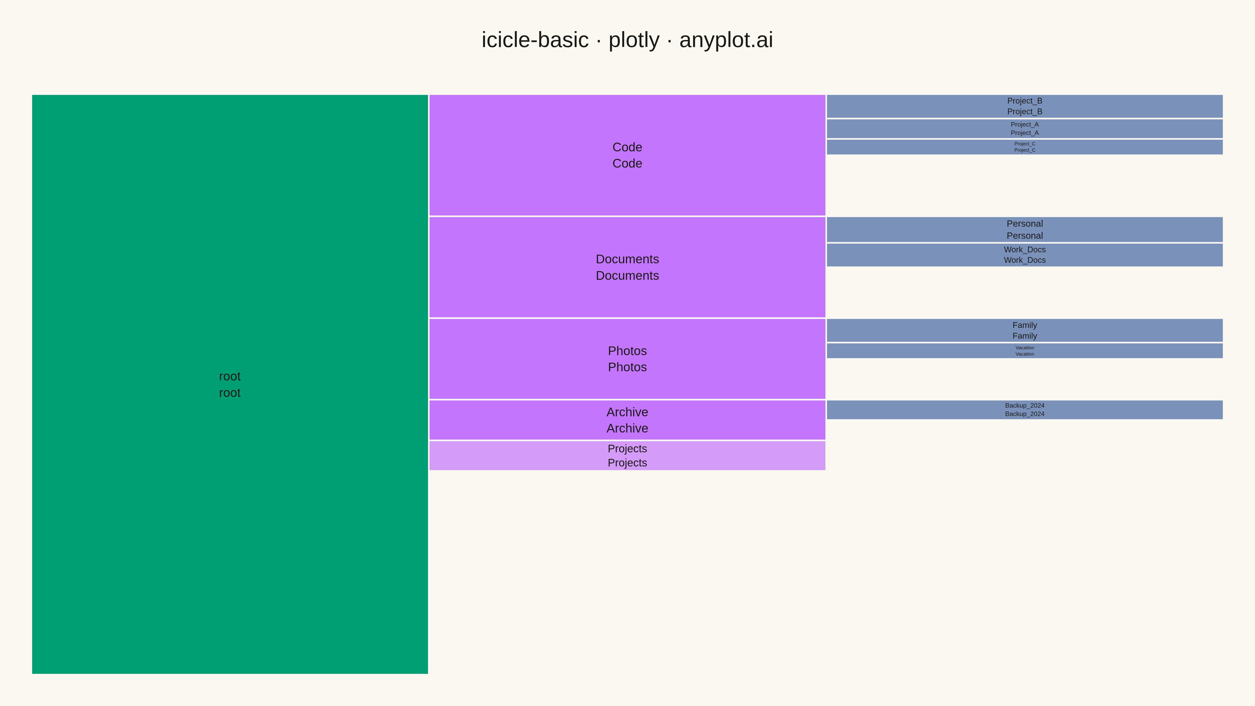
The same plot in 14 other libraries — Python: Altair, Bokeh, lets-plot, Matplotlib, plotnine, Pygal, Seaborn; R: ggplot2; Julia: Makie.jl; JavaScript: Chart.js, D3.js, Apache ECharts, Highcharts, MUI X Charts. Compare all 15 side by side: Basic Icicle Chart in Python, R, Julia and JavaScript.
An icicle chart displaying hierarchical data as adjacent rectangles in a layered structure, where each rectangle's size represents its value in the hierarchy. Unlike treemaps that nest rectangles, icicle charts stack them in rows (horizontal) or columns (vertical), making parent-child relationships explicitly visible through spatial adjacency. This layout excels at showing both the hierarchy levels and the proportional values simultaneously.
""" anyplot.ai
icicle-basic: Basic Icicle Chart
Library: plotly 6.7.0 | Python 3.13.13
Quality: 82/100 | Created: 2026-05-13
"""

import os

import pandas as pd
import plotly.graph_objects as go


THEME = os.getenv("ANYPLOT_THEME", "light")
PAGE_BG = "#FAF8F1" if THEME == "light" else "#1A1A17"
ELEVATED_BG = "#FFFDF6" if THEME == "light" else "#242420"
INK = "#1A1A17" if THEME == "light" else "#F0EFE8"
INK_SOFT = "#4A4A44" if THEME == "light" else "#B8B7B0"
GRID = "rgba(26,26,23,0.10)" if THEME == "light" else "rgba(240,239,232,0.10)"

BRAND = "#009E73"
IMPRINT = ["#009E73", "#C475FD", "#4467A3", "#BD8233", "#AE3030", "#2ABCCD", "#954477"]

# Data - File system hierarchy
data = {
    "name": [
        "root",
        "Documents",
        "Photos",
        "Code",
        "Projects",
        "Archive",
        "Work_Docs",
        "Personal",
        "Vacation",
        "Family",
        "Project_A",
        "Project_B",
        "Project_C",
        "Backup_2024",
    ],
    "parent": [
        "",
        "root",
        "root",
        "root",
        "root",
        "root",
        "Documents",
        "Documents",
        "Photos",
        "Photos",
        "Code",
        "Code",
        "Code",
        "Archive",
    ],
    "value": [100, 25, 20, 30, 15, 10, 12, 13, 8, 12, 10, 12, 8, 10],
}

df = pd.DataFrame(data)


def get_node_level(node, df):
    """Calculate depth level of node in hierarchy"""
    level = 0
    while True:
        parent_row = df[df["name"] == node]
        if len(parent_row) == 0 or parent_row.iloc[0]["parent"] == "":
            return level
        node = parent_row.iloc[0]["parent"]
        level += 1


colors = []
for _, row in df.iterrows():
    level = get_node_level(row["name"], df)
    if level == 0:
        colors.append(BRAND)
    elif level == 1:
        colors.append(IMPRINT[1])
    elif level == 2:
        colors.append(IMPRINT[2])
    else:
        colors.append(IMPRINT[3])

# Create icicle chart
fig = go.Figure(
    go.Icicle(
        labels=df["name"],
        parents=df["parent"],
        values=df["value"],
        marker={"colors": colors, "line": {"color": PAGE_BG, "width": 2}},
        text=df["name"],
        textposition="middle center",
        textfont={"size": 16, "color": INK},
        hovertemplate="<b>%{label}</b><br>Size: %{value}<extra></extra>",
        marker_colorscale=None,
    )
)

fig.update_layout(
    title={
        "text": "icicle-basic · plotly · anyplot.ai",
        "font": {"size": 28, "color": INK},
        "x": 0.5,
        "xanchor": "center",
    },
    paper_bgcolor=PAGE_BG,
    plot_bgcolor=PAGE_BG,
    font={"color": INK, "family": "Arial, sans-serif"},
    margin={"l": 40, "r": 40, "t": 120, "b": 40},
    showlegend=False,
)

# Save
fig.write_image(f"plot-{THEME}.png", width=1600, height=900, scale=3)
fig.write_html(f"plot-{THEME}.html", include_plotlyjs="cdn")
Runnable source as JSON, for any HTTP client: https://api.anyplot.ai/specs/icicle-basic/plotly/code. Any spec id and library id listed in llms-full.txt fit the same URL shape; every URL below is complete and callable.
{
  "spec_id": "icicle-basic",
  "language": "python",
  "library": "plotly",
  "page": "https://anyplot.ai/icicle-basic/python/plotly",
  "hub": "https://anyplot.ai/icicle-basic",
  "code_json": "https://api.anyplot.ai/specs/icicle-basic/plotly/code",
  "spec_json": "https://api.anyplot.ai/specs/icicle-basic",
  "render_light_png": "https://storage.googleapis.com/anyplot-images/plots/icicle-basic/python/plotly/plot-light.png",
  "render_dark_png": "https://storage.googleapis.com/anyplot-images/plots/icicle-basic/python/plotly/plot-dark.png",
  "interactive_light_html": "https://storage.googleapis.com/anyplot-images/plots/icicle-basic/python/plotly/plot-light.html",
  "interactive_dark_html": "https://storage.googleapis.com/anyplot-images/plots/icicle-basic/python/plotly/plot-dark.html",
  "quality_score": 82.0,
  "license": "MIT",
  "guide": "https://anyplot.ai/llms.txt"
}
Part of Basic Icicle Chart on anyplot.ai.