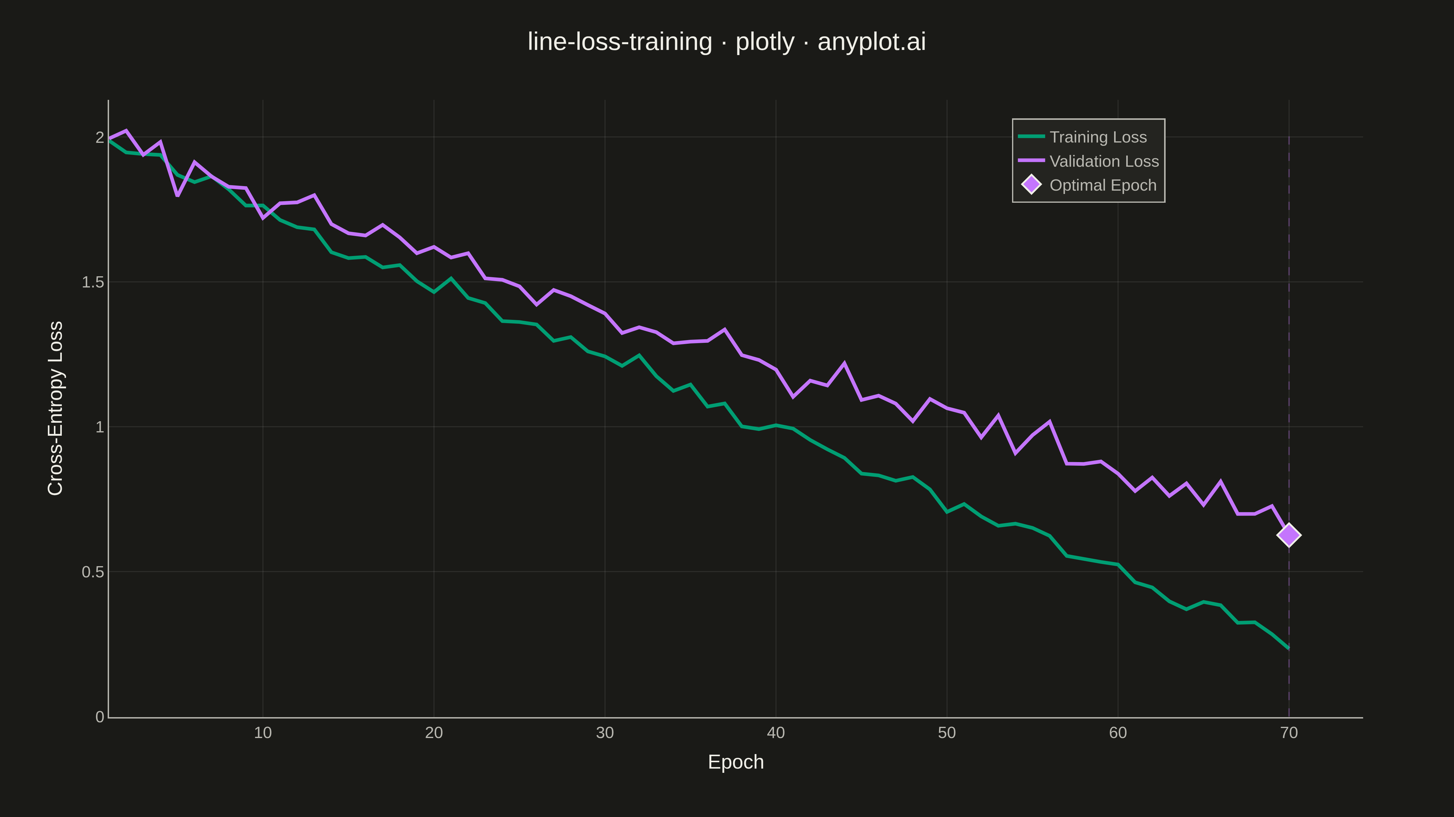
A line plot showing training and validation loss curves over epochs during neural network training. This visualization is essential for monitoring model training, detecting overfitting (when validation loss diverges from training loss), and determining optimal early stopping points. The dual-curve display reveals the gap between training and generalization performance.
""" anyplot.ai
line-loss-training: Training Loss Curve
Library: plotly 6.7.0 | Python 3.13.13
Quality: 91/100 | Updated: 2026-05-14
"""

import os

import numpy as np
import plotly.graph_objects as go


# Theme tokens
THEME = os.getenv("ANYPLOT_THEME", "light")
PAGE_BG = "#FAF8F1" if THEME == "light" else "#1A1A17"
ELEVATED_BG = "#FFFDF6" if THEME == "light" else "#242420"
INK = "#1A1A17" if THEME == "light" else "#F0EFE8"
INK_SOFT = "#4A4A44" if THEME == "light" else "#B8B7B0"
GRID = "rgba(26,26,23,0.10)" if THEME == "light" else "rgba(240,239,232,0.10)"

# Okabe-Ito palette
TRAIN_COLOR = "#009E73"  # Position 1 - bluish green (brand)
VAL_COLOR = "#C475FD"  # Position 2 - vermillion

# Data - Simulated neural network training with different trajectory
np.random.seed(42)
epochs = np.arange(1, 71)  # 70 epochs (differentiate from 100-epoch letsplot)

# Training loss: linear-like decay with small noise, flattens near end
train_base = 2.0 - 0.025 * epochs + np.random.normal(0, 0.025, len(epochs))
train_loss = np.maximum(train_base, 0.1)

# Validation loss: similar pattern but with larger noise and divergence after epoch ~45
val_base = 2.0 - 0.020 * epochs + np.random.normal(0, 0.04, len(epochs))
# Add gentle divergence effect
divergence_effect = np.where(epochs > 45, 0.015 * np.sqrt(np.maximum(epochs - 45, 0)), 0)
val_loss = val_base + divergence_effect
val_loss = np.maximum(val_loss, 0.15)

# Find minimum validation loss epoch
min_val_idx = np.argmin(val_loss)
min_val_epoch = epochs[min_val_idx]
min_val_loss = val_loss[min_val_idx]

# Create figure
fig = go.Figure()

# Training loss curve
fig.add_trace(
    go.Scatter(
        x=epochs,
        y=train_loss,
        mode="lines",
        name="Training Loss",
        line=dict(color=TRAIN_COLOR, width=4),
        hovertemplate="Epoch %{x}<br>Training Loss: %{y:.3f}<extra></extra>",
    )
)

# Validation loss curve
fig.add_trace(
    go.Scatter(
        x=epochs,
        y=val_loss,
        mode="lines",
        name="Validation Loss",
        line=dict(color=VAL_COLOR, width=4),
        hovertemplate="Epoch %{x}<br>Validation Loss: %{y:.3f}<extra></extra>",
    )
)

# Optimal stopping point marker
fig.add_trace(
    go.Scatter(
        x=[min_val_epoch],
        y=[min_val_loss],
        mode="markers",
        name="Optimal Epoch",
        marker=dict(color=VAL_COLOR, size=20, symbol="diamond", line=dict(color=INK, width=2)),
        hovertemplate="Optimal Epoch: %{x}<br>Min Validation Loss: %{y:.3f}<extra></extra>",
    )
)

# Add vertical line at optimal epoch using shape
fig.add_shape(
    type="line",
    x0=min_val_epoch,
    x1=min_val_epoch,
    y0=0,
    y1=max(train_loss.max(), val_loss.max()),
    line=dict(color=VAL_COLOR, width=1.5, dash="dash"),
    opacity=0.3,
)

# Update layout with theme-adaptive styling
fig.update_layout(
    title=dict(text="line-loss-training · plotly · anyplot.ai", font=dict(size=28, color=INK), x=0.5, xanchor="center"),
    xaxis=dict(
        title=dict(text="Epoch", font=dict(size=22, color=INK)),
        tickfont=dict(size=18, color=INK_SOFT),
        gridcolor=GRID,
        gridwidth=1,
        linecolor=INK_SOFT,
        linewidth=1.5,
        zerolinecolor=INK_SOFT,
        zerolinewidth=0,
    ),
    yaxis=dict(
        title=dict(text="Cross-Entropy Loss", font=dict(size=22, color=INK)),
        tickfont=dict(size=18, color=INK_SOFT),
        gridcolor=GRID,
        gridwidth=1,
        linecolor=INK_SOFT,
        linewidth=1.5,
        zerolinecolor=INK_SOFT,
        zerolinewidth=0,
    ),
    legend=dict(
        font=dict(size=18, color=INK_SOFT), bgcolor=ELEVATED_BG, bordercolor=INK_SOFT, borderwidth=1.5, x=0.72, y=0.97
    ),
    paper_bgcolor=PAGE_BG,
    plot_bgcolor=PAGE_BG,
    margin=dict(l=120, r=100, t=110, b=110),
    hovermode="x unified",
)

# Save outputs
fig.write_image(f"plot-{THEME}.png", width=1600, height=900, scale=3)
fig.write_html(f"plot-{THEME}.html", include_plotlyjs="cdn")
Runnable source as JSON, for any HTTP client: https://api.anyplot.ai/specs/line-loss-training/plotly/code. Any spec id and library id listed in llms-full.txt fit the same URL shape; every URL below is complete and callable.
{
  "spec_id": "line-loss-training",
  "language": "python",
  "library": "plotly",
  "page": "https://anyplot.ai/line-loss-training/python/plotly",
  "hub": "https://anyplot.ai/line-loss-training",
  "code_json": "https://api.anyplot.ai/specs/line-loss-training/plotly/code",
  "spec_json": "https://api.anyplot.ai/specs/line-loss-training",
  "render_light_png": "https://storage.googleapis.com/anyplot-images/plots/line-loss-training/python/plotly/plot-light.png",
  "render_dark_png": "https://storage.googleapis.com/anyplot-images/plots/line-loss-training/python/plotly/plot-dark.png",
  "interactive_light_html": "https://storage.googleapis.com/anyplot-images/plots/line-loss-training/python/plotly/plot-light.html",
  "interactive_dark_html": "https://storage.googleapis.com/anyplot-images/plots/line-loss-training/python/plotly/plot-dark.html",
  "quality_score": 91.0,
  "license": "MIT",
  "guide": "https://anyplot.ai/llms.txt"
}
Part of Training Loss Curve on anyplot.ai.