The same plot in 14 other libraries — Python: Altair, Bokeh, lets-plot, Matplotlib, Plotly, plotnine, Pygal, Seaborn; Julia: Makie.jl; JavaScript: Chart.js, D3.js, Apache ECharts, Highcharts, MUI X Charts. Compare all 15 side by side: Stock Price Comparison Chart in Python, R, Julia and JavaScript.
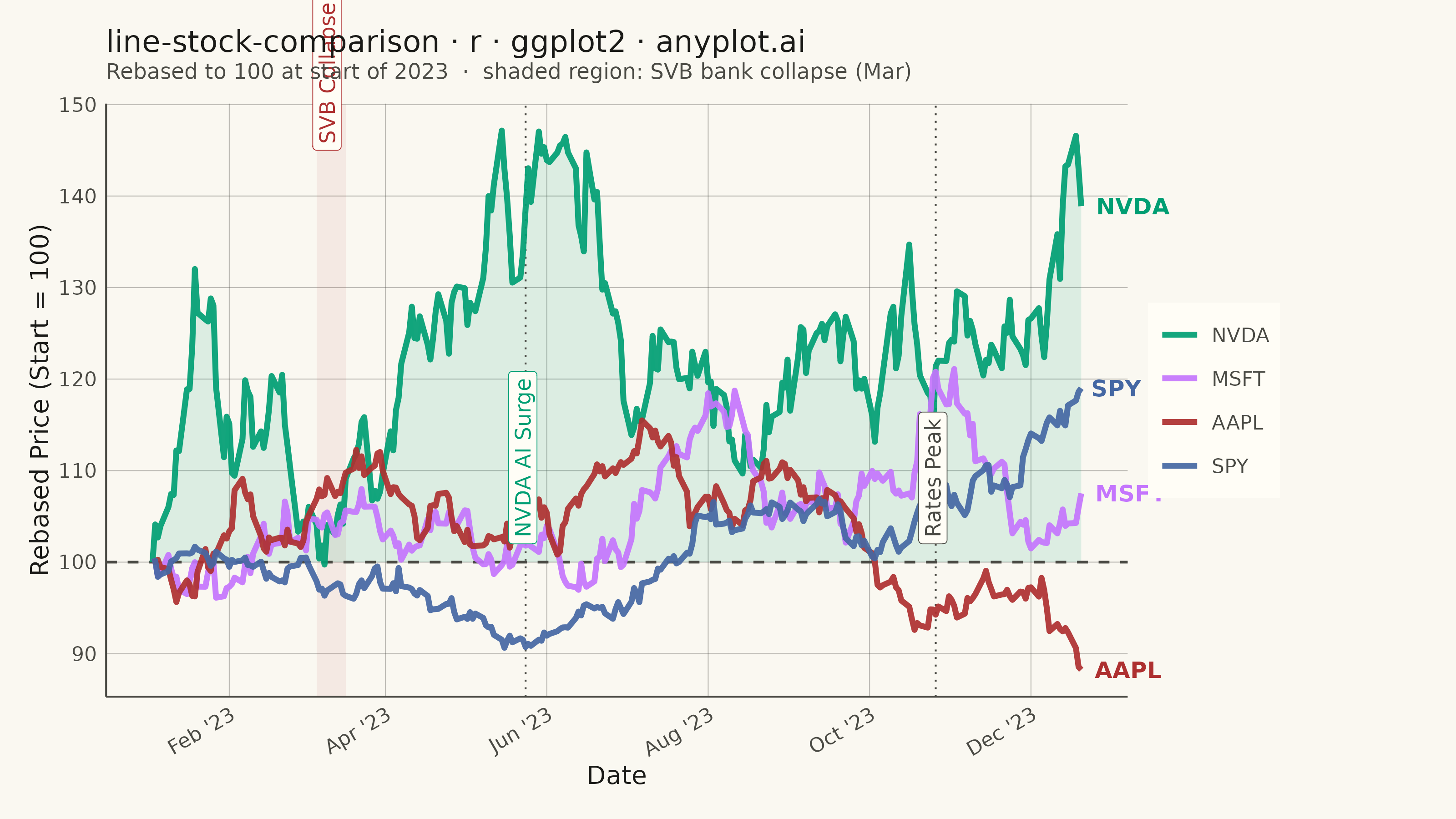
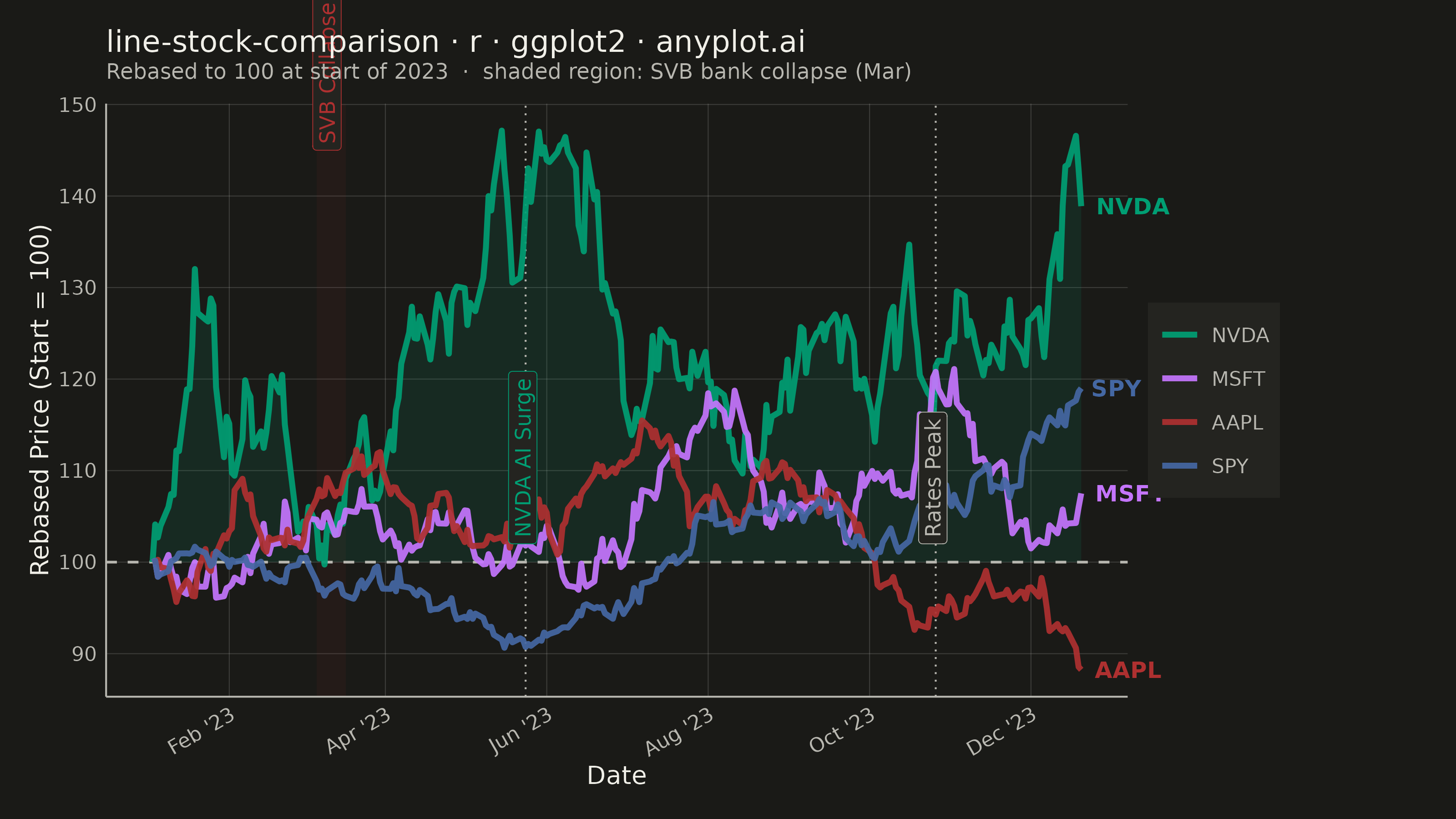
A multi-line chart comparing multiple stock price series normalized to a common starting point (rebased to 100) for direct performance comparison over time. By rebasing all series to the same initial value, investors can easily compare relative returns regardless of absolute price differences. This visualization reveals which stocks outperformed or underperformed relative to each other, making it essential for portfolio analysis and benchmark comparisons.
#' anyplot.ai
#' line-stock-comparison: Stock Price Comparison Chart
#' Library: ggplot2 3.5.1 | R 4.4.1
#' Quality: 88/100 | Created: 2026-05-23

library(ggplot2)
library(ragg)

set.seed(42)

# Theme tokens
THEME       <- Sys.getenv("ANYPLOT_THEME", "light")
PAGE_BG     <- if (THEME == "light") "#FAF8F1" else "#1A1A17"
ELEVATED_BG <- if (THEME == "light") "#FFFDF6" else "#242420"
INK         <- if (THEME == "light") "#1A1A17" else "#F0EFE8"
INK_SOFT    <- if (THEME == "light") "#4A4A44" else "#B8B7B0"
# embed alpha into hex — ggplot2 element_line lacks alpha parameter
GRID_COLOR  <- adjustcolor(INK_SOFT, alpha.f = if (THEME == "dark") 0.22 else 0.35)

IMPRINT <- c("#009E73", "#C475FD", "#AE3030", "#4467A3")

# Data — approximately 1 year of trading days starting Jan 2023
all_dates     <- seq(as.Date("2023-01-03"), by = "day", length.out = 400)
trading_dates <- all_dates[!weekdays(all_dates) %in% c("Saturday", "Sunday")]
trading_dates <- trading_dates[1:252]

tickers <- c("NVDA", "MSFT", "AAPL", "SPY")
mu      <- c(0.0020, 0.0007, 0.0005, 0.0003)
sigma   <- c(0.028,  0.015,  0.012,  0.008)

prices_list <- lapply(seq_along(tickers), function(i) {
    returns <- rnorm(length(trading_dates) - 1, mean = mu[i], sd = sigma[i])
    data.frame(
        date    = trading_dates,
        symbol  = tickers[i],
        rebased = cumprod(c(1.0, exp(returns))) * 100
    )
})

df        <- do.call(rbind, prices_list)
df$symbol <- factor(df$symbol, levels = tickers)

# End-of-line label positions — last observation per symbol
last_pts <- do.call(rbind, lapply(tickers, function(s) {
    sub_df <- df[df$symbol == s, ]
    sub_df[nrow(sub_df), ]
}))

# NVDA subset for outperformance ribbon
nvda_df <- df[df$symbol == "NVDA", ]

# Key 2023 market events
svb_region <- data.frame(
    xmin = as.Date("2023-03-06"), xmax = as.Date("2023-03-17"),
    ymin = -Inf, ymax = Inf
)
ai_surge_date  <- as.Date("2023-05-24")
rate_peak_date <- as.Date("2023-10-26")

# Theme composition as named object — idiomatic ggplot2 pattern
anyplot_theme <- theme_minimal(base_size = 8) +
    theme(
        plot.background       = element_rect(fill = PAGE_BG, color = PAGE_BG),
        panel.background      = element_rect(fill = PAGE_BG, color = NA),
        panel.grid.major      = element_line(color = GRID_COLOR, linewidth = 0.18),
        panel.grid.minor      = element_blank(),
        panel.border          = element_blank(),
        axis.line             = element_line(color = INK_SOFT, linewidth = 0.35),
        axis.title            = element_text(color = INK, size = 10),
        axis.text             = element_text(color = INK_SOFT, size = 8),
        axis.text.x           = element_text(angle = 30, hjust = 1),
        plot.title            = element_text(color = INK, size = 12, margin = margin(b = 2)),
        plot.subtitle         = element_text(color = INK_SOFT, size = 8.5,
                                              margin = margin(b = 8)),
        legend.background     = element_rect(fill = ELEVATED_BG, color = NA),
        legend.box.background = element_blank(),
        legend.text           = element_text(color = INK_SOFT, size = 8),
        legend.title          = element_text(color = INK, size = 10),
        legend.position       = "right",
        plot.margin           = margin(12, 70, 12, 12)
    )

# Plot
p <- ggplot(df, aes(x = date, y = rebased, color = symbol)) +
    # SVB collapse period — shaded rect
    geom_rect(
        data = svb_region,
        aes(xmin = xmin, xmax = xmax, ymin = ymin, ymax = ymax),
        fill = "#AE3030", alpha = 0.07,
        inherit.aes = FALSE
    ) +
    # Subtle fill ribbon under NVDA to emphasize outperformance
    geom_ribbon(
        data = nvda_df,
        aes(x = date, ymin = 100, ymax = rebased),
        fill = IMPRINT[1], alpha = 0.12, inherit.aes = FALSE
    ) +
    # Reference line at 100
    geom_hline(yintercept = 100, color = INK_SOFT, linewidth = 0.5,
               linetype = "dashed") +
    # Event marker lines
    geom_vline(xintercept = c(ai_surge_date, rate_peak_date),
               color = INK_SOFT, linewidth = 0.35, linetype = "dotted") +
    # Stock lines
    geom_line(linewidth = 1.1, alpha = 0.92) +
    # End-of-line ticker labels — coord_cartesian(clip="off") lets them render outside panel
    geom_text(
        data = last_pts,
        aes(x = date, y = rebased, label = symbol, color = symbol),
        hjust = -0.2, size = 3.2, fontface = "bold",
        show.legend = FALSE
    ) +
    # Styled callout boxes using annotate(geom="label") — distinctively ggplot2
    # SVB label at y=145 clears the stock cluster; color-coded to match the shaded region
    annotate("label", x = as.Date("2023-03-11"), y = 145,
             label = "SVB Collapse", color = "#AE3030",
             fill = ELEVATED_BG, label.size = 0.15, size = 3.0,
             angle = 90, hjust = 0, vjust = 0.4, fontface = "italic") +
    annotate("label", x = ai_surge_date, y = 102,
             label = "NVDA AI Surge", color = IMPRINT[1],
             fill = ELEVATED_BG, label.size = 0.15, size = 3.0,
             angle = 90, hjust = 0, vjust = 0.4, fontface = "italic") +
    annotate("label", x = rate_peak_date, y = 102,
             label = "Rates Peak", color = INK_SOFT,
             fill = ELEVATED_BG, label.size = 0.15, size = 3.0,
             angle = 90, hjust = 0, vjust = 0.4, fontface = "italic") +
    # clip="off" enables end-of-line labels and off-axis annotations outside the panel
    coord_cartesian(clip = "off") +
    scale_color_manual(values = setNames(IMPRINT, tickers), name = NULL) +
    scale_x_date(date_labels = "%b '%y", date_breaks = "2 months") +
    labs(
        title    = "line-stock-comparison · r · ggplot2 · anyplot.ai",
        subtitle = "Rebased to 100 at start of 2023  ·  shaded region: SVB bank collapse (Mar)",
        x        = "Date",
        y        = "Rebased Price (Start = 100)"
    ) +
    anyplot_theme

# Save
ggsave(
    filename = sprintf("plot-%s.png", THEME),
    plot     = p,
    device   = ragg::agg_png,
    width    = 8,
    height   = 4.5,
    units    = "in",
    dpi      = 400
)
Runnable source as JSON, for any HTTP client: https://api.anyplot.ai/specs/line-stock-comparison/ggplot2/code. Any spec id and library id listed in llms-full.txt fit the same URL shape; every URL below is complete and callable.
{
  "spec_id": "line-stock-comparison",
  "language": "r",
  "library": "ggplot2",
  "page": "https://anyplot.ai/line-stock-comparison/r/ggplot2",
  "hub": "https://anyplot.ai/line-stock-comparison",
  "code_json": "https://api.anyplot.ai/specs/line-stock-comparison/ggplot2/code",
  "spec_json": "https://api.anyplot.ai/specs/line-stock-comparison",
  "render_light_png": "https://storage.googleapis.com/anyplot-images/plots/line-stock-comparison/r/ggplot2/plot-light.png",
  "render_dark_png": "https://storage.googleapis.com/anyplot-images/plots/line-stock-comparison/r/ggplot2/plot-dark.png",
  "quality_score": 88.0,
  "license": "MIT",
  "guide": "https://anyplot.ai/llms.txt"
}
Part of Stock Price Comparison Chart on anyplot.ai.