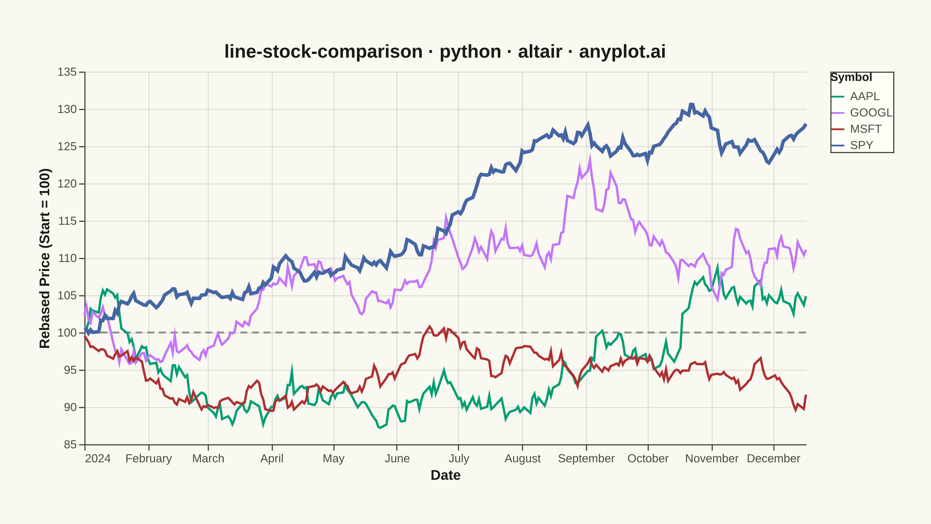
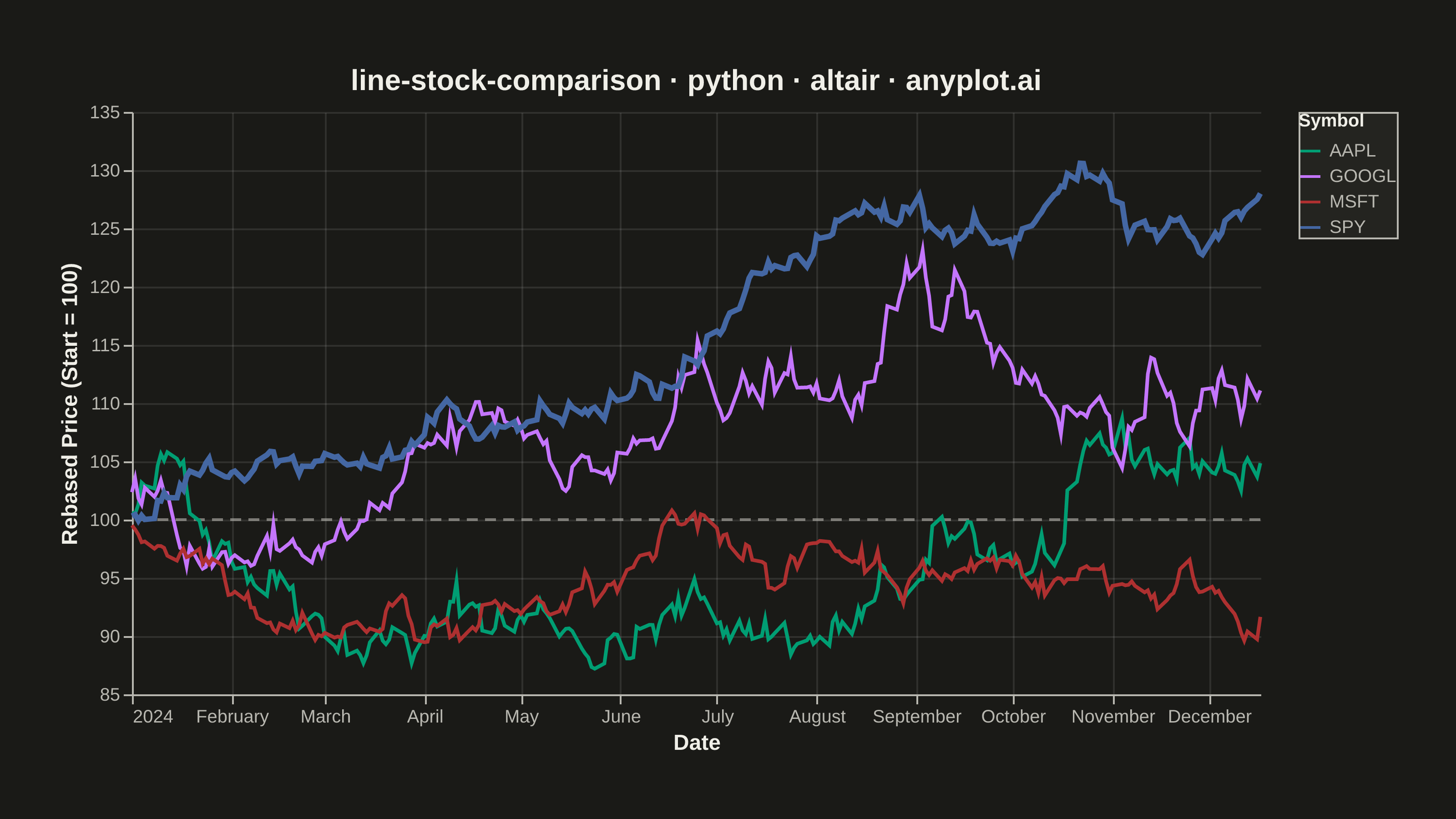
A multi-line chart comparing multiple stock price series normalized to a common starting point (rebased to 100) for direct performance comparison over time. By rebasing all series to the same initial value, investors can easily compare relative returns regardless of absolute price differences. This visualization reveals which stocks outperformed or underperformed relative to each other, making it essential for portfolio analysis and benchmark comparisons.
""" anyplot.ai
line-stock-comparison: Stock Price Comparison Chart
Library: altair 6.1.0 | Python 3.13.13
Quality: 89/100 | Updated: 2026-05-23
"""

import os
import sys


del sys.path[0]  # prevent altair.py from shadowing the altair package

import altair as alt
import numpy as np
import pandas as pd
from PIL import Image


# Theme tokens
THEME = os.getenv("ANYPLOT_THEME", "light")
PAGE_BG = "#FAF8F1" if THEME == "light" else "#1A1A17"
ELEVATED_BG = "#FFFDF6" if THEME == "light" else "#242420"
INK = "#1A1A17" if THEME == "light" else "#F0EFE8"
INK_SOFT = "#4A4A44" if THEME == "light" else "#B8B7B0"

IMPRINT = ["#009E73", "#C475FD", "#AE3030", "#4467A3"]

# Data
np.random.seed(42)
dates = pd.date_range("2024-01-01", periods=252, freq="B")

symbols = ["AAPL", "GOOGL", "MSFT", "SPY"]
returns_params = {"AAPL": (0.0003, 0.012), "GOOGL": (0.0002, 0.011), "MSFT": (0.0003, 0.008), "SPY": (0.0001, 0.006)}

data_list = []
for symbol in symbols:
    mean_return, volatility = returns_params[symbol]
    returns = np.random.normal(mean_return, volatility, len(dates))
    prices = 100 * np.cumprod(1 + returns)
    for date, price in zip(dates, prices, strict=True):
        data_list.append({"date": date, "symbol": symbol, "rebased_price": price})

df = pd.DataFrame(data_list)

# Plot
base = alt.Chart(df).encode(
    x=alt.X("date:T", title="Date"),
    y=alt.Y("rebased_price:Q", title="Rebased Price (Start = 100)", scale=alt.Scale(zero=False)),
    color=alt.Color(
        "symbol:N",
        title="Symbol",
        scale=alt.Scale(domain=symbols, range=IMPRINT),
        legend=alt.Legend(titleFontSize=10, labelFontSize=10, symbolSize=120),
    ),
    tooltip=[
        alt.Tooltip("date:T", title="Date"),
        alt.Tooltip("symbol:N", title="Stock"),
        alt.Tooltip("rebased_price:Q", title="Rebased Price", format=".1f"),
    ],
)

lines = base.mark_line().encode(strokeWidth=alt.condition(alt.datum.symbol == "SPY", alt.value(3.0), alt.value(2.0)))

reference_line = (
    alt.Chart(pd.DataFrame({"y": [100]}))
    .mark_rule(color=INK_SOFT, strokeDash=[6, 4], strokeWidth=1.5, opacity=0.6)
    .encode(y="y:Q")
)

layer = alt.layer(reference_line, lines).properties(
    width=620,
    height=320,
    background=PAGE_BG,
    padding={"left": 0, "right": 0, "top": 0, "bottom": 0},
    title=alt.Title("line-stock-comparison · python · altair · anyplot.ai", fontSize=16, color=INK, anchor="middle"),
)

chart = (
    layer.configure_view(fill=PAGE_BG, stroke=None, continuousWidth=620, continuousHeight=320)
    .configure_axis(
        grid=True,
        labelFontSize=10,
        titleFontSize=12,
        domainColor=INK_SOFT,
        tickColor=INK_SOFT,
        gridColor=INK,
        gridOpacity=0.10,
        labelColor=INK_SOFT,
        titleColor=INK,
    )
    .configure_title(color=INK, fontSize=16)
    .configure_legend(fillColor=ELEVATED_BG, strokeColor=INK_SOFT, labelColor=INK_SOFT, titleColor=INK)
)

# Save PNG
chart.save(f"plot-{THEME}.png", scale_factor=4.0)

# Pad to exact target 3200×1800
TW, TH = 3200, 1800
_img = Image.open(f"plot-{THEME}.png").convert("RGB")
_w, _h = _img.size
if _w > TW or _h > TH:
    raise SystemExit(
        f"altair vl-convert produced {_w}×{_h}, exceeds target {TW}×{TH}. "
        f"Shrink chart .properties(width=, height=) values and re-render."
    )
if _w < TW or _h < TH:
    _canvas = Image.new("RGB", (TW, TH), PAGE_BG)
    _canvas.paste(_img, ((TW - _w) // 2, (TH - _h) // 2))
    _canvas.save(f"plot-{THEME}.png")

chart.save(f"plot-{THEME}.html")
Runnable source as JSON, for any HTTP client: https://api.anyplot.ai/specs/line-stock-comparison/altair/code. Any spec id and library id listed in llms-full.txt fit the same URL shape; every URL below is complete and callable.
{
  "spec_id": "line-stock-comparison",
  "language": "python",
  "library": "altair",
  "page": "https://anyplot.ai/line-stock-comparison/python/altair",
  "hub": "https://anyplot.ai/line-stock-comparison",
  "code_json": "https://api.anyplot.ai/specs/line-stock-comparison/altair/code",
  "spec_json": "https://api.anyplot.ai/specs/line-stock-comparison",
  "render_light_png": "https://storage.googleapis.com/anyplot-images/plots/line-stock-comparison/python/altair/plot-light.png",
  "render_dark_png": "https://storage.googleapis.com/anyplot-images/plots/line-stock-comparison/python/altair/plot-dark.png",
  "interactive_light_html": "https://storage.googleapis.com/anyplot-images/plots/line-stock-comparison/python/altair/plot-light.html",
  "interactive_dark_html": "https://storage.googleapis.com/anyplot-images/plots/line-stock-comparison/python/altair/plot-dark.html",
  "quality_score": 89.0,
  "license": "MIT",
  "guide": "https://anyplot.ai/llms.txt"
}
Part of Stock Price Comparison Chart on anyplot.ai.