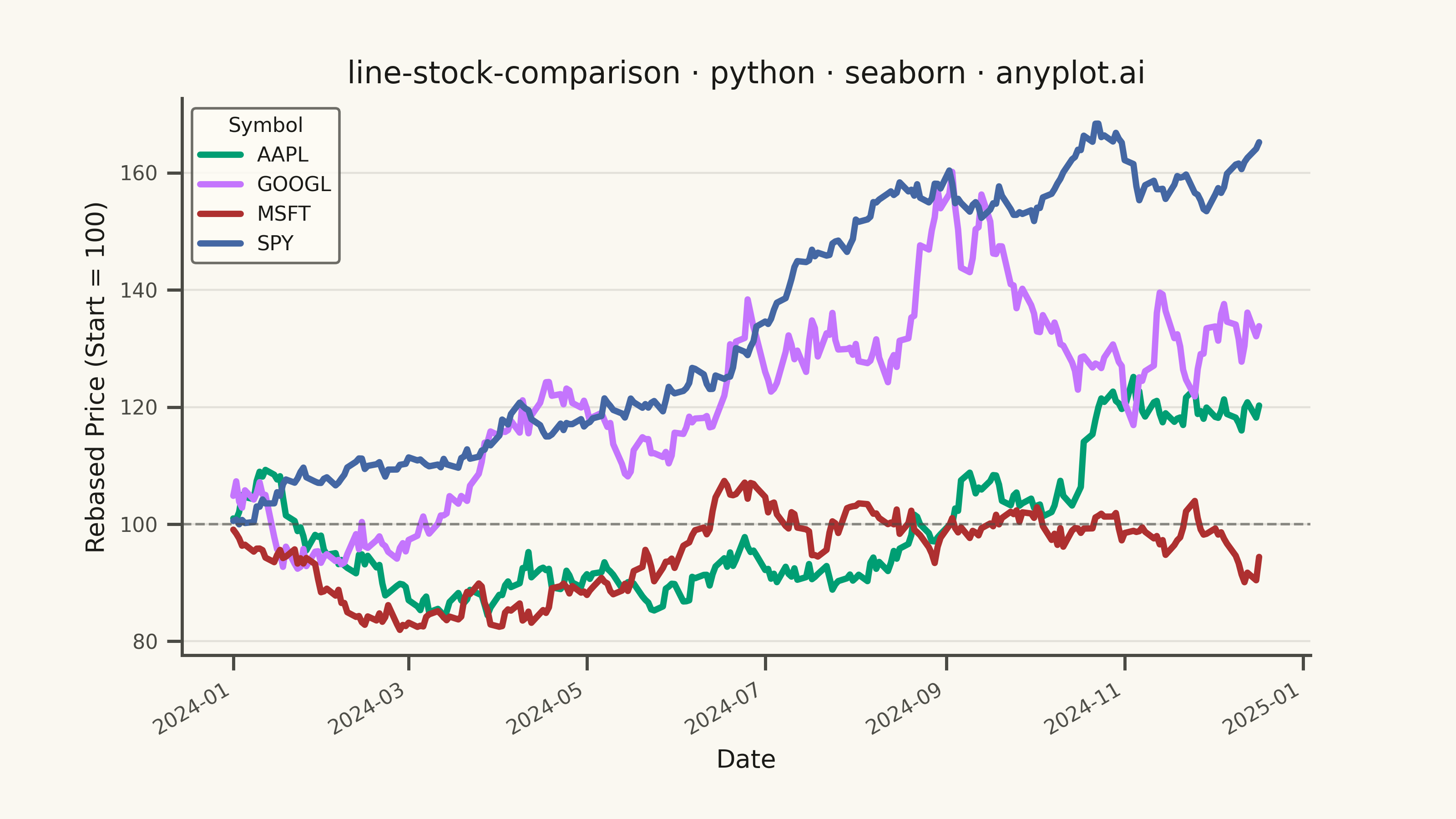
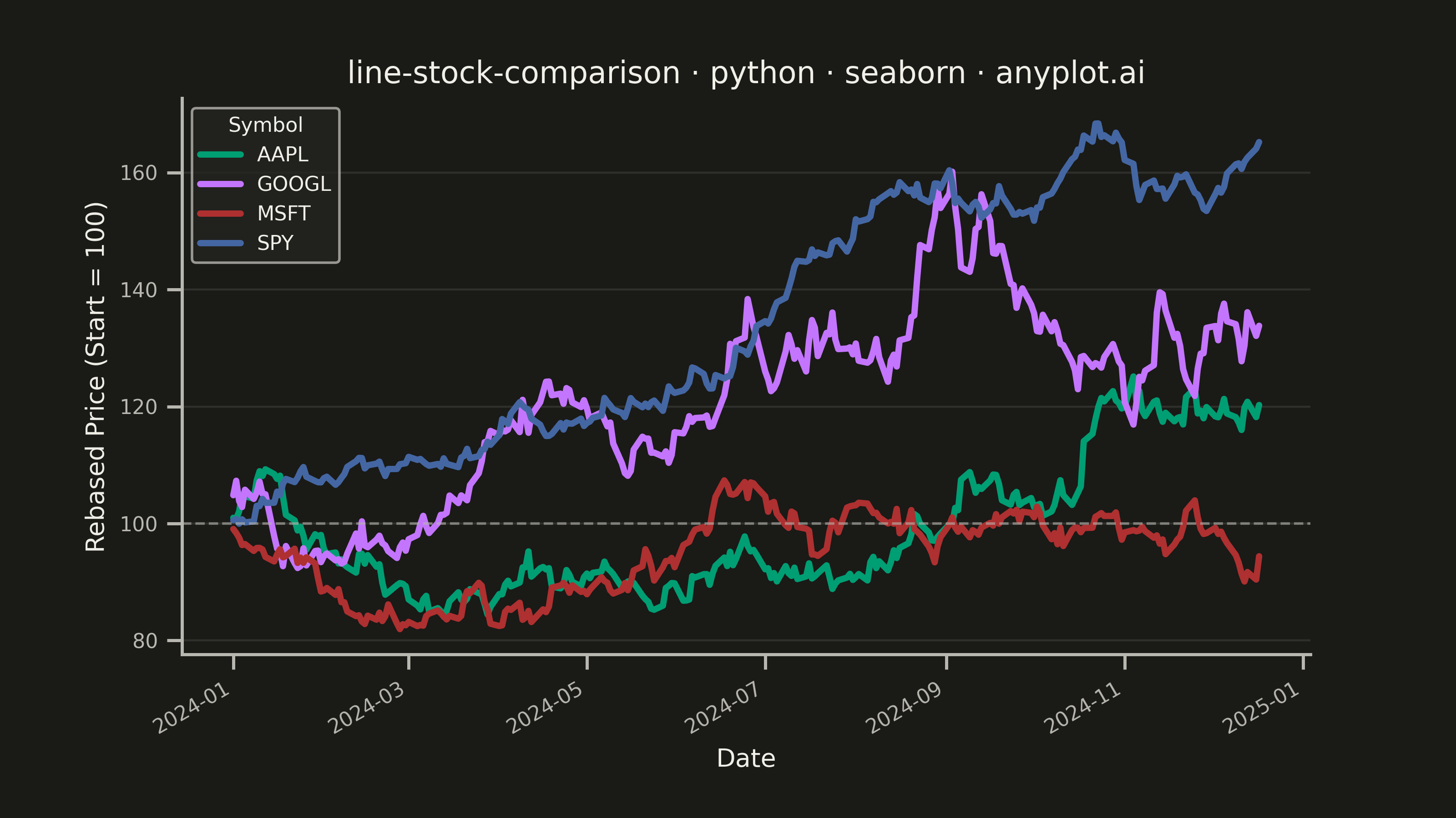
A multi-line chart comparing multiple stock price series normalized to a common starting point (rebased to 100) for direct performance comparison over time. By rebasing all series to the same initial value, investors can easily compare relative returns regardless of absolute price differences. This visualization reveals which stocks outperformed or underperformed relative to each other, making it essential for portfolio analysis and benchmark comparisons.
""" anyplot.ai
line-stock-comparison: Stock Price Comparison Chart
Library: seaborn 0.13.2 | Python 3.13.13
Quality: 81/100 | Updated: 2026-05-23
"""

import os

import matplotlib.pyplot as plt
import numpy as np
import pandas as pd
import seaborn as sns


# Theme tokens
THEME = os.getenv("ANYPLOT_THEME", "light")
PAGE_BG = "#FAF8F1" if THEME == "light" else "#1A1A17"
ELEVATED_BG = "#FFFDF6" if THEME == "light" else "#242420"
INK = "#1A1A17" if THEME == "light" else "#F0EFE8"
INK_SOFT = "#4A4A44" if THEME == "light" else "#B8B7B0"

IMPRINT = ["#009E73", "#C475FD", "#AE3030", "#4467A3"]

# Set seaborn theme BEFORE figure creation
sns.set_theme(
    style="ticks",
    rc={
        "figure.facecolor": PAGE_BG,
        "axes.facecolor": PAGE_BG,
        "axes.edgecolor": INK_SOFT,
        "axes.labelcolor": INK,
        "text.color": INK,
        "xtick.color": INK_SOFT,
        "ytick.color": INK_SOFT,
        "grid.color": INK,
        "grid.alpha": 0.10,
        "legend.facecolor": ELEVATED_BG,
        "legend.edgecolor": INK_SOFT,
    },
)
sns.set_context("notebook", font_scale=1.0)

# Data - Generate synthetic stock price data for 4 tech companies over 1 year
np.random.seed(42)

dates = pd.date_range("2024-01-01", periods=252, freq="B")  # Business days
symbols = ["AAPL", "GOOGL", "MSFT", "SPY"]

# Generate realistic stock price movements using geometric Brownian motion
data = []
for symbol in symbols:
    if symbol == "AAPL":
        drift, volatility = 0.0008, 0.018
    elif symbol == "GOOGL":
        drift, volatility = 0.0006, 0.022
    elif symbol == "MSFT":
        drift, volatility = 0.0010, 0.016
    else:  # SPY (index, lower volatility)
        drift, volatility = 0.0005, 0.010

    returns = np.random.normal(drift, volatility, len(dates))
    price = 100 * np.exp(np.cumsum(returns))  # Start at 100 (already rebased)

    for date, p in zip(dates, price, strict=True):
        data.append({"date": date, "symbol": symbol, "rebased_price": p})

df = pd.DataFrame(data)

# Plot — landscape canvas (3200×1800)
fig, ax = plt.subplots(figsize=(8, 4.5), dpi=400, facecolor=PAGE_BG)
ax.set_facecolor(PAGE_BG)

palette_map = dict(zip(symbols, IMPRINT, strict=True))

sns.lineplot(
    data=df, x="date", y="rebased_price", hue="symbol", hue_order=symbols, palette=palette_map, linewidth=2.5, ax=ax
)

# Reference line at 100 (starting point)
ax.axhline(y=100, color=INK_SOFT, linestyle="--", linewidth=1.0, alpha=0.6)

# Style
ax.set_xlabel("Date", fontsize=10, color=INK)
ax.set_ylabel("Rebased Price (Start = 100)", fontsize=10, color=INK)
ax.set_title("line-stock-comparison · python · seaborn · anyplot.ai", fontsize=12, fontweight="medium", color=INK)
ax.tick_params(axis="both", labelsize=8, colors=INK_SOFT)

# Move legend to upper-left where lines haven't diverged yet (seaborn-idiomatic)
sns.move_legend(ax, "upper left", title="Symbol", fontsize=8, title_fontsize=8)

# Grid — y-axis only for line chart
ax.yaxis.grid(True, alpha=0.10, linewidth=0.8)
ax.set_axisbelow(True)

# Spines — remove top and right (seaborn-idiomatic)
sns.despine(ax=ax)

# Rotate x-axis dates for readability
fig.autofmt_xdate(rotation=30)

# Save — no bbox_inches='tight' per seaborn canvas rule
plt.savefig(f"plot-{THEME}.png", dpi=400, facecolor=PAGE_BG)
Runnable source as JSON, for any HTTP client: https://api.anyplot.ai/specs/line-stock-comparison/seaborn/code. Any spec id and library id listed in llms-full.txt fit the same URL shape; every URL below is complete and callable.
{
  "spec_id": "line-stock-comparison",
  "language": "python",
  "library": "seaborn",
  "page": "https://anyplot.ai/line-stock-comparison/python/seaborn",
  "hub": "https://anyplot.ai/line-stock-comparison",
  "code_json": "https://api.anyplot.ai/specs/line-stock-comparison/seaborn/code",
  "spec_json": "https://api.anyplot.ai/specs/line-stock-comparison",
  "render_light_png": "https://storage.googleapis.com/anyplot-images/plots/line-stock-comparison/python/seaborn/plot-light.png",
  "render_dark_png": "https://storage.googleapis.com/anyplot-images/plots/line-stock-comparison/python/seaborn/plot-dark.png",
  "quality_score": 81.0,
  "license": "MIT",
  "guide": "https://anyplot.ai/llms.txt"
}
Part of Stock Price Comparison Chart on anyplot.ai.