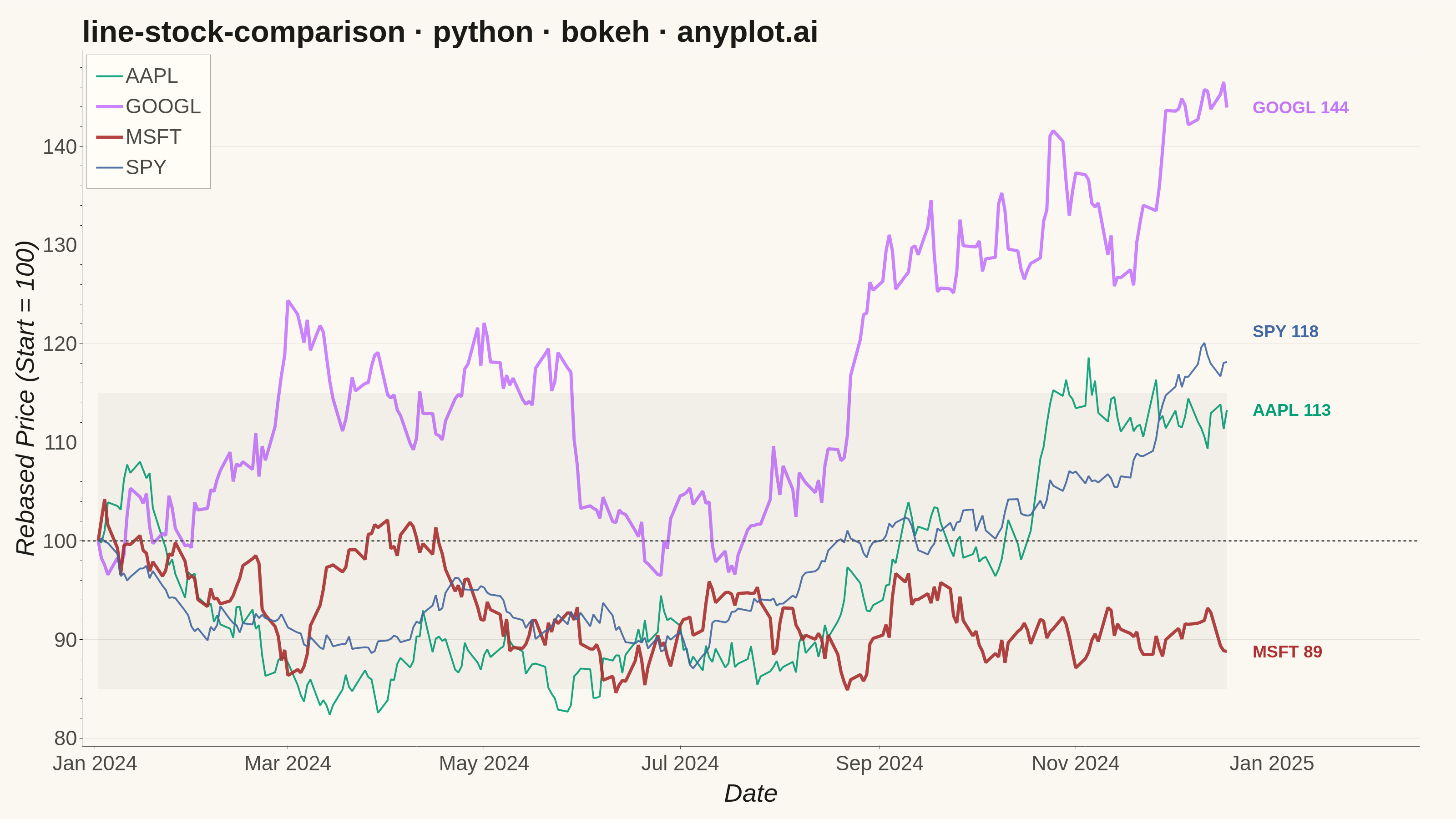
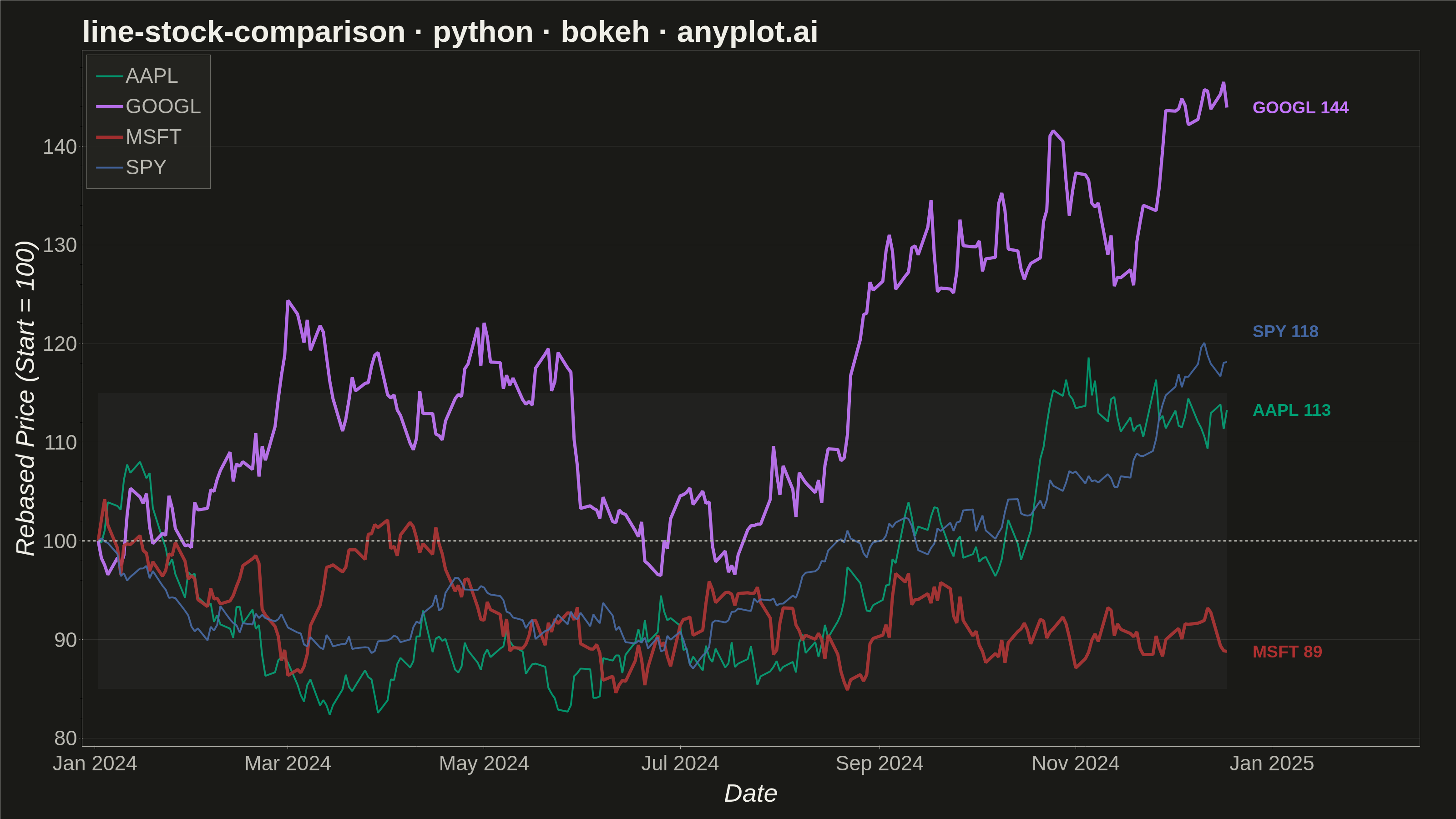
A multi-line chart comparing multiple stock price series normalized to a common starting point (rebased to 100) for direct performance comparison over time. By rebasing all series to the same initial value, investors can easily compare relative returns regardless of absolute price differences. This visualization reveals which stocks outperformed or underperformed relative to each other, making it essential for portfolio analysis and benchmark comparisons.
""" anyplot.ai
line-stock-comparison: Stock Price Comparison Chart
Library: bokeh 3.9.0 | Python 3.13.13
Quality: 92/100 | Updated: 2026-05-23
"""

import base64
import os
import sys
import time
from pathlib import Path


# Remove the current directory from sys.path to avoid circular imports with bokeh.py
sys.path = [p for p in sys.path if p not in ("", ".", os.getcwd(), os.path.dirname(__file__))]

import numpy as np
import pandas as pd
from bokeh.io import output_file, save
from bokeh.models import Band, ColumnDataSource, HoverTool, Label, Legend, Range1d, Span
from bokeh.plotting import figure
from selenium import webdriver
from selenium.webdriver.chrome.options import Options


# Theme tokens
THEME = os.getenv("ANYPLOT_THEME", "light")
PAGE_BG = "#FAF8F1" if THEME == "light" else "#1A1A17"
ELEVATED_BG = "#FFFDF6" if THEME == "light" else "#242420"
INK = "#1A1A17" if THEME == "light" else "#F0EFE8"
INK_SOFT = "#4A4A44" if THEME == "light" else "#B8B7B0"

IMPRINT = ["#009E73", "#C475FD", "#AE3030", "#4467A3"]

# Data — synthetic stock price paths via geometric Brownian motion
n_days = 252
dates = pd.date_range("2024-01-02", periods=n_days, freq="B")

stocks = {
    "AAPL": {"drift": 0.0006, "volatility": 0.018, "seed": 42},
    "GOOGL": {"drift": 0.0005, "volatility": 0.020, "seed": 43},
    "MSFT": {"drift": 0.0002, "volatility": 0.016, "seed": 44},
    "SPY": {"drift": 0.0003, "volatility": 0.009, "seed": 45},
}

price_data = {"date": dates}
for symbol, params in stocks.items():
    rng = np.random.RandomState(params["seed"])
    returns = rng.normal(params["drift"], params["volatility"], n_days)
    prices = 100 * np.exp(np.cumsum(returns))
    prices = prices / prices[0] * 100  # Rebase to exactly 100 at start
    price_data[symbol] = prices

df = pd.DataFrame(price_data)

# Determine visual hierarchy by final performance
final_vals = {symbol: df[symbol].iloc[-1] for symbol in stocks}
ranked = sorted(final_vals, key=lambda s: final_vals[s])
best, worst = ranked[-1], ranked[0]

# Extend x-axis range to accommodate end-of-series labels
DAY_MS = 24 * 60 * 60 * 1000
start_ms = int((dates[0] - pd.Timedelta(days=5)).timestamp() * 1000)
end_ms = int((dates[-1] + pd.Timedelta(days=60)).timestamp() * 1000)

# Figure — 3200×1800 with toolbar disabled for correct PNG dimensions
p = figure(
    width=3200,
    height=1800,
    title="line-stock-comparison · python · bokeh · anyplot.ai",
    x_axis_label="Date",
    y_axis_label="Rebased Price (Start = 100)",
    x_axis_type="datetime",
    x_range=Range1d(start=start_ms, end=end_ms),
    toolbar_location=None,
    min_border_bottom=160,
    min_border_left=180,
    min_border_top=110,
    min_border_right=80,
)

# Font sizes — bokeh CSS pt sizing (~1.333 source-px per pt)
p.title.text_font_size = "50pt"
p.title.text_font_style = "bold"
p.xaxis.axis_label_text_font_size = "42pt"
p.yaxis.axis_label_text_font_size = "42pt"
p.xaxis.major_label_text_font_size = "34pt"
p.yaxis.major_label_text_font_size = "34pt"

# Subtle ±15% performance band — visually anchors the "normal" return envelope
band_source = ColumnDataSource(data={"x": df["date"], "lower": np.full(n_days, 85.0), "upper": np.full(n_days, 115.0)})
perf_band = Band(
    base="x", lower="lower", upper="upper", source=band_source, fill_color=INK, fill_alpha=0.04, line_color=None
)
p.add_layout(perf_band)

# Reference line at 100 (starting point indicator)
hline = Span(location=100, dimension="width", line_color=INK_SOFT, line_dash="dashed", line_width=3)
p.add_layout(hline)

# Smart label y-position assignment — spread overlapping end-of-series labels
sorted_syms = sorted(stocks.keys(), key=lambda s: final_vals[s])
min_gap = 8  # minimum vertical gap in data units
label_ys: dict[str, float] = {}
prev_y = -999.0
for sym in sorted_syms:
    y = max(final_vals[sym], prev_y + min_gap)
    label_ys[sym] = y
    prev_y = y

# Plot each stock series with performance-based line widths for visual hierarchy
legend_items = []
label_ms_offset = 8 * DAY_MS
for i, symbol in enumerate(stocks):
    lw = 7 if symbol in (best, worst) else 4
    line = p.line(x=df["date"], y=df[symbol], line_width=lw, line_color=IMPRINT[i], alpha=0.9)
    legend_items.append((symbol, [line]))

    # End-of-series label showing symbol and final value with vertical alignment fix
    final_date_ms = int(df["date"].iloc[-1].timestamp() * 1000)
    p.add_layout(
        Label(
            x=final_date_ms + label_ms_offset,
            y=label_ys[symbol],
            text=f"{symbol} {final_vals[symbol]:.0f}",
            text_color=IMPRINT[i],
            text_font_size="28pt",
            text_font_style="bold",
            text_baseline="middle",
            text_align="left",
        )
    )

# Hover tool — active in HTML artifact
hover = HoverTool(tooltips=[("Date", "@x{%F}"), ("Value", "@y{0.1f}")], formatters={"@x": "datetime"}, mode="vline")
p.add_tools(hover)

# Legend
legend = Legend(
    items=legend_items,
    location="top_left",
    label_text_font_size="34pt",
    label_text_color=INK_SOFT,
    glyph_width=60,
    glyph_height=30,
    spacing=15,
    padding=20,
    background_fill_color=ELEVATED_BG,
    border_line_color=INK_SOFT,
    click_policy="hide",
)
p.add_layout(legend)

# Theme-adaptive chrome
p.background_fill_color = PAGE_BG
p.border_fill_color = PAGE_BG
p.outline_line_color = None  # Remove box; L-shaped frame via axis lines only

p.title.text_color = INK
p.xaxis.axis_label_text_color = INK
p.yaxis.axis_label_text_color = INK
p.xaxis.major_label_text_color = INK_SOFT
p.yaxis.major_label_text_color = INK_SOFT
p.xaxis.axis_line_color = INK_SOFT
p.yaxis.axis_line_color = INK_SOFT
p.xaxis.major_tick_line_color = INK_SOFT
p.yaxis.major_tick_line_color = INK_SOFT

# Y-axis grid only (appropriate for line charts)
p.ygrid.grid_line_color = INK
p.ygrid.grid_line_alpha = 0.10
p.xgrid.grid_line_color = None

# Save interactive HTML artifact
output_file(f"plot-{THEME}.html")
save(p)

# Screenshot with headless Chrome — use CDP clip to capture exactly W×H px
W, H = 3200, 1800
opts = Options()
for arg in (
    "--headless=new",
    "--no-sandbox",
    "--disable-dev-shm-usage",
    "--disable-gpu",
    f"--window-size={W},{H + 200}",
    "--hide-scrollbars",
    "--force-device-scale-factor=1",
):
    opts.add_argument(arg)
driver = webdriver.Chrome(options=opts)
driver.set_window_size(W, H + 200)
driver.get(f"file://{Path(f'plot-{THEME}.html').resolve()}")
time.sleep(3)
screenshot = driver.execute_cdp_cmd(
    "Page.captureScreenshot",
    {"format": "png", "clip": {"x": 0, "y": 0, "width": W, "height": H, "scale": 1}, "captureBeyondViewport": True},
)
with open(f"plot-{THEME}.png", "wb") as f:
    f.write(base64.b64decode(screenshot["data"]))
driver.quit()
Runnable source as JSON, for any HTTP client: https://api.anyplot.ai/specs/line-stock-comparison/bokeh/code. Any spec id and library id listed in llms-full.txt fit the same URL shape; every URL below is complete and callable.
{
  "spec_id": "line-stock-comparison",
  "language": "python",
  "library": "bokeh",
  "page": "https://anyplot.ai/line-stock-comparison/python/bokeh",
  "hub": "https://anyplot.ai/line-stock-comparison",
  "code_json": "https://api.anyplot.ai/specs/line-stock-comparison/bokeh/code",
  "spec_json": "https://api.anyplot.ai/specs/line-stock-comparison",
  "render_light_png": "https://storage.googleapis.com/anyplot-images/plots/line-stock-comparison/python/bokeh/plot-light.png",
  "render_dark_png": "https://storage.googleapis.com/anyplot-images/plots/line-stock-comparison/python/bokeh/plot-dark.png",
  "interactive_light_html": "https://storage.googleapis.com/anyplot-images/plots/line-stock-comparison/python/bokeh/plot-light.html",
  "interactive_dark_html": "https://storage.googleapis.com/anyplot-images/plots/line-stock-comparison/python/bokeh/plot-dark.html",
  "quality_score": 92.0,
  "license": "MIT",
  "guide": "https://anyplot.ai/llms.txt"
}
Part of Stock Price Comparison Chart on anyplot.ai.