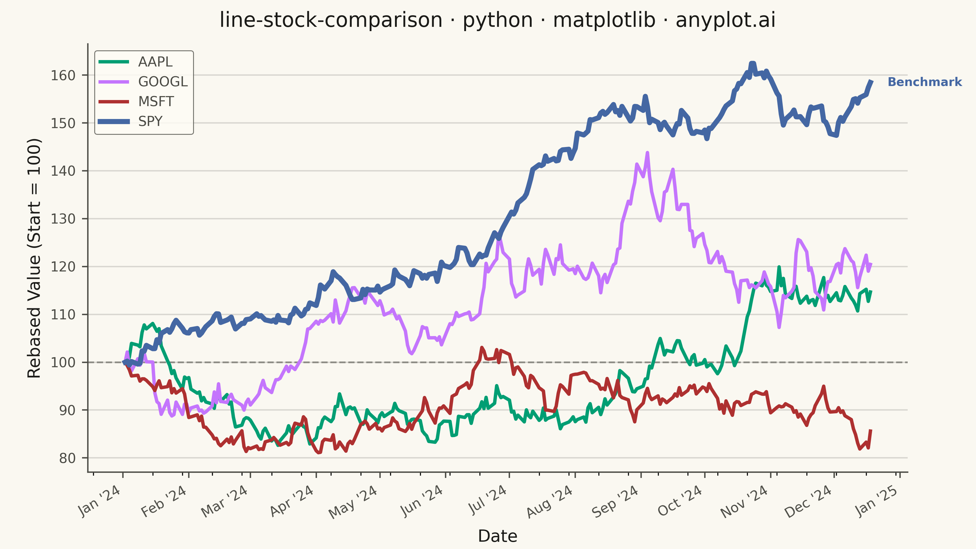
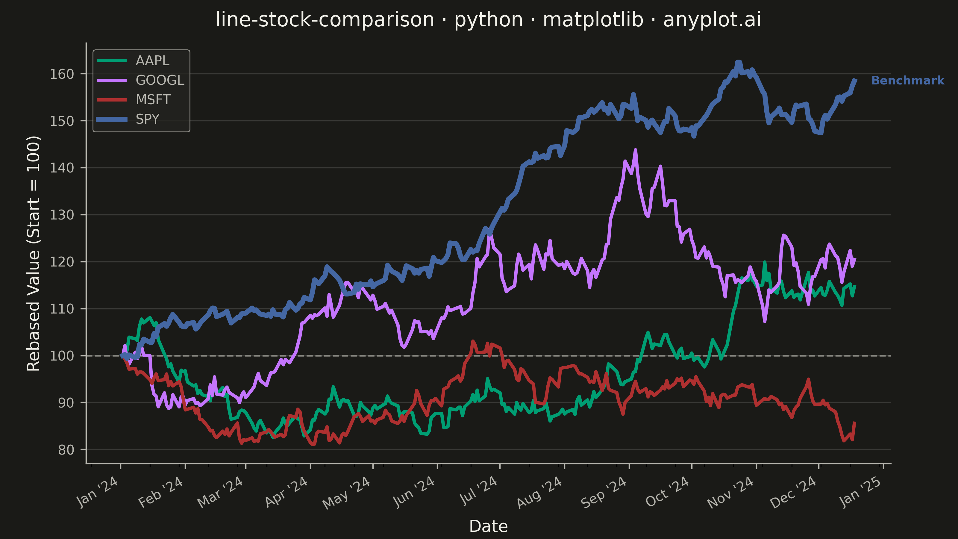
A multi-line chart comparing multiple stock price series normalized to a common starting point (rebased to 100) for direct performance comparison over time. By rebasing all series to the same initial value, investors can easily compare relative returns regardless of absolute price differences. This visualization reveals which stocks outperformed or underperformed relative to each other, making it essential for portfolio analysis and benchmark comparisons.
""" anyplot.ai
line-stock-comparison: Stock Price Comparison Chart
Library: matplotlib 3.10.9 | Python 3.13.13
Quality: 89/100 | Updated: 2026-05-23
"""

import os
import sys


# matplotlib.py filename shadows the installed package; pop the script dir
# so imports resolve to the site-packages installation.
_script_dir = sys.path.pop(0)
import matplotlib.dates as mdates
import matplotlib.pyplot as plt


sys.path.insert(0, _script_dir)

import numpy as np
import pandas as pd


THEME = os.getenv("ANYPLOT_THEME", "light")
PAGE_BG = "#FAF8F1" if THEME == "light" else "#1A1A17"
ELEVATED_BG = "#FFFDF6" if THEME == "light" else "#242420"
INK = "#1A1A17" if THEME == "light" else "#F0EFE8"
INK_SOFT = "#4A4A44" if THEME == "light" else "#B8B7B0"
INK_MUTED = "#6B6A63" if THEME == "light" else "#A8A79F"

# Imprint palette — canonical order
IMPRINT = ["#009E73", "#C475FD", "#AE3030", "#4467A3"]

# Data — simulated daily stock prices for ~1 year (252 trading days)
np.random.seed(42)
n_days = 252
dates = pd.date_range("2024-01-02", periods=n_days, freq="B")

stocks = {
    "AAPL": {"start": 185, "drift": 0.0008, "vol": 0.018},
    "GOOGL": {"start": 140, "drift": 0.0006, "vol": 0.020},
    "MSFT": {"start": 375, "drift": 0.0007, "vol": 0.016},
    "SPY": {"start": 475, "drift": 0.0004, "vol": 0.010},
}

rebased = {}
for symbol, params in stocks.items():
    returns = np.random.normal(params["drift"], params["vol"], n_days)
    price_series = params["start"] * np.cumprod(1 + returns)
    rebased[symbol] = price_series / price_series[0] * 100

# Plot
fig, ax = plt.subplots(figsize=(8, 4.5), dpi=400, facecolor=PAGE_BG)
ax.set_facecolor(PAGE_BG)

for (symbol, values), color in zip(rebased.items(), IMPRINT, strict=False):
    # SPY is the benchmark — thicker line for emphasis and visual hierarchy
    lw = 3.0 if symbol == "SPY" else 2.0
    ax.plot(dates, values, label=symbol, color=color, linewidth=lw)

# Reference line at 100 (starting point)
ax.axhline(y=100, color=INK_MUTED, linestyle="--", linewidth=1.0, alpha=0.7, zorder=1)

# Annotate SPY as benchmark to create visual hierarchy and storytelling focal point
spy_final = rebased["SPY"][-1]
spy_color = IMPRINT[3]  # SPY is 4th series (#4467A3)
ax.annotate(
    "Benchmark",
    xy=(dates[-1], spy_final),
    xytext=(10, 0),
    textcoords="offset points",
    color=spy_color,
    fontsize=7,
    fontweight="bold",
    va="center",
)

# Date formatting with major monthly ticks and minor biweekly ticks
ax.xaxis.set_major_locator(mdates.MonthLocator())
ax.xaxis.set_major_formatter(mdates.DateFormatter("%b '%y"))
ax.xaxis.set_minor_locator(mdates.WeekdayLocator(byweekday=0, interval=2))
fig.autofmt_xdate(rotation=30, ha="right")

# Grid — y-axis only, subtle
ax.yaxis.grid(True, alpha=0.15, color=INK, linewidth=0.8)
ax.set_axisbelow(True)

# Spines — L-shaped
ax.spines["top"].set_visible(False)
ax.spines["right"].set_visible(False)
ax.spines["left"].set_color(INK_SOFT)
ax.spines["bottom"].set_color(INK_SOFT)

ax.set_title(
    "line-stock-comparison · python · matplotlib · anyplot.ai", fontsize=12, fontweight="medium", color=INK, pad=10
)
ax.set_xlabel("Date", fontsize=10, color=INK)
ax.set_ylabel("Rebased Value (Start = 100)", fontsize=10, color=INK)
ax.tick_params(axis="both", labelsize=8, colors=INK_SOFT)

leg = ax.legend(fontsize=8, loc="upper left", frameon=True)
if leg:
    leg.get_frame().set_facecolor(ELEVATED_BG)
    leg.get_frame().set_edgecolor(INK_SOFT)
    leg.get_frame().set_linewidth(0.5)
    plt.setp(leg.get_texts(), color=INK_SOFT)

fig.subplots_adjust(left=0.09, right=0.93, top=0.92, bottom=0.14)
plt.savefig(f"plot-{THEME}.png", dpi=400, facecolor=PAGE_BG)
plt.close()
Runnable source as JSON, for any HTTP client: https://api.anyplot.ai/specs/line-stock-comparison/matplotlib/code. Any spec id and library id listed in llms-full.txt fit the same URL shape; every URL below is complete and callable.
{
  "spec_id": "line-stock-comparison",
  "language": "python",
  "library": "matplotlib",
  "page": "https://anyplot.ai/line-stock-comparison/python/matplotlib",
  "hub": "https://anyplot.ai/line-stock-comparison",
  "code_json": "https://api.anyplot.ai/specs/line-stock-comparison/matplotlib/code",
  "spec_json": "https://api.anyplot.ai/specs/line-stock-comparison",
  "render_light_png": "https://storage.googleapis.com/anyplot-images/plots/line-stock-comparison/python/matplotlib/plot-light.png",
  "render_dark_png": "https://storage.googleapis.com/anyplot-images/plots/line-stock-comparison/python/matplotlib/plot-dark.png",
  "quality_score": 89.0,
  "license": "MIT",
  "guide": "https://anyplot.ai/llms.txt"
}
Part of Stock Price Comparison Chart on anyplot.ai.