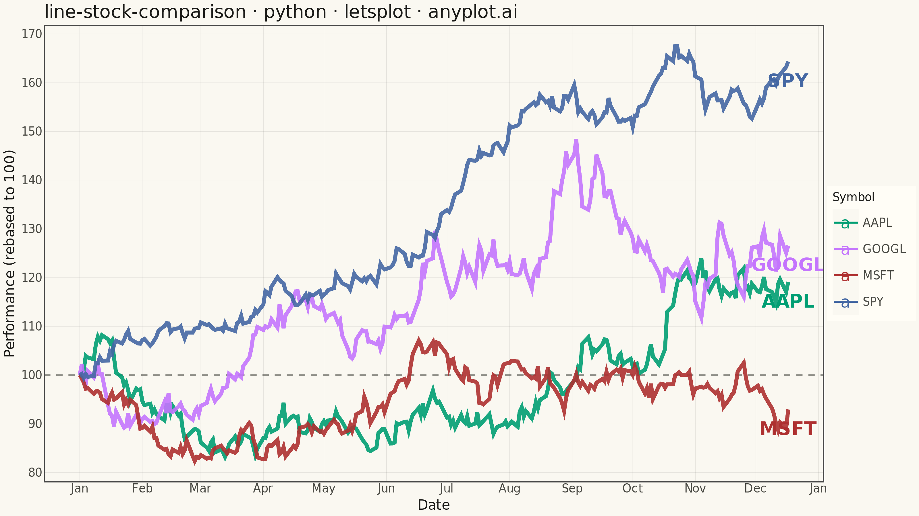
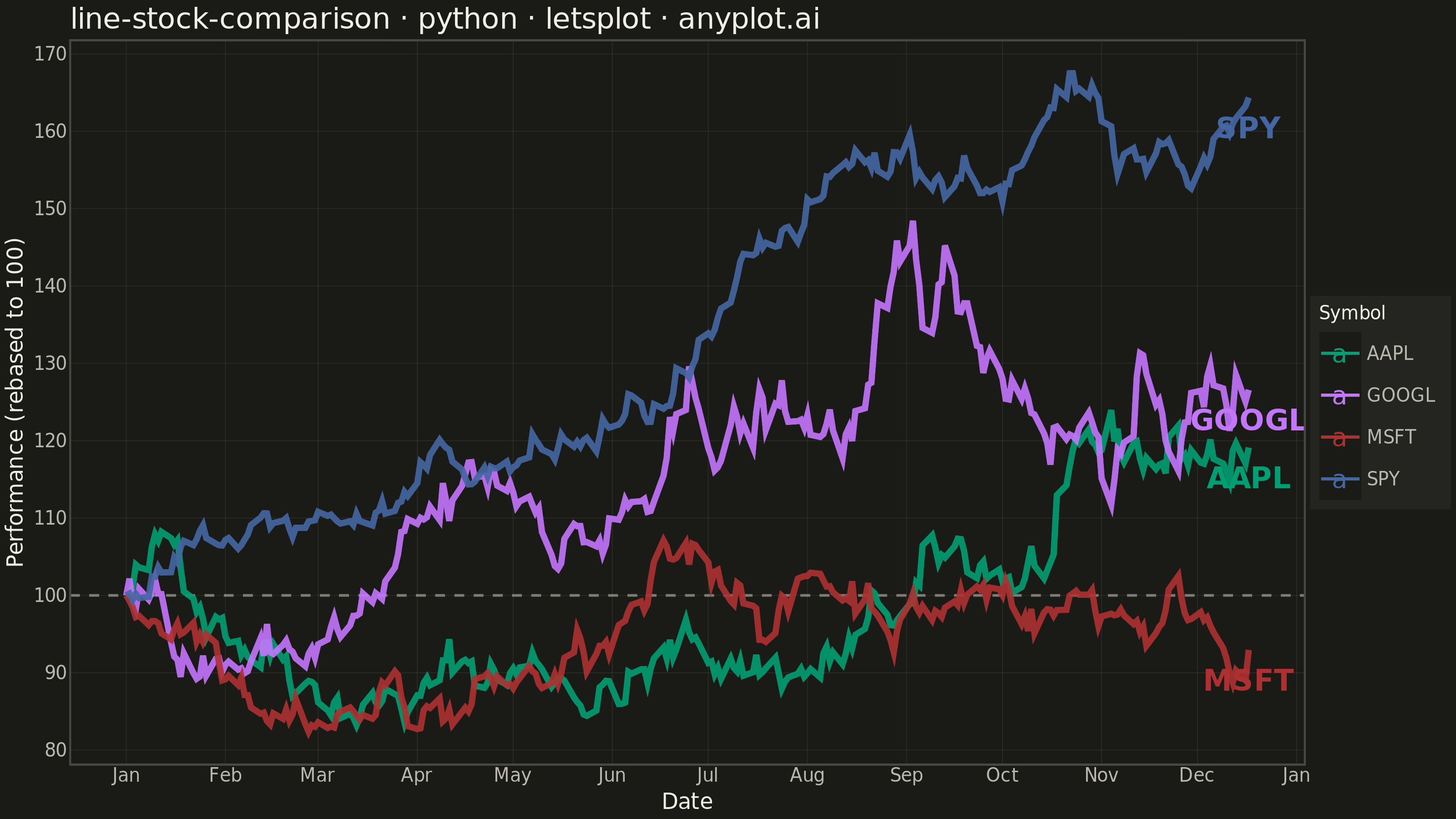
A multi-line chart comparing multiple stock price series normalized to a common starting point (rebased to 100) for direct performance comparison over time. By rebasing all series to the same initial value, investors can easily compare relative returns regardless of absolute price differences. This visualization reveals which stocks outperformed or underperformed relative to each other, making it essential for portfolio analysis and benchmark comparisons.
""" anyplot.ai
line-stock-comparison: Stock Price Comparison Chart
Library: letsplot 4.10.1 | Python 3.13.13
Quality: 83/100 | Updated: 2026-05-23
"""

import os

import numpy as np
import pandas as pd
from lets_plot import (
    LetsPlot,
    aes,
    element_blank,
    element_line,
    element_rect,
    element_text,
    geom_hline,
    geom_line,
    geom_text,
    ggplot,
    ggsize,
    labs,
    layer_tooltips,
    scale_color_manual,
    theme,
    theme_minimal,
)
from lets_plot.export import ggsave


LetsPlot.setup_html()

# Theme tokens
THEME = os.getenv("ANYPLOT_THEME", "light")
PAGE_BG = "#FAF8F1" if THEME == "light" else "#1A1A17"
ELEVATED_BG = "#FFFDF6" if THEME == "light" else "#242420"
INK = "#1A1A17" if THEME == "light" else "#F0EFE8"
INK_SOFT = "#4A4A44" if THEME == "light" else "#B8B7B0"
RULE = "rgba(26,26,23,0.10)" if THEME == "light" else "rgba(240,239,232,0.10)"

IMPRINT = ["#009E73", "#C475FD", "#AE3030", "#4467A3"]

# Data
np.random.seed(42)
dates = pd.date_range("2024-01-01", periods=252, freq="B")
symbols = ["AAPL", "GOOGL", "MSFT", "SPY"]

data_frames = []
for symbol in symbols:
    if symbol == "AAPL":
        drift, volatility = 0.0008, 0.018
    elif symbol == "GOOGL":
        drift, volatility = 0.0006, 0.020
    elif symbol == "MSFT":
        drift, volatility = 0.0009, 0.016
    else:  # SPY index — lower volatility
        drift, volatility = 0.0005, 0.010

    returns = np.random.normal(drift, volatility, len(dates))
    price = 100 * np.exp(np.cumsum(returns))
    df_symbol = pd.DataFrame({"date": dates, "symbol": symbol, "price": price})
    data_frames.append(df_symbol)

df = pd.concat(data_frames, ignore_index=True)
df["rebased"] = df.groupby("symbol")["price"].transform(lambda x: x / x.iloc[0] * 100)

# Last data point per series for end-of-line labels
df_end = df.loc[df.groupby("symbol")["date"].idxmax()].copy()

# Plot
plot = (
    ggplot(df, aes(x="date", y="rebased", color="symbol"))
    + geom_hline(yintercept=100, linetype="dashed", color=INK_SOFT, size=0.6, alpha=0.6)
    + geom_line(size=1.5, alpha=0.9, tooltips=layer_tooltips().format("^y", ".1f").line("@symbol").line("Rebased|^y"))
    + geom_text(
        data=df_end,
        mapping=aes(x="date", y="rebased", label="symbol", color="symbol"),
        hjust=0.5,
        vjust=2,
        size=8,
        fontface="bold",
    )
    + scale_color_manual(values=IMPRINT, name="Symbol")
    + labs(title="line-stock-comparison · python · letsplot · anyplot.ai", x="Date", y="Performance (rebased to 100)")
    + theme_minimal()
    + theme(
        plot_background=element_rect(fill=PAGE_BG, color=PAGE_BG),
        panel_background=element_rect(fill=PAGE_BG),
        panel_grid_major=element_line(color=RULE, size=0.3),
        panel_grid_minor=element_blank(),
        axis_title=element_text(size=12, color=INK),
        axis_text=element_text(size=10, color=INK_SOFT),
        plot_title=element_text(size=16, color=INK),
        legend_title=element_text(size=10, color=INK),
        legend_text=element_text(size=10, color=INK_SOFT),
        legend_background=element_rect(fill=ELEVATED_BG, color=INK_SOFT),
        legend_position="right",
    )
    + ggsize(800, 450)
)

# Save
ggsave(plot, f"plot-{THEME}.png", path=".", scale=4)
ggsave(plot, f"plot-{THEME}.html", path=".")
Runnable source as JSON, for any HTTP client: https://api.anyplot.ai/specs/line-stock-comparison/letsplot/code. Any spec id and library id listed in llms-full.txt fit the same URL shape; every URL below is complete and callable.
{
  "spec_id": "line-stock-comparison",
  "language": "python",
  "library": "letsplot",
  "page": "https://anyplot.ai/line-stock-comparison/python/letsplot",
  "hub": "https://anyplot.ai/line-stock-comparison",
  "code_json": "https://api.anyplot.ai/specs/line-stock-comparison/letsplot/code",
  "spec_json": "https://api.anyplot.ai/specs/line-stock-comparison",
  "render_light_png": "https://storage.googleapis.com/anyplot-images/plots/line-stock-comparison/python/letsplot/plot-light.png",
  "render_dark_png": "https://storage.googleapis.com/anyplot-images/plots/line-stock-comparison/python/letsplot/plot-dark.png",
  "interactive_light_html": "https://storage.googleapis.com/anyplot-images/plots/line-stock-comparison/python/letsplot/plot-light.html",
  "interactive_dark_html": "https://storage.googleapis.com/anyplot-images/plots/line-stock-comparison/python/letsplot/plot-dark.html",
  "quality_score": 83.0,
  "license": "MIT",
  "guide": "https://anyplot.ai/llms.txt"
}
Part of Stock Price Comparison Chart on anyplot.ai.