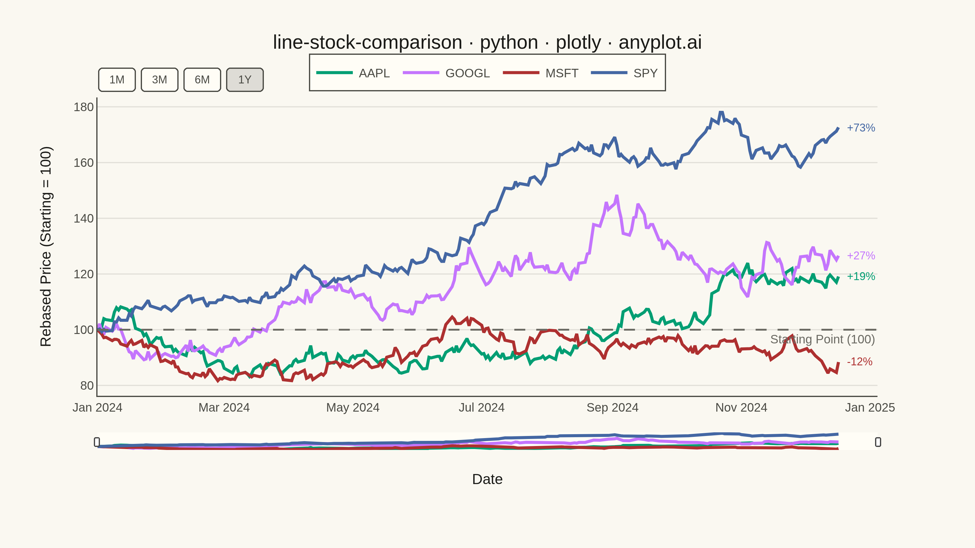
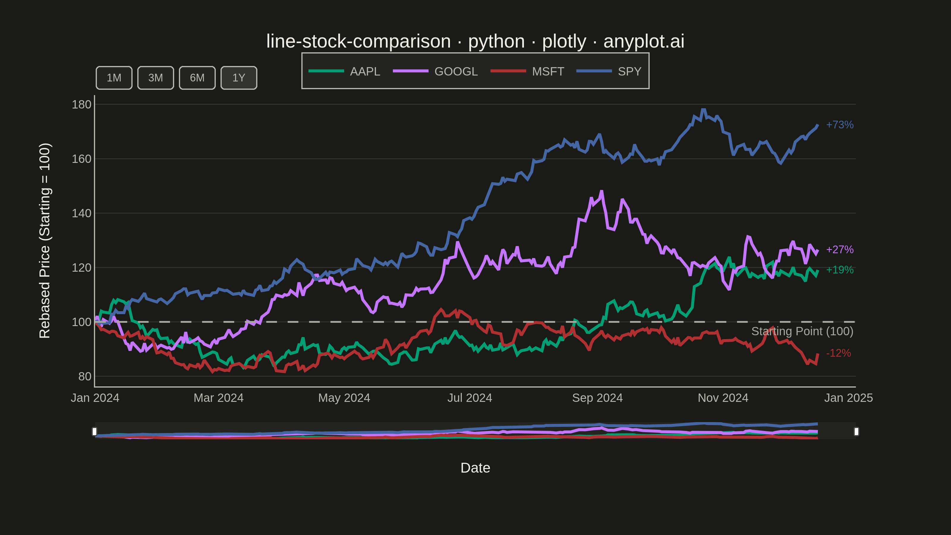
A multi-line chart comparing multiple stock price series normalized to a common starting point (rebased to 100) for direct performance comparison over time. By rebasing all series to the same initial value, investors can easily compare relative returns regardless of absolute price differences. This visualization reveals which stocks outperformed or underperformed relative to each other, making it essential for portfolio analysis and benchmark comparisons.
""" anyplot.ai
line-stock-comparison: Stock Price Comparison Chart
Library: plotly 6.7.0 | Python 3.13.13
Quality: 88/100 | Updated: 2026-05-23
"""

import os

import numpy as np
import pandas as pd
import plotly.graph_objects as go


# Theme tokens
THEME = os.getenv("ANYPLOT_THEME", "light")
PAGE_BG = "#FAF8F1" if THEME == "light" else "#1A1A17"
ELEVATED_BG = "#FFFDF6" if THEME == "light" else "#242420"
INK = "#1A1A17" if THEME == "light" else "#F0EFE8"
INK_SOFT = "#4A4A44" if THEME == "light" else "#B8B7B0"
INK_MUTED = "#6B6A63" if THEME == "light" else "#A8A79F"
GRID = "rgba(26,26,23,0.10)" if THEME == "light" else "rgba(240,239,232,0.10)"
SELECTOR_ACTIVE = "rgba(26,26,23,0.12)" if THEME == "light" else "rgba(240,239,232,0.12)"

IMPRINT = ["#009E73", "#C475FD", "#AE3030", "#4467A3"]

# Data - Generate synthetic stock price data for 4 companies
np.random.seed(42)
n_days = 252  # Approximately 1 year of trading days
date_range = pd.date_range(start="2024-01-01", periods=n_days, freq="B")

# Define stocks with different volatility and drift characteristics
stocks = {
    "AAPL": {"drift": 0.0008, "volatility": 0.018},
    "GOOGL": {"drift": 0.0006, "volatility": 0.020},
    "MSFT": {"drift": 0.0007, "volatility": 0.016},
    "SPY": {"drift": 0.0004, "volatility": 0.012},
}

# Generate price paths using geometric Brownian motion
price_data = {}
for symbol, params in stocks.items():
    returns = np.random.normal(params["drift"], params["volatility"], n_days)
    prices = 100 * np.exp(np.cumsum(returns))
    price_data[symbol] = prices

# Create DataFrame and normalize all series to 100 at the starting point (rebasing)
df = pd.DataFrame(price_data, index=date_range)
df_rebased = (df / df.iloc[0]) * 100
dates = df_rebased.index.strftime("%Y-%m-%d").tolist()

# Plot
fig = go.Figure()

for i, symbol in enumerate(stocks.keys()):
    fig.add_trace(
        go.Scatter(
            x=dates,
            y=df_rebased[symbol],
            mode="lines",
            name=symbol,
            line={"width": 2.5, "color": IMPRINT[i]},
            hovertemplate=f"{symbol}<br>Date: %{{x|%Y-%m-%d}}<br>Value: %{{y:.1f}}<extra></extra>",
        )
    )

# Add horizontal reference line at 100
fig.add_hline(
    y=100,
    line_dash="dash",
    line_color=INK_MUTED,
    line_width=1.5,
    annotation_text="Starting Point (100)",
    annotation_position="bottom right",
    annotation_font_size=10,
    annotation_font_color=INK_MUTED,
)

# Add end-point value labels for each series to show final performance
for i, symbol in enumerate(stocks.keys()):
    final_value = df_rebased[symbol].iloc[-1]
    pct = final_value - 100
    sign = "+" if pct >= 0 else ""
    fig.add_annotation(
        x=dates[-1],
        y=final_value,
        text=f"  {sign}{pct:.0f}%",
        showarrow=False,
        xanchor="left",
        yanchor="middle",
        font={"size": 9, "color": IMPRINT[i]},
    )

# Layout
fig.update_layout(
    autosize=False,
    paper_bgcolor=PAGE_BG,
    plot_bgcolor=PAGE_BG,
    font={"color": INK},
    title={
        "text": "line-stock-comparison · python · plotly · anyplot.ai",
        "font": {"size": 16, "color": INK},
        "x": 0.5,
        "xanchor": "center",
    },
    xaxis={
        "title": {"text": "Date", "font": {"size": 12, "color": INK}},
        "tickfont": {"size": 10, "color": INK_SOFT},
        "showgrid": False,
        "gridcolor": GRID,
        "linecolor": INK_SOFT,
        "zerolinecolor": INK_SOFT,
        "rangeselector": {
            "buttons": [
                {"count": 1, "label": "1M", "step": "month", "stepmode": "backward"},
                {"count": 3, "label": "3M", "step": "month", "stepmode": "backward"},
                {"count": 6, "label": "6M", "step": "month", "stepmode": "backward"},
                {"step": "all", "label": "1Y"},
            ],
            "bgcolor": ELEVATED_BG,
            "activecolor": SELECTOR_ACTIVE,
            "bordercolor": INK_SOFT,
            "borderwidth": 1,
            "font": {"color": INK_SOFT, "size": 9},
        },
        "rangeslider": {"visible": True, "bgcolor": ELEVATED_BG, "bordercolor": INK_SOFT, "thickness": 0.05},
    },
    yaxis={
        "title": {"text": "Rebased Price (Starting = 100)", "font": {"size": 12, "color": INK}},
        "tickfont": {"size": 10, "color": INK_SOFT},
        "showgrid": True,
        "gridcolor": GRID,
        "linecolor": INK_SOFT,
        "zerolinecolor": INK_SOFT,
    },
    legend={
        "bgcolor": ELEVATED_BG,
        "bordercolor": INK_SOFT,
        "borderwidth": 1,
        "font": {"size": 10, "color": INK_SOFT},
        "orientation": "h",
        "yanchor": "bottom",
        "y": 1.02,
        "xanchor": "center",
        "x": 0.5,
    },
    margin={"l": 80, "r": 80, "t": 80, "b": 80},
    hovermode="x unified",
)

# Save
fig.write_image(f"plot-{THEME}.png", width=800, height=450, scale=4)
fig.write_html(f"plot-{THEME}.html", include_plotlyjs="cdn")
Runnable source as JSON, for any HTTP client: https://api.anyplot.ai/specs/line-stock-comparison/plotly/code. Any spec id and library id listed in llms-full.txt fit the same URL shape; every URL below is complete and callable.
{
  "spec_id": "line-stock-comparison",
  "language": "python",
  "library": "plotly",
  "page": "https://anyplot.ai/line-stock-comparison/python/plotly",
  "hub": "https://anyplot.ai/line-stock-comparison",
  "code_json": "https://api.anyplot.ai/specs/line-stock-comparison/plotly/code",
  "spec_json": "https://api.anyplot.ai/specs/line-stock-comparison",
  "render_light_png": "https://storage.googleapis.com/anyplot-images/plots/line-stock-comparison/python/plotly/plot-light.png",
  "render_dark_png": "https://storage.googleapis.com/anyplot-images/plots/line-stock-comparison/python/plotly/plot-dark.png",
  "interactive_light_html": "https://storage.googleapis.com/anyplot-images/plots/line-stock-comparison/python/plotly/plot-light.html",
  "interactive_dark_html": "https://storage.googleapis.com/anyplot-images/plots/line-stock-comparison/python/plotly/plot-dark.html",
  "quality_score": 88.0,
  "license": "MIT",
  "guide": "https://anyplot.ai/llms.txt"
}
Part of Stock Price Comparison Chart on anyplot.ai.