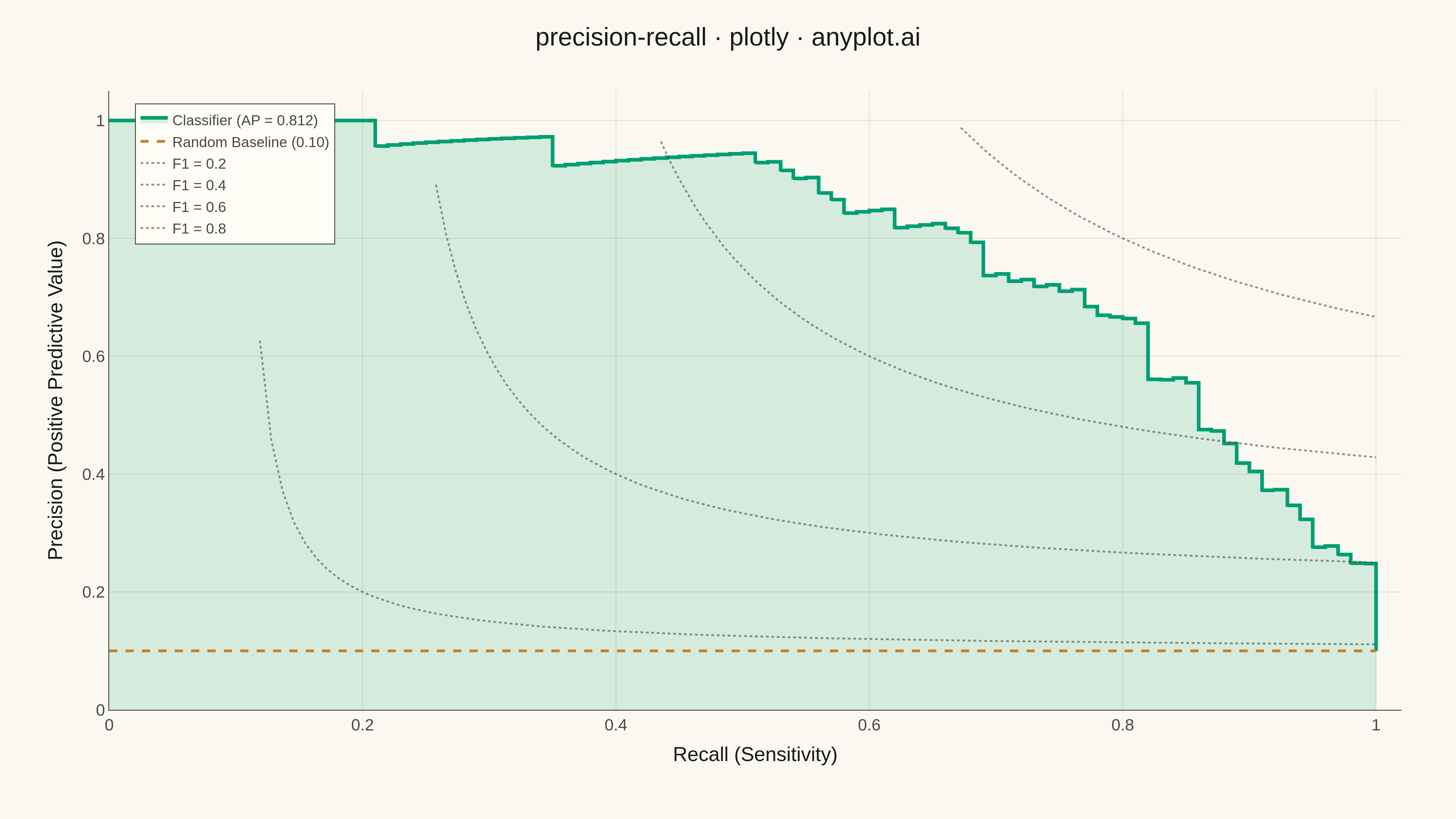
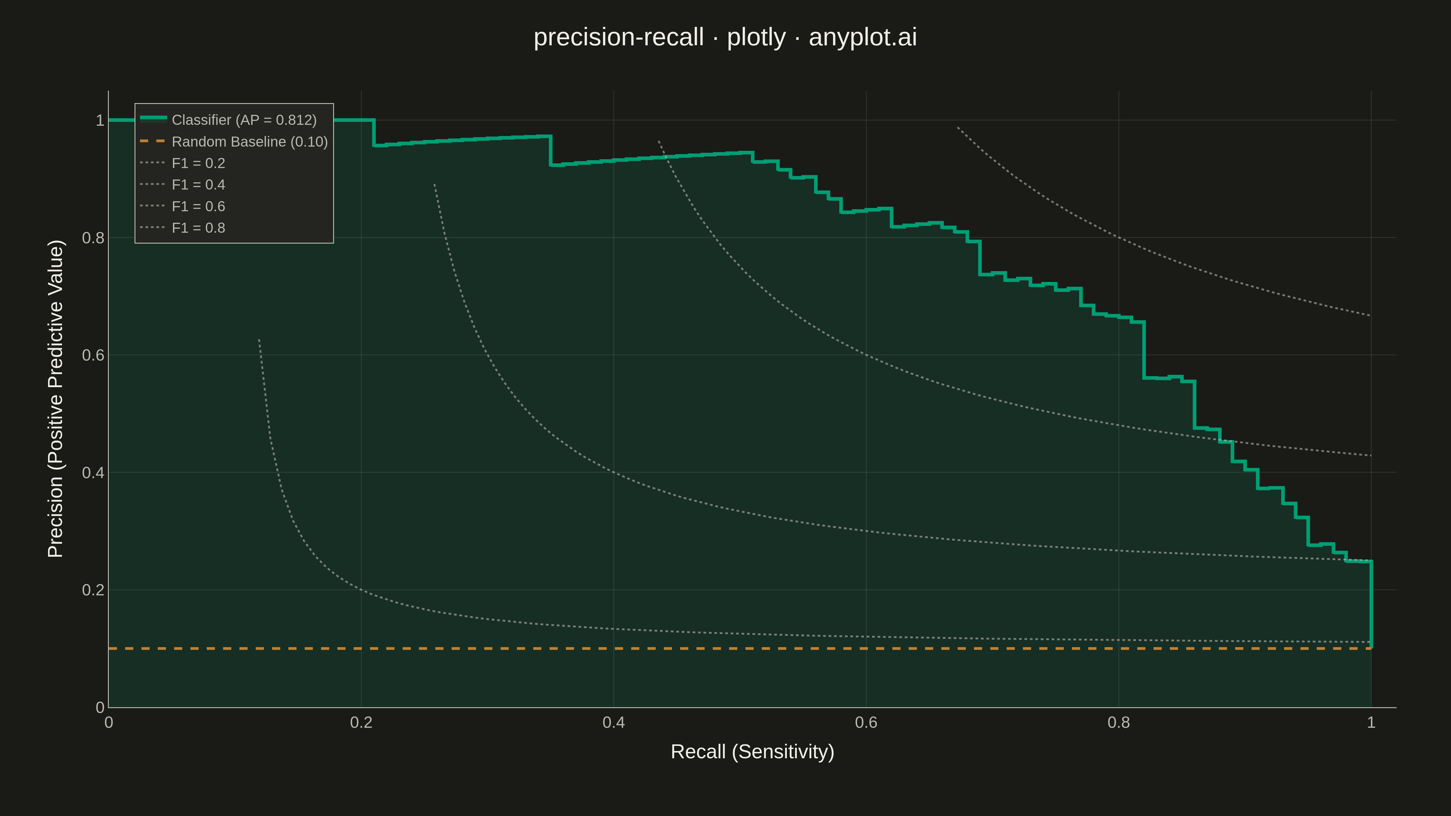
A Precision-Recall curve plots precision (positive predictive value) against recall (sensitivity) at various classification thresholds. This visualization is essential for evaluating binary classifiers on imbalanced datasets where accuracy alone is misleading. The area under the curve (Average Precision) summarizes classifier performance, with higher values indicating better performance.
""" anyplot.ai
precision-recall: Precision-Recall Curve
Library: plotly 6.7.0 | Python 3.13.13
Quality: 94/100 | Updated: 2026-05-10
"""

import os

import numpy as np
import plotly.graph_objects as go
from sklearn.metrics import average_precision_score, precision_recall_curve


# Theme tokens
THEME = os.getenv("ANYPLOT_THEME", "light")
PAGE_BG = "#FAF8F1" if THEME == "light" else "#1A1A17"
ELEVATED_BG = "#FFFDF6" if THEME == "light" else "#242420"
INK = "#1A1A17" if THEME == "light" else "#F0EFE8"
INK_SOFT = "#4A4A44" if THEME == "light" else "#B8B7B0"
GRID = "rgba(26,26,23,0.10)" if THEME == "light" else "rgba(240,239,232,0.10)"

# Okabe-Ito palette
BRAND = "#009E73"  # Position 1, first series
SECONDARY = "#BD8233"  # imprint ochre — secondary reference (red is reserved for semantic bad)

# Data - Simulate a binary classification scenario (fraud detection)
np.random.seed(42)
n_samples = 1000

# Imbalanced dataset: 10% positive class (fraud cases)
y_true = np.zeros(n_samples, dtype=int)
y_true[:100] = 1
np.random.shuffle(y_true)

# Generate prediction scores - good classifier with some noise
y_scores = np.where(
    y_true == 1,
    np.random.beta(5, 2, n_samples),  # Higher scores for positive class
    np.random.beta(2, 5, n_samples),  # Lower scores for negative class
)

# Calculate precision-recall curve
precision, recall, thresholds = precision_recall_curve(y_true, y_scores)
average_precision = average_precision_score(y_true, y_scores)

# Calculate baseline (random classifier performance)
positive_class_ratio = np.mean(y_true)

# Create figure
fig = go.Figure()

# Add precision-recall curve (stepped style for accuracy)
fig.add_trace(
    go.Scatter(
        x=recall,
        y=precision,
        mode="lines",
        name=f"Classifier (AP = {average_precision:.3f})",
        line={"color": BRAND, "width": 4, "shape": "hv"},
        fill="tozeroy",
        fillcolor=f"rgba({int(BRAND[1:3], 16)}, {int(BRAND[3:5], 16)}, {int(BRAND[5:7], 16)}, 0.15)",
        hovertemplate="<b>Classifier</b><br>Recall: %{x:.3f}<br>Precision: %{y:.3f}<extra></extra>",
    )
)

# Add baseline reference line (random classifier)
fig.add_trace(
    go.Scatter(
        x=[0, 1],
        y=[positive_class_ratio, positive_class_ratio],
        mode="lines",
        name=f"Random Baseline ({positive_class_ratio:.2f})",
        line={"color": SECONDARY, "width": 3, "dash": "dash"},
        hovertemplate="<b>Random Baseline</b><br>Precision: %{y:.3f}<extra></extra>",
    )
)

# Add iso-F1 curves
f1_values = [0.2, 0.4, 0.6, 0.8]
for f1 in f1_values:
    # Iso-F1: precision = f1 * recall / (2 * recall - f1) for valid recall range
    x_iso = np.linspace(f1 / 2 + 0.01, 1, 100)
    y_iso = f1 * x_iso / (2 * x_iso - f1)
    # Only keep valid values within [0, 1] range
    mask = (y_iso > 0) & (y_iso <= 1)
    fig.add_trace(
        go.Scatter(
            x=x_iso[mask],
            y=y_iso[mask],
            mode="lines",
            name=f"F1 = {f1}",
            line={"color": INK_SOFT, "width": 2, "dash": "dot"},
            opacity=0.6,
            hovertemplate="<b>Iso-F1: %{fullData.name}</b><br>Recall: %{x:.3f}<br>Precision: %{y:.3f}<extra></extra>",
        )
    )

# Update layout for 4800x2700 px
fig.update_layout(
    title={
        "text": "precision-recall · plotly · anyplot.ai",
        "font": {"size": 28, "color": INK},
        "x": 0.5,
        "xanchor": "center",
    },
    xaxis={
        "title": {"text": "Recall (Sensitivity)", "font": {"size": 22, "color": INK}},
        "tickfont": {"size": 18, "color": INK_SOFT},
        "range": [0, 1.02],
        "showgrid": True,
        "gridcolor": GRID,
        "gridwidth": 1,
        "zeroline": False,
        "linecolor": INK_SOFT,
        "linewidth": 1,
    },
    yaxis={
        "title": {"text": "Precision (Positive Predictive Value)", "font": {"size": 22, "color": INK}},
        "tickfont": {"size": 18, "color": INK_SOFT},
        "range": [0, 1.05],
        "showgrid": True,
        "gridcolor": GRID,
        "gridwidth": 1,
        "zeroline": False,
        "linecolor": INK_SOFT,
        "linewidth": 1,
    },
    legend={
        "font": {"size": 16, "color": INK_SOFT},
        "x": 0.02,
        "y": 0.98,
        "xanchor": "left",
        "yanchor": "top",
        "bgcolor": ELEVATED_BG,
        "bordercolor": INK_SOFT,
        "borderwidth": 1,
    },
    paper_bgcolor=PAGE_BG,
    plot_bgcolor=PAGE_BG,
    margin={"l": 120, "r": 60, "t": 100, "b": 120},
    hovermode="closest",
)

# Save outputs
fig.write_image(f"plot-{THEME}.png", width=1600, height=900, scale=3)
fig.write_html(f"plot-{THEME}.html", include_plotlyjs="cdn")
Runnable source as JSON, for any HTTP client: https://api.anyplot.ai/specs/precision-recall/plotly/code. Any spec id and library id listed in llms-full.txt fit the same URL shape; every URL below is complete and callable.
{
  "spec_id": "precision-recall",
  "language": "python",
  "library": "plotly",
  "page": "https://anyplot.ai/precision-recall/python/plotly",
  "hub": "https://anyplot.ai/precision-recall",
  "code_json": "https://api.anyplot.ai/specs/precision-recall/plotly/code",
  "spec_json": "https://api.anyplot.ai/specs/precision-recall",
  "render_light_png": "https://storage.googleapis.com/anyplot-images/plots/precision-recall/python/plotly/plot-light.png",
  "render_dark_png": "https://storage.googleapis.com/anyplot-images/plots/precision-recall/python/plotly/plot-dark.png",
  "interactive_light_html": "https://storage.googleapis.com/anyplot-images/plots/precision-recall/python/plotly/plot-light.html",
  "interactive_dark_html": "https://storage.googleapis.com/anyplot-images/plots/precision-recall/python/plotly/plot-dark.html",
  "quality_score": 94.0,
  "license": "MIT",
  "guide": "https://anyplot.ai/llms.txt"
}
Part of Precision-Recall Curve on anyplot.ai.