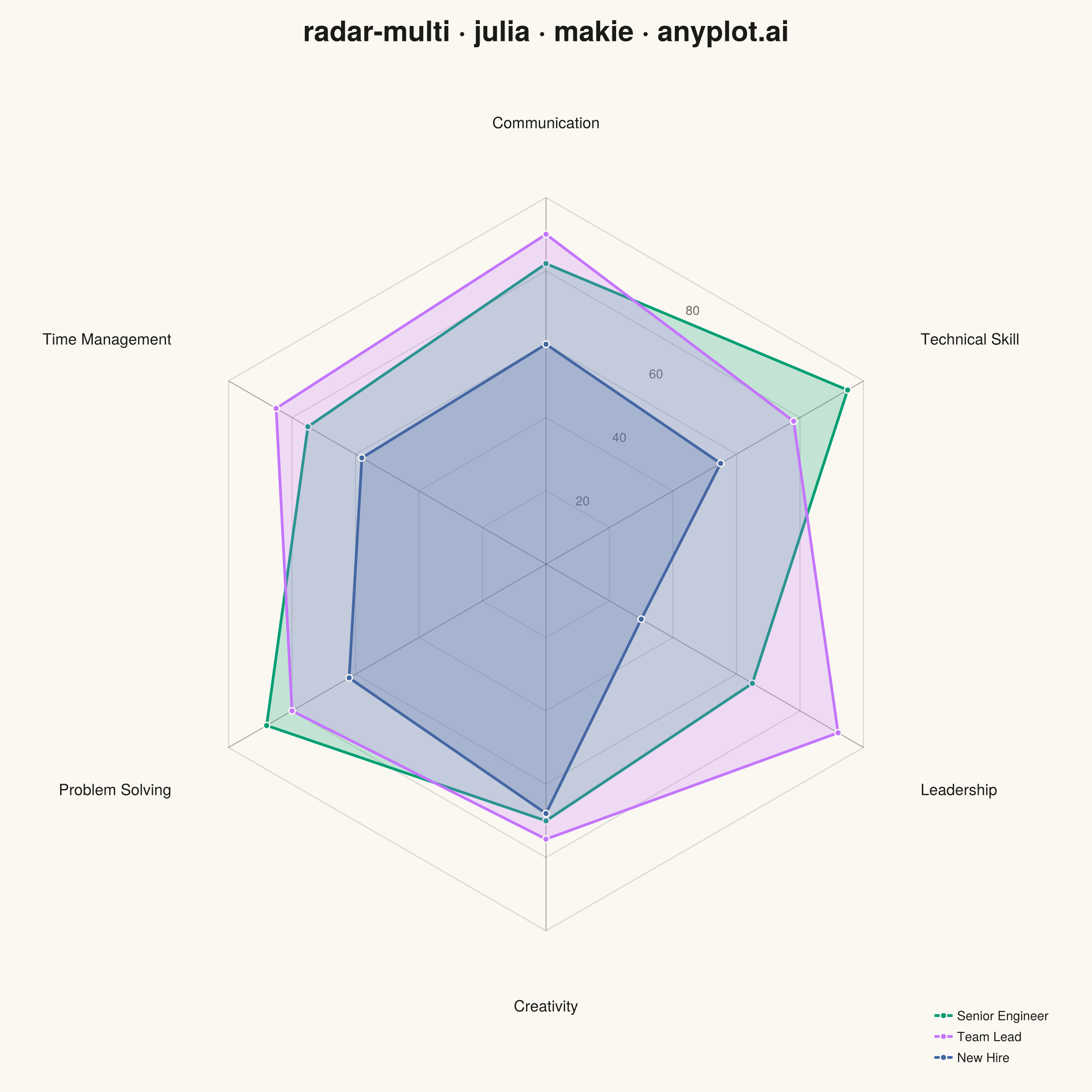
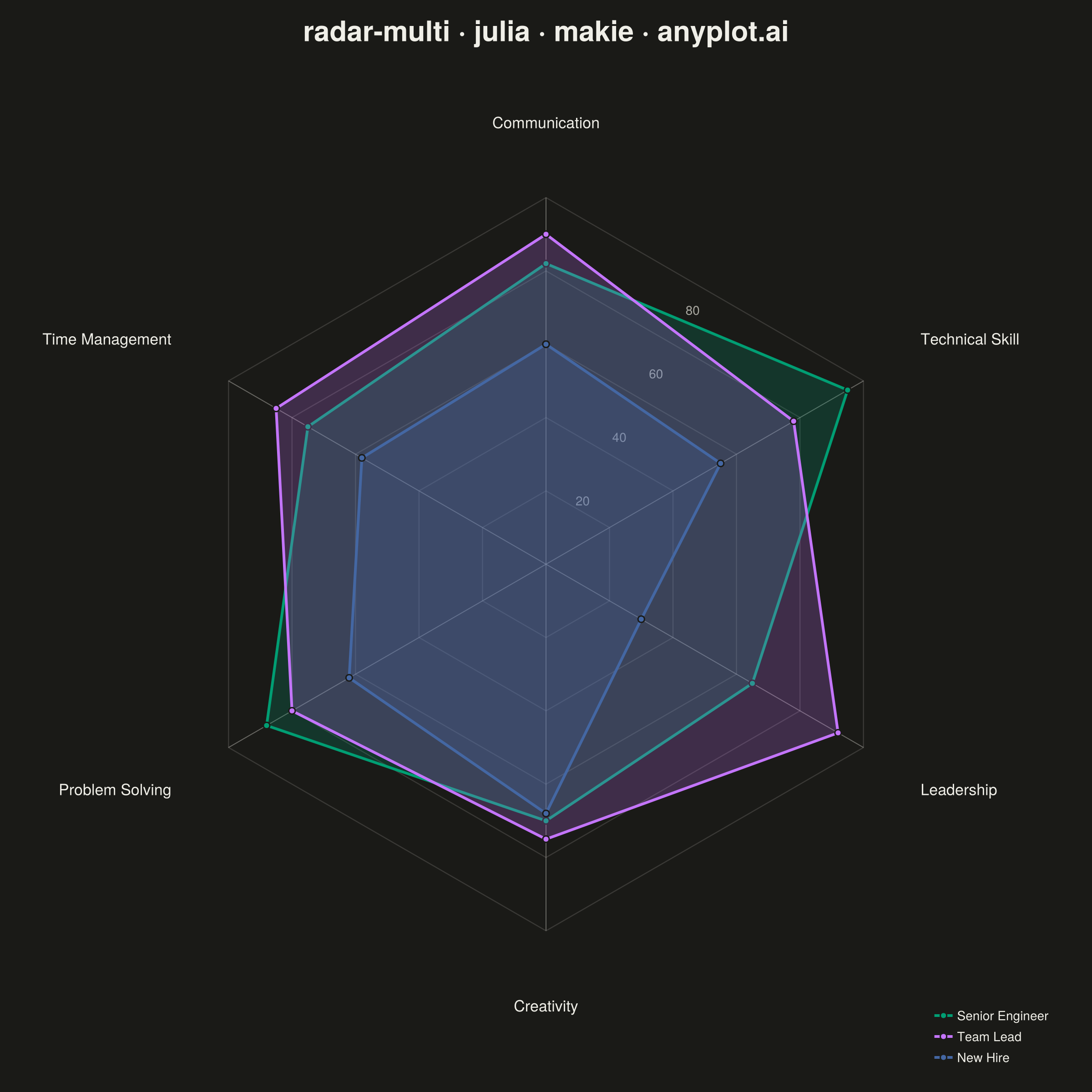
The same plot in 14 other libraries — Python: Altair, Bokeh, lets-plot, Matplotlib, Plotly, plotnine, Pygal, Seaborn; R: ggplot2; JavaScript: Chart.js, D3.js, Apache ECharts, Highcharts, MUI X Charts. Compare all 15 side by side: Multi-Series Radar Chart in Python, R, Julia and JavaScript.
A multi-series radar chart overlays multiple data polygons on shared axes radiating from a center point, enabling direct comparison across several entities or categories. Each series is rendered as a distinct colored polygon, making it easy to identify relative strengths and weaknesses at a glance. This visualization excels at comparative analysis where multiple subjects are evaluated across the same set of metrics.
# anyplot.ai
# radar-multi: Multi-Series Radar Chart
# Library: makie 0.21.9 | Julia 1.11.9
# Quality: 88/100 | Updated: 2026-08-18

using CairoMakie
using Colors

# --- Theme tokens -------------------------------------------------------------
const THEME    = get(ENV, "ANYPLOT_THEME", "light")
const PAGE_BG  = THEME == "light" ? colorant"#FAF8F1" : colorant"#1A1A17"
const INK      = THEME == "light" ? colorant"#1A1A17" : colorant"#F0EFE8"
const INK_SOFT = THEME == "light" ? colorant"#4A4A44" : colorant"#B8B7B0"
const INK_MUTED = THEME == "light" ? colorant"#6B6A63" : colorant"#A8A79F"

# Imprint categorical palette — 8 hues, theme-independent, hybrid-v3 sort
const IMPRINT_PALETTE = [
    colorant"#009E73", colorant"#C475FD", colorant"#4467A3", colorant"#BD8233",
    colorant"#AE3030", colorant"#2ABCCD", colorant"#954477", colorant"#99B314",
]

# --- Data: skill assessment across three roles ---------------------------------
categories = ["Communication", "Technical Skill", "Leadership",
              "Creativity", "Problem Solving", "Time Management"]
series_names = ["Senior Engineer", "Team Lead", "New Hire"]
scores = [
    82.0 90.0 60.0   # Communication
    95.0 78.0 55.0   # Technical Skill
    65.0 92.0 30.0   # Leadership
    70.0 75.0 68.0   # Creativity
    88.0 80.0 62.0   # Problem Solving
    75.0 85.0 58.0   # Time Management
]

n_axes = length(categories)
angles = [pi / 2 - 2pi * (i - 1) / n_axes for i in 1:n_axes]
max_value = 100.0
ring_values = 20:20:100

# --- Plot -----------------------------------------------------------------------
fig = Figure(resolution = (1200, 1200), fontsize = 14, backgroundcolor = PAGE_BG)

ax = Axis(
    fig[1, 1];
    title           = "radar-multi · julia · makie · anyplot.ai",
    titlesize       = 31,
    titlecolor      = INK,
    backgroundcolor = PAGE_BG,
    aspect          = DataAspect(),
)
hidedecorations!(ax)
hidespines!(ax)
limits!(ax, -140, 140, -140, 140)

# Concentric reference rings for value gridlines
for ring in ring_values
    ring_x = [ring * cos(a) for a in angles]
    ring_y = [ring * sin(a) for a in angles]
    push!(ring_x, ring_x[1])
    push!(ring_y, ring_y[1])
    lines!(ax, ring_x, ring_y; color = (INK, 0.15), linewidth = 1.2)
end

# Spokes from center to each category axis
for a in angles
    lines!(ax, [0.0, max_value * cos(a)], [0.0, max_value * sin(a)];
           color = (INK_SOFT, 0.5), linewidth = 1.0)
end

# Radial value labels placed in the empty sector between the first two axes
label_angle = (angles[1] + angles[2]) / 2
for ring in ring_values[1:(end - 1)]
    text!(ax, ring * cos(label_angle), ring * sin(label_angle);
          text = string(Int(ring)), color = INK_MUTED, fontsize = 14,
          align = (:center, :center))
end

# Category labels at the outer edge
for (i, category) in enumerate(categories)
    a = angles[i]
    label_x, label_y = 118 * cos(a), 118 * sin(a)
    halign = cos(a) > 0.15 ? :left : (cos(a) < -0.15 ? :right : :center)
    valign = sin(a) > 0.15 ? :bottom : (sin(a) < -0.15 ? :top : :center)
    text!(ax, label_x, label_y; text = category, color = INK, fontsize = 17,
          align = (halign, valign))
end

# Series polygons — filled with transparency, outlined, and vertex-marked.
# scatterlines! draws the stroke+marker vertices and connecting outline in a
# single Makie recipe call (matplotlib needs two separate calls for this).
for (s, series) in enumerate(series_names)
    values = scores[:, s]
    vertex_x = [values[i] * cos(angles[i]) for i in 1:n_axes]
    vertex_y = [values[i] * sin(angles[i]) for i in 1:n_axes]
    color = IMPRINT_PALETTE[s]

    poly!(ax, Point2f.(vertex_x, vertex_y); color = (color, 0.22), strokewidth = 0)
    closed_x, closed_y = vcat(vertex_x, vertex_x[1]), vcat(vertex_y, vertex_y[1])
    scatterlines!(ax, closed_x, closed_y; color = color, linewidth = 3,
                  markersize = 10, strokewidth = 1.5, strokecolor = PAGE_BG,
                  label = series)
end

axislegend(ax; position = :rb, framevisible = false, labelcolor = INK,
           labelsize = 14, backgroundcolor = (PAGE_BG, 0.0))

# --- Save -------------------------------------------------------------------
save("plot-$(THEME).png", fig; px_per_unit = 2)
Runnable source as JSON, for any HTTP client: https://api.anyplot.ai/specs/radar-multi/makie/code. Any spec id and library id listed in llms-full.txt fit the same URL shape; every URL below is complete and callable.
{
  "spec_id": "radar-multi",
  "language": "julia",
  "library": "makie",
  "page": "https://anyplot.ai/radar-multi/julia/makie",
  "hub": "https://anyplot.ai/radar-multi",
  "code_json": "https://api.anyplot.ai/specs/radar-multi/makie/code",
  "spec_json": "https://api.anyplot.ai/specs/radar-multi",
  "render_light_png": "https://storage.googleapis.com/anyplot-images/plots/radar-multi/julia/makie/plot-light.png",
  "render_dark_png": "https://storage.googleapis.com/anyplot-images/plots/radar-multi/julia/makie/plot-dark.png",
  "quality_score": 88.0,
  "license": "MIT",
  "guide": "https://anyplot.ai/llms.txt"
}
Part of Multi-Series Radar Chart on anyplot.ai.