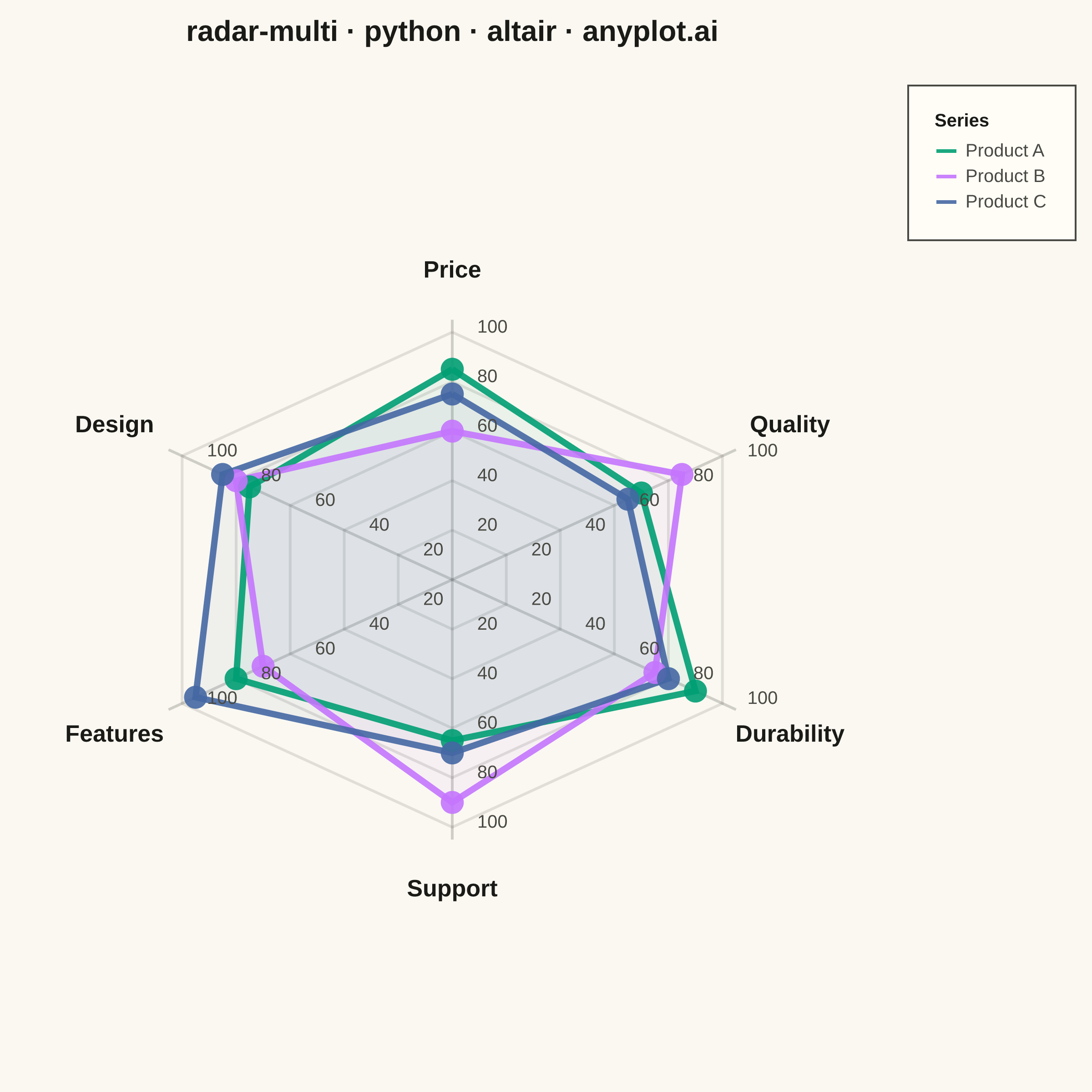
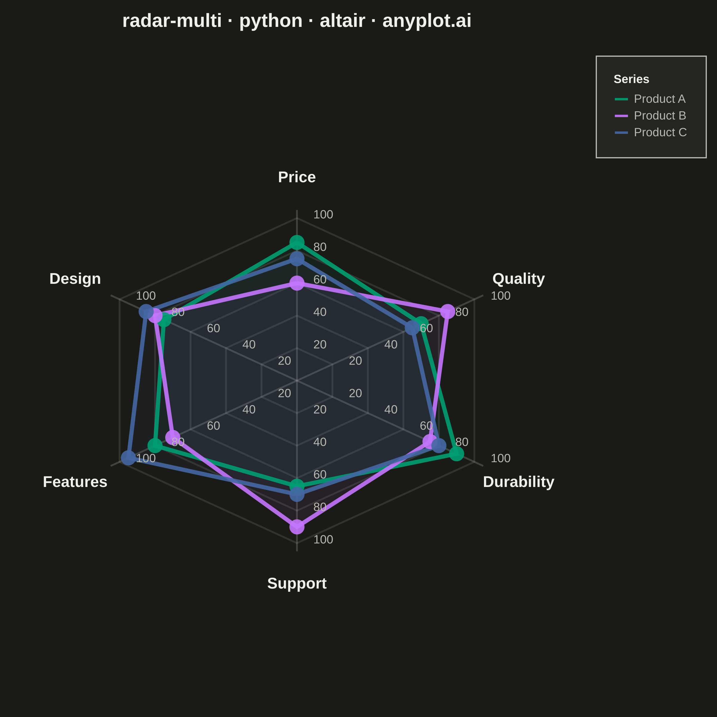
A multi-series radar chart overlays multiple data polygons on shared axes radiating from a center point, enabling direct comparison across several entities or categories. Each series is rendered as a distinct colored polygon, making it easy to identify relative strengths and weaknesses at a glance. This visualization excels at comparative analysis where multiple subjects are evaluated across the same set of metrics.
""" anyplot.ai
radar-multi: Multi-Series Radar Chart
Library: altair 6.2.2 | Python 3.13.15
Quality: 90/100 | Updated: 2026-08-17
"""

import importlib.util
import os
import sys

import numpy as np
import pandas as pd
from PIL import Image


# Explicitly import altair from site-packages to avoid shadowing
spec = importlib.util.find_spec("altair")
if spec and spec.origin and "site-packages" in spec.origin:
    alt = importlib.util.module_from_spec(spec)
    sys.modules["altair"] = alt
    spec.loader.exec_module(alt)
else:
    # Fallback: remove the directory containing this script from path
    script_dir = os.path.dirname(os.path.abspath(__file__))
    sys.path[:] = [p for p in sys.path if os.path.abspath(p) != script_dir]
    import altair as alt


# Theme tokens
THEME = os.getenv("ANYPLOT_THEME", "light")
PAGE_BG = "#FAF8F1" if THEME == "light" else "#1A1A17"
ELEVATED_BG = "#FFFDF6" if THEME == "light" else "#242420"
INK = "#1A1A17" if THEME == "light" else "#F0EFE8"
INK_SOFT = "#4A4A44" if THEME == "light" else "#B8B7B0"

# Imprint palette (first series ALWAYS #009E73)
IMPRINT = ["#009E73", "#C475FD", "#4467A3"]

# Data: Product comparison across key attributes
categories = ["Price", "Quality", "Durability", "Support", "Features", "Design"]
n_categories = len(categories)

data = {
    "Product A": [85, 70, 90, 65, 80, 75],
    "Product B": [60, 85, 75, 90, 70, 80],
    "Product C": [75, 65, 80, 70, 95, 85],
}

# Calculate angles for each axis (in radians) - start from top
angles = [np.pi / 2 - i * 2 * np.pi / n_categories for i in range(n_categories)]

# Build records for each series
records = []
for series_name, values in data.items():
    for i, (cat, val, angle) in enumerate(zip(categories, values, angles, strict=True)):
        # Convert polar to cartesian for plotting
        x = val * np.cos(angle)
        y = val * np.sin(angle)
        records.append(
            {"series": series_name, "category": cat, "value": val, "angle": angle, "x": x, "y": y, "order": i}
        )
    # Close the polygon by adding the first point again
    first_val = values[0]
    first_angle = angles[0]
    records.append(
        {
            "series": series_name,
            "category": categories[0],
            "value": first_val,
            "angle": first_angle,
            "x": first_val * np.cos(first_angle),
            "y": first_val * np.sin(first_angle),
            "order": n_categories,
        }
    )

df = pd.DataFrame(records)

# Create gridlines (hexagonal matching the axes)
grid_records = []
for r in [20, 40, 60, 80, 100]:
    for i, angle in enumerate(angles):
        grid_records.append({"radius": r, "x": r * np.cos(angle), "y": r * np.sin(angle), "order": i})
    # Close the hexagon
    grid_records.append({"radius": r, "x": r * np.cos(angles[0]), "y": r * np.sin(angles[0]), "order": n_categories})
grid_df = pd.DataFrame(grid_records)

# Create axis lines (spokes from center to edge)
spoke_records = []
for i, (cat, angle) in enumerate(zip(categories, angles, strict=True)):
    spoke_records.append({"category": cat, "x": 0, "y": 0, "order": 0, "spoke_id": i})
    spoke_records.append(
        {"category": cat, "x": 105 * np.cos(angle), "y": 105 * np.sin(angle), "order": 1, "spoke_id": i}
    )
spoke_df = pd.DataFrame(spoke_records)

# Create axis labels (positioned beyond the outer gridline)
label_records = []
for cat, angle in zip(categories, angles, strict=True):
    label_x = 125 * np.cos(angle)
    label_y = 125 * np.sin(angle)
    label_records.append({"category": cat, "x": label_x, "y": label_y})
label_df = pd.DataFrame(label_records)

# Create grid value labels on all spokes
value_label_records = []
for r in [20, 40, 60, 80, 100]:
    for angle in angles:
        x = r * np.cos(angle) + 8
        y = r * np.sin(angle) + 2
        value_label_records.append({"value": str(r), "x": x, "y": y})
value_label_df = pd.DataFrame(value_label_records)

# Series list and colors
series_list = ["Product A", "Product B", "Product C"]
color_scale = alt.Scale(domain=series_list, range=IMPRINT)

# Domain for axes, sized to the hexagon's own geometry (not a generic square):
# label radius 125 reaches the full radius only at the top/bottom vertices
# (Price/Support); the left/right vertices (Quality/Durability/Features/
# Design, at +-30 deg off horizontal) only reach 125*cos(30deg). Deriving
# separate x/y half-ranges from that geometry (plus a fixed text buffer)
# keeps the margin tight and the view free of the dead space a flat +-160
# square domain would leave on the hexagon's shorter horizontal axis.
LABEL_R = 125
BUFFER = 18
x_half = LABEL_R * np.cos(np.pi / 6) + BUFFER
y_half = LABEL_R + BUFFER
axis_domain_x = [-x_half, x_half]
axis_domain_y = [-y_half, y_half]

# Chart dimensions — square inner view (see prompts/library/altair.md "Canvas"),
# aspect-matched to x_half:y_half so the hexagon renders undistorted.
chart_width = 480
chart_height = round(chart_width * y_half / x_half)

# Base encoding for x and y
x_enc = alt.X("x:Q", scale=alt.Scale(domain=axis_domain_x), axis=None)
y_enc = alt.Y("y:Q", scale=alt.Scale(domain=axis_domain_y), axis=None)

# Legend-bound selection: click a series to isolate it, click again to
# release. A distinctly altair/vega-lite interaction — not reproducible in
# a static PNG library — that shows up in the saved interactive HTML.
legend_selection = alt.selection_point(fields=["series"], bind="legend")
fill_opacity = alt.condition(legend_selection, alt.value(0.25), alt.value(0.05))
stroke_opacity = alt.condition(legend_selection, alt.value(0.9), alt.value(0.15))
point_opacity = alt.condition(legend_selection, alt.value(0.9), alt.value(0.15))

# Grid hexagons
grid_lines = (
    alt.Chart(grid_df)
    .mark_line(strokeWidth=1.5, opacity=0.15)
    .encode(x=x_enc, y=y_enc, detail="radius:N", order="order:Q", stroke=alt.value(INK_SOFT))
)

# Spokes (axis lines)
spokes = (
    alt.Chart(spoke_df)
    .mark_line(strokeWidth=1.5, opacity=0.25)
    .encode(x=x_enc, y=y_enc, detail="spoke_id:N", order="order:Q", stroke=alt.value(INK_SOFT))
)

# Axis labels
labels = (
    alt.Chart(label_df)
    .mark_text(fontSize=13, fontWeight="bold")
    .encode(x="x:Q", y="y:Q", text="category:N", color=alt.value(INK))
)

# Grid value labels
value_labels = (
    alt.Chart(value_label_df)
    .mark_text(fontSize=10, align="left", baseline="middle")
    .encode(x="x:Q", y="y:Q", text="value:N", color=alt.value(INK_SOFT))
)

# Create filled polygons for each series. `mark_area()` fills toward an
# implicit baseline (it is designed for y=f(x) functions), so feeding it a
# closed, non-monotonic radar-polygon path produces spurious fill spikes. A
# `mark_line` with `interpolate="linear-closed"` instead closes the path as
# a true polygon and fills it directly -- the standard Vega-Lite technique
# for radar/spider charts.
fill_layers = []
for series_name, fill_color in zip(series_list, IMPRINT, strict=True):
    series_df = df[df["series"] == series_name].copy()

    fill_layer = (
        alt.Chart(series_df)
        .mark_line(interpolate="linear-closed", fill=fill_color, fillOpacity=0.25, strokeWidth=0)
        .encode(x=x_enc, y=y_enc, opacity=fill_opacity, order="order:Q")
    )
    fill_layers.append(fill_layer)

# Polygon outlines
polygon_outline = (
    alt.Chart(df)
    .mark_line(strokeWidth=3.5)
    .encode(
        x=x_enc,
        y=y_enc,
        color=alt.Color(
            "series:N",
            scale=color_scale,
            legend=alt.Legend(
                title="Series",
                titleFontSize=10,
                labelFontSize=10,
                orient="right",
                offset=10,
                symbolSize=120,
                symbolStrokeWidth=2,
                fillColor=ELEVATED_BG,
                strokeColor=INK_SOFT,
                labelColor=INK_SOFT,
                titleColor=INK,
            ),
        ),
        opacity=stroke_opacity,
        detail="series:N",
        order="order:Q",
    )
)

# Data points (exclude the closing point)
points_df = df[df["order"] < n_categories].copy()
points = (
    alt.Chart(points_df)
    .mark_circle(size=160)
    .encode(
        x=x_enc,
        y=y_enc,
        color=alt.Color("series:N", scale=color_scale, legend=None),
        opacity=point_opacity,
        tooltip=["series:N", "category:N", "value:Q"],
    )
)

# Combine all layers
all_layers = [grid_lines, spokes] + fill_layers + [polygon_outline, points, labels, value_labels]

title_text = "radar-multi · python · altair · anyplot.ai"

chart = (
    alt.layer(*all_layers)
    .add_params(legend_selection)
    .properties(
        width=chart_width,
        height=chart_height,
        background=PAGE_BG,
        title=alt.Title(title_text, fontSize=16, anchor="middle", offset=20, color=INK),
    )
    .configure_view(strokeWidth=0, fill=PAGE_BG)
    .configure_legend(strokeColor=INK_SOFT, padding=15, labelColor=INK_SOFT, titleColor=INK)
)

# Save as PNG and HTML with theme suffix
chart.save(f"plot-{THEME}.png", scale_factor=4.0)

# PAD-only to the exact canonical target — never crop (see
# prompts/library/altair.md "Canvas — hard rule, no deviation").
TW, TH = 2400, 2400
_img = Image.open(f"plot-{THEME}.png").convert("RGB")
_w, _h = _img.size
if _w > TW or _h > TH:
    raise SystemExit(
        f"altair vl-convert produced {_w}x{_h}, exceeds target {TW}x{TH}. Shrink chart dims and re-render."
    )
if _w < TW or _h < TH:
    _canvas = Image.new("RGB", (TW, TH), PAGE_BG)
    _canvas.paste(_img, ((TW - _w) // 2, (TH - _h) // 2))
    _canvas.save(f"plot-{THEME}.png")

chart.save(f"plot-{THEME}.html")
Runnable source as JSON, for any HTTP client: https://api.anyplot.ai/specs/radar-multi/altair/code. Any spec id and library id listed in llms-full.txt fit the same URL shape; every URL below is complete and callable.
{
  "spec_id": "radar-multi",
  "language": "python",
  "library": "altair",
  "page": "https://anyplot.ai/radar-multi/python/altair",
  "hub": "https://anyplot.ai/radar-multi",
  "code_json": "https://api.anyplot.ai/specs/radar-multi/altair/code",
  "spec_json": "https://api.anyplot.ai/specs/radar-multi",
  "render_light_png": "https://storage.googleapis.com/anyplot-images/plots/radar-multi/python/altair/plot-light.png",
  "render_dark_png": "https://storage.googleapis.com/anyplot-images/plots/radar-multi/python/altair/plot-dark.png",
  "interactive_light_html": "https://storage.googleapis.com/anyplot-images/plots/radar-multi/python/altair/plot-light.html",
  "interactive_dark_html": "https://storage.googleapis.com/anyplot-images/plots/radar-multi/python/altair/plot-dark.html",
  "quality_score": 90.0,
  "license": "MIT",
  "guide": "https://anyplot.ai/llms.txt"
}
Part of Multi-Series Radar Chart on anyplot.ai.