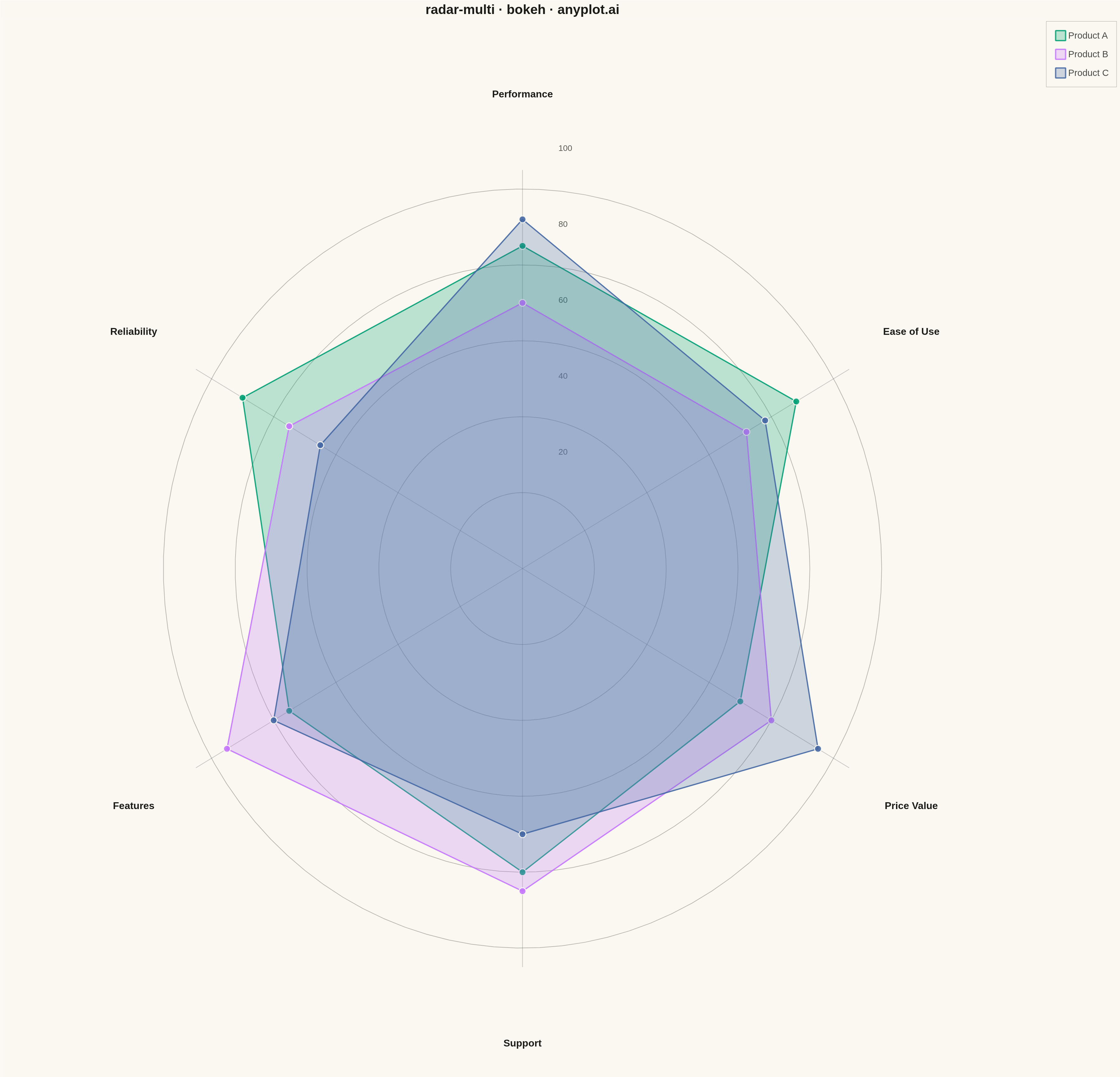
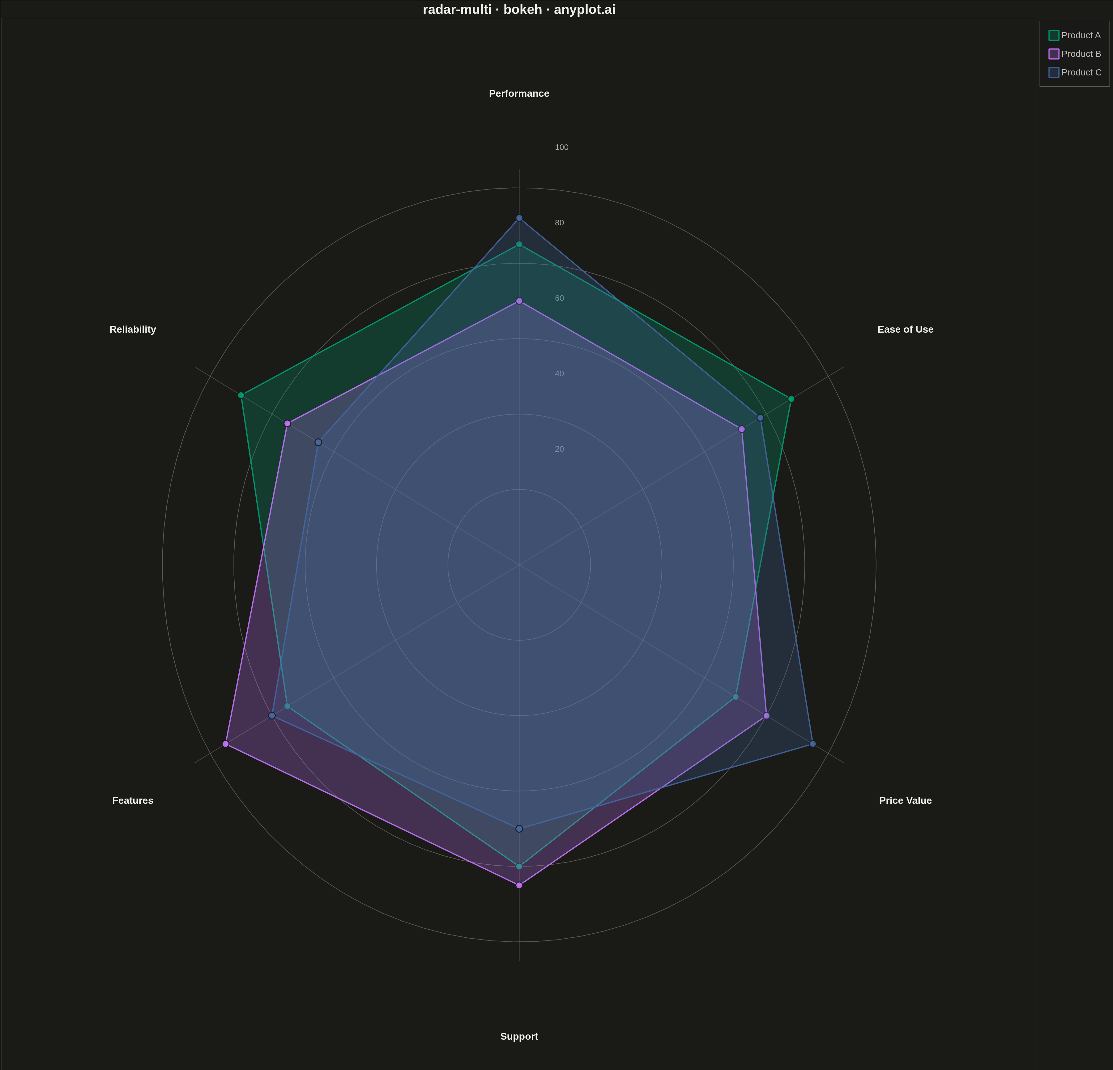
A multi-series radar chart overlays multiple data polygons on shared axes radiating from a center point, enabling direct comparison across several entities or categories. Each series is rendered as a distinct colored polygon, making it easy to identify relative strengths and weaknesses at a glance. This visualization excels at comparative analysis where multiple subjects are evaluated across the same set of metrics.
""" anyplot.ai
radar-multi: Multi-Series Radar Chart
Library: bokeh 3.9.0 | Python 3.13.13
Quality: 91/100 | Updated: 2026-05-07
"""

import os
import time
from pathlib import Path

import numpy as np
from bokeh.io import output_file, save
from bokeh.models import ColumnDataSource, LabelSet, Legend
from bokeh.plotting import figure
from selenium import webdriver
from selenium.webdriver.chrome.options import Options


THEME = os.getenv("ANYPLOT_THEME", "light")
PAGE_BG = "#FAF8F1" if THEME == "light" else "#1A1A17"
INK = "#1A1A17" if THEME == "light" else "#F0EFE8"
INK_SOFT = "#4A4A44" if THEME == "light" else "#B8B7B0"

IMPRINT = ["#009E73", "#C475FD", "#4467A3", "#BD8233"]

# Data - Product comparison across 6 attributes
categories = ["Performance", "Reliability", "Features", "Support", "Price Value", "Ease of Use"]
n_categories = len(categories)

# Three products to compare
products = {
    "Product A": [85, 90, 75, 80, 70, 88],
    "Product B": [70, 75, 95, 85, 80, 72],
    "Product C": [92, 65, 80, 70, 95, 78],
}

# Calculate angles for each axis (starting from top, going clockwise)
angles = np.linspace(0, 2 * np.pi, n_categories, endpoint=False)
angles = angles + np.pi / 2

# Create figure with square aspect for radar chart
p = figure(
    width=3600,
    height=3600,
    title="radar-multi · bokeh · anyplot.ai",
    x_range=(-145, 145),
    y_range=(-145, 145),
    tools="",
    toolbar_location=None,
)

p.background_fill_color = PAGE_BG
p.border_fill_color = PAGE_BG
p.outline_line_color = None

# Remove axes and grid
p.axis.visible = False
p.grid.visible = False

# Draw circular gridlines at 20, 40, 60, 80, 100
grid_values = [20, 40, 60, 80, 100]
for gv in grid_values:
    theta = np.linspace(0, 2 * np.pi, 100)
    x_grid = gv * np.cos(theta)
    y_grid = gv * np.sin(theta)
    p.line(x_grid, y_grid, line_color=INK_SOFT, line_width=2, line_alpha=0.4)

# Draw radial lines from center to each axis
for angle in angles:
    x_line = [0, 105 * np.cos(angle)]
    y_line = [0, 105 * np.sin(angle)]
    p.line(x_line, y_line, line_color=INK_SOFT, line_width=2, line_alpha=0.3)

# Add axis labels at the outer edge
label_radius = 125
label_x = [label_radius * np.cos(a) for a in angles]
label_y = [label_radius * np.sin(a) for a in angles]
label_source = ColumnDataSource(data={"x": label_x, "y": label_y, "text": categories})
labels = LabelSet(
    x="x",
    y="y",
    text="text",
    source=label_source,
    text_font_size="24pt",
    text_align="center",
    text_baseline="middle",
    text_color=INK,
    text_font_style="bold",
)
p.add_layout(labels)

# Add grid value labels on one axis (shifted for visibility)
for gv in grid_values:
    p.text(
        x=[gv * np.cos(angles[0]) + 10],
        y=[gv * np.sin(angles[0]) + 10],
        text=[str(gv)],
        text_font_size="20pt",
        text_color=INK_SOFT,
        text_alpha=0.9,
    )

# Plot each product series
legend_items = []
for idx, (product_name, values) in enumerate(products.items()):
    # Convert values to x, y coordinates
    x_vals = [v * np.cos(a) for v, a in zip(values, angles, strict=True)]
    y_vals = [v * np.sin(a) for v, a in zip(values, angles, strict=True)]

    # Close the polygon
    x_vals.append(x_vals[0])
    y_vals.append(y_vals[0])

    # Draw filled polygon
    fill_renderer = p.patch(
        x_vals,
        y_vals,
        fill_color=IMPRINT[idx],
        fill_alpha=0.25,
        line_color=IMPRINT[idx],
        line_width=4,
        line_alpha=0.9,
    )

    # Draw points at vertices
    p.scatter(x_vals[:-1], y_vals[:-1], size=22, fill_color=IMPRINT[idx], line_color=PAGE_BG, line_width=3, alpha=0.9)

    legend_items.append((product_name, [fill_renderer]))

# Add legend
legend = Legend(
    items=legend_items,
    location="top_right",
    label_text_font_size="22pt",
    glyph_height=40,
    glyph_width=40,
    spacing=20,
    padding=25,
    background_fill_color=PAGE_BG,
    background_fill_alpha=0.85,
    border_line_color=INK_SOFT,
    label_text_color=INK_SOFT,
)
p.add_layout(legend, "right")

# Style title
p.title.text_font_size = "32pt"
p.title.align = "center"
p.title.text_color = INK

# Save HTML
output_file(f"plot-{THEME}.html")
save(p)

# Screenshot with headless Chrome
W, H = 3600, 3600
opts = Options()
for arg in (
    "--headless=new",
    "--no-sandbox",
    "--disable-dev-shm-usage",
    "--disable-gpu",
    f"--window-size={W},{H}",
    "--hide-scrollbars",
):
    opts.add_argument(arg)
driver = webdriver.Chrome(options=opts)
driver.set_window_size(W, H)
driver.get(f"file://{Path(f'plot-{THEME}.html').resolve()}")
time.sleep(3)
driver.save_screenshot(f"plot-{THEME}.png")
driver.quit()
Runnable source as JSON, for any HTTP client: https://api.anyplot.ai/specs/radar-multi/bokeh/code. Any spec id and library id listed in llms-full.txt fit the same URL shape; every URL below is complete and callable.
{
  "spec_id": "radar-multi",
  "language": "python",
  "library": "bokeh",
  "page": "https://anyplot.ai/radar-multi/python/bokeh",
  "hub": "https://anyplot.ai/radar-multi",
  "code_json": "https://api.anyplot.ai/specs/radar-multi/bokeh/code",
  "spec_json": "https://api.anyplot.ai/specs/radar-multi",
  "render_light_png": "https://storage.googleapis.com/anyplot-images/plots/radar-multi/python/bokeh/plot-light.png",
  "render_dark_png": "https://storage.googleapis.com/anyplot-images/plots/radar-multi/python/bokeh/plot-dark.png",
  "interactive_light_html": "https://storage.googleapis.com/anyplot-images/plots/radar-multi/python/bokeh/plot-light.html",
  "interactive_dark_html": "https://storage.googleapis.com/anyplot-images/plots/radar-multi/python/bokeh/plot-dark.html",
  "quality_score": 91.0,
  "license": "MIT",
  "guide": "https://anyplot.ai/llms.txt"
}
Part of Multi-Series Radar Chart on anyplot.ai.