The same plot in 14 other libraries — JavaScript: Chart.js, D3.js, Apache ECharts, MUI X Charts; Python: Altair, Bokeh, lets-plot, Matplotlib, Plotly, plotnine, Pygal, Seaborn; R: ggplot2; Julia: Makie.jl. Compare all 15 side by side: Multi-Series Radar Chart in Python, R, Julia and JavaScript.
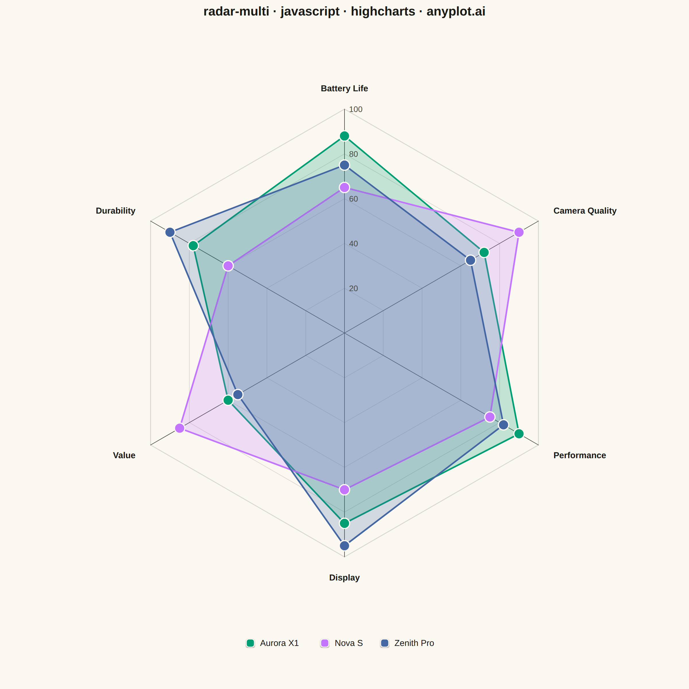
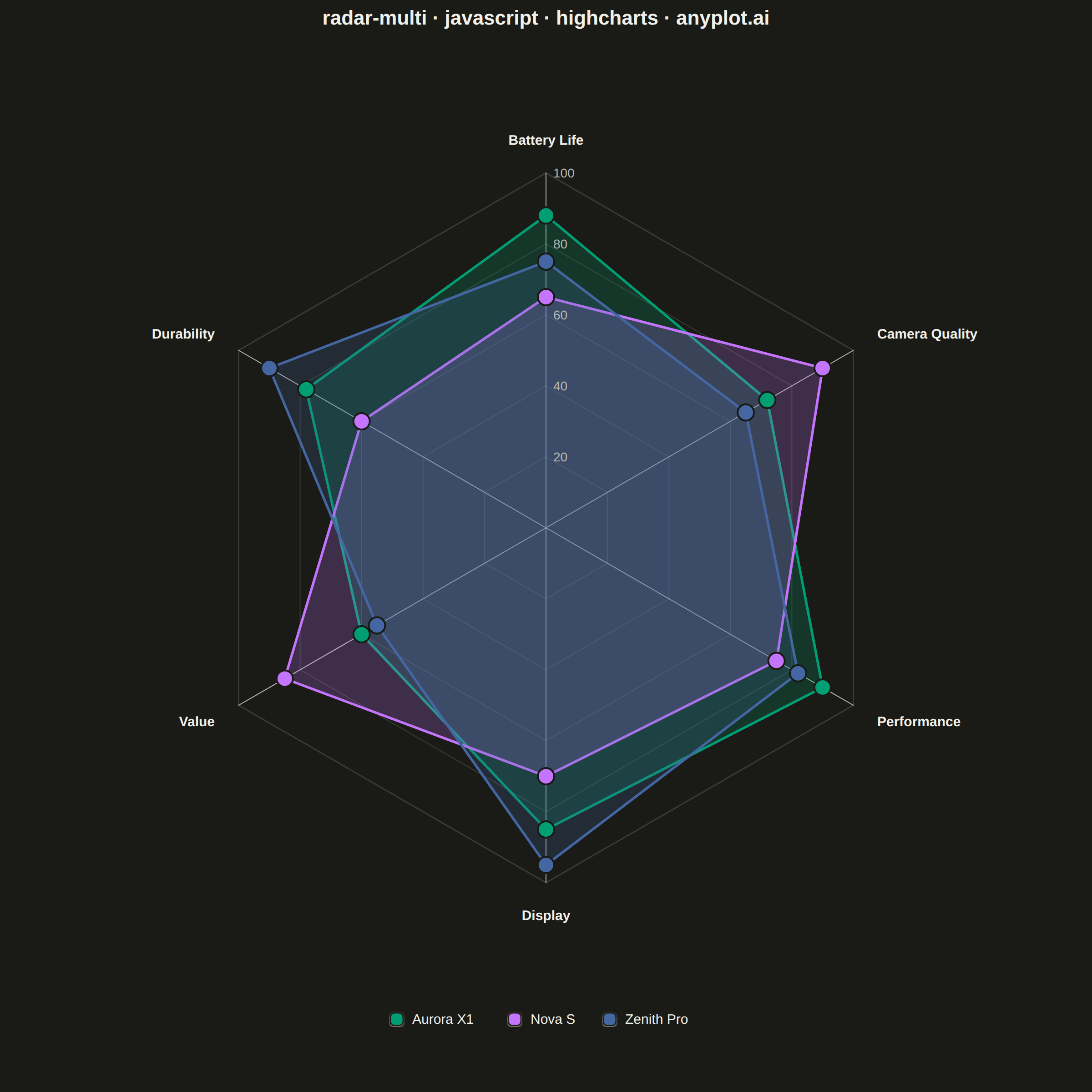
A multi-series radar chart overlays multiple data polygons on shared axes radiating from a center point, enabling direct comparison across several entities or categories. Each series is rendered as a distinct colored polygon, making it easy to identify relative strengths and weaknesses at a glance. This visualization excels at comparative analysis where multiple subjects are evaluated across the same set of metrics.
// anyplot.ai
// radar-multi: Multi-Series Radar Chart
// Library: highcharts 12.6.0 | JavaScript 22.23.2
// Quality: 91/100 | Updated: 2026-08-18
//# anyplot-orientation: square

// Only the core `highcharts` bundle is loaded (no highcharts-more), so the
// native polar chart mode isn't available. As with anyplot's other radar
// specs, each axis's polar coordinate is projected to Cartesian by hand and
// the grid, spokes, labels, and data polygons are drawn with the core SVG
// renderer on top of an otherwise-empty chart.
const t = window.ANYPLOT_TOKENS;

// --- Data (three smartphone models scored across launch-review criteria) --
const axes = ["Battery Life", "Camera Quality", "Performance", "Display", "Value", "Durability"];
const models = [
  { name: "Aurora X1", color: t.palette[0], scores: [88, 72, 90, 85, 60, 78] },
  { name: "Nova S", color: t.palette[1], scores: [65, 90, 75, 70, 85, 60] },
  { name: "Zenith Pro", color: t.palette[2], scores: [75, 65, 82, 95, 55, 90] },
];
const SCALE_MAX = 100;
const RINGS = [20, 40, 60, 80, 100];
const axisCount = axes.length;

const TITLE = "radar-multi · javascript · highcharts · anyplot.ai";
const titleFontSize = Math.max(15, Math.round(22 * Math.min(1, 67 / TITLE.length))) + "px";

// --- Chart shell (core-only; the polygon overlay is drawn below) ----------
const chart = Highcharts.chart("container", {
  chart: {
    backgroundColor: "transparent",
    animation: false,
    style: { fontFamily: "inherit" },
    margin: [110, 90, 150, 90],
  },
  credits: { enabled: false },
  title: {
    text: TITLE,
    style: { color: t.ink, fontSize: titleFontSize, fontWeight: "600" },
  },
  xAxis: { visible: false, gridLineWidth: 0, lineWidth: 0, tickLength: 0 },
  yAxis: { visible: false, gridLineWidth: 0, lineWidth: 0, tickLength: 0 },
  legend: { enabled: false },
  tooltip: {
    enabled: true,
    backgroundColor: t.elevatedBg,
    borderColor: t.grid,
    style: { color: t.ink },
    formatter() {
      return `<b>${this.series.name}</b><br/>${this.point.name}: ${this.point.custom.score}`;
    },
  },
  plotOptions: { series: { animation: false } },
  series: [],
});

// Pin the hidden axes to a known pixel extent so a real scatter series can be
// data-bound at the same projected vertices the renderer overlay draws below
// — the PNG stays untouched, but the interactive HTML gets genuine tooltips.
chart.xAxis[0].setExtremes(0, chart.plotWidth, false);
chart.yAxis[0].setExtremes(0, chart.plotHeight, false);

// --- Polar → Cartesian projection ------------------------------------------
const centerX = chart.plotLeft + chart.plotWidth / 2;
const centerY = chart.plotTop + chart.plotHeight / 2;
const radius = Math.min(chart.plotWidth, chart.plotHeight) / 2 - 80;

// axis 0 points straight up, remaining axes proceed clockwise
function angleFor(axisIndex) {
  return -Math.PI / 2 + axisIndex * ((2 * Math.PI) / axisCount);
}
function project(axisIndex, fraction) {
  const angle = angleFor(axisIndex);
  return [centerX + radius * fraction * Math.cos(angle), centerY + radius * fraction * Math.sin(angle)];
}
function polygonPath(fractionAt) {
  const path = ["M"];
  for (let i = 0; i < axisCount; i += 1) {
    const [x, y] = project(i, fractionAt(i));
    path.push(...(i === 0 ? [x, y] : ["L", x, y]));
  }
  path.push("Z");
  return path;
}

// --- Concentric grid rings --------------------------------------------------
RINGS.forEach((level, i) => {
  chart.renderer
    .path(polygonPath(() => level / SCALE_MAX))
    .attr({
      stroke: t.grid,
      "stroke-width": i === RINGS.length - 1 ? 1.5 : 1,
      "stroke-linejoin": "round",
      fill: "none",
      zIndex: 1,
    })
    .add();
});

// --- Spokes + axis labels ---------------------------------------------------
axes.forEach((label, i) => {
  const [tipX, tipY] = project(i, 1);
  chart.renderer
    .path(["M", centerX, centerY, "L", tipX, tipY])
    .attr({ stroke: t.inkSoft, "stroke-width": 1, "stroke-linecap": "round", zIndex: 1 })
    .add();

  const angle = angleFor(i);
  const cos = Math.cos(angle);
  const sin = Math.sin(angle);
  const [labelX, labelY] = project(i, 1 + 30 / radius);
  const align = cos > 0.3 ? "left" : cos < -0.3 ? "right" : "center";
  chart.renderer
    .text(label, labelX, labelY + sin * 6 + 5)
    .attr({ align, zIndex: 5 })
    .css({ fontSize: "15px", fontWeight: "600", color: t.ink, fontFamily: "inherit" })
    .add();
});

// --- Ring scale labels (along the top spoke) --------------------------------
RINGS.forEach((level) => {
  const [, ringY] = project(0, level / SCALE_MAX);
  chart.renderer
    .text(String(level), centerX + 8, ringY + 5)
    .attr({ align: "left", zIndex: 4 })
    .css({ fontSize: "14px", fontWeight: "500", color: t.inkSoft, fontFamily: "inherit" })
    .add();
});

// --- Data polygons + real (hidden-marker) scatter series for tooltips ------
models.forEach((model) => {
  const vertices = model.scores.map((score, i) => project(i, score / SCALE_MAX));

  chart.renderer
    .path(polygonPath((i) => model.scores[i] / SCALE_MAX))
    .attr({
      fill: model.color,
      "fill-opacity": 0.22,
      stroke: model.color,
      "stroke-width": 2.75,
      "stroke-linejoin": "round",
      zIndex: 3,
    })
    .add();

  vertices.forEach(([x, y]) => {
    chart.renderer
      .circle(x, y, 9)
      .attr({ fill: model.color, stroke: t.pageBg, "stroke-width": 2, zIndex: 4 })
      .add();
  });

  chart.addSeries(
    {
      type: "scatter",
      name: model.name,
      color: model.color,
      enableMouseTracking: true,
      stickyTracking: false,
      animation: false,
      marker: {
        enabled: false,
        radius: 9,
        states: { hover: { enabled: true, radius: 9, lineWidth: 2, lineColor: t.pageBg } },
      },
      data: vertices.map(([x, y], i) => ({
        x: x - chart.plotLeft,
        y: chart.plotTop + chart.plotHeight - y,
        name: axes[i],
        custom: { score: model.scores[i] },
      })),
    },
    false
  );
});
chart.redraw();

// --- Legend ------------------------------------------------------------------
const swatchSize = 14;
const itemGap = 30;
const legendFontSize = 15;
const labelWidths = models.map((model) => model.name.length * 8.4);
const legendTotalWidth = models.reduce(
  (sum, _model, i) => sum + swatchSize + 10 + labelWidths[i] + (i < models.length - 1 ? itemGap : 0),
  0
);
let cursorX = centerX - legendTotalWidth / 2;
const legendY = chart.plotTop + chart.plotHeight + 70;

models.forEach((model, i) => {
  chart.renderer
    .rect(cursorX, legendY - swatchSize / 2, swatchSize, swatchSize, swatchSize / 3)
    .attr({ fill: model.color, stroke: t.pageBg, "stroke-width": 1.5, zIndex: 5 })
    .shadow({ color: t.ink, opacity: 0.12, width: 2, offsetX: 0, offsetY: 1 })
    .add();
  chart.renderer
    .text(model.name, cursorX + swatchSize + 10, legendY + swatchSize / 2 - 2)
    .attr({ align: "left", zIndex: 5 })
    .css({ fontSize: `${legendFontSize}px`, fontWeight: "500", color: t.ink, fontFamily: "inherit" })
    .add();
  cursorX += swatchSize + 10 + labelWidths[i] + itemGap;
});
Runnable source as JSON, for any HTTP client: https://api.anyplot.ai/specs/radar-multi/highcharts/code. Any spec id and library id listed in llms-full.txt fit the same URL shape; every URL below is complete and callable.
{
  "spec_id": "radar-multi",
  "language": "javascript",
  "library": "highcharts",
  "page": "https://anyplot.ai/radar-multi/javascript/highcharts",
  "hub": "https://anyplot.ai/radar-multi",
  "code_json": "https://api.anyplot.ai/specs/radar-multi/highcharts/code",
  "spec_json": "https://api.anyplot.ai/specs/radar-multi",
  "render_light_png": "https://storage.googleapis.com/anyplot-images/plots/radar-multi/javascript/highcharts/plot-light.png",
  "render_dark_png": "https://storage.googleapis.com/anyplot-images/plots/radar-multi/javascript/highcharts/plot-dark.png",
  "interactive_light_html": "https://storage.googleapis.com/anyplot-images/plots/radar-multi/javascript/highcharts/plot-light.html",
  "interactive_dark_html": "https://storage.googleapis.com/anyplot-images/plots/radar-multi/javascript/highcharts/plot-dark.html",
  "quality_score": 91.0,
  "license": "MIT",
  "guide": "https://anyplot.ai/llms.txt"
}
Part of Multi-Series Radar Chart on anyplot.ai.