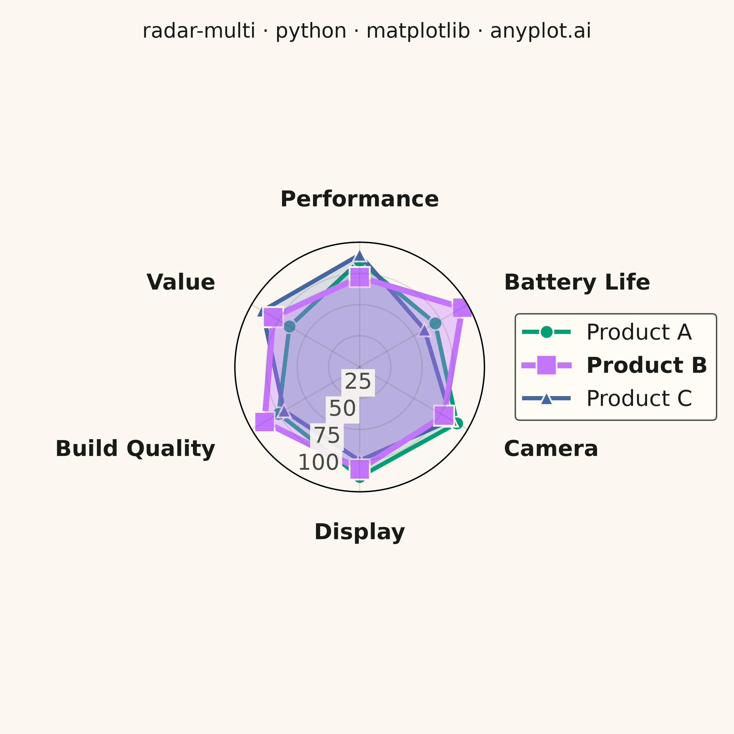
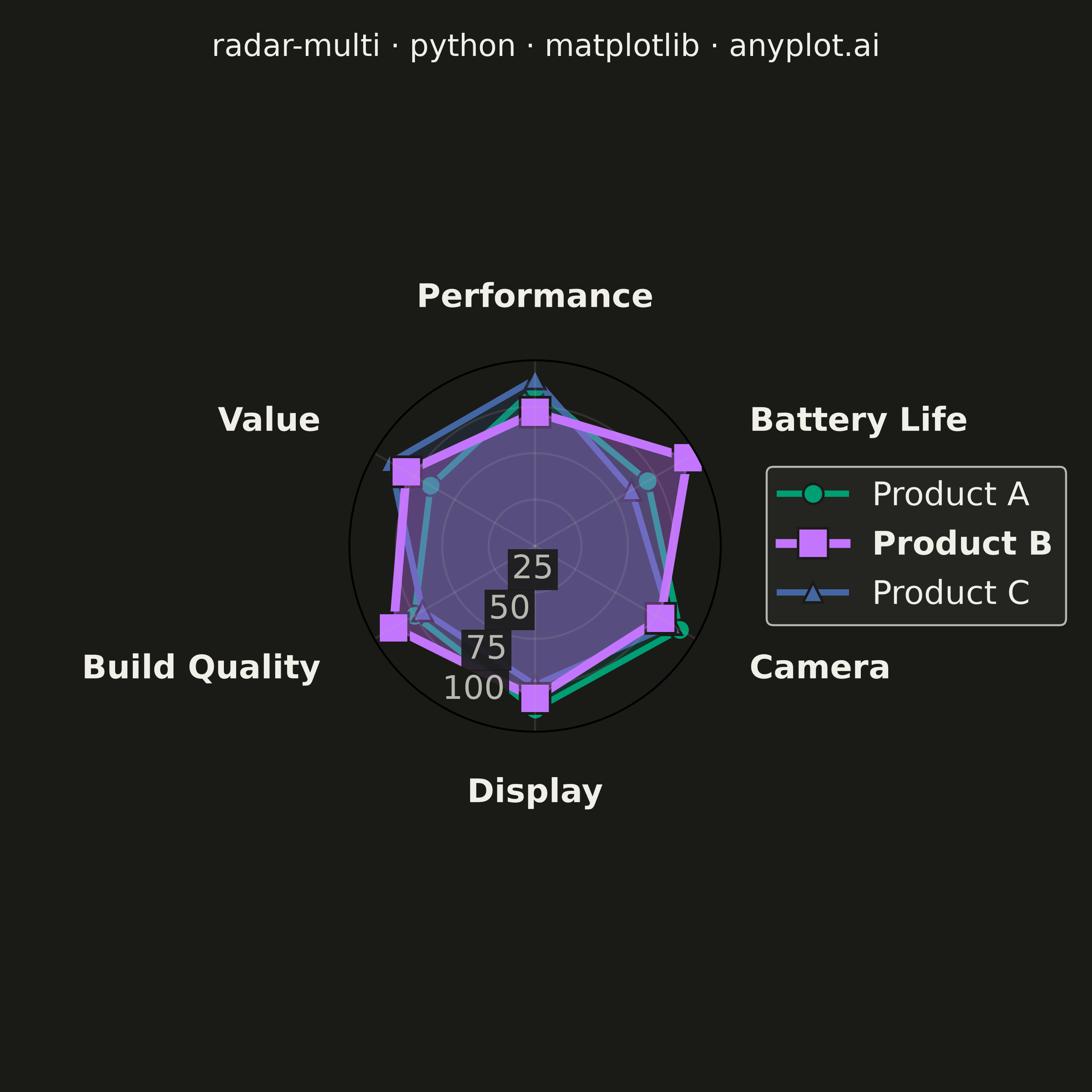
A multi-series radar chart overlays multiple data polygons on shared axes radiating from a center point, enabling direct comparison across several entities or categories. Each series is rendered as a distinct colored polygon, making it easy to identify relative strengths and weaknesses at a glance. This visualization excels at comparative analysis where multiple subjects are evaluated across the same set of metrics.
""" anyplot.ai
radar-multi: Multi-Series Radar Chart
Library: matplotlib 3.11.1 | Python 3.13.15
Quality: 86/100 | Updated: 2026-08-17
"""

import os

import matplotlib.pyplot as plt
import numpy as np


# Theme tokens
THEME = os.getenv("ANYPLOT_THEME", "light")
PAGE_BG = "#FAF8F1" if THEME == "light" else "#1A1A17"
ELEVATED_BG = "#FFFDF6" if THEME == "light" else "#242420"
INK = "#1A1A17" if THEME == "light" else "#F0EFE8"
INK_SOFT = "#4A4A44" if THEME == "light" else "#B8B7B0"

# Imprint palette (first three series, canonical order)
IMPRINT = ["#009E73", "#C475FD", "#4467A3"]

# Data: product comparison across key attributes — Product B is the overall leader
categories = ["Performance", "Battery Life", "Camera", "Display", "Build Quality", "Value"]
products = {
    "Product A": [85, 70, 90, 88, 75, 65],
    "Product B": [72, 95, 78, 82, 88, 80],
    "Product C": [90, 60, 85, 75, 70, 90],
}
leader_idx = 1  # Product B carries the highest average score — given visual emphasis

# Number of variables
n_categories = len(categories)

# Compute angle for each axis
angles = np.linspace(0, 2 * np.pi, n_categories, endpoint=False).tolist()
angles += angles[:1]  # Close the polygon

# Create figure (square format for radar)
fig, ax = plt.subplots(figsize=(6, 6), dpi=400, subplot_kw={"polar": True}, facecolor=PAGE_BG)
ax.set_facecolor(PAGE_BG)

# Orient the radar with the first category at the top, going clockwise, so
# no category label lands due-east where the legend sits
ax.set_theta_zero_location("N")
ax.set_theta_direction(-1)

# Per-series visual weight — the leader draws bolder and on top, guiding the eye
# to the strongest overall performer without adding any text annotation
markers = ["o", "s", "^"]
linewidths = [2.5, 2.5, 2.5]
markersizes = [8, 8, 8]
fill_alphas = [0.18, 0.18, 0.18]
zorders = [1, 1, 1]  # below the default radial-grid/tick-label zorder (~2.5)
linewidths[leader_idx] = 3.5
markersizes[leader_idx] = 12
fill_alphas[leader_idx] = 0.35
zorders[leader_idx] = 1.5

# Plot each product
for idx, (product, values) in enumerate(products.items()):
    values_closed = values + values[:1]  # Close the polygon
    ax.plot(
        angles,
        values_closed,
        marker=markers[idx],
        linestyle="-",
        linewidth=linewidths[idx],
        label=product,
        color=IMPRINT[idx],
        markersize=markersizes[idx],
        markeredgecolor=PAGE_BG,
        markeredgewidth=1,
        zorder=zorders[idx],
    )
    ax.fill(angles, values_closed, alpha=fill_alphas[idx], color=IMPRINT[idx], zorder=zorders[idx])

# Set category labels at each axis, nudged outward and aligned by their
# rendered screen position (accounting for the N-zero/clockwise rotation
# above) so labels on the right lean left, labels on the left lean right,
# and top/bottom labels stay centered — none collide with their own markers
ax.set_xticks(angles[:-1])
tick_labels = ax.set_xticklabels(categories, fontsize=13, fontweight="bold", color=INK)
ax.tick_params(axis="x", pad=14)
for label, raw_angle in zip(tick_labels, angles[:-1], strict=True):
    cos_disp = np.cos(np.pi / 2 - raw_angle)
    if cos_disp > 0.3:
        label.set_horizontalalignment("left")
    elif cos_disp < -0.3:
        label.set_horizontalalignment("right")
    else:
        label.set_horizontalalignment("center")

# Set radial grid — fewer labels (25/50/75/100) placed in the empty sector
# between Display and Build Quality, away from every category axis, so they
# no longer collide with each other or with the data. Labels keep an opaque
# halo so they stay legible where polygon fills cross the radial axis
ax.set_ylim(0, 100)
ax.set_yticks([25, 50, 75, 100])
r_tick_labels = ax.set_yticklabels(["25", "50", "75", "100"], fontsize=13, color=INK_SOFT)
# set_rlabel_position takes a RAW (pre-rotation) angle; raw=210 (Build
# Quality's own axis) renders at display angle 240 = between Display (270)
# and Build Quality (210) after the theta_zero_location/direction rotation
ax.set_rlabel_position(210)
for label in r_tick_labels:
    label.set_bbox({"facecolor": PAGE_BG, "edgecolor": "none", "alpha": 0.9, "pad": 1.5})

# Grid styling
ax.yaxis.grid(True, linestyle="-", alpha=0.15, linewidth=0.8, color=INK_SOFT)
ax.xaxis.grid(True, linestyle="-", alpha=0.15, linewidth=0.8, color=INK_SOFT)

# Title — figure-level (not axes-level) so it stays centered on the full
# canvas regardless of how the legend reshapes the polar axes below
fig.suptitle("radar-multi · python · matplotlib · anyplot.ai", fontsize=12, fontweight="medium", color=INK, y=0.97)

# Legend outside the circular grid, vertically centered — leader label
# rendered bold to echo its bolder polygon
leg = ax.legend(loc="center left", bbox_to_anchor=(1.08, 0.5), fontsize=13, framealpha=1.0)
leg.get_frame().set_facecolor(ELEVATED_BG)
leg.get_frame().set_edgecolor(INK_SOFT)
leg.get_frame().set_linewidth(0.8)
for idx, text in enumerate(leg.get_texts()):
    text.set_color(INK)
    if idx == leader_idx:
        text.set_fontweight("bold")

# Explicit margins (not tight_layout) so the polar axes sit vertically
# centered in the square canvas — top/bottom margins balanced, right margin
# reserved for the legend
fig.subplots_adjust(left=0.32, right=0.66, top=0.80, bottom=0.20)
plt.savefig(f"plot-{THEME}.png", dpi=400, facecolor=PAGE_BG)
Runnable source as JSON, for any HTTP client: https://api.anyplot.ai/specs/radar-multi/matplotlib/code. Any spec id and library id listed in llms-full.txt fit the same URL shape; every URL below is complete and callable.
{
  "spec_id": "radar-multi",
  "language": "python",
  "library": "matplotlib",
  "page": "https://anyplot.ai/radar-multi/python/matplotlib",
  "hub": "https://anyplot.ai/radar-multi",
  "code_json": "https://api.anyplot.ai/specs/radar-multi/matplotlib/code",
  "spec_json": "https://api.anyplot.ai/specs/radar-multi",
  "render_light_png": "https://storage.googleapis.com/anyplot-images/plots/radar-multi/python/matplotlib/plot-light.png",
  "render_dark_png": "https://storage.googleapis.com/anyplot-images/plots/radar-multi/python/matplotlib/plot-dark.png",
  "quality_score": 86.0,
  "license": "MIT",
  "guide": "https://anyplot.ai/llms.txt"
}
Part of Multi-Series Radar Chart on anyplot.ai.