The same plot in 14 other libraries — Python: Altair, Bokeh, lets-plot, Matplotlib, Plotly, plotnine, Pygal, Seaborn; Julia: Makie.jl; JavaScript: Chart.js, D3.js, Apache ECharts, Highcharts, MUI X Charts. Compare all 15 side by side: Multi-Series Radar Chart in Python, R, Julia and JavaScript.
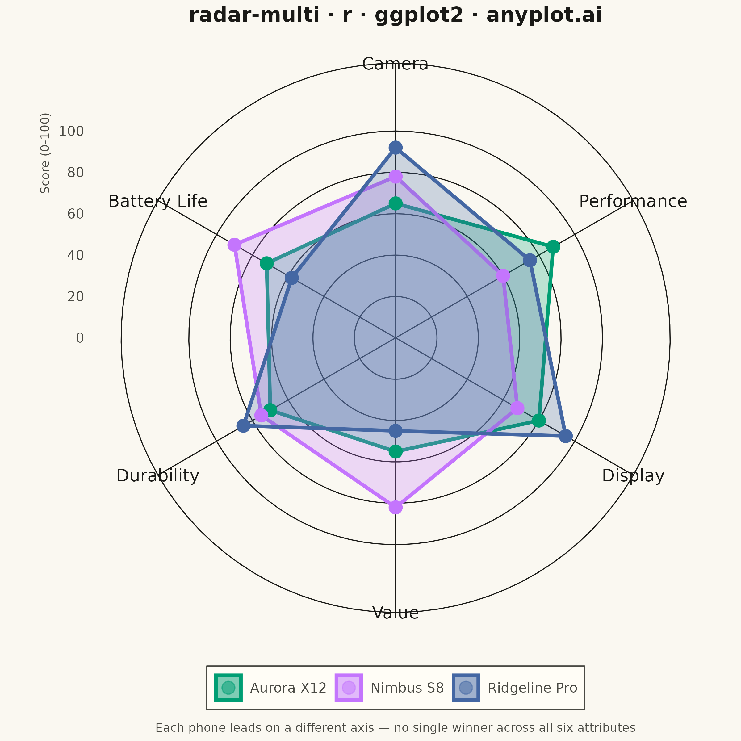
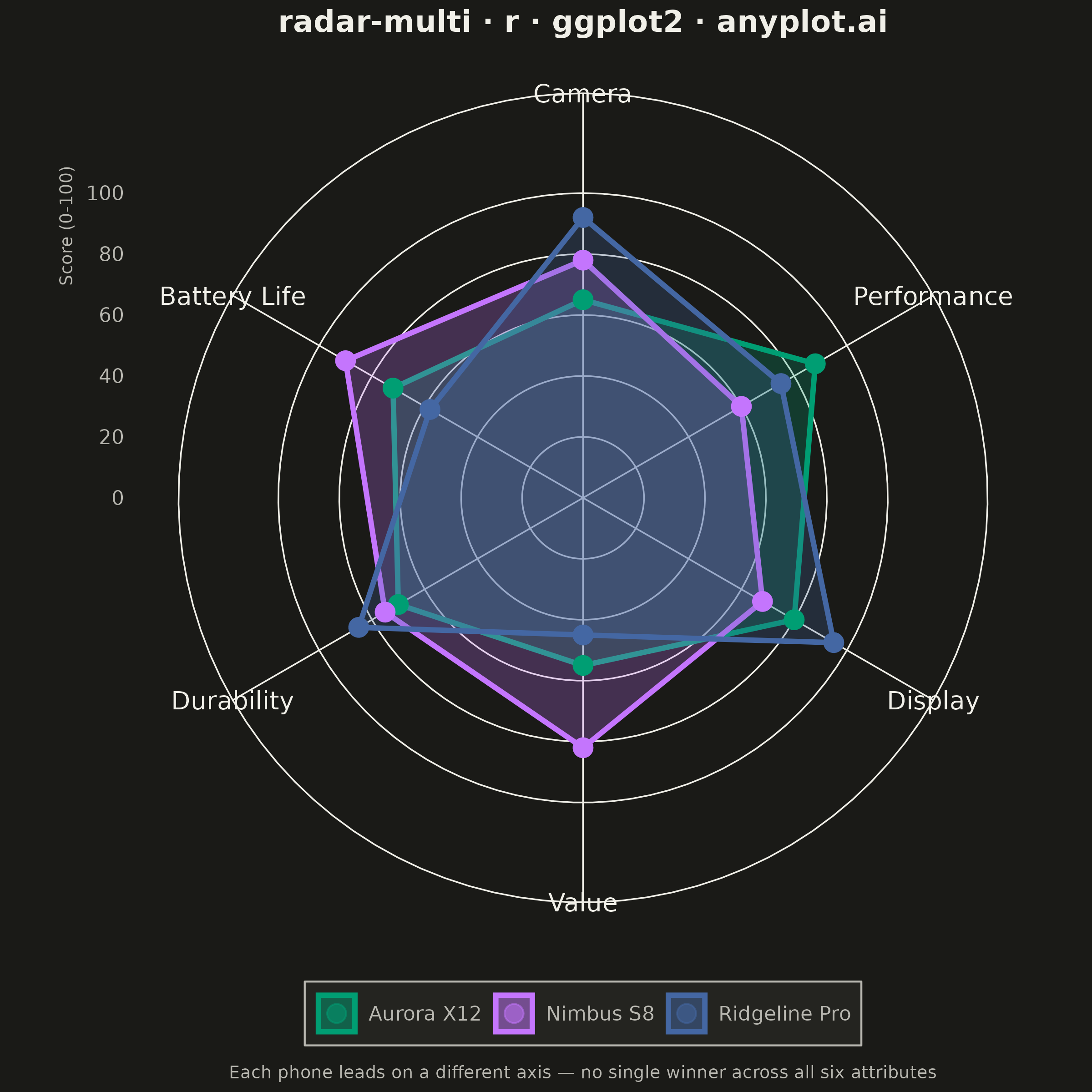
A multi-series radar chart overlays multiple data polygons on shared axes radiating from a center point, enabling direct comparison across several entities or categories. Each series is rendered as a distinct colored polygon, making it easy to identify relative strengths and weaknesses at a glance. This visualization excels at comparative analysis where multiple subjects are evaluated across the same set of metrics.
#' anyplot.ai
#' radar-multi: Multi-Series Radar Chart
#' Library: ggplot2 3.5.1 | R 4.4.1
#' Quality: 91/100 | Updated: 2026-08-20

library(ggplot2)
library(ragg)

set.seed(42)

# --- Theme tokens -------------------------------------------------------
THEME       <- Sys.getenv("ANYPLOT_THEME", "light")
PAGE_BG     <- if (THEME == "light") "#FAF8F1" else "#1A1A17"
ELEVATED_BG <- if (THEME == "light") "#FFFDF6" else "#242420"
INK         <- if (THEME == "light") "#1A1A17" else "#F0EFE8"
INK_SOFT    <- if (THEME == "light") "#4A4A44" else "#B8B7B0"

IMPRINT_PALETTE <- c(
  "#009E73", # 1 — brand green, always first series
  "#C475FD", # 2 — lavender
  "#4467A3", # 3 — blue
  "#BD8233", # 4 — ochre
  "#AE3030", # 5 — matte red
  "#2ABCCD", # 6 — cyan
  "#954477", # 7 — rose
  "#99B314"  # 8 — lime
)

# coord_polar() munges straight polygon edges into arcs when interpolating
# between vertices; is_linear = TRUE keeps the radar spokes and value rings
# as straight-edged polygons, matching the spec's "closed polygon" per axis.
# clip = "off" lets the manually-placed category labels below sit outside
# the r=100 ring without being clipped by the panel boundary.
coord_radar <- function(start = 0, direction = 1, clip = "off") {
  ggproto("CoordRadar", CoordPolar,
    theta = "x", r = "y", start = start, direction = sign(direction),
    is_linear = function(coord) TRUE,
    clip = clip
  )
}

# --- Data -----------------------------------------------------------------
attributes <- c("Battery Life", "Camera", "Performance", "Display", "Value", "Durability")

radar_df <- tibble::tibble(
  phone = rep(c("Aurora X12", "Nimbus S8", "Ridgeline Pro"), each = length(attributes)),
  attribute = factor(rep(attributes, times = 3), levels = attributes),
  score = c(
    72, 65, 88, 80, 55, 70,   # Aurora X12   — performance-focused flagship
    90, 78, 60, 68, 82, 75,   # Nimbus S8    — battery + value pick
    58, 92, 75, 95, 45, 85    # Ridgeline Pro — camera + display, premium price
  )
)

# Alternating ring bands (drawn back-to-front: wide band first, then a
# narrower band painted in the page color to punch out the "gap") give the
# grid a touch of depth beyond the mandated gridlines alone. Strengthened
# from alpha=0.09 (still barely perceptible) to 0.16 for a visible band.
ring_hi <- data.frame(attribute = factor(attributes, levels = attributes), score = 80)
ring_lo <- data.frame(attribute = factor(attributes, levels = attributes), score = 60)

# Category labels are drawn manually (rather than via the default polar
# axis.text.x, which ggplot2 always renders exactly at the panel's outer
# boundary) at score = 116 — clear of the r=100 gridline. The default
# axis.text.x placement previously made the boundary ring/spoke lines cut
# straight through 3 of the 6 labels ("Camera", "Value", "Durability").
label_df <- data.frame(attribute = factor(attributes, levels = attributes), score = 116)

# Each phone's single strongest attribute, ringed with an open halo below,
# reinforces the caption's "each phone leads on a different axis" claim
# directly in the encoding — not just as caption text.
leader_idx <- tapply(seq_len(nrow(radar_df)), radar_df$phone, function(idx) idx[which.max(radar_df$score[idx])])
leader_df <- radar_df[unlist(leader_idx), ]

# --- Plot -------------------------------------------------------------------
p <- ggplot(radar_df, aes(x = attribute, y = score, group = phone, color = phone, fill = phone)) +
  geom_polygon(data = ring_hi, aes(x = attribute, y = score), inherit.aes = FALSE, fill = INK, alpha = 0.16) +
  geom_polygon(data = ring_lo, aes(x = attribute, y = score), inherit.aes = FALSE, fill = PAGE_BG) +
  geom_polygon(alpha = 0.25, linewidth = 1.0) +
  geom_point(size = 3.8) +
  geom_point(
    data = leader_df, aes(x = attribute, y = score, color = phone),
    inherit.aes = FALSE, shape = 1, size = 7.5, stroke = 1.6, show.legend = FALSE
  ) +
  geom_text(
    data = label_df, aes(x = attribute, y = score, label = attribute),
    inherit.aes = FALSE, color = INK, size = 10 / .pt
  ) +
  coord_radar(start = -pi / 2) +
  # limits stay open-ended (NA) so the panel's true range grows to fit the
  # score = 116 label layer above; breaks stop at 100 so no extra gridline
  # is drawn out there — only the mandated 20/40/60/80/100 rings render.
  scale_y_continuous(limits = c(0, NA), breaks = seq(0, 100, 20), expand = expansion(mult = c(0, 0.06))) +
  scale_color_manual(values = IMPRINT_PALETTE) +
  scale_fill_manual(values = IMPRINT_PALETTE) +
  labs(
    title = "radar-multi · r · ggplot2 · anyplot.ai",
    caption = "Each phone leads on a different axis — no single winner across all six attributes",
    x = NULL, y = "Score (0-100)", color = NULL, fill = NULL
  ) +
  theme_minimal(base_size = 8) +
  theme(
    plot.background    = element_rect(fill = PAGE_BG, color = PAGE_BG),
    panel.background   = element_rect(fill = PAGE_BG, color = NA),
    panel.border       = element_blank(),
    axis.line          = element_blank(),
    axis.ticks         = element_blank(),
    panel.grid.major   = element_line(color = INK, linewidth = 0.3),
    panel.grid.minor   = element_blank(),
    # category labels are drawn via geom_text (label_df) instead, so the
    # built-in polar axis text — always pinned to the panel's outer edge — is
    # suppressed here to avoid a second, overlapping set of labels.
    axis.text.x        = element_blank(),
    axis.text.y        = element_text(color = INK_SOFT, size = 8),
    axis.title.y       = element_text(color = INK_SOFT, size = 7, hjust = 0.85, margin = margin(r = 4)),
    plot.title         = element_text(color = INK, size = 12, face = "bold", hjust = 0.5),
    plot.caption       = element_text(color = INK_SOFT, size = 7, hjust = 0.5, margin = margin(t = 8)),
    legend.position    = "bottom",
    legend.background  = element_rect(fill = ELEVATED_BG, color = INK_SOFT),
    legend.text        = element_text(color = INK_SOFT, size = 8),
    legend.title       = element_blank()
  ) +
  guides(fill = guide_legend(override.aes = list(alpha = 0.5)))

# --- Save -------------------------------------------------------------------
ggsave(
  filename = sprintf("plot-%s.png", THEME),
  plot     = p,
  device   = ragg::agg_png,
  width    = 6,
  height   = 6,
  units    = "in",
  dpi      = 400
)
Runnable source as JSON, for any HTTP client: https://api.anyplot.ai/specs/radar-multi/ggplot2/code. Any spec id and library id listed in llms-full.txt fit the same URL shape; every URL below is complete and callable.
{
  "spec_id": "radar-multi",
  "language": "r",
  "library": "ggplot2",
  "page": "https://anyplot.ai/radar-multi/r/ggplot2",
  "hub": "https://anyplot.ai/radar-multi",
  "code_json": "https://api.anyplot.ai/specs/radar-multi/ggplot2/code",
  "spec_json": "https://api.anyplot.ai/specs/radar-multi",
  "render_light_png": "https://storage.googleapis.com/anyplot-images/plots/radar-multi/r/ggplot2/plot-light.png",
  "render_dark_png": "https://storage.googleapis.com/anyplot-images/plots/radar-multi/r/ggplot2/plot-dark.png",
  "quality_score": 91.0,
  "license": "MIT",
  "guide": "https://anyplot.ai/llms.txt"
}
Part of Multi-Series Radar Chart on anyplot.ai.