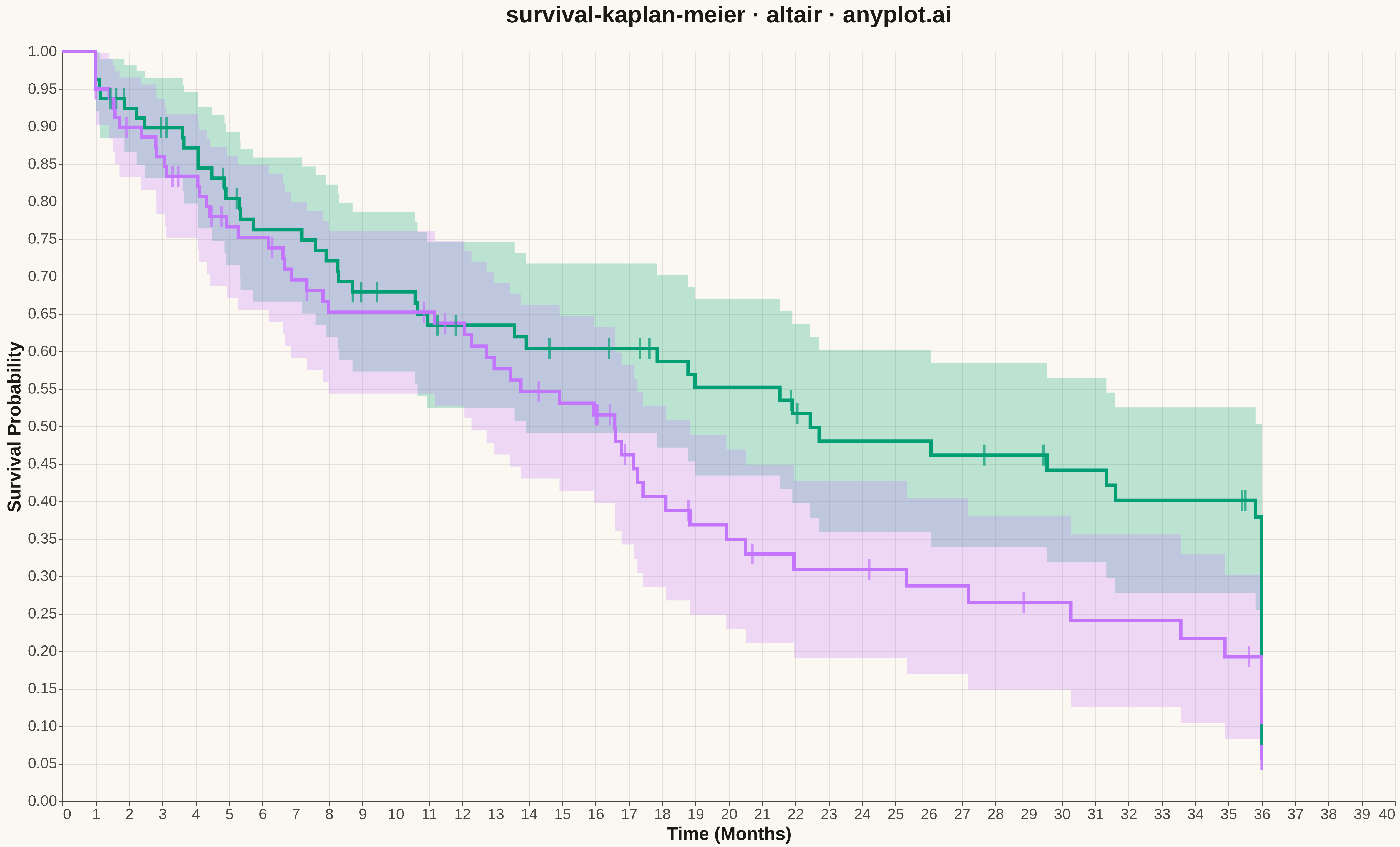
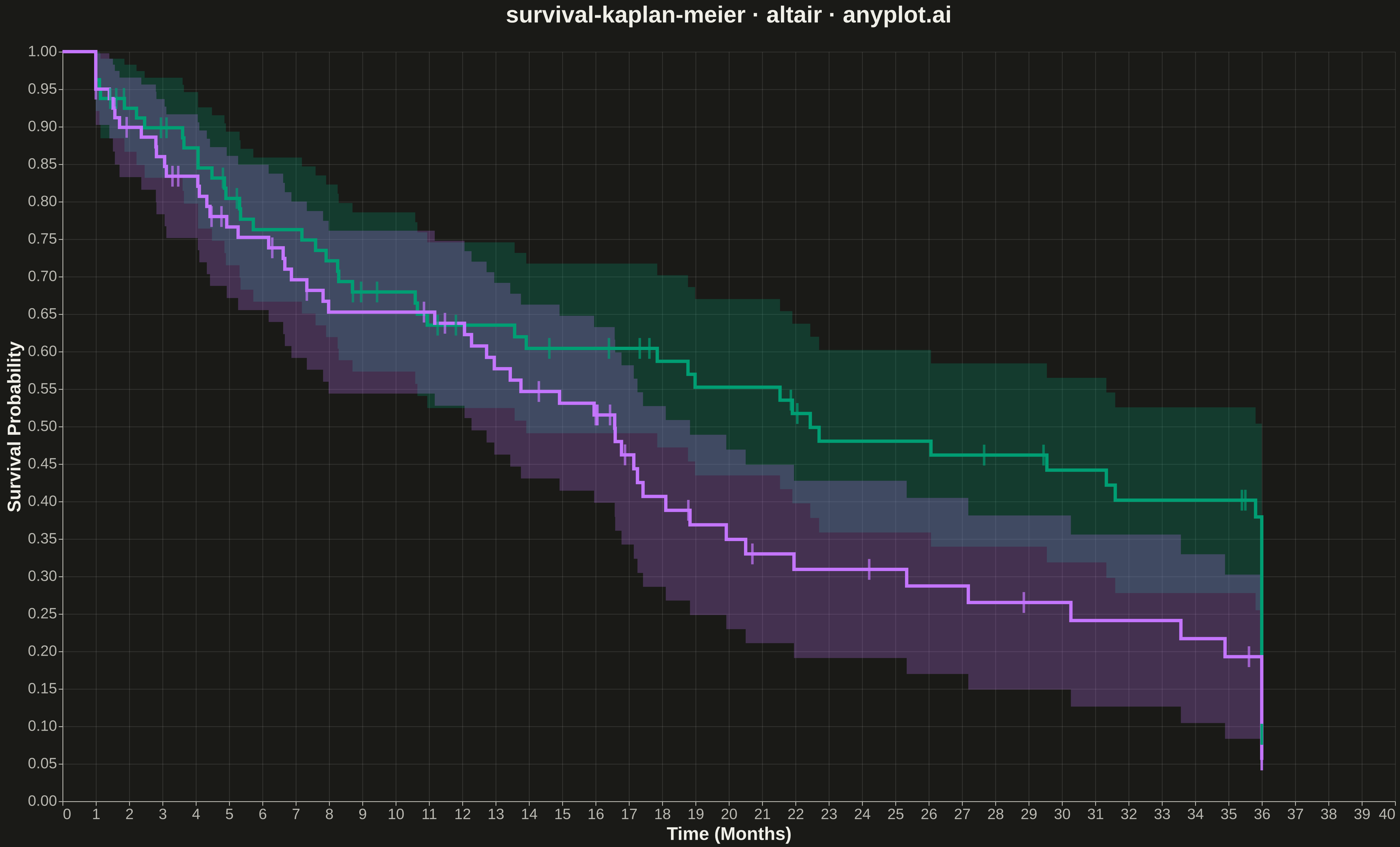
A Kaplan-Meier survival plot visualizes the probability of survival (or event-free time) over a time period using a step function. It is the standard method for estimating survival functions from time-to-event data, handling censored observations where the event has not yet occurred. The plot shows how survival probability decreases over time, with optional confidence intervals and comparison between groups.
""" anyplot.ai
survival-kaplan-meier: Kaplan-Meier Survival Plot
Library: altair 6.1.0 | Python 3.13.13
Quality: 90/100 | Updated: 2026-05-11
"""

import os

import altair as alt
import numpy as np
import pandas as pd


# Theme tokens
THEME = os.getenv("ANYPLOT_THEME", "light")
PAGE_BG = "#FAF8F1" if THEME == "light" else "#1A1A17"
ELEVATED_BG = "#FFFDF6" if THEME == "light" else "#242420"
INK = "#1A1A17" if THEME == "light" else "#F0EFE8"
INK_SOFT = "#4A4A44" if THEME == "light" else "#B8B7B0"

# Okabe-Ito palette
IMPRINT = ["#009E73", "#C475FD", "#4467A3", "#BD8233", "#AE3030", "#2ABCCD", "#954477"]

# Data - Clinical trial with two treatment groups
np.random.seed(42)

n_per_group = 80

# Treatment A (better survival)
time_a = np.random.exponential(scale=24, size=n_per_group)
time_a = np.clip(time_a, 1, 36)
event_a = np.random.binomial(1, 0.65, size=n_per_group)

# Treatment B (standard)
time_b = np.random.exponential(scale=16, size=n_per_group)
time_b = np.clip(time_b, 1, 36)
event_b = np.random.binomial(1, 0.75, size=n_per_group)

# Combine into dataframe
df = pd.DataFrame(
    {
        "time": np.concatenate([time_a, time_b]),
        "event": np.concatenate([event_a, event_b]),
        "group": ["Treatment A"] * n_per_group + ["Treatment B"] * n_per_group,
    }
)

# Kaplan-Meier estimation (inline - no functions)
km_data = []

for group_name in ["Treatment A", "Treatment B"]:
    mask = df["group"] == group_name
    time = df.loc[mask, "time"].values
    event = df.loc[mask, "event"].values

    # Sort by time
    order = np.argsort(time)
    time = time[order]
    event = event[order]

    # Get unique event times
    unique_times = np.unique(time[event == 1])

    # Calculate survival at each time point
    survival = 1.0
    times = [0]
    survivals = [1.0]
    ci_lower = [1.0]
    ci_upper = [1.0]
    var_sum = 0

    for t in unique_times:
        at_risk = np.sum(time >= t)
        events = np.sum((time == t) & (event == 1))

        if at_risk > 0:
            survival *= (at_risk - events) / at_risk
            if at_risk > events:
                var_sum += events / (at_risk * (at_risk - events))

        times.append(t)
        survivals.append(survival)

        se = survival * np.sqrt(var_sum) if var_sum > 0 else 0
        ci_lower.append(max(0, survival - 1.96 * se))
        ci_upper.append(min(1, survival + 1.96 * se))

    # Extend to max time
    max_time = time.max()
    times.append(max_time)
    survivals.append(survival)
    ci_lower.append(ci_lower[-1])
    ci_upper.append(ci_upper[-1])

    for i in range(len(times)):
        km_data.append(
            {
                "Time (Months)": times[i],
                "Survival Probability": survivals[i],
                "CI Lower": ci_lower[i],
                "CI Upper": ci_upper[i],
                "Group": group_name,
            }
        )

km_df = pd.DataFrame(km_data)

# Get censored observations for tick marks
censored = df[df["event"] == 0].copy()
censored_marks = []
for _, row in censored.iterrows():
    mask = (km_df["Group"] == row["group"]) & (km_df["Time (Months)"] <= row["time"])
    if mask.any():
        surv_at_censor = km_df.loc[mask, "Survival Probability"].iloc[-1]
        censored_marks.append(
            {"Time (Months)": row["time"], "Survival Probability": surv_at_censor, "Group": row["group"]}
        )

censored_df = pd.DataFrame(censored_marks) if censored_marks else pd.DataFrame()

# Define colors using Okabe-Ito palette
color_scale = alt.Scale(domain=["Treatment A", "Treatment B"], range=[IMPRINT[0], IMPRINT[1]])

# Step line for survival curves
survival_line = (
    alt.Chart(km_df)
    .mark_line(interpolate="step-after", strokeWidth=4)
    .encode(
        x=alt.X("Time (Months):Q", scale=alt.Scale(domain=[0, 38]), title="Time (Months)"),
        y=alt.Y("Survival Probability:Q", scale=alt.Scale(domain=[0, 1.0]), title="Survival Probability"),
        color=alt.Color("Group:N", scale=color_scale),
    )
)

# Confidence interval bands
ci_band = (
    alt.Chart(km_df)
    .mark_area(interpolate="step-after", opacity=0.25)
    .encode(
        x=alt.X("Time (Months):Q"),
        y=alt.Y("CI Lower:Q", title=""),
        y2=alt.Y2("CI Upper:Q"),
        color=alt.Color("Group:N", scale=color_scale, legend=None),
    )
)

# Censored observation marks
if not censored_df.empty:
    censor_marks = (
        alt.Chart(censored_df)
        .mark_tick(thickness=3, size=25)
        .encode(
            x=alt.X("Time (Months):Q"),
            y=alt.Y("Survival Probability:Q", title=""),
            color=alt.Color("Group:N", scale=color_scale, legend=None),
        )
    )
    chart_layers = ci_band + survival_line + censor_marks
else:
    chart_layers = ci_band + survival_line

# Create final chart with theme-adaptive styling
chart = (
    chart_layers.properties(
        width=1600,
        height=900,
        background=PAGE_BG,
        title=alt.Title("survival-kaplan-meier · altair · anyplot.ai", fontSize=28, anchor="middle", offset=20),
    )
    .configure_view(fill=PAGE_BG, strokeWidth=0)
    .configure_axis(
        domainColor=INK_SOFT,
        tickColor=INK_SOFT,
        gridColor=INK,
        gridOpacity=0.10,
        labelFontSize=18,
        titleFontSize=22,
        labelColor=INK_SOFT,
        titleColor=INK,
    )
    .configure_title(color=INK)
    .configure_legend(
        fillColor=ELEVATED_BG,
        strokeColor=INK_SOFT,
        labelColor=INK_SOFT,
        titleColor=INK,
        titleFontSize=20,
        labelFontSize=18,
        strokeWidth=1,
    )
)

# Save outputs
chart.save(f"plot-{THEME}.png", scale_factor=3.0)
chart.save(f"plot-{THEME}.html")
Runnable source as JSON, for any HTTP client: https://api.anyplot.ai/specs/survival-kaplan-meier/altair/code. Any spec id and library id listed in llms-full.txt fit the same URL shape; every URL below is complete and callable.
{
  "spec_id": "survival-kaplan-meier",
  "language": "python",
  "library": "altair",
  "page": "https://anyplot.ai/survival-kaplan-meier/python/altair",
  "hub": "https://anyplot.ai/survival-kaplan-meier",
  "code_json": "https://api.anyplot.ai/specs/survival-kaplan-meier/altair/code",
  "spec_json": "https://api.anyplot.ai/specs/survival-kaplan-meier",
  "render_light_png": "https://storage.googleapis.com/anyplot-images/plots/survival-kaplan-meier/python/altair/plot-light.png",
  "render_dark_png": "https://storage.googleapis.com/anyplot-images/plots/survival-kaplan-meier/python/altair/plot-dark.png",
  "interactive_light_html": "https://storage.googleapis.com/anyplot-images/plots/survival-kaplan-meier/python/altair/plot-light.html",
  "interactive_dark_html": "https://storage.googleapis.com/anyplot-images/plots/survival-kaplan-meier/python/altair/plot-dark.html",
  "quality_score": 90.0,
  "license": "MIT",
  "guide": "https://anyplot.ai/llms.txt"
}
Part of Kaplan-Meier Survival Plot on anyplot.ai.