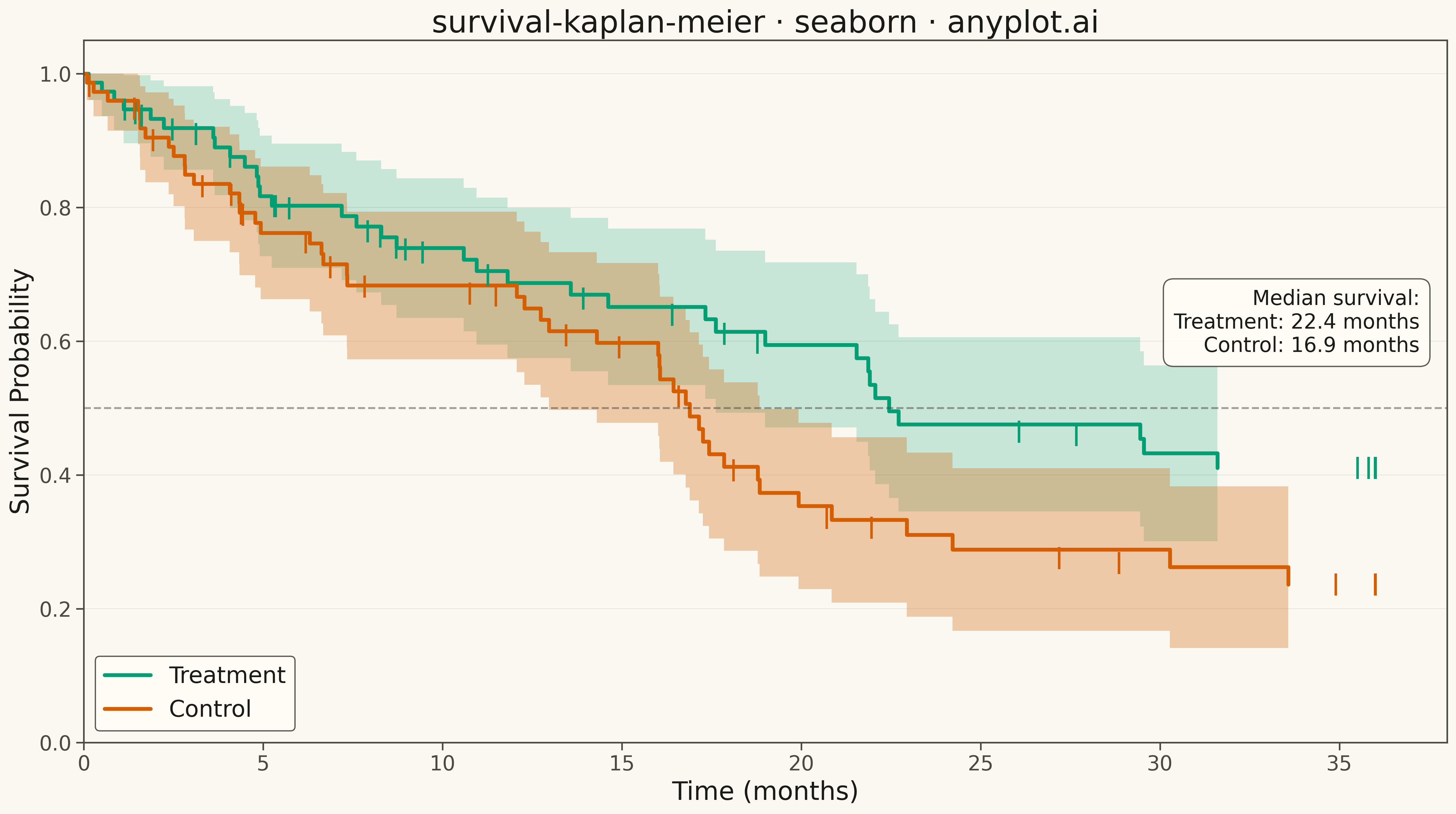
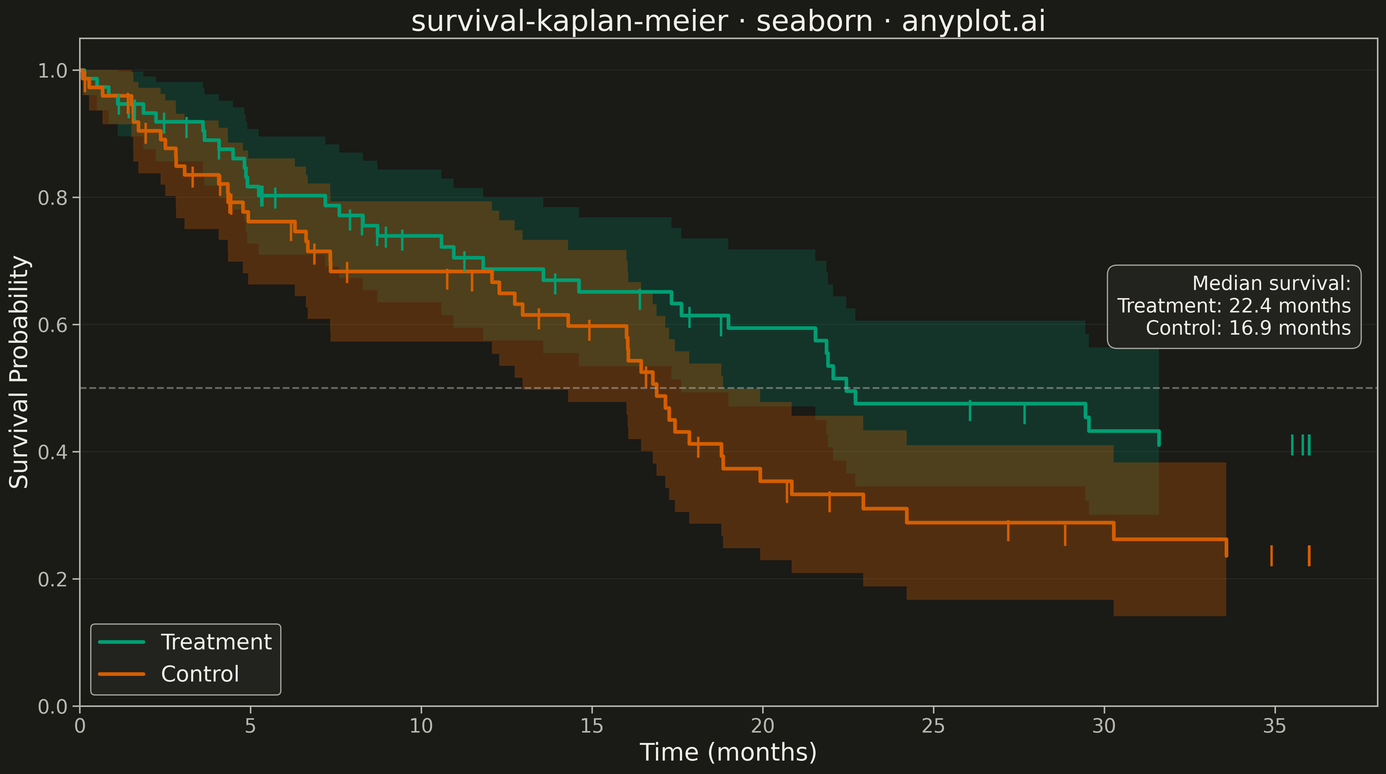
A Kaplan-Meier survival plot visualizes the probability of survival (or event-free time) over a time period using a step function. It is the standard method for estimating survival functions from time-to-event data, handling censored observations where the event has not yet occurred. The plot shows how survival probability decreases over time, with optional confidence intervals and comparison between groups.
""" anyplot.ai
survival-kaplan-meier: Kaplan-Meier Survival Plot
Library: seaborn 0.13.2 | Python 3.13.13
Quality: 72/100 | Updated: 2026-05-11
"""

import matplotlib.pyplot as plt
import numpy as np
import pandas as pd
import seaborn as sns


# Kaplan-Meier estimator function
def kaplan_meier(time, event):
    """Calculate Kaplan-Meier survival estimates with confidence intervals."""
    df = pd.DataFrame({"time": time, "event": event}).sort_values("time")

    # Get unique event times (only where events occurred)
    event_times = df[df["event"] == 1]["time"].unique()
    event_times = np.sort(event_times)

    survival = []
    ci_lower = []
    ci_upper = []
    times = [0]
    survival.append(1.0)
    ci_lower.append(1.0)
    ci_upper.append(1.0)

    s = 1.0
    var_sum = 0.0

    for t in event_times:
        n_at_risk = len(df[df["time"] >= t])
        n_events = len(df[(df["time"] == t) & (df["event"] == 1)])

        if n_at_risk > 0:
            s *= 1 - n_events / n_at_risk
            if n_at_risk > n_events:
                var_sum += n_events / (n_at_risk * (n_at_risk - n_events))

        times.append(t)
        survival.append(s)

        # Greenwood's formula for confidence intervals
        if s > 0 and var_sum > 0:
            se = s * np.sqrt(var_sum)
            ci_lower.append(max(0, s - 1.96 * se))
            ci_upper.append(min(1, s + 1.96 * se))
        else:
            ci_lower.append(s)
            ci_upper.append(s)

    return np.array(times), np.array(survival), np.array(ci_lower), np.array(ci_upper)


# Generate synthetic clinical trial data
np.random.seed(42)
n_patients = 150

# Treatment group (better survival)
n_treatment = 75
treatment_time = np.random.exponential(scale=24, size=n_treatment)
treatment_time = np.clip(treatment_time, 0, 36)  # Max follow-up 36 months
treatment_event = np.random.binomial(1, 0.6, size=n_treatment)
# Censor some patients (still alive at end of study)
treatment_event[treatment_time >= 35] = 0

# Control group (worse survival)
n_control = 75
control_time = np.random.exponential(scale=16, size=n_control)
control_time = np.clip(control_time, 0, 36)
control_event = np.random.binomial(1, 0.75, size=n_control)
control_event[control_time >= 35] = 0

# Calculate Kaplan-Meier estimates for each group
treat_times, treat_surv, treat_ci_lo, treat_ci_hi = kaplan_meier(treatment_time, treatment_event)
ctrl_times, ctrl_surv, ctrl_ci_lo, ctrl_ci_hi = kaplan_meier(control_time, control_event)

# Get censored observations for marking
treat_censor_times = treatment_time[treatment_event == 0]
ctrl_censor_times = control_time[control_event == 0]

# Interpolate survival at censoring times for tick marks
treat_censor_surv = np.interp(treat_censor_times, treat_times, treat_surv)
ctrl_censor_surv = np.interp(ctrl_censor_times, ctrl_times, ctrl_surv)

# Colors
treatment_color = "#306998"  # Python Blue
control_color = "#FFD43B"  # Python Yellow

# Create plot
sns.set_style("whitegrid")
fig, ax = plt.subplots(figsize=(16, 9))

# Plot treatment group survival curve (step function)
ax.step(treat_times, treat_surv, where="post", color=treatment_color, linewidth=3, label="Treatment")
ax.fill_between(treat_times, treat_ci_lo, treat_ci_hi, step="post", alpha=0.2, color=treatment_color, linewidth=0)

# Plot control group survival curve (step function)
ax.step(ctrl_times, ctrl_surv, where="post", color=control_color, linewidth=3, label="Control")
ax.fill_between(ctrl_times, ctrl_ci_lo, ctrl_ci_hi, step="post", alpha=0.3, color=control_color, linewidth=0)

# Mark censored observations with tick marks
ax.scatter(treat_censor_times, treat_censor_surv, marker="|", s=300, color=treatment_color, linewidths=2, zorder=5)
ax.scatter(ctrl_censor_times, ctrl_censor_surv, marker="|", s=300, color=control_color, linewidths=2, zorder=5)

# Calculate median survival times
treat_median_idx = np.where(treat_surv <= 0.5)[0]
treat_median = treat_times[treat_median_idx[0]] if len(treat_median_idx) > 0 else None
ctrl_median_idx = np.where(ctrl_surv <= 0.5)[0]
ctrl_median = ctrl_times[ctrl_median_idx[0]] if len(ctrl_median_idx) > 0 else None

# Add median survival annotation
if treat_median is not None:
    ax.axhline(y=0.5, color="gray", linestyle="--", alpha=0.5, linewidth=1.5)
    annotation_text = f"Median survival:\nTreatment: {treat_median:.1f} months"
    if ctrl_median is not None:
        annotation_text += f"\nControl: {ctrl_median:.1f} months"
    ax.annotate(
        annotation_text,
        xy=(0.98, 0.55),
        xycoords="axes fraction",
        fontsize=16,
        ha="right",
        va="bottom",
        bbox={"boxstyle": "round,pad=0.5", "facecolor": "white", "edgecolor": "gray", "alpha": 0.9},
    )

# Labels and styling
ax.set_xlabel("Time (months)", fontsize=20)
ax.set_ylabel("Survival Probability", fontsize=20)
ax.set_title("survival-kaplan-meier · seaborn · pyplots.ai", fontsize=24)
ax.tick_params(axis="both", labelsize=16)

ax.set_xlim(0, 38)
ax.set_ylim(0, 1.05)

# Legend
ax.legend(fontsize=18, loc="lower left", framealpha=0.9)

# Subtle grid
ax.grid(True, alpha=0.3, linestyle="--")

plt.tight_layout()
plt.savefig("plot.png", dpi=300, bbox_inches="tight")
Runnable source as JSON, for any HTTP client: https://api.anyplot.ai/specs/survival-kaplan-meier/seaborn/code. Any spec id and library id listed in llms-full.txt fit the same URL shape; every URL below is complete and callable.
{
  "spec_id": "survival-kaplan-meier",
  "language": "python",
  "library": "seaborn",
  "page": "https://anyplot.ai/survival-kaplan-meier/python/seaborn",
  "hub": "https://anyplot.ai/survival-kaplan-meier",
  "code_json": "https://api.anyplot.ai/specs/survival-kaplan-meier/seaborn/code",
  "spec_json": "https://api.anyplot.ai/specs/survival-kaplan-meier",
  "render_light_png": "https://storage.googleapis.com/anyplot-images/plots/survival-kaplan-meier/python/seaborn/plot-light.png",
  "render_dark_png": "https://storage.googleapis.com/anyplot-images/plots/survival-kaplan-meier/python/seaborn/plot-dark.png",
  "quality_score": 72.0,
  "license": "MIT",
  "guide": "https://anyplot.ai/llms.txt"
}
Part of Kaplan-Meier Survival Plot on anyplot.ai.