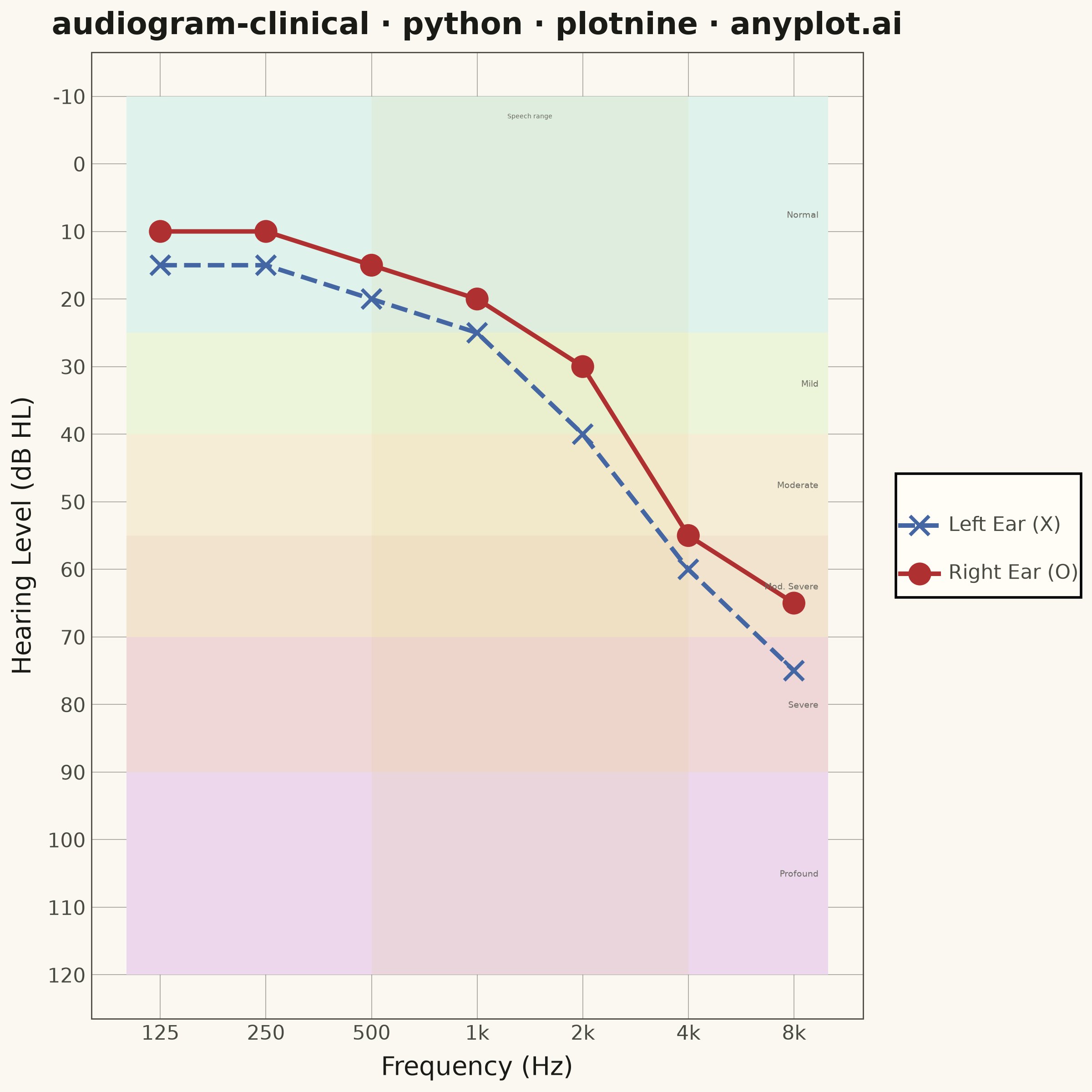
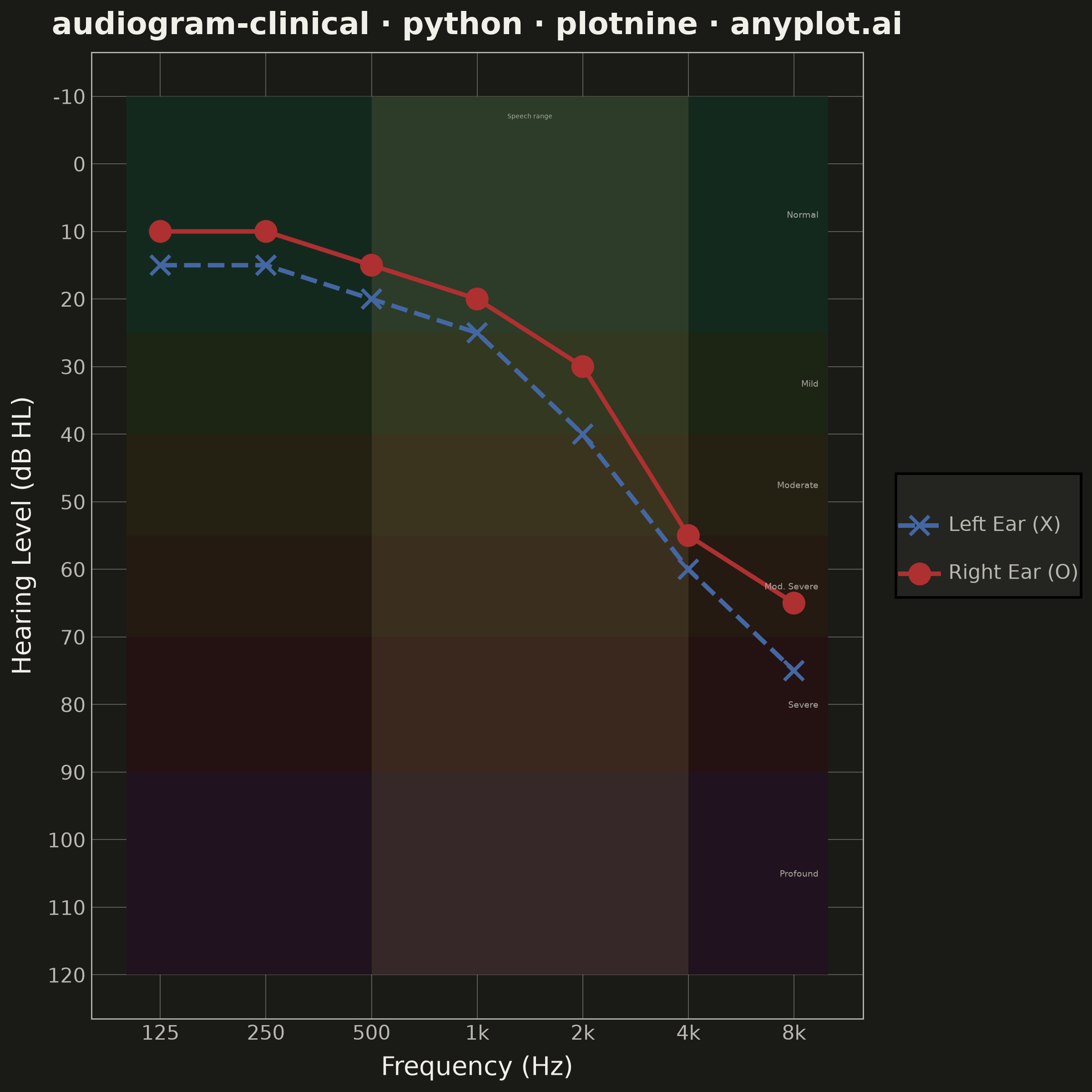
A standardized clinical audiogram that displays hearing test results, plotting hearing threshold (dB HL) against test frequency for each ear. The y-axis is inverted so that 0 dB HL (best hearing) sits at the top and increasing hearing loss extends downward, while the x-axis is logarithmic spanning the standard audiometric frequencies (125 Hz to 8 kHz). Thresholds are marked with the conventional symbols — a circle (O) for the right ear in red and a cross (X) for the left ear in blue — and connected per ear, with shaded horizontal bands indicating severity of hearing loss (normal, mild, moderate, severe, profound).
""" anyplot.ai
audiogram-clinical: Clinical Audiogram
Library: plotnine 0.15.7 | Python 3.13.13
Quality: 89/100 | Created: 2026-06-15
"""

import sys


sys.path.pop(0)  # prevent this file (plotnine.py) from shadowing the plotnine library

import os

import pandas as pd
from plotnine import (
    aes,
    element_blank,
    element_line,
    element_rect,
    element_text,
    geom_line,
    geom_point,
    geom_rect,
    geom_text,
    ggplot,
    guides,
    labs,
    scale_color_manual,
    scale_fill_manual,
    scale_linetype_manual,
    scale_shape_manual,
    scale_x_log10,
    scale_y_reverse,
    theme,
    theme_minimal,
)


# Theme tokens
THEME = os.getenv("ANYPLOT_THEME", "light")
PAGE_BG = "#FAF8F1" if THEME == "light" else "#1A1A17"
ELEVATED_BG = "#FFFDF6" if THEME == "light" else "#242420"
INK = "#1A1A17" if THEME == "light" else "#F0EFE8"
INK_SOFT = "#4A4A44" if THEME == "light" else "#B8B7B0"
INK_MUTED = "#6B6A63" if THEME == "light" else "#A8A79F"

# Audiogram uses strict clinical color conventions (semantic exception)
RIGHT_COLOR = "#AE3030"  # Imprint matte red — right ear standard
LEFT_COLOR = "#4467A3"  # Imprint blue — left ear standard
ANYPLOT_AMBER = "#DDCC77"  # speech frequency range indicator

# Data: noise-induced high-frequency sensorineural hearing loss pattern
frequencies = [125, 250, 500, 1000, 2000, 4000, 8000]
right_thresh = [10, 10, 15, 20, 30, 55, 65]
left_thresh = [15, 15, 20, 25, 40, 60, 75]

df = pd.concat(
    [
        pd.DataFrame({"frequency": frequencies, "threshold": right_thresh, "ear": "Right Ear (O)"}),
        pd.DataFrame({"frequency": frequencies, "threshold": left_thresh, "ear": "Left Ear (X)"}),
    ],
    ignore_index=True,
)

# Severity bands — contiguous boundaries for clean shading
bands = pd.DataFrame(
    {
        "xmin": [100] * 6,
        "xmax": [10000] * 6,
        "ymin": [-10, 25, 40, 55, 70, 90],
        "ymax": [25, 40, 55, 70, 90, 120],
        "severity": ["Normal", "Mild", "Moderate", "Mod. Severe", "Severe", "Profound"],
    }
)

# Subtle severity band fills per theme
if THEME == "light":
    band_colors = {
        "Normal": "#DFF2EC",
        "Mild": "#ECF4D9",
        "Moderate": "#F5EDD6",
        "Mod. Severe": "#F2E3CE",
        "Severe": "#F0D7D7",
        "Profound": "#EDD7EC",
    }
else:
    band_colors = {
        "Normal": "#14291E",
        "Mild": "#1C2414",
        "Moderate": "#242012",
        "Mod. Severe": "#241A12",
        "Severe": "#241212",
        "Profound": "#20121E",
    }

# Severity band labels: midpoint y positions, placed near right edge
band_labels = pd.DataFrame(
    {
        "x": [9400] * 6,
        "y": [7.5, 32.5, 47.5, 62.5, 80.0, 105.0],
        "label": ["Normal", "Mild", "Moderate", "Mod. Severe", "Severe", "Profound"],
    }
)

# Speech frequency reference band (500–4000 Hz is clinically critical for speech intelligibility)
speech_ref = pd.DataFrame({"xmin": [500], "xmax": [4000], "ymin": [-10], "ymax": [120]})
speech_label = pd.DataFrame({"x": [1414], "y": [-7.0], "label": ["Speech range"]})

# Title font scaling
title = "audiogram-clinical · python · plotnine · anyplot.ai"
n = len(title)
ratio = 67 / n if n > 67 else 1.0
title_fontsize = max(8, round(12 * ratio))

# Plot
plot = (
    ggplot(df, aes(x="frequency", y="threshold"))
    # Severity shading (drawn first so data sits on top)
    + geom_rect(
        data=bands, mapping=aes(xmin="xmin", xmax="xmax", ymin="ymin", ymax="ymax", fill="severity"), inherit_aes=False
    )
    + scale_fill_manual(values=band_colors)
    + guides(fill=False)
    # Speech frequency range: subtle amber vertical band highlighting clinically important region
    + geom_rect(
        data=speech_ref,
        mapping=aes(xmin="xmin", xmax="xmax", ymin="ymin", ymax="ymax"),
        inherit_aes=False,
        fill=ANYPLOT_AMBER,
        alpha=0.12,
    )
    # Connecting lines per ear
    + geom_line(aes(color="ear", linetype="ear"), size=1.0)
    # Threshold markers: O for right, X for left
    + geom_point(aes(color="ear", shape="ear"), size=3.5, stroke=0.8)
    # Severity band labels inside plot near right edge
    + geom_text(
        data=band_labels,
        mapping=aes(x="x", y="y", label="label"),
        inherit_aes=False,
        size=3.5,
        color=INK_MUTED,
        ha="right",
    )
    # Speech range label near top of band (y=-7 is near the top of the inverted axis)
    + geom_text(
        data=speech_label,
        mapping=aes(x="x", y="y", label="label"),
        inherit_aes=False,
        size=2.5,
        color=INK_MUTED,
        ha="center",
    )
    # Color: right=red, left=blue (clinical convention); same name merges legend entries
    + scale_color_manual(values={"Right Ear (O)": RIGHT_COLOR, "Left Ear (X)": LEFT_COLOR}, name=" ")
    + scale_shape_manual(values={"Right Ear (O)": "o", "Left Ear (X)": "x"}, name=" ")
    + scale_linetype_manual(values={"Right Ear (O)": "solid", "Left Ear (X)": "dashed"}, name=" ")
    # Logarithmic frequency axis with standard audiometric ticks
    + scale_x_log10(
        breaks=[125, 250, 500, 1000, 2000, 4000, 8000],
        labels=["125", "250", "500", "1k", "2k", "4k", "8k"],
        limits=[100, 10000],
    )
    # Inverted hearing level axis: 0 dB at top, loss increases downward
    + scale_y_reverse(limits=(-10, 120), breaks=list(range(-10, 130, 10)))
    + labs(x="Frequency (Hz)", y="Hearing Level (dB HL)", title=title)
    + theme_minimal()
    + theme(
        figure_size=(6, 6),
        text=element_text(size=7),
        plot_title=element_text(size=title_fontsize, color=INK, weight="bold"),
        axis_title=element_text(size=10, color=INK),
        axis_text=element_text(size=8, color=INK_SOFT),
        legend_text=element_text(size=8, color=INK_SOFT),
        legend_title=element_text(size=9, color=INK),
        legend_background=element_rect(fill=ELEVATED_BG, color=None),
        legend_key=element_blank(),
        panel_background=element_rect(fill=PAGE_BG, color=None),
        plot_background=element_rect(fill=PAGE_BG, color=PAGE_BG),
        panel_grid_major=element_line(color=INK_SOFT, size=0.3, alpha=0.5),
        panel_grid_minor=element_blank(),
        panel_border=element_rect(color=INK_SOFT, fill=None, size=0.5),
        legend_position="right",
    )
)

# Save
plot.save(f"plot-{THEME}.png", dpi=400, width=6, height=6, units="in")
Runnable source as JSON, for any HTTP client: https://api.anyplot.ai/specs/audiogram-clinical/plotnine/code. Any spec id and library id listed in llms-full.txt fit the same URL shape; every URL below is complete and callable.
{
  "spec_id": "audiogram-clinical",
  "language": "python",
  "library": "plotnine",
  "page": "https://anyplot.ai/audiogram-clinical/python/plotnine",
  "hub": "https://anyplot.ai/audiogram-clinical",
  "code_json": "https://api.anyplot.ai/specs/audiogram-clinical/plotnine/code",
  "spec_json": "https://api.anyplot.ai/specs/audiogram-clinical",
  "render_light_png": "https://storage.googleapis.com/anyplot-images/plots/audiogram-clinical/python/plotnine/plot-light.png",
  "render_dark_png": "https://storage.googleapis.com/anyplot-images/plots/audiogram-clinical/python/plotnine/plot-dark.png",
  "quality_score": 89.0,
  "license": "MIT",
  "guide": "https://anyplot.ai/llms.txt"
}
Part of Clinical Audiogram on anyplot.ai.