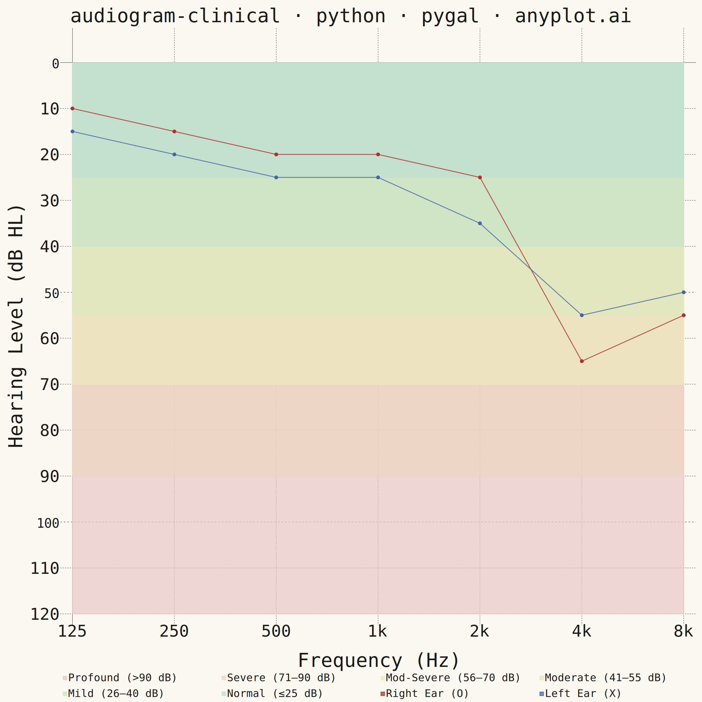
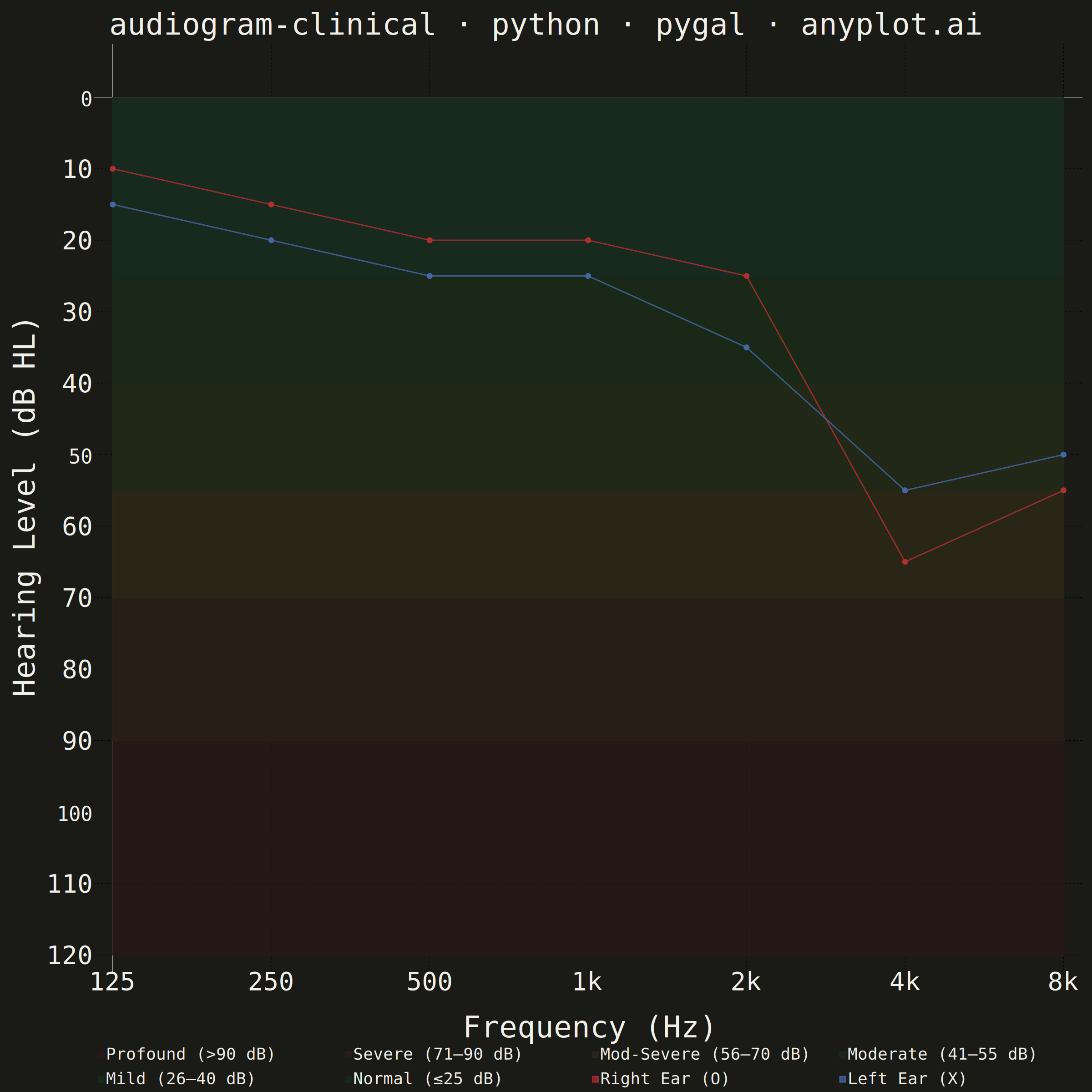
A standardized clinical audiogram that displays hearing test results, plotting hearing threshold (dB HL) against test frequency for each ear. The y-axis is inverted so that 0 dB HL (best hearing) sits at the top and increasing hearing loss extends downward, while the x-axis is logarithmic spanning the standard audiometric frequencies (125 Hz to 8 kHz). Thresholds are marked with the conventional symbols — a circle (O) for the right ear in red and a cross (X) for the left ear in blue — and connected per ear, with shaded horizontal bands indicating severity of hearing loss (normal, mild, moderate, severe, profound).
""" anyplot.ai
audiogram-clinical: Clinical Audiogram
Library: pygal 3.1.0 | Python 3.13.13
Quality: 82/100 | Created: 2026-06-15
"""

import os
import sys


# Remove the script's own directory from sys.path to prevent shadowing the pygal package
_script_dir = os.path.dirname(os.path.abspath(__file__))
if _script_dir in sys.path:
    sys.path.remove(_script_dir)

import pygal
from pygal.style import Style


THEME = os.getenv("ANYPLOT_THEME", "light")
PAGE_BG = "#FAF8F1" if THEME == "light" else "#1A1A17"
INK = "#1A1A17" if THEME == "light" else "#F0EFE8"
INK_MUTED = "#6B6A63" if THEME == "light" else "#A8A79F"

# Semantic exception: audiology convention overrides Imprint categorical colors
RIGHT_COLOR = "#AE3030"  # Imprint matte red — right ear
LEFT_COLOR = "#4467A3"  # Imprint blue — left ear

# Muted severity band fills — (light_hex, dark_hex), worst to best
_BAND_COLOR_PAIRS = (
    ("#E8C8C8", "#2A1818"),  # Profound (>90 dB)
    ("#EDD6C0", "#2A2018"),  # Severe (71–90 dB)
    ("#EDE8C0", "#2A2A18"),  # Mod-Severe (56–70 dB)
    ("#DEE8C0", "#1E2A18"),  # Moderate (41–55 dB)
    ("#C8E4C8", "#182A18"),  # Mild (26–40 dB)
    ("#C0E0D4", "#182A22"),  # Normal (≤25 dB)
)
band_fills = tuple(pair[0] if THEME == "light" else pair[1] for pair in _BAND_COLOR_PAIRS)

# Full palette: 6 band fills then the two ear colors
PALETTE = band_fills + (RIGHT_COLOR, LEFT_COLOR)

title_str = "audiogram-clinical · python · pygal · anyplot.ai"
n_chars = len(title_str)
ratio = 67 / n_chars if n_chars > 67 else 1.0
title_font_size = max(44, round(66 * ratio))

custom_style = Style(
    background=PAGE_BG,
    plot_background=PAGE_BG,
    foreground=INK,
    foreground_strong=INK,
    foreground_subtle=INK_MUTED,
    colors=PALETTE,
    title_font_size=title_font_size,
    label_font_size=56,
    major_label_font_size=44,
    legend_font_size=36,
    value_font_size=36,
    stroke_width=3.0,
)

# Standard audiometric octave frequencies — each is exactly 2× the prior, so equal
# categorical spacing in pygal.Line matches logarithmic visual spacing precisely
freq_labels = ["125", "250", "500", "1k", "2k", "4k", "8k"]
n_freqs = len(freq_labels)

# Noise-induced sensorineural hearing loss — bilateral 4 kHz notch
threshold_right = [10, 15, 20, 20, 25, 65, 55]  # right ear, red O markers
threshold_left = [15, 20, 25, 25, 35, 55, 50]  # left ear, blue X markers

# Negate: 0 dB HL (best hearing) sits at y=0 (top); increasing loss goes negative
right_neg = [-t for t in threshold_right]
left_neg = [-t for t in threshold_left]

# Y-axis: absolute-value labels displayed at their negated positions every 10 dB
y_label_items = [{"label": str(abs(v)), "value": v} for v in range(-120, 1, 10)]

chart = pygal.Line(
    width=2400,
    height=2400,
    style=custom_style,
    title=title_str,
    x_title="Frequency (Hz)",
    y_title="Hearing Level (dB HL)",
    show_dots=True,
    dots_size=6,
    show_x_guides=True,
    show_y_guides=True,
    range=(-120, 5),
    legend_at_bottom=True,
    legend_at_bottom_columns=4,
)

chart.x_labels = freq_labels
chart.y_labels = y_label_items

# Stacked fill technique for severity bands:
# Each band is a flat horizontal line with fill=True, which fills from that y-value
# upward to y=0.  Adding from deepest (worst, y=−120) to shallowest (best, y=−25)
# means each later fill overwrites the upper portion, so every band retains its own
# color only between its two surrounding boundary lines.
band_specs = [
    ("Profound (>90 dB)", -120),  # initial fill covers entire chart height
    ("Severe (71–90 dB)", -90),  # overwrites from −90 to 0, exposing profound below
    ("Mod-Severe (56–70 dB)", -70),
    ("Moderate (41–55 dB)", -55),
    ("Mild (26–40 dB)", -40),
    ("Normal (≤25 dB)", -25),
]

for label, y_val in band_specs:
    chart.add(label, [y_val] * n_freqs, fill=True, show_dots=False, stroke_style={"width": 0.5})

# Audiogram lines — drawn on top of all band fills
chart.add("Right Ear (O)", right_neg, fill=False, stroke_style={"width": 5.0})
chart.add("Left Ear (X)", left_neg, fill=False, stroke_style={"width": 5.0})

chart.render_to_png(f"plot-{THEME}.png")
with open(f"plot-{THEME}.html", "wb") as f:
    f.write(chart.render())
Runnable source as JSON, for any HTTP client: https://api.anyplot.ai/specs/audiogram-clinical/pygal/code. Any spec id and library id listed in llms-full.txt fit the same URL shape; every URL below is complete and callable.
{
  "spec_id": "audiogram-clinical",
  "language": "python",
  "library": "pygal",
  "page": "https://anyplot.ai/audiogram-clinical/python/pygal",
  "hub": "https://anyplot.ai/audiogram-clinical",
  "code_json": "https://api.anyplot.ai/specs/audiogram-clinical/pygal/code",
  "spec_json": "https://api.anyplot.ai/specs/audiogram-clinical",
  "render_light_png": "https://storage.googleapis.com/anyplot-images/plots/audiogram-clinical/python/pygal/plot-light.png",
  "render_dark_png": "https://storage.googleapis.com/anyplot-images/plots/audiogram-clinical/python/pygal/plot-dark.png",
  "interactive_light_html": "https://storage.googleapis.com/anyplot-images/plots/audiogram-clinical/python/pygal/plot-light.html",
  "interactive_dark_html": "https://storage.googleapis.com/anyplot-images/plots/audiogram-clinical/python/pygal/plot-dark.html",
  "quality_score": 82.0,
  "license": "MIT",
  "guide": "https://anyplot.ai/llms.txt"
}
Part of Clinical Audiogram on anyplot.ai.