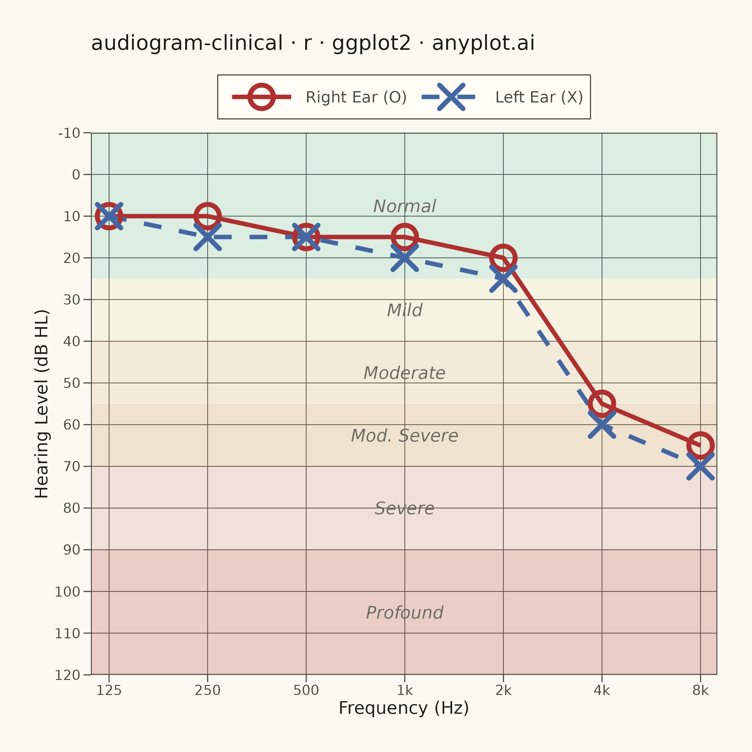
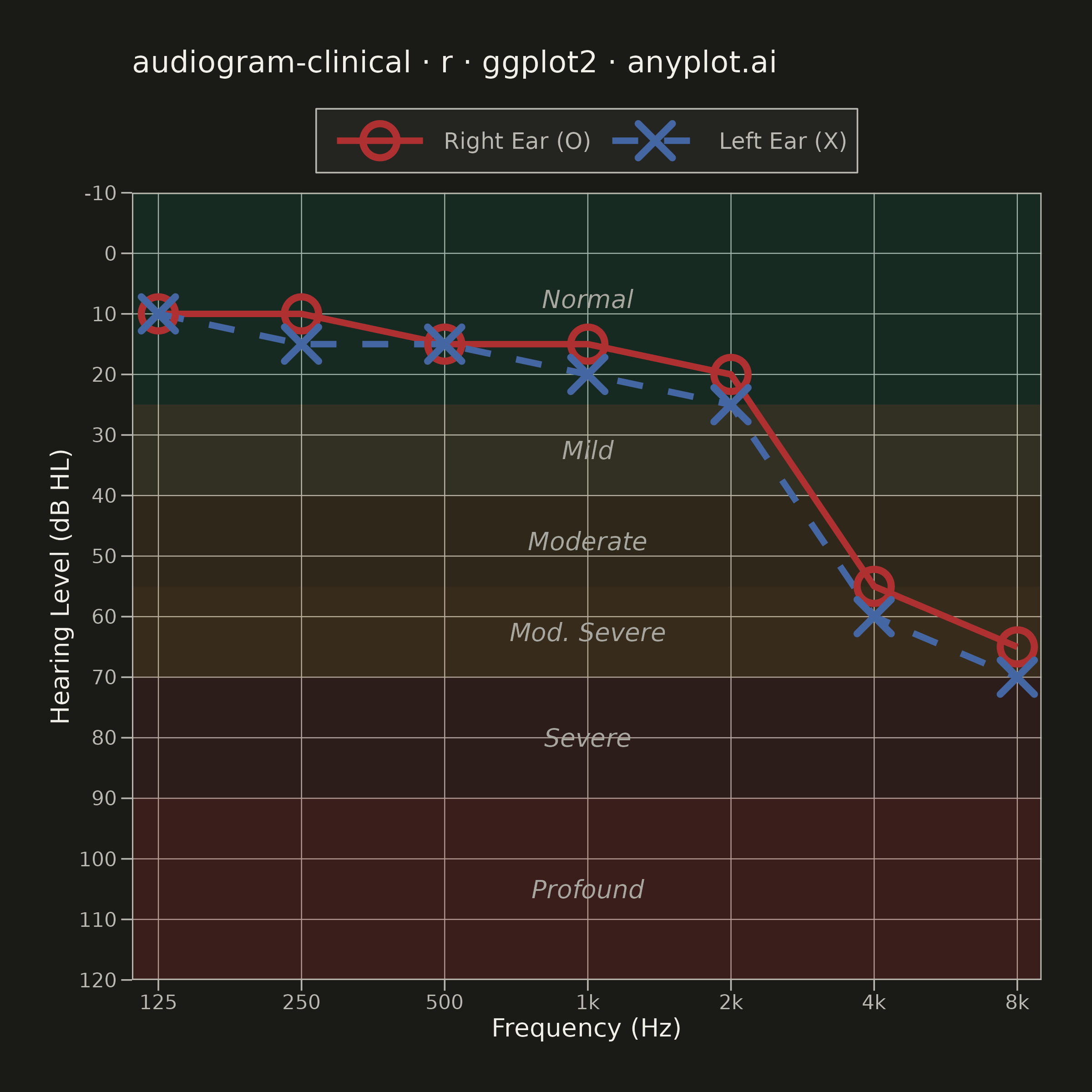
A standardized clinical audiogram that displays hearing test results, plotting hearing threshold (dB HL) against test frequency for each ear. The y-axis is inverted so that 0 dB HL (best hearing) sits at the top and increasing hearing loss extends downward, while the x-axis is logarithmic spanning the standard audiometric frequencies (125 Hz to 8 kHz). Thresholds are marked with the conventional symbols — a circle (O) for the right ear in red and a cross (X) for the left ear in blue — and connected per ear, with shaded horizontal bands indicating severity of hearing loss (normal, mild, moderate, severe, profound).
#' anyplot.ai
#' audiogram-clinical: Clinical Audiogram
#' Library: ggplot2 3.5.1 | R 4.4.1
#' Quality: 92/100 | Created: 2026-06-15

library(ggplot2)
library(ragg)

set.seed(42)

# --- Theme tokens -----------------------------------------------------------
THEME       <- Sys.getenv("ANYPLOT_THEME", "light")
PAGE_BG     <- if (THEME == "light") "#FAF8F1" else "#1A1A17"
ELEVATED_BG <- if (THEME == "light") "#FFFDF6" else "#242420"
INK         <- if (THEME == "light") "#1A1A17" else "#F0EFE8"
INK_SOFT    <- if (THEME == "light") "#4A4A44" else "#B8B7B0"
INK_MUTED   <- if (THEME == "light") "#6B6A63" else "#A8A79F"

# Imprint palette — semantic exception applied: audiogram uses the international
# clinical convention of right ear = red, left ear = blue
RIGHT_COLOR <- "#AE3030"  # Imprint matte red — right ear (O marker)
LEFT_COLOR  <- "#4467A3"  # Imprint blue — left ear (X marker)
BAND_ALPHA  <- 0.12       # severity band fill opacity

# --- Data -------------------------------------------------------------------
# Noise-induced bilateral high-frequency sensorineural hearing loss
# Classic 4 kHz notch pattern from occupational noise exposure
frequencies <- c(125, 250, 500, 1000, 2000, 4000, 8000)

right_thresholds <- c(10, 10, 15, 15, 20, 55, 65)  # right ear: high-freq slope
left_thresholds  <- c(10, 15, 15, 20, 25, 60, 70)  # left ear: slightly worse

df <- data.frame(
  frequency = rep(frequencies, 2),
  threshold = c(right_thresholds, left_thresholds),
  ear       = factor(
    rep(c("Right Ear (O)", "Left Ear (X)"), each = 7),
    levels = c("Right Ear (O)", "Left Ear (X)")
  )
)

# --- Plot -------------------------------------------------------------------
PLOT_TITLE <- "audiogram-clinical · r · ggplot2 · anyplot.ai"

# coord_cartesian extends the view to the full audiometric range without
# removing any data rows (unlike scale limits which censor OOB points)
X_LO <- 110   # slightly below 125 Hz for left-side breathing room
X_HI <- 9000  # slightly above 8000 Hz for right-side breathing room
Y_LO <- -10   # best hearing at top of audiogram
Y_HI <- 120   # profound loss at bottom

p <- ggplot(df, aes(x = frequency, y = threshold,
                    color    = ear,
                    shape    = ear,
                    linetype = ear,
                    group    = ear)) +

  # Severity bands — rendered first so data layers sit on top.
  # xmin/xmax cover the full coord_cartesian x range to avoid edge gaps.
  annotate("rect", xmin = X_LO, xmax = X_HI, ymin = Y_LO, ymax = 25,
           fill = "#009E73", alpha = BAND_ALPHA) +
  annotate("rect", xmin = X_LO, xmax = X_HI, ymin = 25,   ymax = 40,
           fill = "#DDCC77", alpha = BAND_ALPHA) +
  annotate("rect", xmin = X_LO, xmax = X_HI, ymin = 40,   ymax = 55,
           fill = "#BD8233", alpha = BAND_ALPHA) +
  annotate("rect", xmin = X_LO, xmax = X_HI, ymin = 55,   ymax = 70,
           fill = "#BD8233", alpha = BAND_ALPHA * 1.5) +
  annotate("rect", xmin = X_LO, xmax = X_HI, ymin = 70,   ymax = 90,
           fill = "#AE3030", alpha = BAND_ALPHA) +
  annotate("rect", xmin = X_LO, xmax = X_HI, ymin = 90,   ymax = Y_HI,
           fill = "#AE3030", alpha = BAND_ALPHA * 1.8) +

  # Severity labels at 1000 Hz (log-centre of x-axis, all data in Normal zone here)
  annotate("text", x = 1000, y = 7.5,  label = "Normal",
           size = 3.5, color = INK_MUTED, hjust = 0.5, fontface = "italic") +
  annotate("text", x = 1000, y = 32.5, label = "Mild",
           size = 3.5, color = INK_MUTED, hjust = 0.5, fontface = "italic") +
  annotate("text", x = 1000, y = 47.5, label = "Moderate",
           size = 3.5, color = INK_MUTED, hjust = 0.5, fontface = "italic") +
  annotate("text", x = 1000, y = 62.5, label = "Mod. Severe",
           size = 3.5, color = INK_MUTED, hjust = 0.5, fontface = "italic") +
  annotate("text", x = 1000, y = 80,   label = "Severe",
           size = 3.5, color = INK_MUTED, hjust = 0.5, fontface = "italic") +
  annotate("text", x = 1000, y = 105,  label = "Profound",
           size = 3.5, color = INK_MUTED, hjust = 0.5, fontface = "italic") +

  # Connecting lines drawn before points so markers appear on top
  geom_line(linewidth = 1.2) +

  # Standard audiogram symbols: shape 1 = open circle (O), shape 4 = cross (X)
  geom_point(size = 5, stroke = 2.0, fill = NA) +

  # Logarithmic frequency axis with audiometric tick labels
  scale_x_log10(
    breaks = c(125, 250, 500, 1000, 2000, 4000, 8000),
    labels = c("125", "250", "500", "1k", "2k", "4k", "8k")
  ) +

  # Inverted hearing level axis (0 dB at top, increasing loss downward).
  # Limits are set via coord_cartesian to avoid OOB row removal.
  scale_y_reverse(
    breaks = seq(Y_LO, Y_HI, by = 10)
  ) +

  # Fix the view to the standard audiometric range without censoring data
  coord_cartesian(
    xlim   = c(X_LO, X_HI),
    ylim   = c(Y_HI, Y_LO),
    expand = FALSE
  ) +

  # Unified legend: color + shape + linetype merged by matching NULL name
  scale_color_manual(
    name   = NULL,
    values = c("Right Ear (O)" = RIGHT_COLOR, "Left Ear (X)" = LEFT_COLOR)
  ) +
  scale_shape_manual(
    name   = NULL,
    values = c("Right Ear (O)" = 1, "Left Ear (X)" = 4)
  ) +
  scale_linetype_manual(
    name   = NULL,
    values = c("Right Ear (O)" = "solid", "Left Ear (X)" = "dashed")
  ) +

  labs(
    title = PLOT_TITLE,
    x     = "Frequency (Hz)",
    y     = "Hearing Level (dB HL)"
  ) +

  theme_minimal(base_size = 8) +
  theme(
    plot.background   = element_rect(fill = PAGE_BG,     color = PAGE_BG),
    panel.background  = element_rect(fill = PAGE_BG,     color = NA),
    panel.border      = element_rect(fill = NA,          color = INK_SOFT,
                                     linewidth = 0.5),
    panel.grid.major  = element_line(color = INK_SOFT,   linewidth = 0.2),
    panel.grid.minor  = element_blank(),
    axis.title        = element_text(color = INK,        size = 10),
    axis.text         = element_text(color = INK_SOFT,   size = 8),
    axis.ticks        = element_line(color = INK_SOFT,   linewidth = 0.3),
    axis.ticks.length = unit(0.15, "cm"),
    plot.title        = element_text(color = INK,        size = 12,
                                     margin = margin(b = 12)),
    legend.background = element_rect(fill = ELEVATED_BG, color = INK_SOFT,
                                     linewidth = 0.3),
    legend.text       = element_text(color = INK_SOFT,   size = 9),
    legend.title      = element_blank(),
    legend.position   = "top",
    legend.key        = element_rect(fill = NA,          color = NA),
    legend.key.width  = unit(1.5, "cm"),
    plot.margin       = margin(20, 20, 20, 20)
  )

# --- Save -------------------------------------------------------------------
ggsave(
  filename = sprintf("plot-%s.png", THEME),
  plot     = p,
  device   = ragg::agg_png,
  width    = 6,
  height   = 6,
  units    = "in",
  dpi      = 400
)
Runnable source as JSON, for any HTTP client: https://api.anyplot.ai/specs/audiogram-clinical/ggplot2/code. Any spec id and library id listed in llms-full.txt fit the same URL shape; every URL below is complete and callable.
{
  "spec_id": "audiogram-clinical",
  "language": "r",
  "library": "ggplot2",
  "page": "https://anyplot.ai/audiogram-clinical/r/ggplot2",
  "hub": "https://anyplot.ai/audiogram-clinical",
  "code_json": "https://api.anyplot.ai/specs/audiogram-clinical/ggplot2/code",
  "spec_json": "https://api.anyplot.ai/specs/audiogram-clinical",
  "render_light_png": "https://storage.googleapis.com/anyplot-images/plots/audiogram-clinical/r/ggplot2/plot-light.png",
  "render_dark_png": "https://storage.googleapis.com/anyplot-images/plots/audiogram-clinical/r/ggplot2/plot-dark.png",
  "quality_score": 92.0,
  "license": "MIT",
  "guide": "https://anyplot.ai/llms.txt"
}
Part of Clinical Audiogram on anyplot.ai.