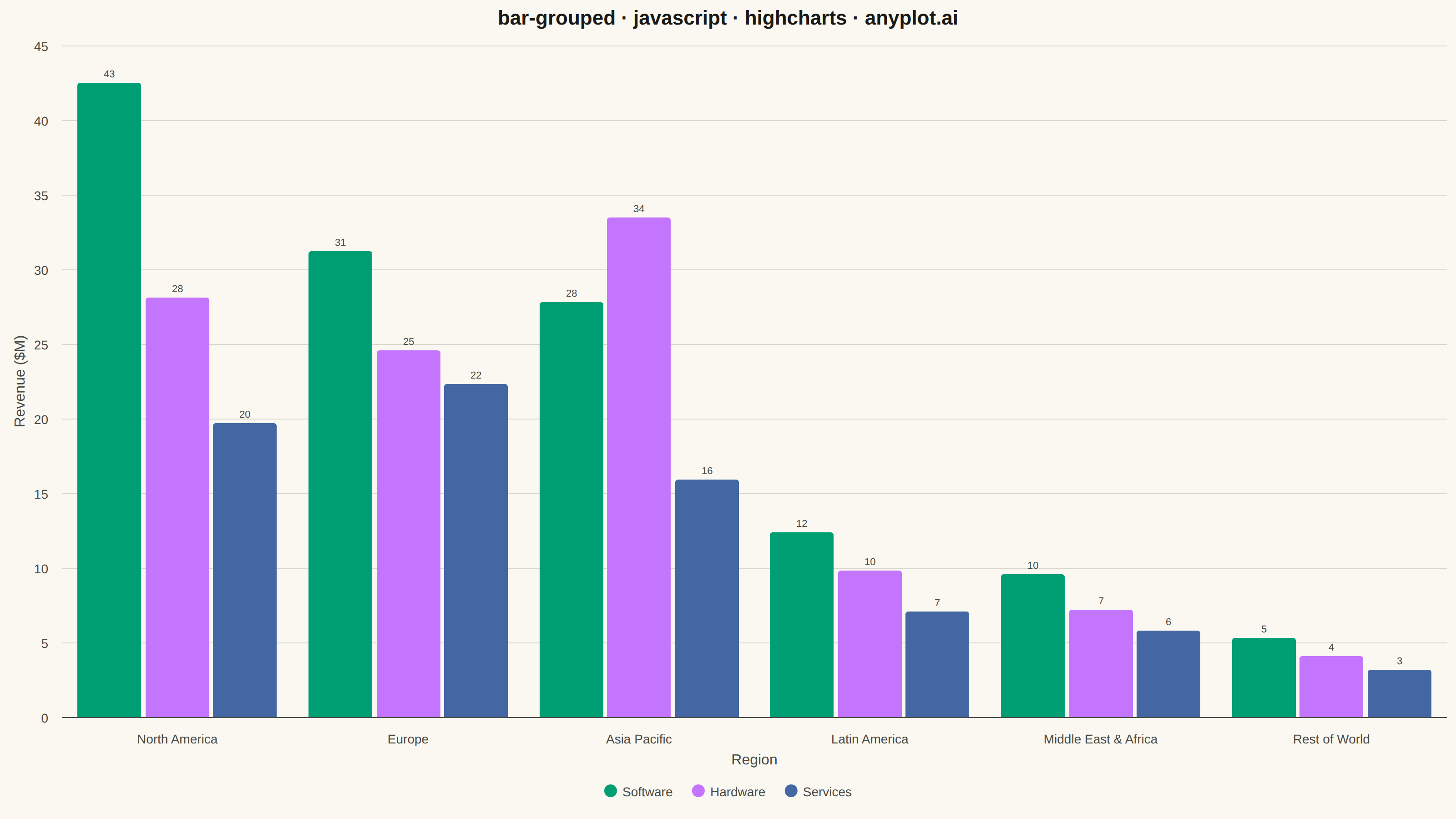
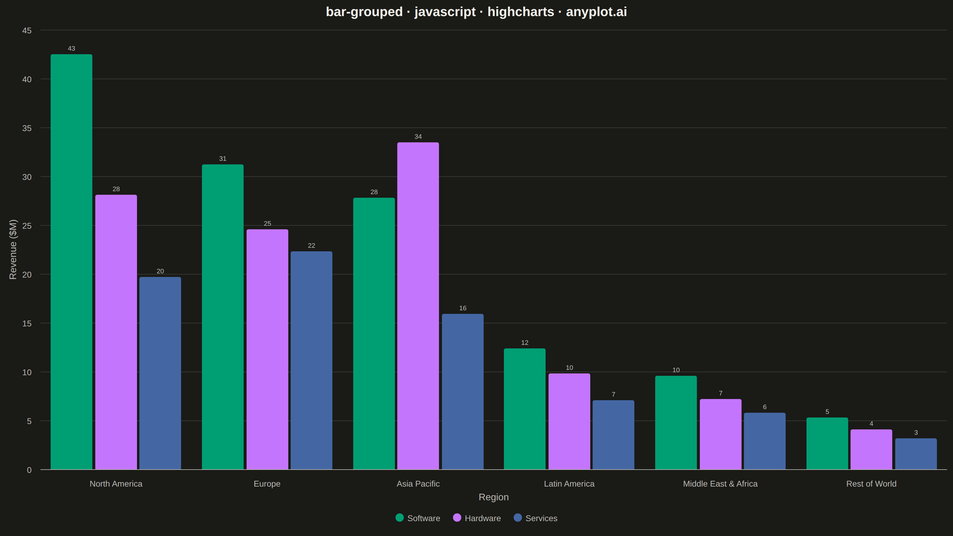
A grouped bar chart that displays multiple bars side-by-side for each category, enabling direct comparison of values across different groups within the same categorical dimension. This visualization excels at showing how different groups perform relative to each other across multiple categories, making patterns and differences immediately apparent. Grouped bar charts are essential for comparative analysis where you need to track multiple series against the same set of categories.
// anyplot.ai
// bar-grouped: Grouped Bar Chart
// Library: highcharts 12.6.0 | JavaScript 22.23.1
// Quality: 87/100 | Created: 2026-08-05

const t = window.ANYPLOT_TOKENS;

// --- Data (in-memory, deterministic) ----------------------------------------
// Quarterly revenue ($M) by product line across sales regions.
const regions = [
  "North America",
  "Europe",
  "Asia Pacific",
  "Latin America",
  "Middle East & Africa",
  "Rest of World",
];
const productLines = ["Software", "Hardware", "Services"];
const revenueByProduct = [
  [42.5, 31.2, 27.8, 12.4, 9.6, 5.3], // Software
  [28.1, 24.6, 33.5, 9.8, 7.2, 4.1], // Hardware
  [19.7, 22.3, 15.9, 7.1, 5.8, 3.2], // Services
];

// --- Chart -------------------------------------------------------------------
Highcharts.chart("container", {
  chart: {
    type: "column",
    backgroundColor: "transparent",
    animation: false,
    style: { fontFamily: "inherit" },
  },
  credits: { enabled: false },
  colors: t.palette,
  title: {
    text: "bar-grouped · javascript · highcharts · anyplot.ai",
    style: { color: t.ink, fontSize: "22px", fontWeight: "600" },
  },
  xAxis: {
    categories: regions,
    title: {
      text: "Region",
      style: { color: t.inkSoft, fontSize: "16px" },
    },
    lineColor: t.inkSoft,
    tickColor: t.inkSoft,
    labels: { style: { color: t.inkSoft, fontSize: "14px" } },
  },
  yAxis: {
    title: {
      text: "Revenue ($M)",
      style: { color: t.inkSoft, fontSize: "16px" },
    },
    gridLineColor: t.grid,
    labels: { style: { color: t.inkSoft, fontSize: "14px" } },
  },
  legend: {
    itemStyle: { color: t.inkSoft, fontSize: "14px" },
    itemHoverStyle: { color: t.ink },
  },
  plotOptions: {
    series: { animation: false, groupPadding: 0.06, pointPadding: 0.03 },
    column: {
      borderWidth: 0,
      borderRadius: 3,
      dataLabels: {
        enabled: true,
        format: "{y:.0f}",
        style: {
          color: t.inkSoft,
          fontSize: "11px",
          fontWeight: "500",
          textOutline: "none",
        },
      },
    },
  },
  series: productLines.map((name, i) => ({
    name,
    data: revenueByProduct[i],
  })),
});
Runnable source as JSON, for any HTTP client: https://api.anyplot.ai/specs/bar-grouped/highcharts/code. Any spec id and library id listed in llms-full.txt fit the same URL shape; every URL below is complete and callable.
{
  "spec_id": "bar-grouped",
  "language": "javascript",
  "library": "highcharts",
  "page": "https://anyplot.ai/bar-grouped/javascript/highcharts",
  "hub": "https://anyplot.ai/bar-grouped",
  "code_json": "https://api.anyplot.ai/specs/bar-grouped/highcharts/code",
  "spec_json": "https://api.anyplot.ai/specs/bar-grouped",
  "render_light_png": "https://storage.googleapis.com/anyplot-images/plots/bar-grouped/javascript/highcharts/plot-light.png",
  "render_dark_png": "https://storage.googleapis.com/anyplot-images/plots/bar-grouped/javascript/highcharts/plot-dark.png",
  "interactive_light_html": "https://storage.googleapis.com/anyplot-images/plots/bar-grouped/javascript/highcharts/plot-light.html",
  "interactive_dark_html": "https://storage.googleapis.com/anyplot-images/plots/bar-grouped/javascript/highcharts/plot-dark.html",
  "quality_score": 87.0,
  "license": "MIT",
  "guide": "https://anyplot.ai/llms.txt"
}
Part of Grouped Bar Chart on anyplot.ai.