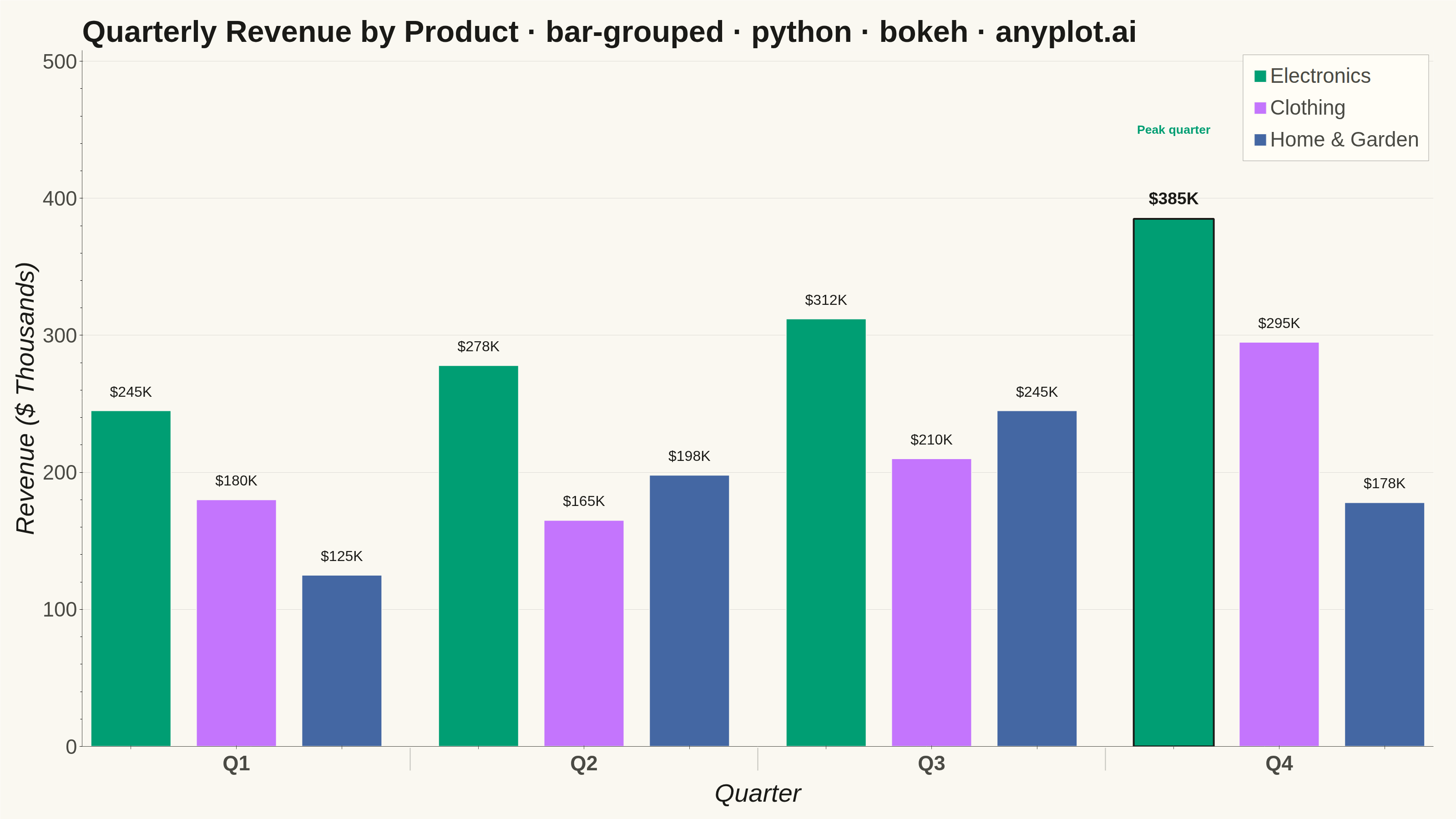
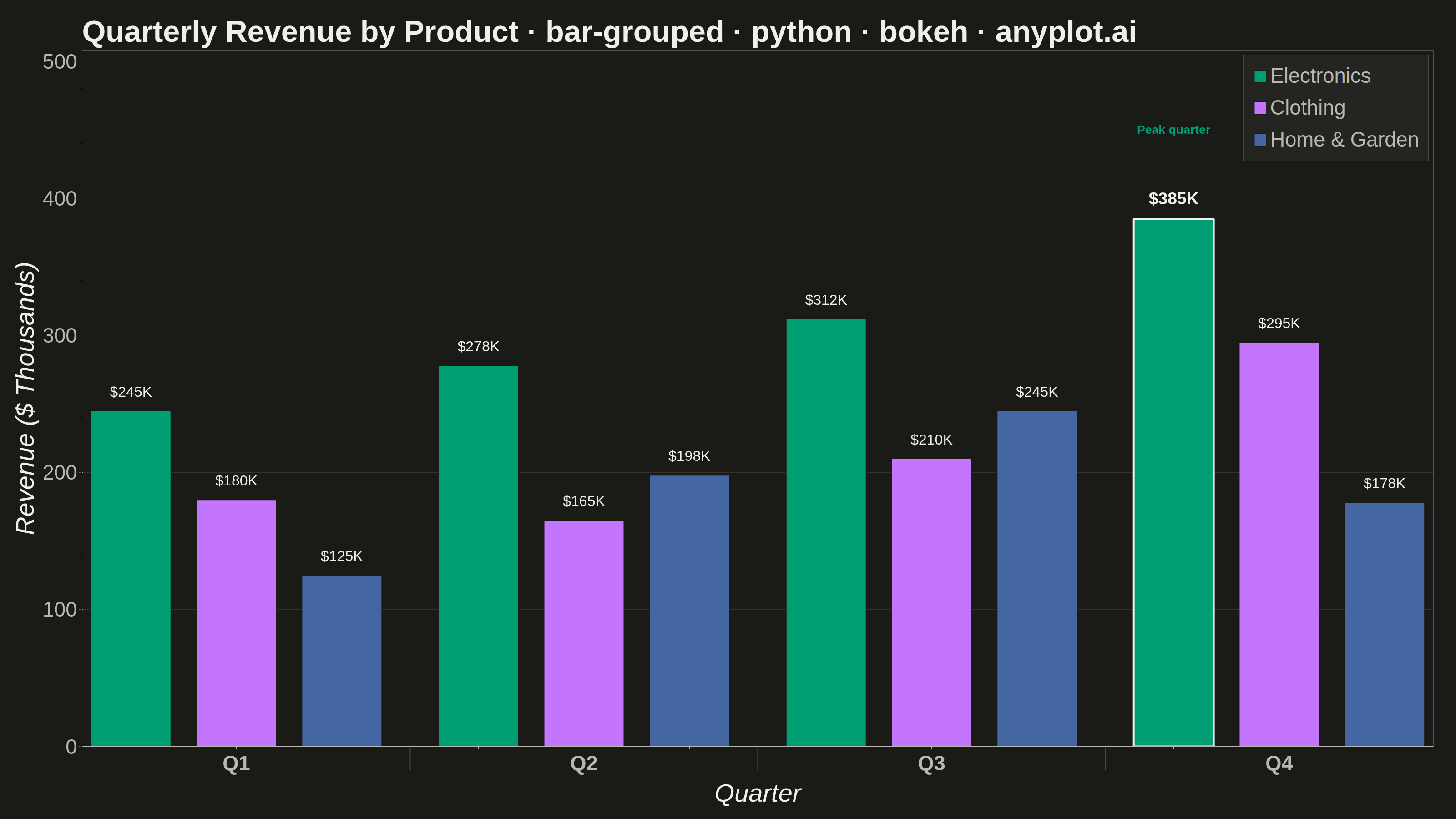
A grouped bar chart that displays multiple bars side-by-side for each category, enabling direct comparison of values across different groups within the same categorical dimension. This visualization excels at showing how different groups perform relative to each other across multiple categories, making patterns and differences immediately apparent. Grouped bar charts are essential for comparative analysis where you need to track multiple series against the same set of categories.
""" anyplot.ai
bar-grouped: Grouped Bar Chart
Library: bokeh 3.9.2 | Python 3.13.14
Quality: 95/100 | Updated: 2026-08-05
"""

import os
import time
from pathlib import Path

from bokeh.io import output_file, save
from bokeh.models import ColumnDataSource, FactorRange, Legend, LegendItem
from bokeh.plotting import figure
from selenium import webdriver
from selenium.webdriver.chrome.options import Options


# Theme tokens (Imprint)
THEME = os.getenv("ANYPLOT_THEME", "light")
PAGE_BG = "#FAF8F1" if THEME == "light" else "#1A1A17"
ELEVATED_BG = "#FFFDF6" if THEME == "light" else "#242420"
INK = "#1A1A17" if THEME == "light" else "#F0EFE8"
INK_SOFT = "#4A4A44" if THEME == "light" else "#B8B7B0"

# Imprint categorical palette (first series is always #009E73)
IMPRINT_PALETTE = ["#009E73", "#C475FD", "#4467A3", "#BD8233", "#AE3030", "#2ABCCD", "#954477", "#99B314"]

# Data - quarterly revenue by product line (in thousands of USD)
categories = ["Q1", "Q2", "Q3", "Q4"]
groups = ["Electronics", "Clothing", "Home & Garden"]
data = {"Electronics": [245, 278, 312, 385], "Clothing": [180, 165, 210, 295], "Home & Garden": [125, 198, 245, 178]}
group_colors = IMPRINT_PALETTE[: len(groups)]

# Nested (category, group) factors for the grouped categorical axis
x = [(cat, group) for cat in categories for group in groups]
values = [data[group][categories.index(cat)] for cat, group in x]
bar_colors = [group_colors[groups.index(group)] for _cat, group in x]

# Highlight the single largest bar so the peak reads as a focal point, not just
# another data point — addresses the "no visual hierarchy" review note.
peak_i = max(range(len(values)), key=lambda i: values[i])
peak_factor = x[peak_i]
peak_value = values[peak_i]

source = ColumnDataSource(
    data={
        "x": x,
        "values": values,
        "color": bar_colors,
        "line_color": [INK if i == peak_i else PAGE_BG for i in range(len(x))],
        "line_width": [4 if i == peak_i else 2 for i in range(len(x))],
    }
)

title = "Quarterly Revenue by Product · bar-grouped · python · bokeh · anyplot.ai"

p = figure(
    x_range=FactorRange(*x, group_padding=0.4, factor_padding=0.08),
    width=3200,
    height=1800,
    title=title,
    toolbar_location=None,  # bokeh's default toolbar adds ~30-50px above the canvas
    min_border_bottom=160,
    min_border_left=180,
    min_border_top=110,
    min_border_right=50,
)

bars = p.vbar(
    x="x", top="values", width=0.82, source=source, fill_color="color", line_color="line_color", line_width="line_width"
)

# Value labels on top of every bar
for factor, value in zip(x, values, strict=True):
    is_peak = factor == peak_factor
    p.text(
        x=[factor],
        y=[value + 8],
        text=[f"${value}K"],
        text_align="center",
        text_baseline="bottom",
        text_font_size="28pt" if is_peak else "24pt",
        text_font_style="bold" if is_peak else "normal",
        text_color=INK,
    )

# Callout marking the peak quarter as the focal point of the chart
p.text(
    x=[peak_factor],
    y=[peak_value + 60],
    text=["Peak quarter"],
    text_align="center",
    text_baseline="bottom",
    text_font_size="20pt",
    text_font_style="bold",
    text_color=IMPRINT_PALETTE[0],
)

# Title styling
p.title.text_font_size = "50pt"
p.title.text_color = INK

# X-axis styling — the leaf-level tick labels (Electronics/Clothing/Home &
# Garden repeated under every bar) are redundant with the legend and collide
# at this canvas width, so hide them and show only the Q1-Q4 group labels.
p.xaxis.axis_label = "Quarter"
p.xaxis.axis_label_text_font_size = "42pt"
p.xaxis.axis_label_text_color = INK
p.xaxis.major_label_text_font_size = "0pt"
p.xaxis.group_text_font_size = "34pt"
p.xaxis.group_text_color = INK_SOFT
p.xaxis.group_label_orientation = "horizontal"
p.xaxis.separator_line_color = INK_SOFT
p.xaxis.separator_line_alpha = 0.3

# Y-axis styling
p.yaxis.axis_label = "Revenue ($ Thousands)"
p.yaxis.axis_label_text_font_size = "42pt"
p.yaxis.major_label_text_font_size = "34pt"
p.yaxis.major_label_text_color = INK_SOFT
p.yaxis.axis_label_text_color = INK

# Grid styling — y-axis only, subtle
p.xgrid.grid_line_color = None
p.ygrid.grid_line_color = INK
p.ygrid.grid_line_alpha = 0.12

# Background and L-shaped frame (drop the boxed outline, keep left/bottom axis lines)
p.background_fill_color = PAGE_BG
p.border_fill_color = PAGE_BG
p.outline_line_color = None
p.xaxis.axis_line_color = INK_SOFT
p.yaxis.axis_line_color = INK_SOFT
p.xaxis.major_tick_line_color = INK_SOFT
p.yaxis.major_tick_line_color = INK_SOFT

# Legend with correct color swatch for each group (indices 0-2 are the three
# bars of the first category, one per group, in canonical order)
legend_items = [
    LegendItem(label=groups[0], renderers=[bars], index=0),
    LegendItem(label=groups[1], renderers=[bars], index=1),
    LegendItem(label=groups[2], renderers=[bars], index=2),
]
legend = Legend(items=legend_items, location="top_right", orientation="vertical")
legend.label_text_font_size = "34pt"
legend.label_text_color = INK_SOFT
legend.background_fill_color = ELEVATED_BG
legend.background_fill_alpha = 1.0
legend.border_line_color = INK_SOFT
legend.glyph_height = 34
legend.glyph_width = 34
legend.spacing = 18
legend.padding = 20
p.add_layout(legend)

# Y-axis range with headroom for the value labels and the peak callout
p.y_range.start = 0
p.y_range.end = round(max(values) * 1.32)

# Save HTML output (required catalog artifact)
output_file(f"plot-{THEME}.html")
save(p)

# Screenshot with headless Chrome (Selenium) — bokeh.io.export_png is unreliable
# in this environment, see prompts/library/bokeh.md.
W, H = 3200, 1800
opts = Options()
for arg in (
    "--headless=new",
    "--no-sandbox",
    "--disable-dev-shm-usage",
    "--disable-gpu",
    f"--window-size={W},{H}",
    "--hide-scrollbars",
):
    opts.add_argument(arg)
driver = webdriver.Chrome(options=opts)
driver.set_window_size(W, H)
driver.get(f"file://{Path(f'plot-{THEME}.html').resolve()}")
# Pin the viewport exactly via CDP — headless Chrome's --window-size sets the
# OUTER window and still reserves a phantom title-bar height even headless.
driver.execute_cdp_cmd(
    "Emulation.setDeviceMetricsOverride", {"width": W, "height": H, "deviceScaleFactor": 1, "mobile": False}
)
time.sleep(3)  # let bokeh's JS render the canvas
driver.save_screenshot(f"plot-{THEME}.png")
driver.quit()
Runnable source as JSON, for any HTTP client: https://api.anyplot.ai/specs/bar-grouped/bokeh/code. Any spec id and library id listed in llms-full.txt fit the same URL shape; every URL below is complete and callable.
{
  "spec_id": "bar-grouped",
  "language": "python",
  "library": "bokeh",
  "page": "https://anyplot.ai/bar-grouped/python/bokeh",
  "hub": "https://anyplot.ai/bar-grouped",
  "code_json": "https://api.anyplot.ai/specs/bar-grouped/bokeh/code",
  "spec_json": "https://api.anyplot.ai/specs/bar-grouped",
  "render_light_png": "https://storage.googleapis.com/anyplot-images/plots/bar-grouped/python/bokeh/plot-light.png",
  "render_dark_png": "https://storage.googleapis.com/anyplot-images/plots/bar-grouped/python/bokeh/plot-dark.png",
  "interactive_light_html": "https://storage.googleapis.com/anyplot-images/plots/bar-grouped/python/bokeh/plot-light.html",
  "interactive_dark_html": "https://storage.googleapis.com/anyplot-images/plots/bar-grouped/python/bokeh/plot-dark.html",
  "quality_score": 95.0,
  "license": "MIT",
  "guide": "https://anyplot.ai/llms.txt"
}
Part of Grouped Bar Chart on anyplot.ai.