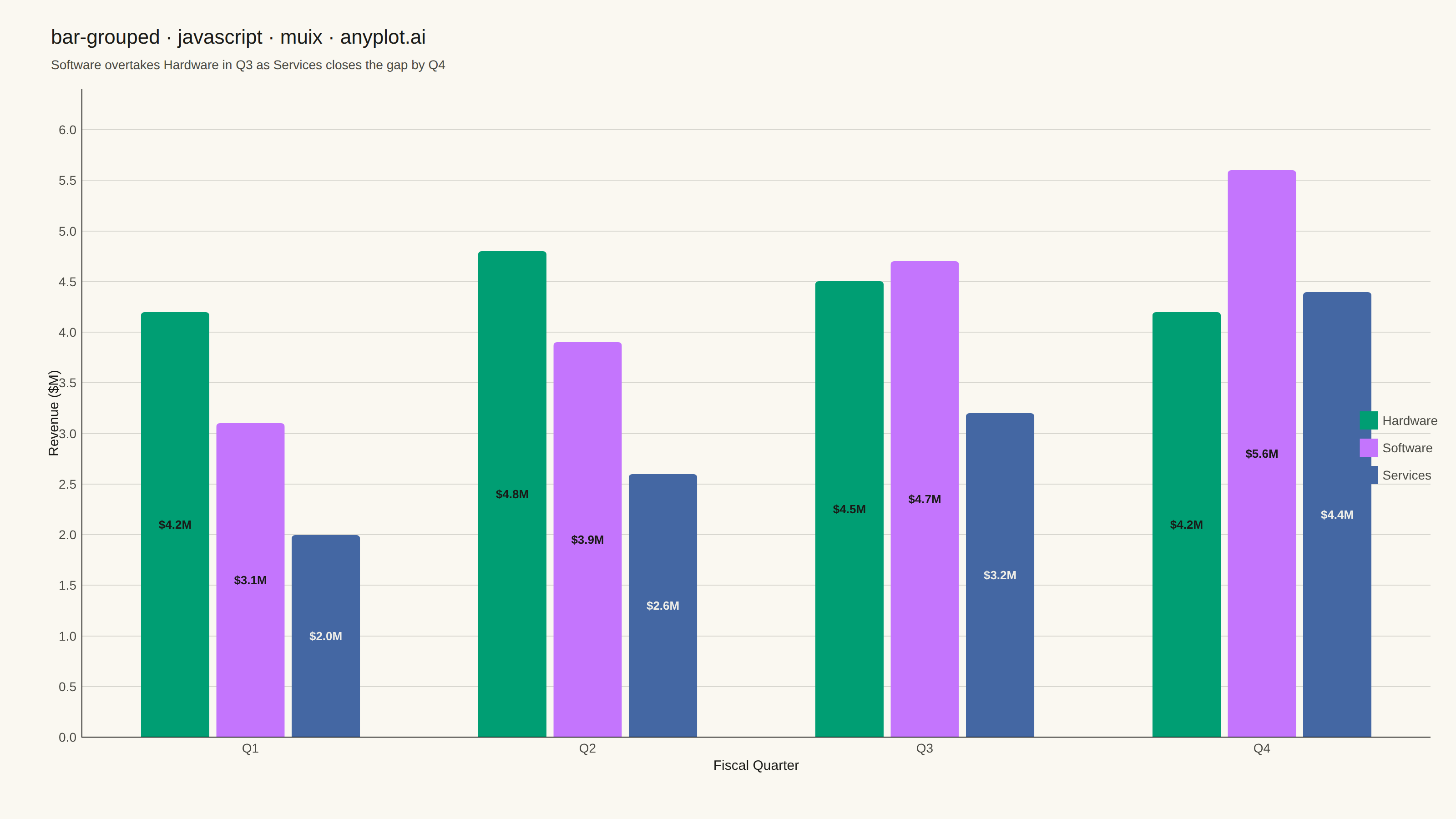
A grouped bar chart that displays multiple bars side-by-side for each category, enabling direct comparison of values across different groups within the same categorical dimension. This visualization excels at showing how different groups perform relative to each other across multiple categories, making patterns and differences immediately apparent. Grouped bar charts are essential for comparative analysis where you need to track multiple series against the same set of categories.
// anyplot.ai
// bar-grouped: Grouped Bar Chart
// Library: muix 7.29.1 | JavaScript 22.23.1
// Quality: 92/100 | Created: 2026-08-05
import { BarChart } from "@mui/x-charts/BarChart";
import Box from "@mui/material/Box";
import Typography from "@mui/material/Typography";

const t = window.ANYPLOT_TOKENS;

// Fixed (non-theme-flipping) text colors for in-bar value labels — the bar
// fills stay the same hex in both themes, so the label contrast is chosen
// per series color rather than following t.ink/t.inkSoft.
const LABEL_ON_LIGHT_FILL = "#1A1A17"; // dark ink — for the green & lavender bars
const LABEL_ON_DARK_FILL = "#F0EFE8"; // light ink — for the darker blue bars

// --- Data (in-memory, deterministic) ----------------------------------------
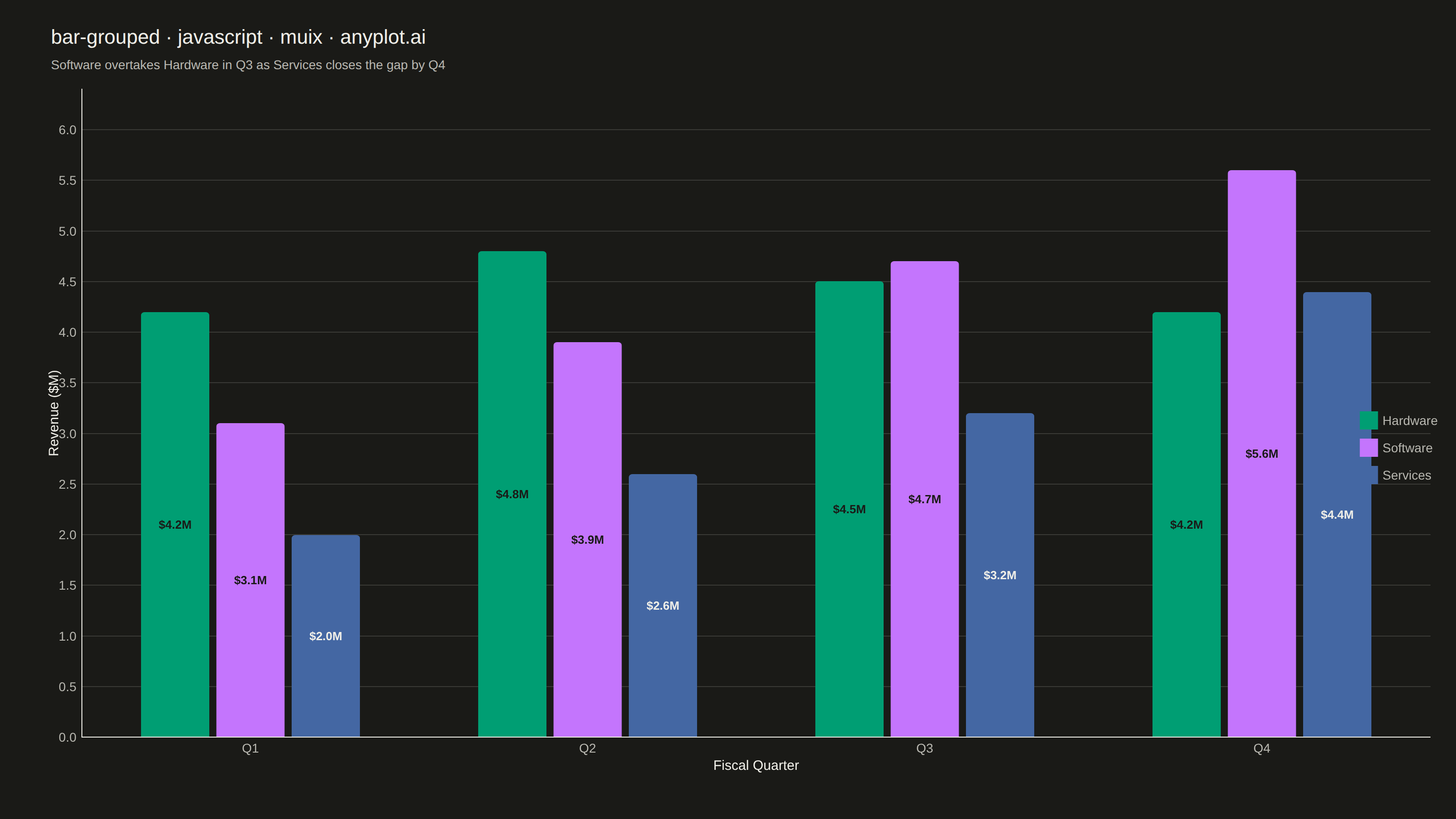
// Quarterly revenue (in $M) for three product lines. Hardware peaks in Q2
// then plateaus/declines as the mix shifts toward recurring revenue: Software
// overtakes Hardware in Q3, and Services closes the gap to overtake it too by
// Q4 — a genuine rank crossover rather than three lines rising in lockstep.
const quarters = ["Q1", "Q2", "Q3", "Q4"];
const productLines = [
  { id: "hardware", label: "Hardware", data: [4.2, 4.8, 4.5, 4.2], labelFill: LABEL_ON_LIGHT_FILL },
  { id: "software", label: "Software", data: [3.1, 3.9, 4.7, 5.6], labelFill: LABEL_ON_LIGHT_FILL },
  { id: "services", label: "Services", data: [2.0, 2.6, 3.2, 4.4], labelFill: LABEL_ON_DARK_FILL },
];
const labelFillById = Object.fromEntries(productLines.map((p) => [p.id, p.labelFill]));

export default function Chart() {
  const W = window.ANYPLOT_SIZE.width; // 1600 CSS px (landscape mount)
  const H = window.ANYPLOT_SIZE.height; // 900 CSS px
  const CHART_TOP = 84;

  return (
    <Box sx={{ position: "relative", width: W, height: H, bgcolor: t.pageBg }}>
      {/* Title + subtitle */}
      <Box sx={{ position: "absolute", top: 24, left: 56, right: 56 }}>
        <Typography sx={{ color: t.ink, fontSize: 22, fontWeight: 500 }}>
          bar-grouped · javascript · muix · anyplot.ai
        </Typography>
        <Typography sx={{ color: t.inkSoft, fontSize: 14, mt: 0.5 }}>
          Software overtakes Hardware in Q3 as Services closes the gap by Q4
        </Typography>
      </Box>

      {/* Bar chart */}
      <Box
        sx={{
          position: "absolute",
          top: CHART_TOP,
          left: 0,
          right: 0,
          bottom: 0,
        }}
      >
        <BarChart
          width={W}
          height={H - CHART_TOP}
          colors={t.palette}
          skipAnimation
          borderRadius={4}
          xAxis={[
            {
              scaleType: "band",
              data: quarters,
              label: "Fiscal Quarter",
              disableTicks: true,
              labelStyle: { fontSize: 15, fill: t.ink },
              tickLabelStyle: { fontSize: 14, fill: t.inkSoft },
              categoryGapRatio: 0.35,
            },
          ]}
          yAxis={[
            {
              label: "Revenue ($M)",
              labelStyle: { fontSize: 15, fill: t.ink },
              tickLabelStyle: { fontSize: 14, fill: t.inkSoft },
              disableTicks: true,
              max: 6.4,
            },
          ]}
          series={productLines.map((p) => ({
            id: p.id,
            label: p.label,
            data: p.data,
            valueFormatter: (v) => `$${v.toFixed(1)}M`,
          }))}
          barLabel={(item) => (item.value != null ? `$${item.value.toFixed(1)}M` : null)}
          margin={{ top: 14, right: 28, bottom: 90, left: 90 }}
          grid={{ horizontal: true }}
          slotProps={{
            legend: {
              position: { vertical: "middle", horizontal: "right" },
              direction: "column",
              labelStyle: { fontSize: 14, fill: t.inkSoft },
            },
            barLabel: (ownerState) => ({
              style: {
                fontSize: 13,
                fontWeight: 600,
                fill: labelFillById[ownerState.seriesId] ?? LABEL_ON_LIGHT_FILL,
              },
            }),
          }}
          sx={{
            "& .MuiChartsAxis-line": { stroke: t.inkSoft },
            "& .MuiChartsGrid-line": { stroke: t.grid },
          }}
        />
      </Box>
    </Box>
  );
}
Runnable source as JSON, for any HTTP client: https://api.anyplot.ai/specs/bar-grouped/muix/code. Any spec id and library id listed in llms-full.txt fit the same URL shape; every URL below is complete and callable.
{
  "spec_id": "bar-grouped",
  "language": "javascript",
  "library": "muix",
  "page": "https://anyplot.ai/bar-grouped/javascript/muix",
  "hub": "https://anyplot.ai/bar-grouped",
  "code_json": "https://api.anyplot.ai/specs/bar-grouped/muix/code",
  "spec_json": "https://api.anyplot.ai/specs/bar-grouped",
  "render_light_png": "https://storage.googleapis.com/anyplot-images/plots/bar-grouped/javascript/muix/plot-light.png",
  "render_dark_png": "https://storage.googleapis.com/anyplot-images/plots/bar-grouped/javascript/muix/plot-dark.png",
  "interactive_light_html": "https://storage.googleapis.com/anyplot-images/plots/bar-grouped/javascript/muix/plot-light.html",
  "interactive_dark_html": "https://storage.googleapis.com/anyplot-images/plots/bar-grouped/javascript/muix/plot-dark.html",
  "quality_score": 92.0,
  "license": "MIT",
  "guide": "https://anyplot.ai/llms.txt"
}
Part of Grouped Bar Chart on anyplot.ai.