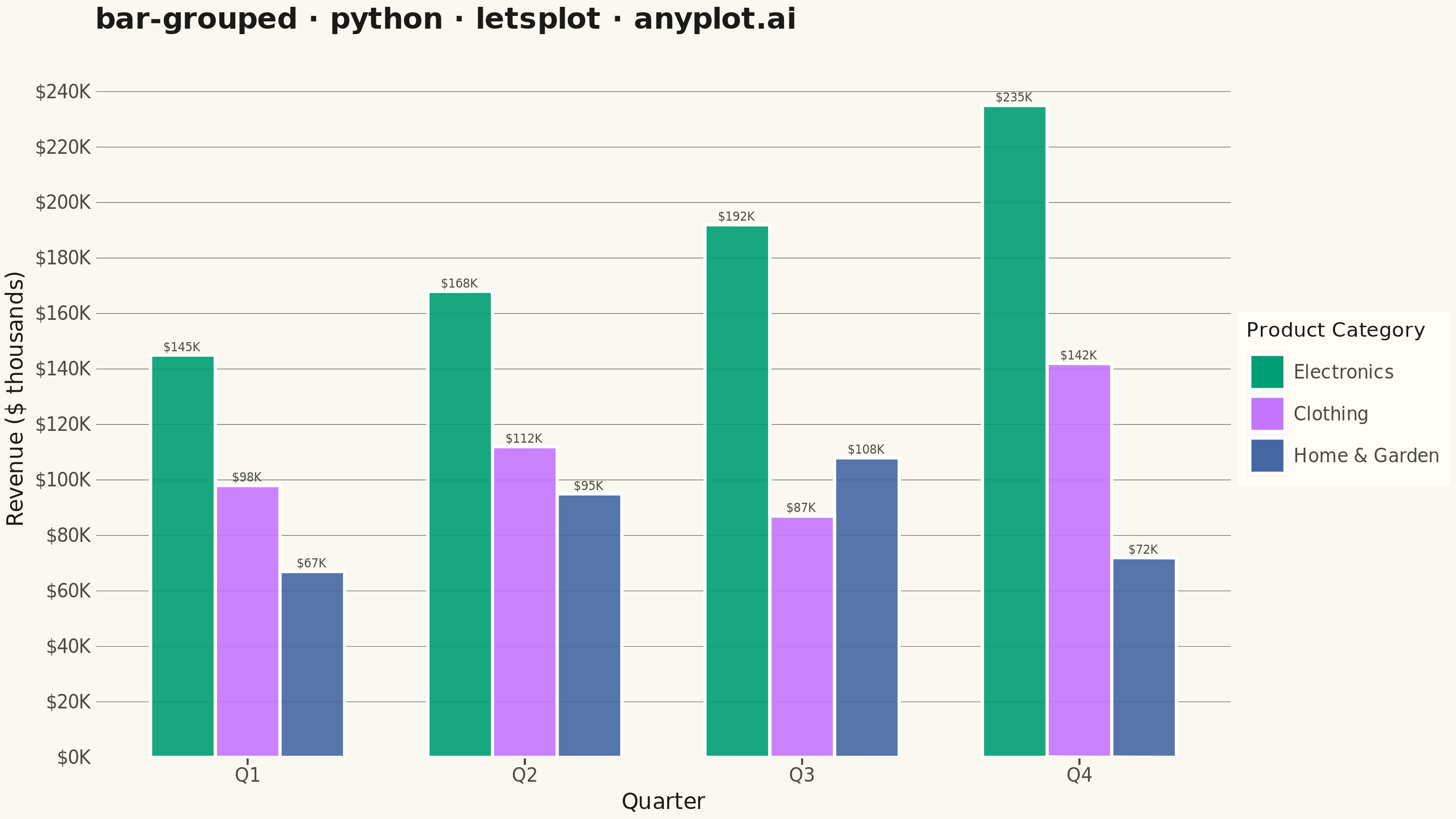
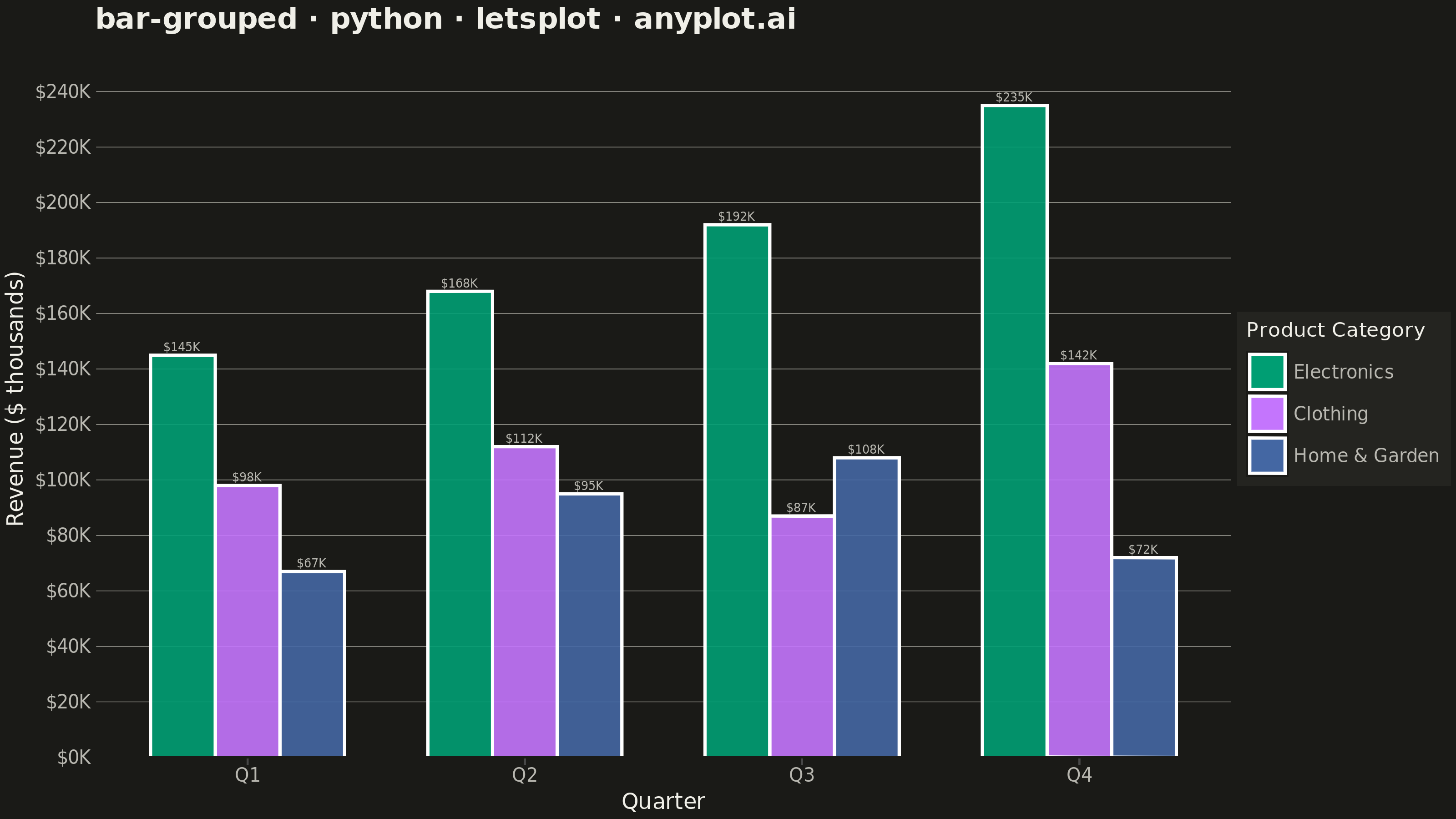
A grouped bar chart that displays multiple bars side-by-side for each category, enabling direct comparison of values across different groups within the same categorical dimension. This visualization excels at showing how different groups perform relative to each other across multiple categories, making patterns and differences immediately apparent. Grouped bar charts are essential for comparative analysis where you need to track multiple series against the same set of categories.
""" anyplot.ai
bar-grouped: Grouped Bar Chart
Library: letsplot 4.11.0 | Python 3.13.14
Quality: 86/100 | Updated: 2026-08-05
"""

import os

import pandas as pd
from lets_plot import *


LetsPlot.setup_html()

# Theme tokens
THEME = os.getenv("ANYPLOT_THEME", "light")
PAGE_BG = "#FAF8F1" if THEME == "light" else "#1A1A17"
ELEVATED_BG = "#FFFDF6" if THEME == "light" else "#242420"
INK = "#1A1A17" if THEME == "light" else "#F0EFE8"
INK_SOFT = "#4A4A44" if THEME == "light" else "#B8B7B0"
INK_MUTED = "#6B6A63" if THEME == "light" else "#A8A79F"

# Imprint palette (positions 1-3)
IMPRINT = ["#009E73", "#C475FD", "#4467A3"]

# Data - Quarterly sales by product category
categories = ["Q1", "Q2", "Q3", "Q4"]
products = ["Electronics", "Clothing", "Home & Garden"]

data = {
    "Quarter": categories * 3,
    "Product": ["Electronics"] * 4 + ["Clothing"] * 4 + ["Home & Garden"] * 4,
    "Revenue": [
        # Electronics - strong growth
        145,
        168,
        192,
        235,
        # Clothing - seasonal pattern
        98,
        112,
        87,
        142,
        # Home & Garden - spring/summer peak
        67,
        95,
        108,
        72,
    ],
}

df = pd.DataFrame(data)
df["Label"] = df["Revenue"].apply(lambda v: f"${v}K")

# Theme-adaptive chrome
anyplot_theme = theme(
    plot_background=element_rect(fill=PAGE_BG, color=PAGE_BG),
    panel_background=element_rect(fill=PAGE_BG, color=PAGE_BG),
    panel_border=element_blank(),
    panel_grid_major_y=element_line(color=INK_MUTED, size=0.3),
    panel_grid_major_x=element_blank(),
    panel_grid_minor=element_blank(),
    axis_title=element_text(size=12, color=INK),
    axis_text=element_text(size=10, color=INK_SOFT),
    axis_line_x=element_line(color=INK_SOFT, size=0.5),
    axis_line_y=element_line(color=INK_SOFT, size=0.5),
    plot_title=element_text(size=16, color=INK, face="bold"),
    legend_background=element_rect(fill=ELEVATED_BG, color=INK_SOFT),
    legend_text=element_text(size=10, color=INK_SOFT),
    legend_title=element_text(size=11, color=INK),
    legend_position="right",
)

# Distinctive lets-plot feature: rich, formatted native tooltips (beyond
# just emitting an interactive HTML file) - each bar reports its quarter,
# product line and exact revenue with a "$" prefix and "K" suffix.
revenue_tooltips = layer_tooltips().line("@Product").line("Quarter|@Quarter").line("Revenue|$@Revenue K")

# Plot - Grouped bar chart with direct value labels for a clearer data story
plot = (
    ggplot(df, aes(x="Quarter", y="Revenue", fill="Product"))
    + geom_bar(stat="identity", position="dodge", width=0.7, alpha=0.9, tooltips=revenue_tooltips)
    + geom_text(
        aes(label="Label", group="Product"), position=position_dodge(width=0.7), vjust=-0.5, size=3.2, color=INK_SOFT
    )
    + scale_fill_manual(values=IMPRINT)
    + scale_y_continuous(format="${.0f}K", expand=[0.1, 0])
    + labs(
        x="Quarter",
        y="Revenue ($ thousands)",
        title="bar-grouped · python · letsplot · anyplot.ai",
        fill="Product Category",
    )
    + anyplot_theme
    + ggsize(800, 450)
)

# Save as PNG and HTML
ggsave(plot, f"plot-{THEME}.png", path=".", scale=4)
ggsave(plot, f"plot-{THEME}.html", path=".")
Runnable source as JSON, for any HTTP client: https://api.anyplot.ai/specs/bar-grouped/letsplot/code. Any spec id and library id listed in llms-full.txt fit the same URL shape; every URL below is complete and callable.
{
  "spec_id": "bar-grouped",
  "language": "python",
  "library": "letsplot",
  "page": "https://anyplot.ai/bar-grouped/python/letsplot",
  "hub": "https://anyplot.ai/bar-grouped",
  "code_json": "https://api.anyplot.ai/specs/bar-grouped/letsplot/code",
  "spec_json": "https://api.anyplot.ai/specs/bar-grouped",
  "render_light_png": "https://storage.googleapis.com/anyplot-images/plots/bar-grouped/python/letsplot/plot-light.png",
  "render_dark_png": "https://storage.googleapis.com/anyplot-images/plots/bar-grouped/python/letsplot/plot-dark.png",
  "interactive_light_html": "https://storage.googleapis.com/anyplot-images/plots/bar-grouped/python/letsplot/plot-light.html",
  "interactive_dark_html": "https://storage.googleapis.com/anyplot-images/plots/bar-grouped/python/letsplot/plot-dark.html",
  "quality_score": 86.0,
  "license": "MIT",
  "guide": "https://anyplot.ai/llms.txt"
}
Part of Grouped Bar Chart on anyplot.ai.