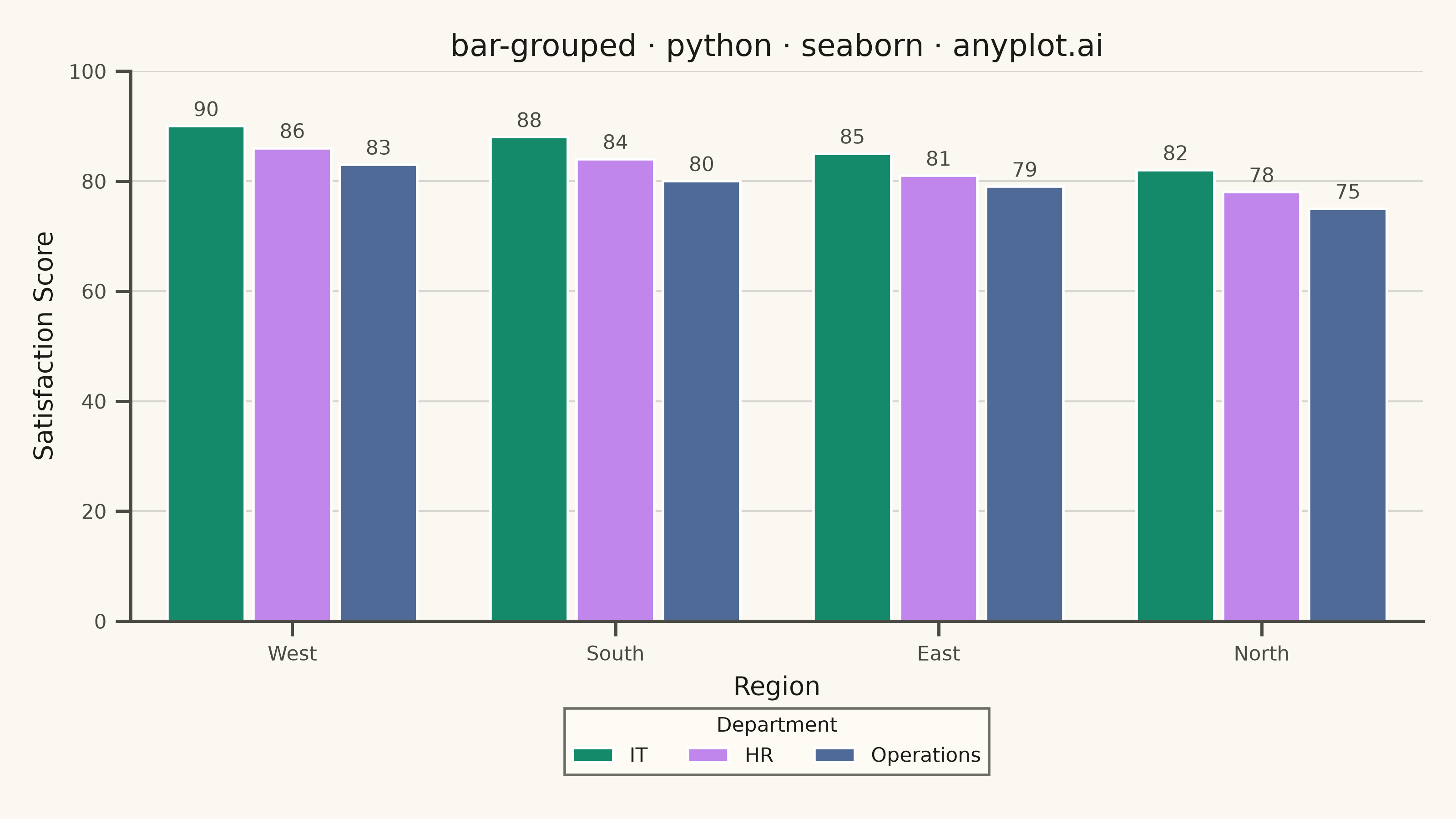
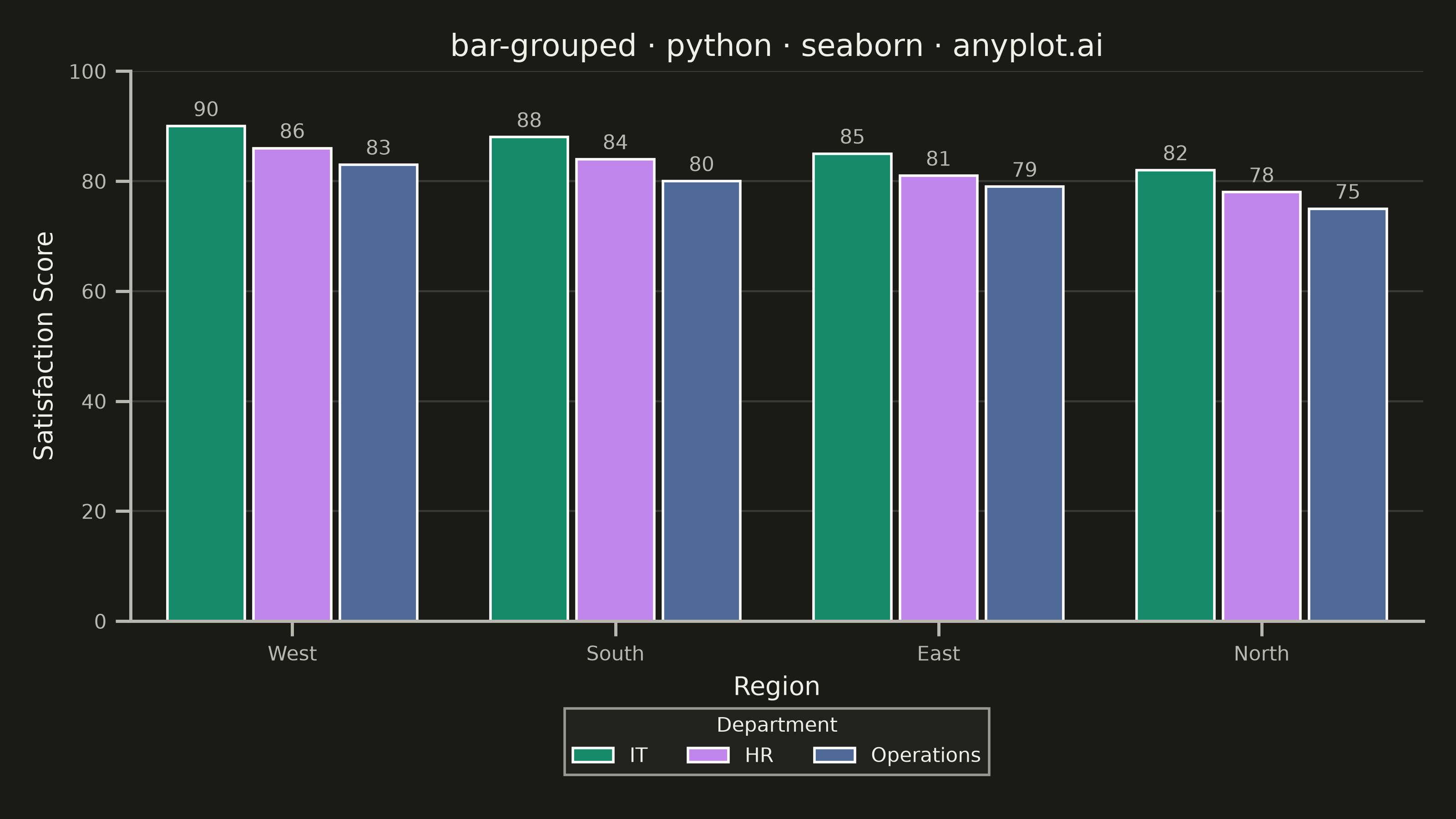
A grouped bar chart that displays multiple bars side-by-side for each category, enabling direct comparison of values across different groups within the same categorical dimension. This visualization excels at showing how different groups perform relative to each other across multiple categories, making patterns and differences immediately apparent. Grouped bar charts are essential for comparative analysis where you need to track multiple series against the same set of categories.
""" anyplot.ai
bar-grouped: Grouped Bar Chart
Library: seaborn 0.13.2 | Python 3.13.14
Quality: 89/100 | Updated: 2026-08-05
"""

import os
import sys


# Fix sys.path to avoid importing local matplotlib.py file
if sys.path and sys.path[0] == os.path.dirname(__file__):
    sys.path.pop(0)

import matplotlib.pyplot as plt
import pandas as pd
import seaborn as sns


# Theme tokens
THEME = os.getenv("ANYPLOT_THEME", "light")
PAGE_BG = "#FAF8F1" if THEME == "light" else "#1A1A17"
ELEVATED_BG = "#FFFDF6" if THEME == "light" else "#242420"
INK = "#1A1A17" if THEME == "light" else "#F0EFE8"
INK_SOFT = "#4A4A44" if THEME == "light" else "#B8B7B0"

# Imprint palette (canonical order, positions 1-3)
IMPRINT = ["#009E73", "#C475FD", "#4467A3"]

# Data: Customer satisfaction across departments and regions
# North deliberately crosses the IT/HR ranking (HR > IT there) so the grouped
# comparison isn't just a flat repeated ordering across all four regions.
data = {
    "Region": ["North", "North", "North", "South", "South", "South", "East", "East", "East", "West", "West", "West"],
    "Department": ["IT", "HR", "Operations"] * 4,
    "Score": [78, 82, 75, 88, 84, 80, 85, 81, 79, 90, 86, 83],
}
df = pd.DataFrame(data)
region_order = df.groupby("Region")["Score"].mean().sort_values(ascending=False).index

# Set theme
sns.set_theme(
    style="ticks",
    rc={
        "figure.facecolor": PAGE_BG,
        "axes.facecolor": PAGE_BG,
        "axes.edgecolor": INK_SOFT,
        "axes.labelcolor": INK,
        "text.color": INK,
        "xtick.color": INK_SOFT,
        "ytick.color": INK_SOFT,
        "grid.color": INK,
        "grid.alpha": 0.15,
        "legend.facecolor": ELEVATED_BG,
        "legend.edgecolor": INK_SOFT,
    },
)

# Create figure — 3200x1800 px canvas (Step 0 hard contract)
fig, ax = plt.subplots(figsize=(8, 4.5), dpi=400)

# Plot grouped bars, ordered by mean score and dodged with a seaborn 0.13 `gap`
# for cleaner within-group separation than the matplotlib default
sns.barplot(
    data=df,
    x="Region",
    y="Score",
    hue="Department",
    order=region_order,
    palette=IMPRINT,
    ax=ax,
    edgecolor="white",
    linewidth=1,
    gap=0.1,
)

# Value labels for precise comparisons
for container in ax.containers:
    ax.bar_label(container, fontsize=8, color=INK_SOFT, padding=2, fmt="%.0f")

# Focal-point emphasis on the top-scoring region (West, first in region_order)
top_x = 0
ax.axvspan(top_x - 0.5, top_x + 0.5, color=IMPRINT[0], alpha=0.05, zorder=0)
ax.annotate(
    "Top performer",
    xy=(top_x, 92),
    xytext=(top_x, 97),
    ha="center",
    fontsize=8,
    color=INK_SOFT,
    style="italic",
    arrowprops={"arrowstyle": "-", "color": INK_SOFT, "lw": 0.8},
)

# Styling
ax.set_xlabel("Region", fontsize=10, color=INK)
ax.set_ylabel("Satisfaction Score (0-100)", fontsize=10, color=INK)
ax.set_title("bar-grouped · python · seaborn · anyplot.ai", fontsize=12, fontweight="medium", color=INK)
ax.tick_params(axis="both", labelsize=8, colors=INK_SOFT)
ax.set_ylim(0, 100)
ax.yaxis.grid(True, alpha=0.15, linewidth=0.8, color=INK)

# Legend - moved below the plot with seaborn's move_legend helper, which
# repositions the auto-generated hue legend without rebuilding it manually
sns.move_legend(
    ax,
    "upper center",
    bbox_to_anchor=(0.5, -0.14),
    ncol=3,
    title="Department",
    fontsize=8,
    title_fontsize=8,
    frameon=True,
    edgecolor=INK_SOFT,
)

# Remove top and right spines, idiomatic seaborn cleanup
sns.despine(ax=ax)
ax.spines["left"].set_color(INK_SOFT)
ax.spines["bottom"].set_color(INK_SOFT)

plt.tight_layout()
plt.savefig(f"plot-{THEME}.png", dpi=400, facecolor=PAGE_BG)
Runnable source as JSON, for any HTTP client: https://api.anyplot.ai/specs/bar-grouped/seaborn/code. Any spec id and library id listed in llms-full.txt fit the same URL shape; every URL below is complete and callable.
{
  "spec_id": "bar-grouped",
  "language": "python",
  "library": "seaborn",
  "page": "https://anyplot.ai/bar-grouped/python/seaborn",
  "hub": "https://anyplot.ai/bar-grouped",
  "code_json": "https://api.anyplot.ai/specs/bar-grouped/seaborn/code",
  "spec_json": "https://api.anyplot.ai/specs/bar-grouped",
  "render_light_png": "https://storage.googleapis.com/anyplot-images/plots/bar-grouped/python/seaborn/plot-light.png",
  "render_dark_png": "https://storage.googleapis.com/anyplot-images/plots/bar-grouped/python/seaborn/plot-dark.png",
  "quality_score": 89.0,
  "license": "MIT",
  "guide": "https://anyplot.ai/llms.txt"
}
Part of Grouped Bar Chart on anyplot.ai.