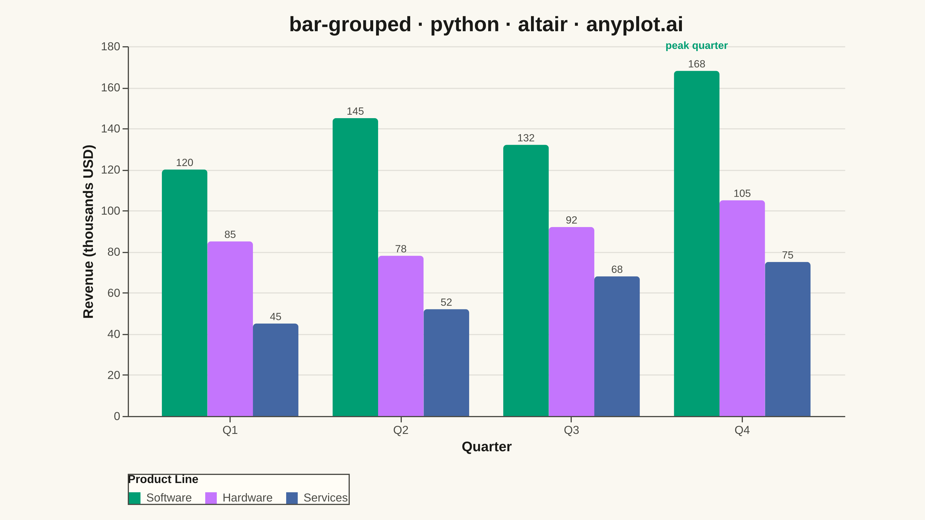
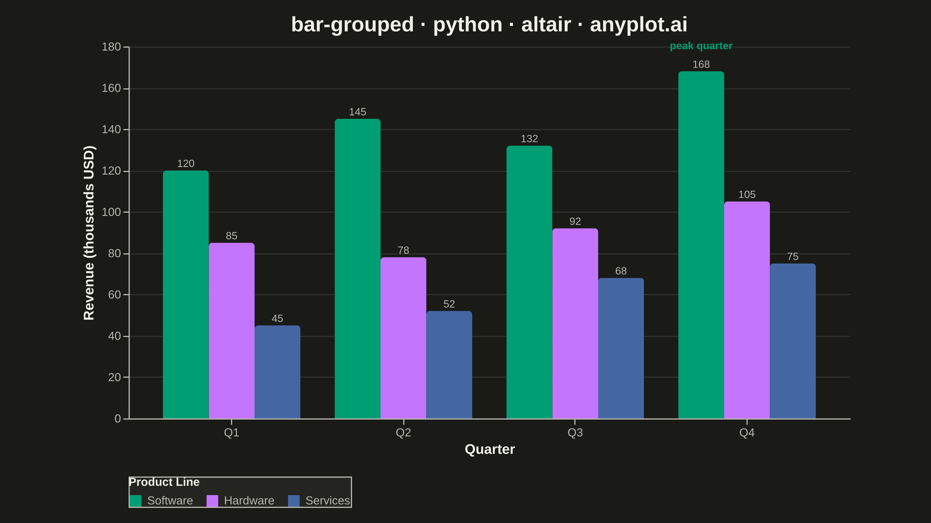
A grouped bar chart that displays multiple bars side-by-side for each category, enabling direct comparison of values across different groups within the same categorical dimension. This visualization excels at showing how different groups perform relative to each other across multiple categories, making patterns and differences immediately apparent. Grouped bar charts are essential for comparative analysis where you need to track multiple series against the same set of categories.
""" anyplot.ai
bar-grouped: Grouped Bar Chart
Library: altair 6.2.2 | Python 3.13.14
Quality: 93/100 | Updated: 2026-08-05
"""

import os
import sys

import pandas as pd
from PIL import Image


# Remove current directory from path to avoid local altair.py shadowing
script_dir = os.path.dirname(os.path.abspath(__file__))
sys.path = [p for p in sys.path if p != script_dir and os.path.abspath(p) != script_dir]

import altair as alt


# Theme tokens (see prompts/default-style-guide.md "Background" + "Theme-adaptive Chrome")
THEME = os.getenv("ANYPLOT_THEME", "light")
PAGE_BG = "#FAF8F1" if THEME == "light" else "#1A1A17"
ELEVATED_BG = "#FFFDF6" if THEME == "light" else "#242420"
INK = "#1A1A17" if THEME == "light" else "#F0EFE8"
INK_SOFT = "#4A4A44" if THEME == "light" else "#B8B7B0"

# Imprint palette (positions 1->3) — Product is abstract, so canonical order applies
IMPRINT = ["#009E73", "#C475FD", "#4467A3"]

# Data: Quarterly revenue by product line
data = pd.DataFrame(
    {
        "Quarter": ["Q1", "Q1", "Q1", "Q2", "Q2", "Q2", "Q3", "Q3", "Q3", "Q4", "Q4", "Q4"],
        "Product": ["Software", "Hardware", "Services"] * 4,
        "Revenue": [
            120,
            85,
            45,  # Q1
            145,
            78,
            52,  # Q2
            132,
            92,
            68,  # Q3
            168,
            105,
            75,  # Q4
        ],
    }
)

# Legend-bound selection: click a product in the legend to isolate it, showcasing
# altair's declarative interaction model (LM-01/LM-02) — resets to full opacity
# when the same legend entry is clicked again (altair's built-in toggle behavior).
product_selection = alt.selection_point(fields=["Product"], bind="legend")

bars = (
    alt.Chart(data)
    .mark_bar(cornerRadiusTopLeft=3, cornerRadiusTopRight=3)
    .encode(
        x=alt.X(
            "Quarter:O",
            title="Quarter",
            axis=alt.Axis(labelAngle=0, labelFontSize=10, titleFontSize=12, labelColor=INK_SOFT, titleColor=INK),
        ),
        xOffset=alt.XOffset("Product:N", sort=["Software", "Hardware", "Services"]),
        y=alt.Y(
            "Revenue:Q",
            title="Revenue (thousands USD)",
            axis=alt.Axis(labelFontSize=10, titleFontSize=12, labelColor=INK_SOFT, titleColor=INK),
        ),
        color=alt.Color(
            "Product:N",
            scale=alt.Scale(domain=["Software", "Hardware", "Services"], range=IMPRINT),
            legend=alt.Legend(
                title="Product Line", titleFontSize=10, labelFontSize=10, orient="bottom", direction="horizontal"
            ),
        ),
        opacity=alt.condition(product_selection, alt.value(1.0), alt.value(0.25)),
        tooltip=["Quarter", "Product", "Revenue"],
    )
    .add_params(product_selection)
)

# Value labels above each bar — direct, forceful emphasis for precise comparison
# (DE-03: data storytelling) rather than relying on bar height alone.
labels = (
    alt.Chart(data)
    .mark_text(dy=-6, fontSize=9, color=INK_SOFT)
    .encode(
        x=alt.X("Quarter:O"),
        xOffset=alt.XOffset("Product:N", sort=["Software", "Hardware", "Services"]),
        y=alt.Y("Revenue:Q"),
        text=alt.Text("Revenue:Q", format=".0f"),
    )
)


# Callout on the standout bar (Q4 Software, the clear growth peak) — a deliberate
# storytelling touch beyond the raw value labels (DE-03).
callout = pd.DataFrame({"Quarter": ["Q4"], "Product": ["Software"], "Revenue": [168], "note": ["peak quarter"]})
callout_text = (
    alt.Chart(callout)
    .mark_text(dy=-22, fontSize=9, fontWeight="bold", color=IMPRINT[0])
    .encode(
        x=alt.X("Quarter:O"),
        xOffset=alt.XOffset("Product:N", sort=["Software", "Hardware", "Services"]),
        y=alt.Y("Revenue:Q"),
        text="note:N",
    )
)

chart = (
    (bars + labels + callout_text)
    .properties(
        width=620,
        height=320,
        background=PAGE_BG,
        title=alt.Title("bar-grouped · python · altair · anyplot.ai", fontSize=18, anchor="middle"),
    )
    .configure_axis(domainColor=INK_SOFT, tickColor=INK_SOFT, gridColor=INK, gridOpacity=0.10)
    .configure_view(fill=PAGE_BG, stroke=INK_SOFT, strokeWidth=0)
    .configure_title(color=INK)
    .configure_legend(fillColor=ELEVATED_BG, strokeColor=INK_SOFT, labelColor=INK_SOFT, titleColor=INK)
)

# Save as PNG (Canvas hard rule — see prompts/library/altair.md "Canvas")
chart.save(f"plot-{THEME}.png", scale_factor=4.0)

TW, TH = 3200, 1800
_img = Image.open(f"plot-{THEME}.png").convert("RGB")
_w, _h = _img.size
if _w > TW or _h > TH:
    raise SystemExit(
        f"altair vl-convert produced {_w}x{_h}, exceeds target {TW}x{TH}. "
        f"Shrink chart .properties(width=, height=) values and re-render."
    )
if _w < TW or _h < TH:
    _canvas = Image.new("RGB", (TW, TH), PAGE_BG)
    _canvas.paste(_img, ((TW - _w) // 2, (TH - _h) // 2))
    _canvas.save(f"plot-{THEME}.png")

# Save as HTML (untouched by the pad step — only PNGs are gated)
chart.save(f"plot-{THEME}.html")
Runnable source as JSON, for any HTTP client: https://api.anyplot.ai/specs/bar-grouped/altair/code. Any spec id and library id listed in llms-full.txt fit the same URL shape; every URL below is complete and callable.
{
  "spec_id": "bar-grouped",
  "language": "python",
  "library": "altair",
  "page": "https://anyplot.ai/bar-grouped/python/altair",
  "hub": "https://anyplot.ai/bar-grouped",
  "code_json": "https://api.anyplot.ai/specs/bar-grouped/altair/code",
  "spec_json": "https://api.anyplot.ai/specs/bar-grouped",
  "render_light_png": "https://storage.googleapis.com/anyplot-images/plots/bar-grouped/python/altair/plot-light.png",
  "render_dark_png": "https://storage.googleapis.com/anyplot-images/plots/bar-grouped/python/altair/plot-dark.png",
  "interactive_light_html": "https://storage.googleapis.com/anyplot-images/plots/bar-grouped/python/altair/plot-light.html",
  "interactive_dark_html": "https://storage.googleapis.com/anyplot-images/plots/bar-grouped/python/altair/plot-dark.html",
  "quality_score": 93.0,
  "license": "MIT",
  "guide": "https://anyplot.ai/llms.txt"
}
Part of Grouped Bar Chart on anyplot.ai.