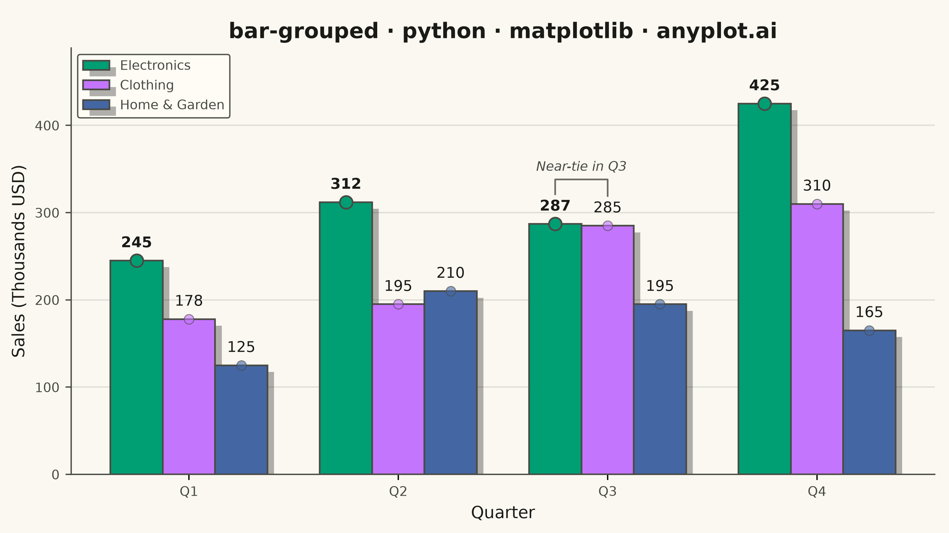
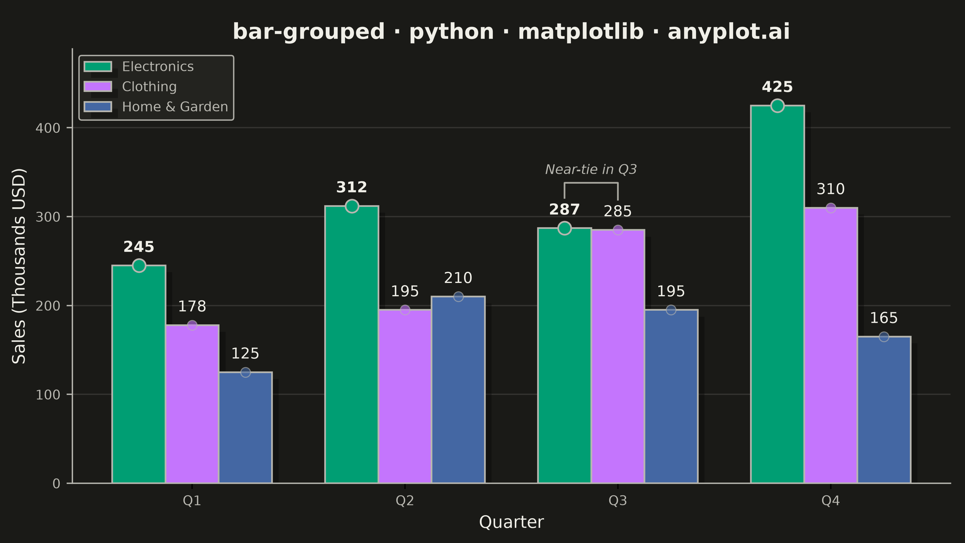
A grouped bar chart that displays multiple bars side-by-side for each category, enabling direct comparison of values across different groups within the same categorical dimension. This visualization excels at showing how different groups perform relative to each other across multiple categories, making patterns and differences immediately apparent. Grouped bar charts are essential for comparative analysis where you need to track multiple series against the same set of categories.
""" anyplot.ai
bar-grouped: Grouped Bar Chart
Library: matplotlib 3.11.1 | Python 3.13.14
Quality: 94/100 | Updated: 2026-08-05
"""

import os

import matplotlib.patheffects as patheffects
import matplotlib.pyplot as plt
import numpy as np


# Theme tokens
THEME = os.getenv("ANYPLOT_THEME", "light")
PAGE_BG = "#FAF8F1" if THEME == "light" else "#1A1A17"
ELEVATED_BG = "#FFFDF6" if THEME == "light" else "#242420"
INK = "#1A1A17" if THEME == "light" else "#F0EFE8"
INK_SOFT = "#4A4A44" if THEME == "light" else "#B8B7B0"
INK_MUTED = "#6B6A63" if THEME == "light" else "#A8A79F"

# Imprint palette (position 1 is always #009E73)
IMPRINT = ["#009E73", "#C475FD", "#4467A3"]

# Data: quarterly sales by product line (thousands USD)
categories = ["Q1", "Q2", "Q3", "Q4"]
groups = ["Electronics", "Clothing", "Home & Garden"]

sales_data = {
    "Electronics": [245, 312, 287, 425],
    "Clothing": [178, 195, 285, 310],
    "Home & Garden": [125, 210, 195, 165],
}

# Setup for grouped bars
x = np.arange(len(categories))
n_groups = len(groups)
bar_width = 0.25
offsets = np.linspace(-(n_groups - 1) / 2, (n_groups - 1) / 2, n_groups) * bar_width
max_value = max(max(v) for v in sales_data.values())

# Plot
fig, ax = plt.subplots(figsize=(8, 4.5), dpi=400, facecolor=PAGE_BG)
ax.set_facecolor(PAGE_BG)

# Track the top group per category for visual emphasis
max_values_per_category = {cat: max(sales_data[group][i] for group in groups) for i, cat in enumerate(categories)}

bars = []
for i, (group, color) in enumerate(zip(groups, IMPRINT, strict=True)):
    bar = ax.bar(
        x + offsets[i], sales_data[group], bar_width, label=group, color=color, edgecolor=INK_SOFT, linewidth=1.0
    )
    bars.append(bar)

    # Drop shadow for depth, via matplotlib's native path-effect (idiomatic vs. manual patches)
    for rect in bar:
        rect.set_path_effects([patheffects.withSimplePatchShadow(offset=(4, -4), shadow_rgbFace="#000000", alpha=0.30)])

# Value labels and top-performer markers
for bar_group in bars:
    for j, bar in enumerate(bar_group):
        height = bar.get_height()
        is_max = height == max_values_per_category[categories[j]]

        ax.scatter(
            bar.get_x() + bar.get_width() / 2,
            height,
            s=60 if is_max else 34,
            color=bar.get_facecolor(),
            edgecolors=INK_SOFT,
            linewidth=1.0 if is_max else 0.6,
            alpha=1.0 if is_max else 0.6,
            zorder=3,
        )
        ax.annotate(
            f"{int(height)}",
            xy=(bar.get_x() + bar.get_width() / 2, height),
            xytext=(0, 6),
            textcoords="offset points",
            ha="center",
            va="bottom",
            fontsize=9,
            color=INK,
            fontweight="bold" if is_max else "normal",
            zorder=4,
        )

# Explicit callout for the data story: Electronics vs. Clothing near-tie in Q3
q3_idx = categories.index("Q3")
top_group, second_group = sorted(groups, key=lambda g: sales_data[g][q3_idx], reverse=True)[:2]
top_i, second_i = groups.index(top_group), groups.index(second_group)
top_val, second_val = sales_data[top_group][q3_idx], sales_data[second_group][q3_idx]
x1, x2 = x[q3_idx] + offsets[top_i], x[q3_idx] + offsets[second_i]
top_y, second_y = top_val + max_value * 0.08, second_val + max_value * 0.08
bracket_y = max(top_y, second_y) + max_value * 0.04
ax.plot([x1, x1, x2, x2], [top_y, bracket_y, bracket_y, second_y], color=INK_MUTED, linewidth=1.0, zorder=5)
ax.text(
    (x1 + x2) / 2,
    bracket_y + max_value * 0.015,
    "Near-tie in Q3",
    ha="center",
    va="bottom",
    fontsize=8,
    color=INK_SOFT,
    style="italic",
    zorder=5,
)

# Style
title = "bar-grouped · python · matplotlib · anyplot.ai"
title_fontsize = round(13 * 67 / len(title)) if len(title) > 67 else 13
ax.set_title(title, fontsize=title_fontsize, fontweight="bold", color=INK)
ax.set_xlabel("Quarter", fontsize=10, color=INK)
ax.set_ylabel("Sales (Thousands USD)", fontsize=10, color=INK)

ax.set_xticks(x)
ax.set_xticklabels(categories, fontsize=8, color=INK_SOFT)
ax.tick_params(axis="y", labelsize=8, colors=INK_SOFT)

# Legend, theme-adaptive
leg = ax.legend(fontsize=8, loc="upper left", framealpha=0.95)
if leg:
    leg.get_frame().set_facecolor(ELEVATED_BG)
    leg.get_frame().set_edgecolor(INK_SOFT)
    leg.get_frame().set_linewidth(0.8)
    plt.setp(leg.get_texts(), color=INK_SOFT)

# Grid
ax.yaxis.grid(True, alpha=0.12, linewidth=0.8, color=INK)
ax.set_axisbelow(True)

# Spines
ax.spines["top"].set_visible(False)
ax.spines["right"].set_visible(False)
ax.spines["left"].set_color(INK_SOFT)
ax.spines["bottom"].set_color(INK_SOFT)

ax.set_ylim(0, max_value * 1.15)

fig.subplots_adjust(left=0.075, right=0.985, top=0.91, bottom=0.11)
plt.savefig(f"plot-{THEME}.png", dpi=400, facecolor=PAGE_BG)
Runnable source as JSON, for any HTTP client: https://api.anyplot.ai/specs/bar-grouped/matplotlib/code. Any spec id and library id listed in llms-full.txt fit the same URL shape; every URL below is complete and callable.
{
  "spec_id": "bar-grouped",
  "language": "python",
  "library": "matplotlib",
  "page": "https://anyplot.ai/bar-grouped/python/matplotlib",
  "hub": "https://anyplot.ai/bar-grouped",
  "code_json": "https://api.anyplot.ai/specs/bar-grouped/matplotlib/code",
  "spec_json": "https://api.anyplot.ai/specs/bar-grouped",
  "render_light_png": "https://storage.googleapis.com/anyplot-images/plots/bar-grouped/python/matplotlib/plot-light.png",
  "render_dark_png": "https://storage.googleapis.com/anyplot-images/plots/bar-grouped/python/matplotlib/plot-dark.png",
  "quality_score": 94.0,
  "license": "MIT",
  "guide": "https://anyplot.ai/llms.txt"
}
Part of Grouped Bar Chart on anyplot.ai.