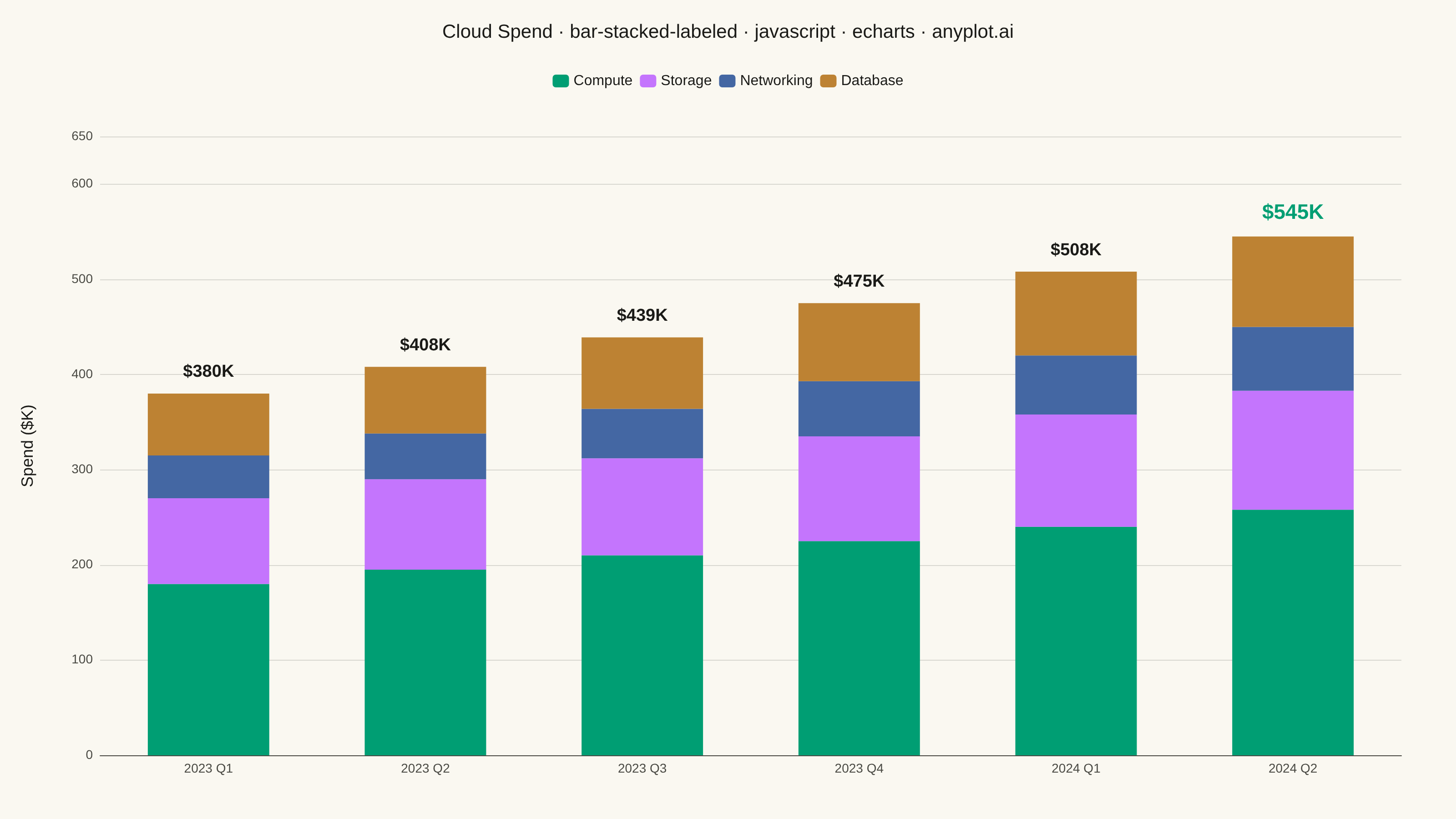
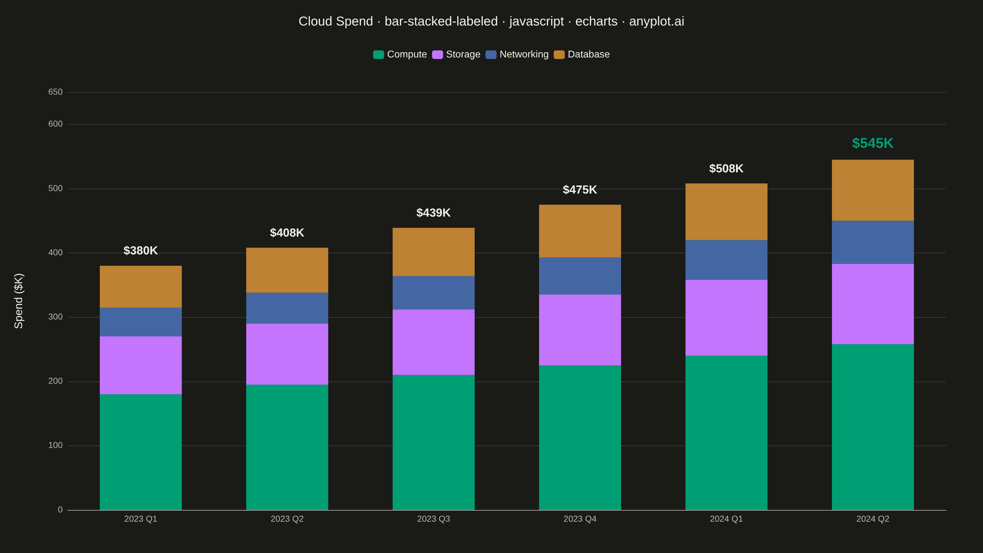
The same plot in 14 other libraries — JavaScript: Chart.js, D3.js, Highcharts, MUI X Charts; Python: Altair, Bokeh, lets-plot, Matplotlib, Plotly, plotnine, Pygal, Seaborn; R: ggplot2; Julia: Makie.jl. Compare all 15 side by side: Stacked Bar Chart with Total Labels in Python, R, Julia and JavaScript.
A stacked bar chart that displays multiple data series stacked on top of each other with total value labels prominently shown above each bar stack. This variant combines part-to-whole visualization with explicit numerical annotations, making it easy to read both individual segment contributions and cumulative totals at a glance. The total labels eliminate the need for mental arithmetic when comparing overall values across categories.
// anyplot.ai
// bar-stacked-labeled: Stacked Bar Chart with Total Labels
// Library: echarts 6.1.0 | JavaScript 22.23.2
// Quality: 92/100 | Created: 2026-08-26

const t = window.ANYPLOT_TOKENS;

// --- Data (in-memory, deterministic) ----------------------------------------
const quarters = ["2023 Q1", "2023 Q2", "2023 Q3", "2023 Q4", "2024 Q1", "2024 Q2"];
const services = ["Compute", "Storage", "Networking", "Database"];
const spendByService = {
  Compute: [180, 195, 210, 225, 240, 258],
  Storage: [90, 95, 102, 110, 118, 125],
  Networking: [45, 48, 52, 58, 62, 67],
  Database: [65, 70, 75, 82, 88, 95],
};
const totals = quarters.map((_, i) =>
  services.reduce((sum, service) => sum + spendByService[service][i], 0)
);
const yAxisMax = Math.ceil((Math.max(...totals) * 1.15) / 50) * 50;

const title = "Cloud Spend · bar-stacked-labeled · javascript · echarts · anyplot.ai";
const titleFontSize = Math.round(22 * Math.min(1, 67 / title.length));

// --- Init ---------------------------------------------------------------------
const chart = echarts.init(document.getElementById("container"));

// --- Option ---------------------------------------------------------------------
chart.setOption({
  animation: false,
  color: t.palette,
  backgroundColor: "transparent",
  title: {
    text: title,
    left: "center",
    top: 20,
    textStyle: { color: t.ink, fontSize: titleFontSize, fontWeight: 500 },
  },
  legend: {
    data: services,
    top: 76,
    textStyle: { color: t.ink, fontSize: 16 },
    itemWidth: 18,
    itemHeight: 14,
  },
  tooltip: {
    trigger: "axis",
    axisPointer: { type: "shadow" },
    valueFormatter: (value) => `$${value}K`,
  },
  grid: { left: 110, right: 60, top: 150, bottom: 70, containLabel: false },
  xAxis: {
    type: "category",
    data: quarters,
    axisLabel: { color: t.inkSoft, fontSize: 14 },
    axisLine: { lineStyle: { color: t.inkSoft } },
    axisTick: { show: false },
    splitLine: { show: false },
  },
  yAxis: {
    type: "value",
    name: "Spend ($K)",
    nameLocation: "middle",
    nameGap: 70,
    nameTextStyle: { color: t.ink, fontSize: 18 },
    max: yAxisMax,
    axisLabel: { color: t.inkSoft, fontSize: 14 },
    axisLine: { show: false },
    splitLine: { lineStyle: { color: t.grid } },
  },
  series: [
    ...services.map((service) => ({
      name: service,
      type: "bar",
      stack: "spend",
      barWidth: "56%",
      data: spendByService[service],
    })),
    {
      name: "Total",
      type: "bar",
      stack: "spend",
      data: totals.map((_, i) =>
        i === totals.length - 1
          ? { value: 0, label: { fontSize: 23, color: t.palette[0] } }
          : 0
      ),
      itemStyle: { color: "transparent" },
      silent: true,
      tooltip: { show: false },
      label: {
        show: true,
        position: "top",
        distance: 14,
        color: t.ink,
        fontSize: 19,
        fontWeight: "bold",
        formatter: (params) => `$${totals[params.dataIndex]}K`,
      },
    },
  ],
});
Runnable source as JSON, for any HTTP client: https://api.anyplot.ai/specs/bar-stacked-labeled/echarts/code. Any spec id and library id listed in llms-full.txt fit the same URL shape; every URL below is complete and callable.
{
  "spec_id": "bar-stacked-labeled",
  "language": "javascript",
  "library": "echarts",
  "page": "https://anyplot.ai/bar-stacked-labeled/javascript/echarts",
  "hub": "https://anyplot.ai/bar-stacked-labeled",
  "code_json": "https://api.anyplot.ai/specs/bar-stacked-labeled/echarts/code",
  "spec_json": "https://api.anyplot.ai/specs/bar-stacked-labeled",
  "render_light_png": "https://storage.googleapis.com/anyplot-images/plots/bar-stacked-labeled/javascript/echarts/plot-light.png",
  "render_dark_png": "https://storage.googleapis.com/anyplot-images/plots/bar-stacked-labeled/javascript/echarts/plot-dark.png",
  "interactive_light_html": "https://storage.googleapis.com/anyplot-images/plots/bar-stacked-labeled/javascript/echarts/plot-light.html",
  "interactive_dark_html": "https://storage.googleapis.com/anyplot-images/plots/bar-stacked-labeled/javascript/echarts/plot-dark.html",
  "quality_score": 92.0,
  "license": "MIT",
  "guide": "https://anyplot.ai/llms.txt"
}
Part of Stacked Bar Chart with Total Labels on anyplot.ai.