The same plot in 14 other libraries — JavaScript: Chart.js, D3.js, Apache ECharts, MUI X Charts; Python: Altair, Bokeh, lets-plot, Matplotlib, Plotly, plotnine, Pygal, Seaborn; R: ggplot2; Julia: Makie.jl. Compare all 15 side by side: Stacked Bar Chart with Total Labels in Python, R, Julia and JavaScript.
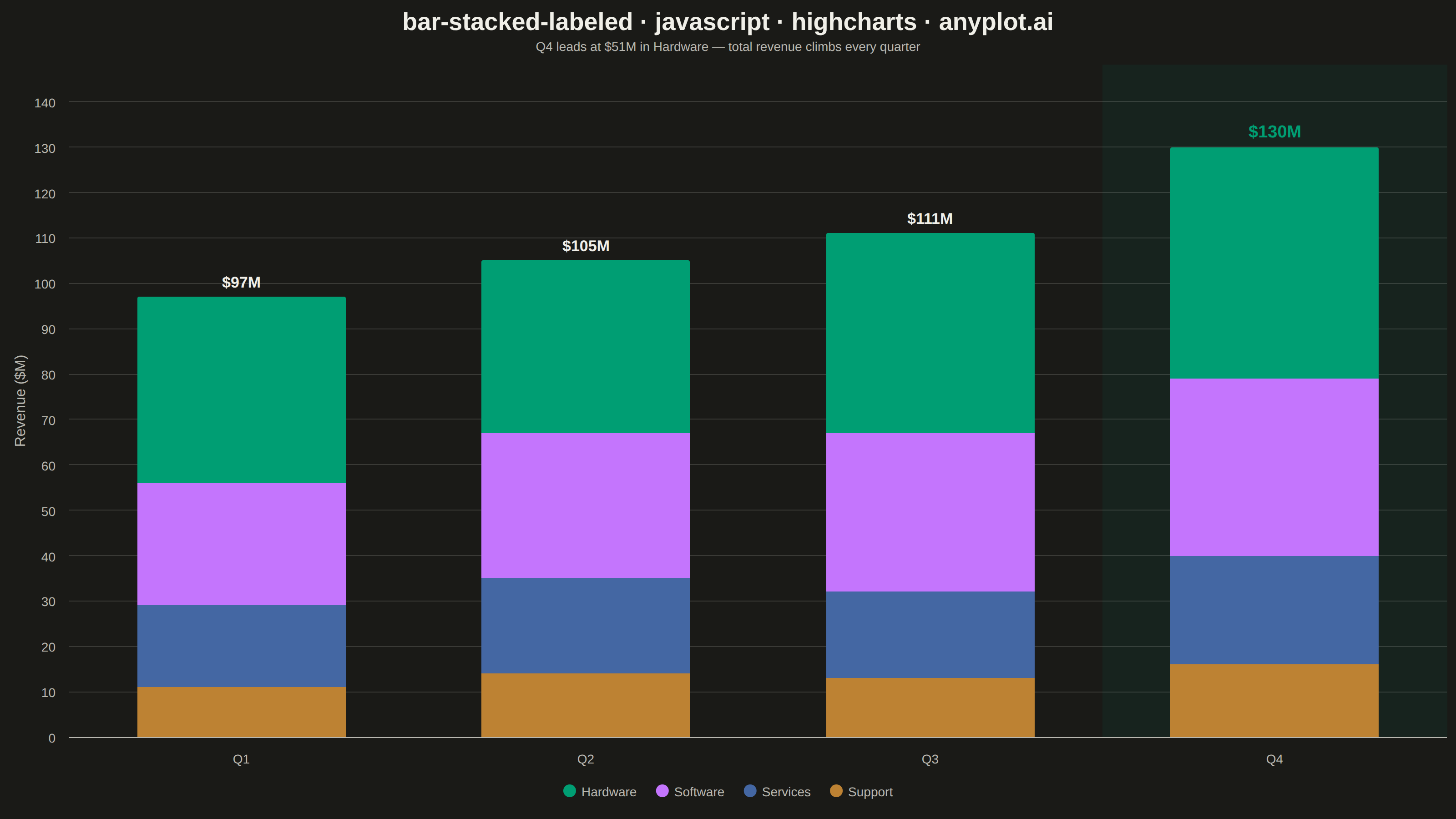
A stacked bar chart that displays multiple data series stacked on top of each other with total value labels prominently shown above each bar stack. This variant combines part-to-whole visualization with explicit numerical annotations, making it easy to read both individual segment contributions and cumulative totals at a glance. The total labels eliminate the need for mental arithmetic when comparing overall values across categories.
// anyplot.ai
// bar-stacked-labeled: Stacked Bar Chart with Total Labels
// Library: highcharts 12.6.0 | JavaScript 22.23.2
// Quality: 94/100 | Created: 2026-08-26

const t = window.ANYPLOT_TOKENS;

// --- Data (in-memory, deterministic) ---------------------------------------
// Quarterly revenue by product line, in $M.
const quarters = ["Q1", "Q2", "Q3", "Q4"];
const hardware = [41, 38, 44, 51];
const software = [27, 32, 35, 39];
const services = [18, 21, 19, 24];
const support = [11, 14, 13, 16];

// The strongest quarter (highest stacked total) anchors the storytelling
// emphasis below — a soft highlight band plus a bolder, brand-green total
// label draw the eye straight to it.
const peakIndex = quarters.length - 1;
const peakBand = Highcharts.color(t.palette[0]).setOpacity(0.08).get();

// --- Chart -------------------------------------------------------------------
Highcharts.chart("container", {
  chart: {
    type: "column",
    backgroundColor: "transparent",
    animation: false,
    style: { fontFamily: "inherit" },
  },
  credits: { enabled: false },
  colors: t.palette,
  title: {
    text: "bar-stacked-labeled · javascript · highcharts · anyplot.ai",
    style: { color: t.ink, fontSize: "27px", fontWeight: "700" },
  },
  subtitle: {
    text:
      "Q" +
      quarters.length +
      " leads at $" +
      hardware[peakIndex] +
      "M in Hardware — total revenue climbs every quarter",
    style: { color: t.inkSoft, fontSize: "14px" },
  },
  xAxis: {
    categories: quarters,
    lineColor: t.inkSoft,
    tickColor: t.inkSoft,
    labels: { style: { color: t.inkSoft, fontSize: "14px" } },
    plotBands: [
      {
        from: peakIndex - 0.5,
        to: peakIndex + 0.5,
        color: peakBand,
      },
    ],
  },
  yAxis: {
    title: {
      text: "Revenue ($M)",
      style: { color: t.inkSoft, fontSize: "16px" },
    },
    gridLineColor: t.grid,
    labels: { style: { color: t.inkSoft, fontSize: "14px" } },
    endOnTick: false,
    maxPadding: 0.14,
    stackLabels: {
      enabled: true,
      useHTML: true,
      style: { textOutline: "none" },
      formatter: function () {
        const isPeak = this.x === peakIndex;
        const color = isPeak ? t.palette[0] : t.ink;
        const fontSize = isPeak ? "19px" : "17px";
        return (
          '<span style="color:' +
          color +
          ";font-size:" +
          fontSize +
          ';font-weight:700;">$' +
          this.total +
          "M</span>"
        );
      },
    },
  },
  legend: {
    itemStyle: { color: t.inkSoft, fontSize: "14px" },
    itemHoverStyle: { color: t.ink },
  },
  plotOptions: {
    series: { animation: false },
    column: {
      borderWidth: 0,
      borderRadius: 2,
      stacking: "normal",
      pointPadding: 0.08,
      groupPadding: 0.14,
    },
  },
  series: [
    { name: "Hardware", data: hardware },
    { name: "Software", data: software },
    { name: "Services", data: services },
    { name: "Support", data: support },
  ],
});
Runnable source as JSON, for any HTTP client: https://api.anyplot.ai/specs/bar-stacked-labeled/highcharts/code. Any spec id and library id listed in llms-full.txt fit the same URL shape; every URL below is complete and callable.
{
  "spec_id": "bar-stacked-labeled",
  "language": "javascript",
  "library": "highcharts",
  "page": "https://anyplot.ai/bar-stacked-labeled/javascript/highcharts",
  "hub": "https://anyplot.ai/bar-stacked-labeled",
  "code_json": "https://api.anyplot.ai/specs/bar-stacked-labeled/highcharts/code",
  "spec_json": "https://api.anyplot.ai/specs/bar-stacked-labeled",
  "render_light_png": "https://storage.googleapis.com/anyplot-images/plots/bar-stacked-labeled/javascript/highcharts/plot-light.png",
  "render_dark_png": "https://storage.googleapis.com/anyplot-images/plots/bar-stacked-labeled/javascript/highcharts/plot-dark.png",
  "interactive_light_html": "https://storage.googleapis.com/anyplot-images/plots/bar-stacked-labeled/javascript/highcharts/plot-light.html",
  "interactive_dark_html": "https://storage.googleapis.com/anyplot-images/plots/bar-stacked-labeled/javascript/highcharts/plot-dark.html",
  "quality_score": 94.0,
  "license": "MIT",
  "guide": "https://anyplot.ai/llms.txt"
}
Part of Stacked Bar Chart with Total Labels on anyplot.ai.