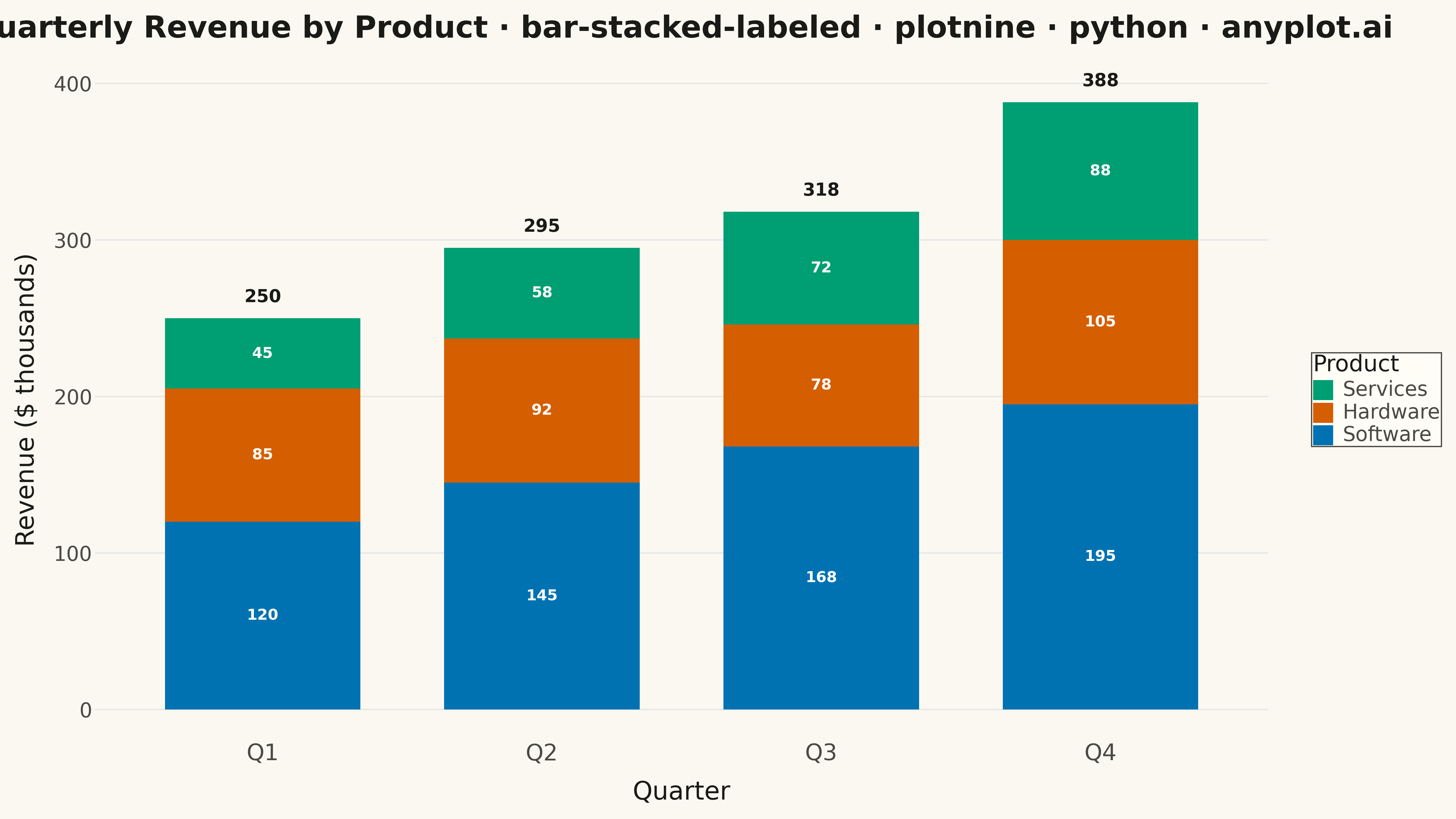
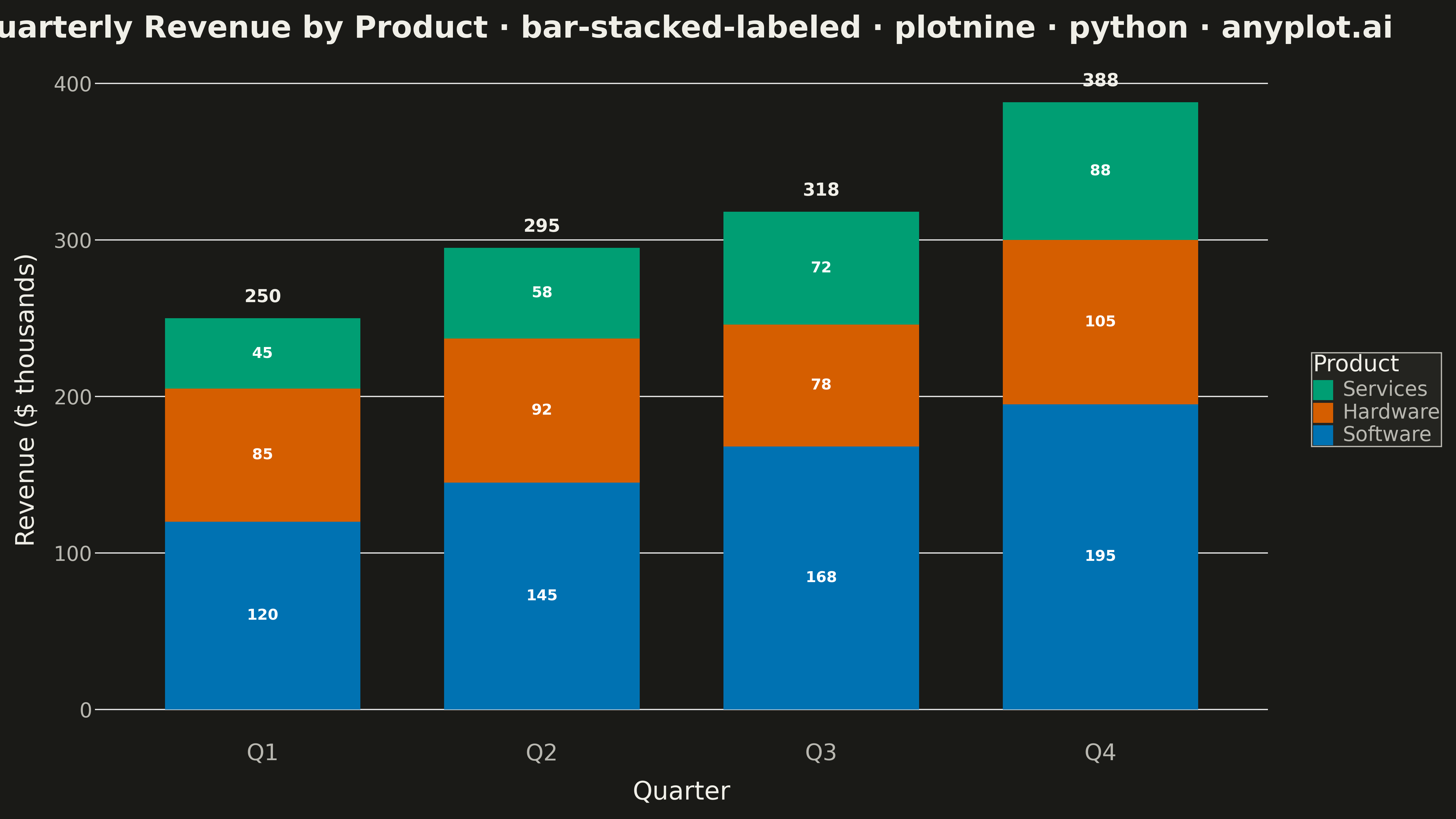
A stacked bar chart that displays multiple data series stacked on top of each other with total value labels prominently shown above each bar stack. This variant combines part-to-whole visualization with explicit numerical annotations, making it easy to read both individual segment contributions and cumulative totals at a glance. The total labels eliminate the need for mental arithmetic when comparing overall values across categories.
""" anyplot.ai
bar-stacked-labeled: Stacked Bar Chart with Total Labels
Library: plotnine 0.15.4 | Python 3.13.13
Quality: 76/100 | Updated: 2026-05-18
"""

import pandas as pd
from plotnine import (
    aes,
    element_blank,
    element_text,
    geom_bar,
    geom_text,
    ggplot,
    labs,
    position_stack,
    scale_fill_manual,
    theme,
    theme_minimal,
)


# Data - Quarterly revenue by product category
data = {
    "Quarter": ["Q1", "Q1", "Q1", "Q2", "Q2", "Q2", "Q3", "Q3", "Q3", "Q4", "Q4", "Q4"],
    "Product": [
        "Software",
        "Hardware",
        "Services",
        "Software",
        "Hardware",
        "Services",
        "Software",
        "Hardware",
        "Services",
        "Software",
        "Hardware",
        "Services",
    ],
    "Revenue": [120, 85, 45, 145, 92, 58, 168, 78, 72, 195, 105, 88],
}
df = pd.DataFrame(data)

# Calculate totals for each quarter
totals = df.groupby("Quarter")["Revenue"].sum().reset_index()
totals.columns = ["Quarter", "Total"]

# Define category order for proper stacking
df["Quarter"] = pd.Categorical(df["Quarter"], categories=["Q1", "Q2", "Q3", "Q4"], ordered=True)
df["Product"] = pd.Categorical(df["Product"], categories=["Services", "Hardware", "Software"], ordered=True)
totals["Quarter"] = pd.Categorical(totals["Quarter"], categories=["Q1", "Q2", "Q3", "Q4"], ordered=True)

# Python-inspired color palette
colors = ["#306998", "#FFD43B", "#4B8BBE"]  # Blue, Yellow, Light Blue

# Create stacked bar chart
plot = (
    ggplot(df, aes(x="Quarter", y="Revenue", fill="Product"))
    + geom_bar(stat="identity", position="stack", width=0.7)
    + geom_text(aes(label="Revenue"), position=position_stack(vjust=0.5), size=12, color="white", fontweight="bold")
    + geom_text(
        data=totals,
        mapping=aes(x="Quarter", y="Total", label="Total"),
        inherit_aes=False,
        va="bottom",
        size=14,
        fontweight="bold",
        nudge_y=8,
    )
    + scale_fill_manual(values=colors)
    + labs(
        title="Quarterly Revenue by Product · bar-stacked-labeled · plotnine · pyplots.ai",
        x="Quarter",
        y="Revenue ($ thousands)",
        fill="Product",
    )
    + theme_minimal()
    + theme(
        figure_size=(16, 9),
        plot_title=element_text(size=24, weight="bold"),
        axis_title_x=element_text(size=20),
        axis_title_y=element_text(size=20),
        axis_text_x=element_text(size=18),
        axis_text_y=element_text(size=16),
        legend_title=element_text(size=18),
        legend_text=element_text(size=16),
        legend_position="right",
        panel_grid_major_x=element_blank(),
        panel_grid_minor=element_blank(),
    )
)

# Save
plot.save("plot.png", dpi=300, verbose=False)
Runnable source as JSON, for any HTTP client: https://api.anyplot.ai/specs/bar-stacked-labeled/plotnine/code. Any spec id and library id listed in llms-full.txt fit the same URL shape; every URL below is complete and callable.
{
  "spec_id": "bar-stacked-labeled",
  "language": "python",
  "library": "plotnine",
  "page": "https://anyplot.ai/bar-stacked-labeled/python/plotnine",
  "hub": "https://anyplot.ai/bar-stacked-labeled",
  "code_json": "https://api.anyplot.ai/specs/bar-stacked-labeled/plotnine/code",
  "spec_json": "https://api.anyplot.ai/specs/bar-stacked-labeled",
  "render_light_png": "https://storage.googleapis.com/anyplot-images/plots/bar-stacked-labeled/python/plotnine/plot-light.png",
  "render_dark_png": "https://storage.googleapis.com/anyplot-images/plots/bar-stacked-labeled/python/plotnine/plot-dark.png",
  "quality_score": 76.0,
  "license": "MIT",
  "guide": "https://anyplot.ai/llms.txt"
}
Part of Stacked Bar Chart with Total Labels on anyplot.ai.