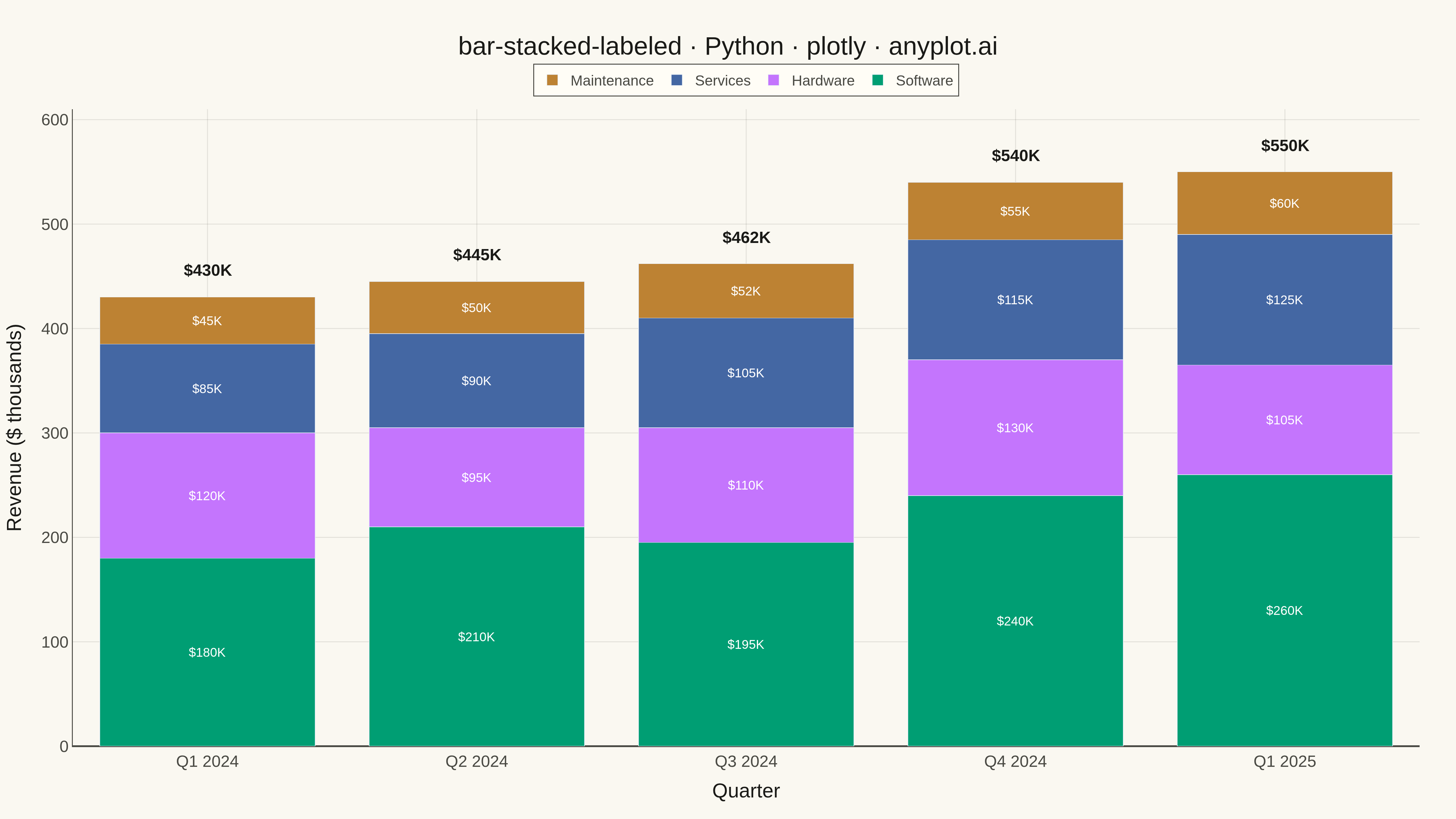
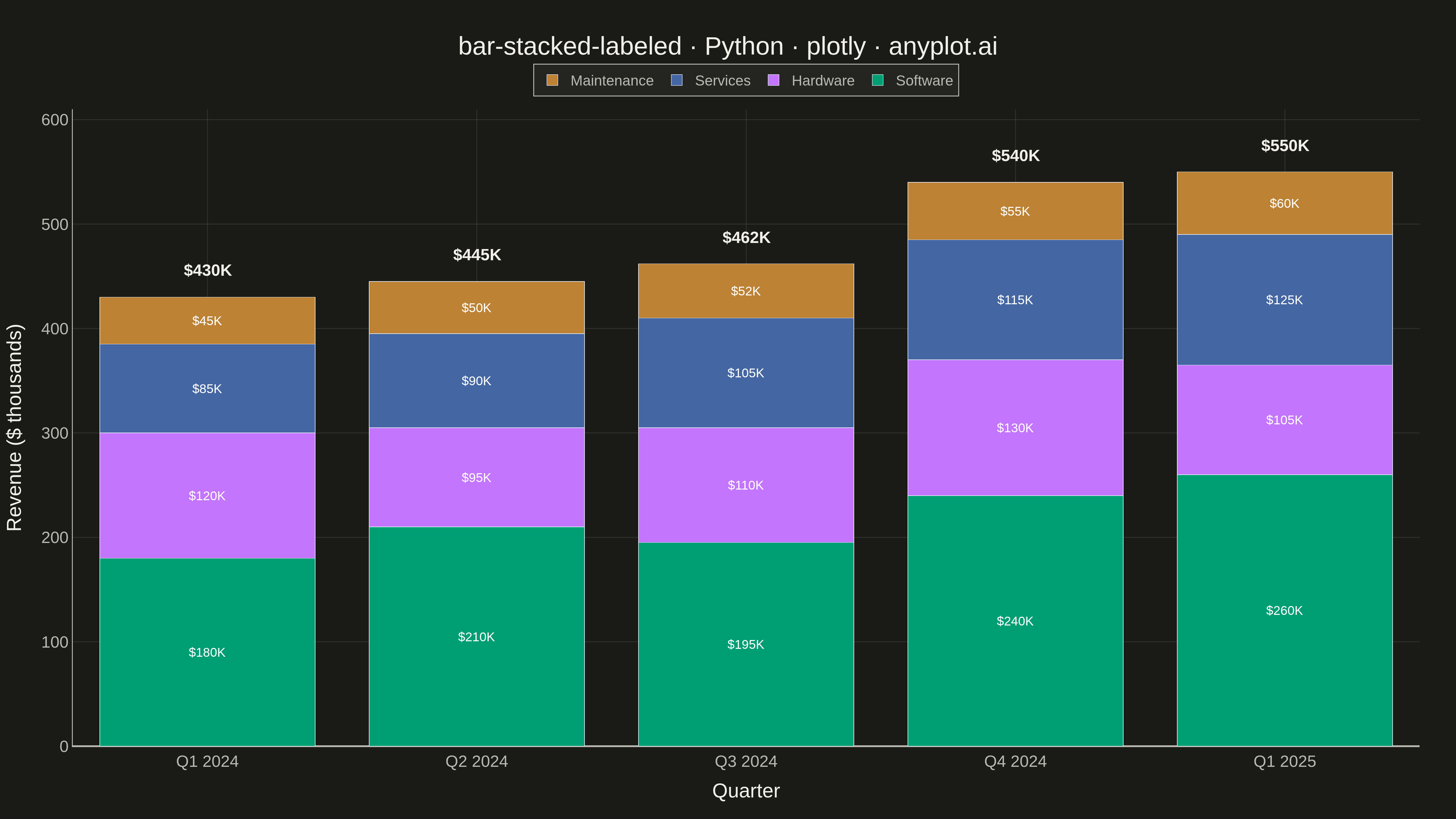
A stacked bar chart that displays multiple data series stacked on top of each other with total value labels prominently shown above each bar stack. This variant combines part-to-whole visualization with explicit numerical annotations, making it easy to read both individual segment contributions and cumulative totals at a glance. The total labels eliminate the need for mental arithmetic when comparing overall values across categories.
""" anyplot.ai
bar-stacked-labeled: Stacked Bar Chart with Total Labels
Library: plotly 6.7.0 | Python 3.13.13
Quality: 94/100 | Updated: 2026-05-18
"""

import os
import sys


# Work around naming conflict: remove current directory from import path
sys.path.pop(0)
import plotly.graph_objects as go


# Theme tokens
THEME = os.getenv("ANYPLOT_THEME", "light")
PAGE_BG = "#FAF8F1" if THEME == "light" else "#1A1A17"
ELEVATED_BG = "#FFFDF6" if THEME == "light" else "#242420"
INK = "#1A1A17" if THEME == "light" else "#F0EFE8"
INK_SOFT = "#4A4A44" if THEME == "light" else "#B8B7B0"
GRID = "rgba(26,26,23,0.10)" if THEME == "light" else "rgba(240,239,232,0.10)"

# Okabe-Ito palette (first series is ALWAYS #009E73)
IMPRINT = ["#009E73", "#C475FD", "#4467A3", "#BD8233"]

# Data: Quarterly revenue by product category
quarters = ["Q1 2024", "Q2 2024", "Q3 2024", "Q4 2024", "Q1 2025"]
products = ["Software", "Hardware", "Services", "Maintenance"]

# Revenue data in thousands (realistic business scenario)
revenue_data = {
    "Software": [180, 210, 195, 240, 260],
    "Hardware": [120, 95, 110, 130, 105],
    "Services": [85, 90, 105, 115, 125],
    "Maintenance": [45, 50, 52, 55, 60],
}

# Calculate totals for labels
totals = [sum(revenue_data[p][i] for p in products) for i in range(len(quarters))]

# Create figure
fig = go.Figure()

# Add stacked bars for each product
for product, color in zip(products, IMPRINT, strict=True):
    fig.add_trace(
        go.Bar(
            name=product,
            x=quarters,
            y=revenue_data[product],
            marker_color=color,
            text=[f"${v}K" for v in revenue_data[product]],
            textposition="inside",
            textfont={"size": 14, "color": "white"},
            insidetextanchor="middle",
        )
    )

# Add total labels as annotations above each bar stack
for quarter, total in zip(quarters, totals, strict=True):
    fig.add_annotation(
        x=quarter,
        y=total + 15,
        text=f"<b>${total}K</b>",
        showarrow=False,
        font={"size": 18, "color": INK},
        yanchor="bottom",
    )

# Layout for 4800x2700 px output
fig.update_layout(
    title={
        "text": "bar-stacked-labeled · Python · plotly · anyplot.ai",
        "font": {"size": 28, "color": INK},
        "x": 0.5,
        "xanchor": "center",
    },
    xaxis={
        "title": {"text": "Quarter", "font": {"size": 22, "color": INK}},
        "tickfont": {"size": 18, "color": INK_SOFT},
        "gridcolor": GRID,
        "linecolor": INK_SOFT,
        "zerolinecolor": INK_SOFT,
    },
    yaxis={
        "title": {"text": "Revenue ($ thousands)", "font": {"size": 22, "color": INK}},
        "tickfont": {"size": 18, "color": INK_SOFT},
        "range": [0, max(totals) + 60],
        "gridcolor": GRID,
        "linecolor": INK_SOFT,
        "zerolinecolor": INK_SOFT,
    },
    barmode="stack",
    paper_bgcolor=PAGE_BG,
    plot_bgcolor=PAGE_BG,
    legend={
        "orientation": "h",
        "yanchor": "bottom",
        "y": 1.02,
        "xanchor": "center",
        "x": 0.5,
        "font": {"size": 16, "color": INK_SOFT},
        "bgcolor": ELEVATED_BG,
        "bordercolor": INK_SOFT,
        "borderwidth": 1,
    },
    margin={"t": 120, "b": 80, "l": 80, "r": 40},
)

# Save as PNG and HTML (4800x2700)
fig.write_image(f"plot-{THEME}.png", width=1600, height=900, scale=3)
fig.write_html(f"plot-{THEME}.html", include_plotlyjs="cdn")
Runnable source as JSON, for any HTTP client: https://api.anyplot.ai/specs/bar-stacked-labeled/plotly/code. Any spec id and library id listed in llms-full.txt fit the same URL shape; every URL below is complete and callable.
{
  "spec_id": "bar-stacked-labeled",
  "language": "python",
  "library": "plotly",
  "page": "https://anyplot.ai/bar-stacked-labeled/python/plotly",
  "hub": "https://anyplot.ai/bar-stacked-labeled",
  "code_json": "https://api.anyplot.ai/specs/bar-stacked-labeled/plotly/code",
  "spec_json": "https://api.anyplot.ai/specs/bar-stacked-labeled",
  "render_light_png": "https://storage.googleapis.com/anyplot-images/plots/bar-stacked-labeled/python/plotly/plot-light.png",
  "render_dark_png": "https://storage.googleapis.com/anyplot-images/plots/bar-stacked-labeled/python/plotly/plot-dark.png",
  "interactive_light_html": "https://storage.googleapis.com/anyplot-images/plots/bar-stacked-labeled/python/plotly/plot-light.html",
  "interactive_dark_html": "https://storage.googleapis.com/anyplot-images/plots/bar-stacked-labeled/python/plotly/plot-dark.html",
  "quality_score": 94.0,
  "license": "MIT",
  "guide": "https://anyplot.ai/llms.txt"
}
Part of Stacked Bar Chart with Total Labels on anyplot.ai.